Tag Archives: zen

Moving the Center Line of a Bar Chart with a Gantt Chart

There are cases where we have bar charts whose centerline is not zero, for example when we’ve indexed a measure to have a base of 100. Here’s an example where the SUM(Sales) for each product Category is indexed to the average sales per Category:

What happens when we want the bars to start at 100 and then go up or down from there, like this?

Read on for how to build this in Tableau! Continue reading

So You Want to be a (Tableau) Zen Master

So You Want to be a (Tableau) Zen Master

As usage of Tableau grows there’s a question that comes up more and more often: How can I become a Tableau Zen Master? It’s quite natural that people would ask for that question, and since we Tableau users are analytically-minded we tend to start looking for something like a checklist.

I’ve been thinking about how to answer this question for several months now. I think I have an answer, and it’s not a checklist. Please know that I’m not writing or speaking for Tableau the company here, just using my own insight and what I’ve gathered from conversations with others both inside and outside Tableau.

One part of being a Tableau Zen Master is demonstrating excellence in one or more areas of working with Tableau, and towards that I published Getting Good at Tableau. Another part is helping the Tableau community, and Steve Wexler has published a great series of posts on that (1, 2, 3). And another part is a way of doing and being, and to communicate that I put together the following presentation (with a little help from my wife, as you’ll soon find out):

If you find this helpful (or not), please let me know!

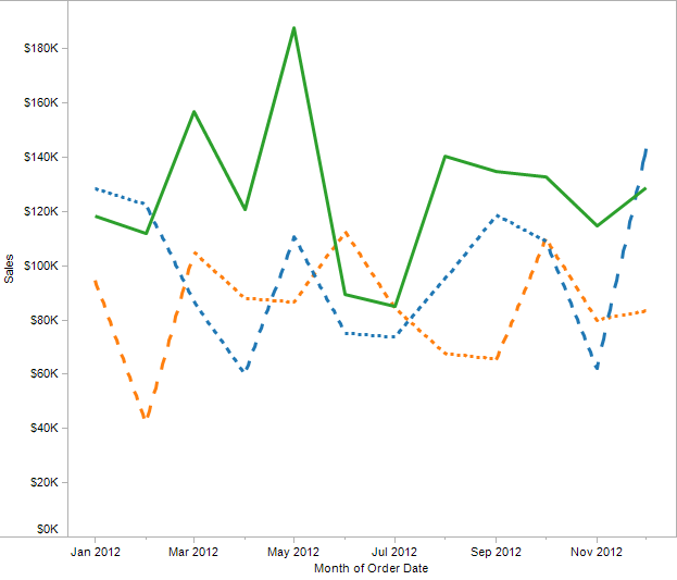
Eddie Van Halen and Dashed Lines

Mastery can be magic. I can remember a time as a young person when I just started to have a clue about how music was made hearing an Eddie Van Halen solo on the radio and wondering, “How does one person make that many notes???” Or the scene in The Empire Strikes Back where Yoda lifts the X-Wing out of the bog and Luke is hornswoggled. Amazement, disbelief, and “I want to do that too!” all rolled into one feeling, when the heretofore impossible becomes, for an instant, possible.

One of the things Tableau doesn’t do is let you draw line charts with dashed lines, to create a view like this that could be from Excel or another application:

Solid and Dashed

Except that Tableau can do this, and you’re about to learn how – actually, three entirely different techniques. Along the way you’ll learn some more about how Tableau draws Line Marks and table calculation domain padding.

Continue reading

Older But Still Useful – Conditional Formatting

Back in May of this year before I started this blog, I did a presentation at the Boston Tableau User Group on conditional formatting in Tableau. Prior to using Tableau, I’d created some dashboards and reports in Excel, and when I tried to re-create them in Tableau I ran into a number of different issues in terms of doing the kinds of formatting, layout, and conditional formatting that are possible in Excel. I created a workbook with every technique I could find and some I figured out. Continue reading