Mastery can be magic. I can remember a time as a young person when I just started to have a clue about how music was made hearing an Eddie Van Halen solo on the radio and wondering, “How does one person make that many notes???” Or the scene in The Empire Strikes Back where Yoda lifts the X-Wing out of the bog and Luke is hornswoggled. Amazement, disbelief, and “I want to do that too!” all rolled into one feeling, when the heretofore impossible becomes, for an instant, possible.
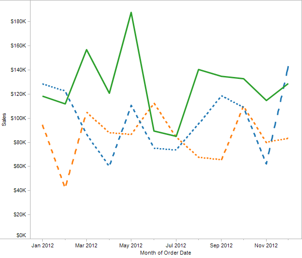
One of the things Tableau doesn’t do is let you draw line charts with dashed lines, to create a view like this that could be from Excel or another application:
Except that Tableau can do this, and you’re about to learn how – actually, three entirely different techniques. Along the way you’ll learn some more about how Tableau draws Line Marks and table calculation domain padding.
When we’re building a view in Tableau, we’re set up by the interface to think about moving this pill to that shelf. Just like when picking up a guitar, one hand is on the frets and another on the strings and we’re set up to start picking or strumming. It takes a willingness and curiosity to see and do things differently to start tapping away on the frets, or to get around the limits of size and mass (easier to do when 800 years old are you, hmm?).
One of the keys to Tableau mastery is to stop thinking “What pills do I need in the view,” or “How do I format the pills in the view,” and instead use a different approach:
- Understand your goal.
- Understand your data.
- Figure out what the ideal data structure and values – given an understanding of how Tableau works – would look like to reach that goal.
- Then and only then figuring out what calculated fields, dimensions, measures, and/or reshaped data would lead back to #1.
- Build the view. Now you start dragging and dropping pills.
When we start thinking like that, the view becomes a canvas on which we can paint with marks, labels, annotations, reference lines, and more and the limits of “this can go here, but not over there” go away and instead become sources of creativity.
1. Understanding the Goal
In this case, the goal is pretty clear: A time series line chart using dashed lines, showing the sum of sales for each month for a dimension.
2. Understanding the Data
I’m using Superstore Sales in this example, so we’ve got a nice data set. Key things to know for Tableau are things like the dimensionality of the data, the “cardinality of the result set” – aka fancy words for how many unique values there will be for a given set of dimensions, what makes for a unique record, data types, and ranges of values. Tableau can be a great tool for exploring your data structure as you drag and drop pills, move them around in the view, and visually interact with the data.
3. Figuring out the ideal data structure and values – given an understanding of how Tableau works
The second part of the above statement is probably more important, and it’s like that old joke: “How do I get to Carnegie Hall?” “Practice, practice, practice.” The Tableau apprenticeship is to master the the ins and outs of different mark types, the continuous/discrete and aggregate/non-aggregate variations, reshaping data, table calculations, etc. One of the best ways to learn Tableau is to take apart a workbook and then duplicate it yourself. Not just looking at the workbook to see how the magic was done, but actually re-recreating it yourself, so you can embed the “move this pill onto that Shelf results in X happening” knowledge into your muscle memory. Also, making mistakes while rebuilding workbooks has been hugely educational for me.
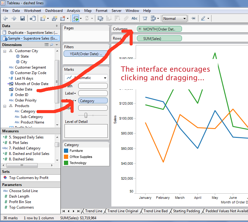
For this example, the “aha” moment (over breakfast) was that all I needed to do was draw a line, then erase some values. That requires an understanding of how Tableau draws lines. When we drag something like Month(Order Date) and SUM(Sales) into the view, Tableau generates a point for each Month of Order Date in the data:
We can get a sense of this in the status bar at the bottom of the Tableau window, Tableau tells us how many marks, and how many panes (via the rows and columns):
Tableau is drawing 12 marks, and connecting the points. All Tableau needs to do to draw a line is two marks, one for each end of the line, so what we’d need to generate to make dashed lines would be a whole lot more marks in the right places.
4. Figuring out what calculated fields, dimensions, measures, and/or reshaped data would lead back to #1.
So, we need a bunch more marks. Where can we get more marks? Padding. We can pad the data outside Tableau using Custom SQL, a custom query in our data source, manual calculations in Excel, etc. Or we can do it inside Tableau using table calculation domain padding, which is what we get when we turn on the Show Missing Values switch for a date or Bin. For example, we can pad monthly data into daily data, and that would give us 28-31 values per month to work with, which seems like it would make a reasonable number of dashes. In the Superstore Sales data, though, the data is already at the day level and excluding every Nth day would be removing data from the view. So, here’s what I did:
- Created a field that truncates the date to the month level.
- Use that month of date in the view at the day level.
- Turn on Show Missing Values to fill in the missing days.
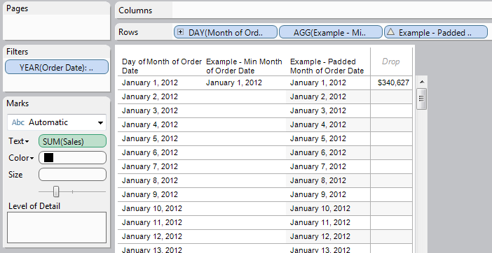
Here’s what that looks like in a crosstab:
This is a good example of the kind of thinking I’m advocating here – we’re taking control of the level of aggregation used in the calculated field. An example you might have already used is in building a set for nested sorting.
I’d thought about drawing just enough marks to make the lines, but that would involve a whole lot of calculations just to figure out where we were in the dashes. So instead I decided to just use up more CPU cycles, do all the calculations for every padded mark, and then erase every Nth mark. The basic algorithm is:
- Pad out the sum of sales so that is available to every day.
- Determine next month’s sales and pad that out to every day. While I could have used a table calc or Custom SQL here, the easier route was to do a self-blend on the Month of Date, only the Month of Date in the secondary is from the next month. Since Tableau can blend on any dimension, calculated or otherwise, using a calculated field for blending can be a useful trick.
- Figure out the number of days in the month and pad that out to every day.
- Generate an index within each padded month for every day.
- Use the calcs from 1-4 to generate stepped daily sales value so the lines will have the right slope.
- Set every Nth value to Null. I set this up using a parameter, to make it easier to control. 4 is a good value for dashed lines, smaller can get you dots.
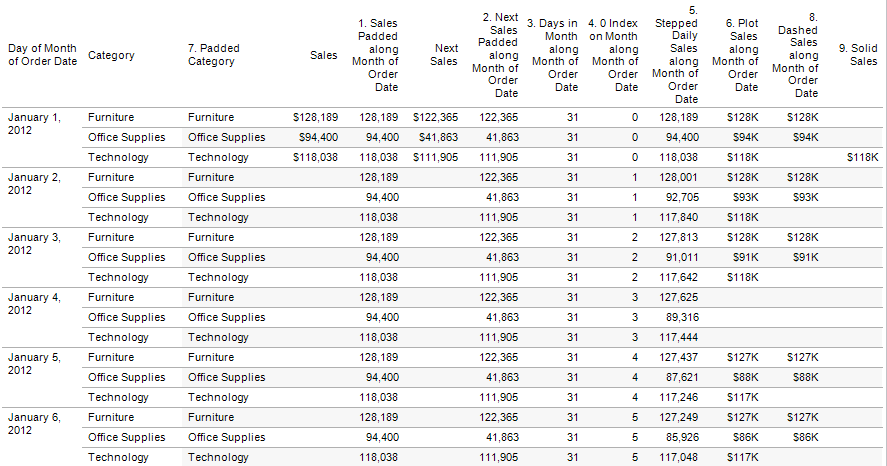
For the solid and dashed crosstab, I also added a parameter to choose which line would be solid, and a couple of other calculated fields to return the proper values based on whether the line would be a solid or dashed.
The particular lesson here is that even though Tableau has a SUM(Sales) measure, and an easy way to draw the Month of the Date, in order to generate the desired results we’re using our own derivations of those fields. At this particular moment, we’re not just thinking about Tableau as a tool for enabling the cycle of visual analysis, we’re also thinking about Tableau as a drawing engine. The bit of Tableau Zen here is to focus on what the data needs to look like for Tableau to generate the desired outcome.
Here’s a screenshot of the crosstab for the solid and dashed lines version:
I’ll leave the details to your own exploration, and only add a couple of notes: Tableau’s densification operations like table calculation domain padding can do some pretty amazing things, but something that they don’t do give us access to the dimensions that are used in creating the padding. This is due to Tableau’s order of operations – all row level calculations, and almost all aggregates are computed in the underlying data source before densification occurs. For example, MIN([Month of Order Date]) is computed in the data source and does not return values for the padded data:
Therefore, we need to use table calculations to interpolate the values, like this formula to get the padded day of the Month of Order Date:
DATEADD('day',INDEX()-1,TOTAL(MIN([Month of Order Date])))
A similar case exists for the Category that is used to color the lines, it’s also not available in the padded data, so this calc is used to generate that:
IFNULL(ATTR([Category]),PREVIOUS_VALUE(""))
5. Building the View – Dragging and dropping pills
Once the crosstab was working and the calculations were set up, it was time to build the view by duplicating the crosstab and moving pills around. Going through the first four steps of this makes this process quite easy, whereas starting with the blank sheet and moving pills around would be much more difficult, if not impossible. Oftentimes, when things are difficult in Tableau it’s either a lack of knowledge or a data structure that’s not ideal for Tableau.
The two settings necessary to make the dashes were to use a Continuous (green) date, and to set the dashed lines pill to have Format->Pane tab->Special Values section->Marks combo box set to Hide (Break Lines). If you are actually going to use a view like this, you may also need to play with the date axis tick marks so they show the proper aggregation. In addition, I organized the tooltips so instead of displaying the sum of Sales value used to plot the mark, they display the sum of Sales for that month. Here’s the Tableau workbook:
Something you might have noticed is that the dashes don’t have the same length. They are longer when the difference between one month and the next is bigger. This is because of the algorithm I’d used, making an algorithm that would end up with equal length dashes is theoretically possible, but beyond the scope of this demo.
There you have it…dashed lines in Tableau, with a dash of densification. Now for a variation and a couple of alternative solutions for creating dashed lines.
Area Chart Variation
Here’s an area chart made from the above view, personally I like how the shape of the area chart is still there, yet the time element is somehow more visible here, especially when hovering over the view.
The Tableau Jedi Quiz Solution
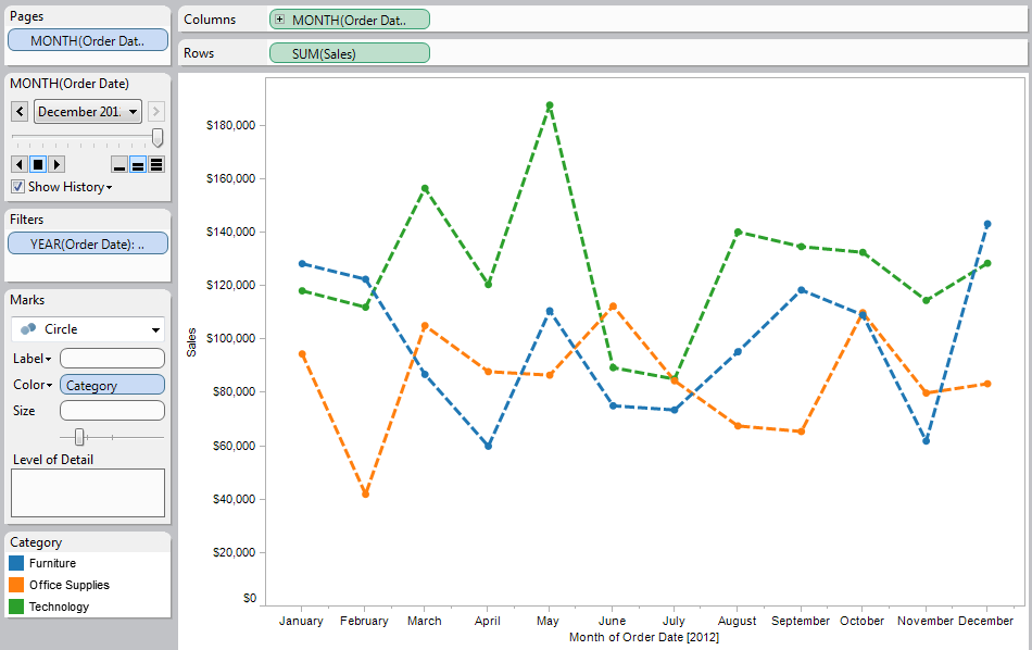
A couple of weeks ago I posted the screenshot of this to Twitter (link, pic), and Dustin Smith – Tableau’s Community Manager – responded that Marc Reuter – the Director of Sales Consulting at Tableau who’s famous for his Tableau Jedi talks at the Customer Conferences – had a technique for dashed lines that he’d use to stump new employees. I got a little hint from Dustin and put this together, it’s using the dashed line History from the Pages Shelf:
One advantage to this solution is that you don’t need to know table calculations to put it together. An aesthetic advantage is that all the dashes are the same length. Two disadvantages compared to the table calc solution are that you can only do dual axis charts with bars in this one because the Pages History is turned on for all marks in the marks in the view, and that you are really only showing one set of Marks (for the last value on the Pages Shelf) so the tooltips are not accurate.
The Tortured Trend Line Solution
This is a case where playing around in Tableau can lead to serendipitous-and-sometimes-impractical techniques. If your data has *just* the right values, you can create a line, apply a polynomial trend line, and make the original transparent:
While I’d never use this in practice, it’s a demonstration of the idea that we don’t have to be limited by pills on Rows and Columns.
Epilogue
This post started out with a call to change how you look at the Tableau workspace, your data, and your visualizations. With some practice, you’ll be able to do this yourself. While a few of the particular techniques used here are advanced, they are all within reach and fast to implement – after having the seed of the idea, I had all the elements of the view together in under half an hour while riding the bus to work. The first key is to take the time to use, understand, and experiment with the different features of Tableau. If the data you work with daily doesn’t have much variation, then go seek out more to explore. The Tableau Forums are a tremendous resource for this, with a huge variety of user-submitted problems and answers. The second key is that there is that there is no pill.
(Sorry, couldn’t help myself with that Matrix reference there.) Seriously, though, mastering building views in Tableau is about learning the fundamentals well enough so they are in memory, then forgetting them so you can build something magical.






Robert Morton – a Tableau developer @TableauDataNerd – came up with this alternative that uses white square marks to blank out line sections. This is perhaps the simplest solution of all of them, the two disadvantages that I can see are extra marks in the view that can be selected by the user, and the view needs to have just the right level of detail and angles to get the squares to create dashes. Here’s the Tableau Public workbook: http://public.tableausoftware.com/download/workbooks/DashedLines?format=html
This is a great example of how there are almost always multiple routes toward the same goal in Tableau, though sometimes the workarounds are very involved. Also, here’s the Idea for implementing dashed lines in Tableau: http://community.tableausoftware.com/ideas/1378.
Jonathan, thanks for posting that update here. I typically use this kind of redundant encoding to decorate each line with different shape marks, not to opaquely break the line into segments. This simple technique enables creating PDFs that may be printed in grayscale, which is still common requirement for academic publications.
-Robert
Above mentioned link doesn’t exist anymore.
I dont think there is a download folder on tableau public
I’m not sure what link you’re referring to? You can download the workbook directly from Tableau Public.
Awesome investigative work Jonathan! I can’t believe how simple Marc’s solution is.
Hi Jonathan,
Could you please attach the twbx file for this Dashedline Dashboard as I could not open the downloaded file in tableau public as it says unknown file format.
Thanks,
Banu
What you need to do is download the file and change the .twbx. There’s a change that the Tableau folks made on Tableau Public that causes the .twbx file to lose its .twbx extension on some browsers, they are hoping to have a fix for that soon.
Should it really be this hard to make a dashed line in a tool that touts itself as a visualization tool?
I tend to think of Tableau as an evidence-based visualization tool. If there’s not good evidence that some feature is useful in assisting comprehension of the data, Tableau is much less likely to support it (examples include 3D pie charts, gauges, spider charts, and color gradients)…unlike many other tools. As I noted in the post, I’ve looked and haven’t found research to support dashed lines in data viz. if you know of some, please forward it along!
Pingback: Moving the Center Line of a Bar Chart with a Gantt Chart | Drawing with Numbers
When i try to recreate what you have created here in the sample, my workbook shows only 10 marks for the field-Plotted Sales which includes null values.However, your implementation shows 253 marks for the same graph.
Cant figure out why?
Hi Manika,
There are a few reasons this could be happening. The most likely version is the addressing (Compute Using) settings of the table calculations, you’ll need to look at them closely. A second possibility that would be about the Tableau version and the changes to how marks have been counted in the status bar since I made that post, see http://drawingwithnumbers.artisart.org/when-576-567-528-456-counting-marks/ for more details. Finally you need to check the view to make sure that the same pills are being used. If those suggestions don’t help then I suggest you publish your workbook on Tableau Public and link back to it here so I can take a look.
Jonathan
Thanks for getting back, Jonathan.
I am replicating the same table calculations at my local machine with Tableau10.0.
Why i am trying to replicate your logic is because i want to obtain a line graph with current year and sales and prior year sales, while having prior year sales being dashed line.
I am using Lookup function to have both the sales in one graph. Here’s the link to the workbook i have created.
https://public.tableau.com/profile/manika2474#!/vizhome/PriorandCurrentSales-dashedline/PYsalesandCurrentYearSales
Regards,
Manika
Hi Manika,
This is a case where I’d ask if the juice is worth the squeeze. A much easier solution would be to use dual axis shape & line chart such as this example: https://public.tableau.com/views/combochartshapesandlines/dashboard?:embed=y&:display_count=yes. This only took a few minutes to build and was entirely point and click (no calculated fields required). If’d you’d like I can build an example with a dashed line for the prior year sales but it’ll take a couple of days before I can get to it.
Jonathan
Hi Jonathan,
What i am trying to obtain is entirely different from what you have suggested.
Here’s a glimpse of what is actually required- https://public.tableau.com/profile/manika2474#!/vizhome/DashedLineTrend/Dashboard1
Regards,
Manika
Hi Manika,
I understand that you have a requirement to develop a view in Tableau that combines solid and dashed lines that are drawn as marks (i.e. not reference lines, trend lines, or Pages Shelf history that do support dashed lines). And what I tried to say in my previous post is that this is difficult to do in Tableau and using an alternative method such as line color, line size, a combo chart using shape and line, etc. would be *much* easier to set up *and* meet the underlying need to visually distinguish between current year and prior year.
I took a look at your workbook. I have limited time to do community support for free and due to the complexity of the calculations to draw the dashed lines and work out the data blending, densification, table calculation addressing and partitioning, etc. it would take more than the time I have available. If you would like to hire me at an hourly rate to build this out I can do so, please contact me at jonathan.drummey@gmail.com.
Regards,
Jonathan
Is it possible to replicate the same if we have the data aggregated at a monthly level?
If you’re using the Pages Shelf, yes. If you’re using the technique I outlined here then you’ll need to pad out the data to a finer grain like the day level.