Tag Archives: multiple axis crosstab

KPIs and Floating Dashboards

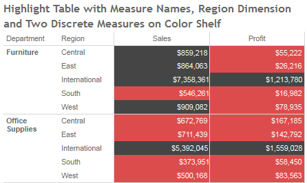
I haven’t seen this particular trick out there yet, it’s a fun one for the toolbox. When we’ve wanted to mix and match KPIs in a crosstab or text table, we’ve had to resort to multiple worksheets on a dashboard in a layout container, or a multiple axis crosstab. The former can result in various display issues because Tableau imposes certain border sizes, the latter has problems with performance due to the number of separate queries and computations that are necessary.

Tableau version 8 gives us floating dashboard elements with pixel-level precision for element location, and that gives us a third way to build text tables with KPIs.

Continue reading

Measure Names on the Color Shelf: Tableau v8 Enhancements

Tableau version 8 “The Kraken” is in beta right now, and Tableau is also beta testing Tableau Public for the new release, and they’ve kindly given me access to it. Tableau v8 is a huge release, as I’m exploring it I’m finding some subtle and not-so-subtle differences. In the coming weeks I expect to do a series of posts on how those changes affect my workflow, and/or relate to prior posts of mine.

I’m going to focus on the new feature that enables multiple discrete (blue) pills on the Colors Shelf of the Marks Card, in particular how it interacts with the Measure Names pill and makes possible some things that were much more difficult to to in prior versions of Tableau.

Continue reading

Older But Still Useful – Conditional Formatting

Back in May of this year before I started this blog, I did a presentation at the Boston Tableau User Group on conditional formatting in Tableau. Prior to using Tableau, I’d created some dashboards and reports in Excel, and when I tried to re-create them in Tableau I ran into a number of different issues in terms of doing the kinds of formatting, layout, and conditional formatting that are possible in Excel. I created a workbook with every technique I could find and some I figured out. Continue reading