Currently (July 2013), the #1 most-voted-for Idea for Tableau is Dynamic Parameters. Here, I’ll show you a technique for using Tableau data blending to create a dynamic, data-driven “parameter”. We’re going to use a loosely coupled secondary data source to get the information associated with the “parameter” and return that information to the primary data source, where it can be used in further calculations. Some examples of where this can be useful:
- Choose one value to build a comparison to other values, such as finding the distance from a chosen origin city to a set of destination cities, or a market basket-type analysis where we want to compare one against others.
- Set the limits and input data to an algorithm that is then used to create other results, for example to get a starting set of data to use to build a projection, such as an executive retirement forecast model.
Read on for a description of the technique and demos of all three options!
Process for Creating the Dynamic “Parameter”
Here are the 7 major steps for putting this together:
- Set up your primary (main) and secondary (parameter) data sources.
- Build whatever calculated fields from the secondary that need to be used in in the primary.
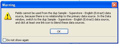
- Create a “Blend Field” with a value of 1 in both your primary and secondary. This is necessary to stop the “Fields cannot be used from the [secondary] data source…” error:
- Build the initial view in the primary.
- Add the necessary filter(s) from your secondary data source. There are a few steps to this:
- Drag the filtered dimension from the secondary onto the Filters Shelf.
- Choose the Select from List radio button.
- Click OK to close the Filter dialog.
- Click on the pill on the Filters Shelf and choose Quick Filter.
- On the Quick Filter, edit the Quick Filter settings as necessary, for example to make it a single select filter, and choose one of the options. Depending on your view, it may change radically here and look totally wrong. The next step will solve that.
- Turn on the relationship for the Blend Field, and turn off the relationships on as many fields in the secondary as you need, which is probably all of them except for the Blend Field.
- Finish setting up the view.
- If you have multiple worksheets for a dashboard, you can set up scoped or global filters.
Demonstration #1: Choosing a Customer and Showing Profit & Sales for Customers within X% Sales of Selected Customer
This is a totally made-up scenario using Superstore Sales to do a market basket analysis. Here, we’re picking a particular customer, finding out their sales, then showing every other customer that has sales within X% of the selected customer. Here’s the view:
There are a few other ways we could go about this, such as:
- Using a parameter to identify the customer. This would have to be updated every time there’s a change in the list of customers.
- Putting the basket creation logic into Custom SQL or custom queries. This depends on skills that not all Tableau users have.
- Data blend and table calculations. This is powerful, but complicated and potentially the slowest option. Also depends on skills that not all Tableau users have.
This is how I set this up the data blend for a dynamic “parameter”:
- For this example, I used Superstore Sales and simply duplicated the data source to make the secondary source of Customer Names. In practice, I’d probably use a separate data source that just had the names and sales to reduce the size of the secondary source (in other words, use the minimum number of dimensions and measures).
- In Superstore Sales, I built the following calculations in the primary data source:
- Sales for Selected – This is the sum of sales from the secondary
- Sales Range Filter – Used to filter the customer list based on the % difference, using a “Sales Range from Selected Customer” parameter.
-
IF (ABS(SUM([Sales]) - [Sales for Selected])/[Sales for Selected]) <= [Sales Range from Selected Customer] THEN
 1
END
- Selected Customer – Identifies the Selected Customer from the secondary so we can use that on the Color, Shape, and Size Shelf:
-
IF MIN([Customer Name]) == MIN([dup Sample - Superstore - English (Extract)].[Customer Name]) THEN
 "Selected Customer"
ELSE
 "Other"
END
- Size – 1 – Has the formula SIZE()-1 and a Compute Using of Customer, it is used for the title.
- In both Superstore Sales and the duplicate Superstore Sales, created a Blend Field dimension with a value of 1.
- Now to build the initial view:

- Now to add the quick filter on the Customer Name from the secondary source. Once I choose one customer, there’s now only one mark in the view:
 This is because Customer Name exists in both data sources and Tableau is automatically linking the two dimensions. So…
 - In the secondary data source, turn on the relationship for the Blend Field, and turn off the relationship on Customer Name:
 You will now see all the marks again, as in the view from step 3 above.
 - To finish up this view, I put the Selected Customer field on the Color Shape, and Size Shelves, put the Sales for Selected Customer on the Level of Detail Shelf, put the Sales Range Filter on the Filters Shelf filtering for non-Null values, edited the title and added a couple of reference lines:

And there you have it, a completely dynamic view with no SQL necessary, and the only table calculation is to give us some extra information in the worksheet title.
Demonstration #2: Executive 401(k) Retirement Forecasting Model
This example comes from a scenario where I was helping another Tableau user to build a retirement calculator for executives, where based on some data about each executive and some choices a scenario would be built of what their particular 401(k) and assets would look like. Here’s a simplified reproduction of one of the views:
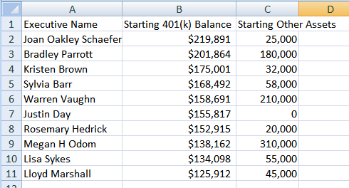
- Setting up the data. This example is a bit more complicated because of the data arrangement and the goals. In the main data, there is a row for each executive:
 To build the forecast, we’re using table calculations. Since table calculations require something to address over, we need a set of dates. Unlike set of dates need to be the primary data source. The reason why is that if we make the executive data the primary, it doesn’t have enough level of detail to show the individual dates from the secondary, and we see a bunch of asterisks:
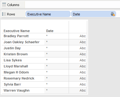
Therefore, we make the dates primary, and executive data secondary, then use the dimension filter on the secondary to pull the information for a particular executive. This ability to filter a dimension in the secondary without needing a linking dimension in the primary is one of the most useful new additions to data blending in v8. For the date data, I used Joe Mako’s 2 row data source scaffold technique. You can see his Think Data Thursday presentation on data scaffolding for complete details, the short form is that we take a data source with two values, then assign dates to them (which can be dynamically calculated), then turn on domain padding in Tableau via the Show Missing Values option to fill in the dates in-between. So this:  …is brought into Tableau, then with a [Years to Retirement] parameter and this calculated field for the Date:
CASE [Value]
 WHEN 1 THEN TODAY()
 WHEN 2 THEN DATEADD('year',[Years to Retirement],TODAY())
END
Becomes this in the view when using the YEAR(Date) aggregation: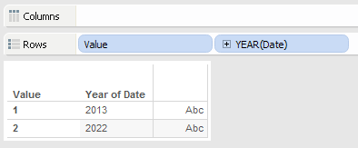 And then we turn on domain padding to fill in the missing years:
 And end up with this padded out set of years:
 Tableau’s domain padding occurs before the blended data is added, so we can use this padded source (no SQL required!) to blend in the executive data. For more details, see my earlier post on Blending Secondary Data into Primary without Linking Data in Primary. So that’s step 1 of the process. Here’s the rest:
- In the primary data source, I built out a set of parameters and calculated fields for the data. For example, the 401(k) Balance calc has the following formula, where the 401(k) Growth Rate and Annual Contribution are both parameters. The table calculations all have a Compute Using of the Date.
IF FIRST()==0 THEN
 SUM([Executive Data (executive data.xlsx)].[Starting 401(k) Balance])
ELSE
 PREVIOUS_VALUE(0)*(1+[401(k) Growth Rate])+[Annual 401(k) Contribution]
END
- In both the primary and secondary, build the Blend Field with a value of 1.
- The initial view is just the padded out date. I work with this way for table calculations to get the addressing and partitioning right, then will duplicate the sheet later to create the final view.
- Add the filter on the Executive Name from the secondary.
- Turn on Blend Field as a linking dimension.
- Add the table calculations, set their Compute Using’s and validate, add the parameter controls, build the title, etc. Once that was working, then I duplicated the worksheet and used those settings to build the final view:

Ok, so that’s a modeling application of data blending.
Demonstration #3: Distance from Selected Origin City to Destination Cities
This one is based on a Tableau forums thread from last week. The goal here is to allow the user to pick an origin city and return the distance (and potentially other data about) destination cities. There are a couple of other ways to go about this:
- Build a data source that has a row for every origin/destination pair with latitudes and longitudes for both, and potentially also pre-computed distances. This is the ultimately the most flexible in terms of what can be done in Tableau, and requires the most effort and resources to set up.
- Use a parameter to select the city, then a table calculation to propagate the latitude/longitude for the selected city to all the other cities, then further table calculations to compute the distance. This was what I first tried out, and Jim Wahl completed in the thread. The parameter would have to be updated any time new origins are added.
Here’s the alternative: Use a secondary data source to select the origin city, then feed back the latitude/longitude of that for use in a dynamic distance calculation. With the computations happening as regular aggregates instead of table calculations, we can then take advantage of global & scoped filters, and get some nice dynamic filtering, and will automatically update when new origin cities are added. This should be faster than the parameter-based solution, and has a smaller data storage footprint than the fully computed data source. Here’s the view:
One more time through the 7 steps:
- I first set up two data sources (one for origin and one for destination) to get the latitude and longitude of all the cities. Because we’re needing to compute a distance between the origin city and other cities, we can’t use Tableau’s built-in generated latitude and longitude.
- Then I created fields in the Superstore Sales primary to bring in the origin and destination latitude and longitude, and used a Great Circle Distance formula from the Tableau Knowledgebase to make a Distance calculated field.And I created an Origin City Flag in the primary to identify the selected city for color & shape:
IF MIN([State+City])==MIN([Origin GeoData].[State+City]) THEN
    "Origin"
ELSE
    "Destination"
END
And here’s a State+City calc for the Origin data source to use for the filter:
[State] + " - " + [City]
- The next step is to create Blend Field with a value of 1 in both the primary and secondary sources.
- Now to build the initial view. From the primary, drag the City to the Level of Detail and Tableau will automatically include the State & Country and start a map:

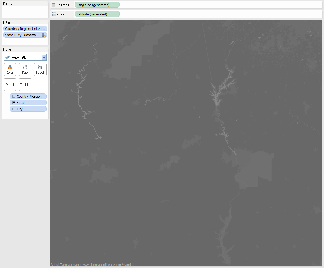
- Now to add the filter from the secondary. Switch to the secondary data source, drag the State+City dimension onto the Filters Shelf and pick a city from the Filters dialog. The view will change to only the selected city:
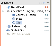
- Next, turn on the relationship for the Blend Field, and turn off the relationships for Country/Region, City, and State:
- To build the rest of the view, I put Distance on the Filters Shelf and used an “At Most” filter so the users couldn’t filter out 0 distance and hide the origin city, then set it up to be a Quick Filter. Origin City went on Shape and Size, and Distance on Color:

To get the origin city to be red and the rest blue, I tried several different techniques such as multiple discretes on colors, different levels of detail, and dual axes, and all of them had their issues. Then I figured out I could use a diverging red/blue color palette. Because only the selected origin city has a distance of 0, I set the center of palette to 1, so the origin would be red and the rest of the marks shades of blue: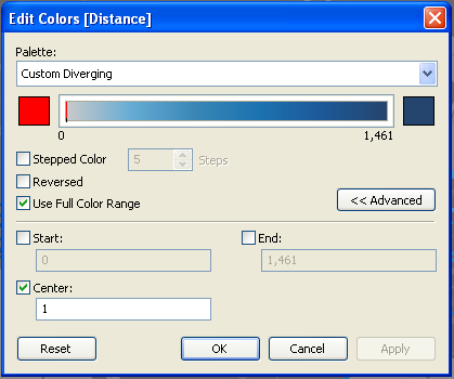 Then to demonstrate how we can use the the filter across worksheets, I set up another worksheet to be the title:
Then those sheets could be laid out in a dashboard:
Potential Issues and Complications
There are a few rough spots with this technique that might affect you as you work with it:
- As you can see on the map above, there are some blue circles on top of the star. Because we’re using data from a secondary source, in some cases we can’t get the data (and therefore the marks) to sort and therefore layer the marks in the way that we might want.
- We also can’t control the sort of Quick Filters on the secondary the way we can for Quick Filters from the primary.
- Tableau always puts a Null value at the bottom of each Quick Filter from the secondary whether it is actually needed or not, this is because Tableau does not fully compare the domain of the filter from the secondary to the primary data source.
- If the primary and secondary have dates or datetime fields that have the same name and you are using those dimensions in the view, then the issue with linking fields I identified in this post will crop up. You’ll have to manually turn off the relationships using Edit->Data Relationships.
- If you have additional linking dimensions turned on besides the manufactured Blend Field your results may not be what you might expect, due to how Tableau blending and filters interact. I hope to explore some of those details in a future blog post.
If any of these potential issues are showstoppers, the workaround is to use different method, such as building a scaffold data source to use as the primary that has enough detail to enable the filtering and computation to occur in the scaffold source.
Conclusion
This can be a useful technique when scaffolding is not an option and a dynamic solution is needed for doing a comparison to other like with the map and similar customer views, or performing an algorithmic computation across a set of rows of data as in the executive retirement calculator. Thanks to Richard Leeke, Shawn Wallwork, and Joe Mako for their help at different times in putting this post together, and go forth and blend!

This look cool and promising Jonathan! It’ll take awhile to digest. I was wondering why you’d gone forum silent, now I know. This was a lot of work. Thanks,
–Shawn
Thanks! I’ve mostly been quiet with working on my TCC presentation and summer play.
Very helpful and already put to use Jonathan! Thank you for all the hard work.
That’s great, and thanks!
Jonathan,
Thank you very much for this very in-depth and thorough representation of dynamic parameters. I was able to use your example to get exactly what I was looking for using version 8 of Tableau Public.
Question … is Demo #3 able to be reproduced in version 6 or 7? I seem to be having issues with the data source linkings in 6 and 7 and am unable to reproduce in these versions.
Thank you in advance.
Eric
Hi Eric,
All three of the demos depend on the new feature in Tableau v8 where we can use a dimension filter on a secondary data source, so they won’t work in version 6 or 7. In version 7 and earlier, what Tableau showed as a dimension pill from the secondary on the Filters Shelf was really an ATTR() aggregate, so it would return * where there wasn’t sufficient level of detail. The workarounds for v6 and v7 are to increase the level of detail in the primary (and potentially vastly multiply your data), or to use static parameters.
Jonathan
Pingback: User Defined Functions and Process Control Charts | Drawing with Numbers
You mentioned that “in practice, I’d probably use a separate data source that just had the names to reduce the size of the secondary source.”
My question is, how does the calculated field “Sales for Selected” work, then? I was able to get everything but that to work using your suggested practice.
Oops! Great catch, thanks! I think that might have been leftover from an earlier draft, I’ve updated the text to say use the customer name *and* sales, to have the minimum number of dimensions. There is an alternative using a secondary source with just the customer name and then a table calc to get the sales from the primary for the chosen customer, however that can run into issues with filtering (which is part of why I came up with this particular solution).
Jonathan
Hi Jonathan – You can’t imagine how many times I’ve hit this page and downloaded this workbook. It is so helpful in so many situations. Just wanted to say thanks!
You’re welcome! And to return an appreciation, I’m in the middle of designing a dashboard right now and I’m regularly thinking, “What would Kelly do?” 🙂
Hi Jonathan,
Appreciate the information you presented. I followed the first one exactly like you presented (x% from selected customer), but Tableau does not allow me to create a quick filter on the secondary duplicated datasource by customer name. Am I missing something? Thanks.
Jonathan,
It actually worked after a few iterations of trial and error. I had to drop the customer name in the filter and from there I was able to create a quick filter. The only issue I am now seeing is that the quick filter has a null option in it and I have not been successful in removing it. Thanks.
Unfortunately, Tableau always puts in a Null option on filters using dimensions from secondary sources. This is a “just in case” option for the situation where the primary source doesn’t have corresponding values in the secondary, Tableau doesn’t go the extra step to determine whether the primary and secondary have complete domains. Here’s the link to voting for this to change: http://community.tableausoftware.com/ideas/2847
Pingback: Tableau Tips,Tricks,Best Practices - Calculation - Jenny (Xiao) Zhang
Jonathan – Thanks, this is a great post – a year or two old and still going strong!
Question: I have tried to replicate your example with my data (which is using campaigns instead of customers). I followed the steps exactly as you wrote and have studied your workbook, but for some reason my viz is not displaying the “other” marks (in your example, the 143 other customers). It seems that since my secondary filter (Campaign Name) is on the Filters shelf, it is limiting the view to that specific campaign, which obviously defeats the purpose since I’m trying to show how this particular campaign stacks up against all other campaigns. This leads me to believe that my join might be incorrect, but I have double-checked it and found no difference between your workbook and mine. Any thoughts on where I might be going astray?
Best,
Alex
…and of course I figure it out as soon as I posted that (feel free to remove it). I was still linking on the Campaign field in addition to the Blend field. As soon as I removed the link to Campaign Name…voila!
Thanks again for a great workaround to dynamic parameters.
Alex
Hi Alex,
I’m glad you figured it out! I’m leaving the comment up because I think it’ll be useful to others, making sure the linking dimensions are exactly what you want (no more, and no less) is key to getting the data blend to return the desired values.
Jonathan,
Since the Null option in the Quick Filter cannot be removed entirely or just moved to the bottom of the value list, is it possible to make the Quick Filter default to a non-Null value?
I know the setting of a default value could be achieved in Tableau Server with the Remember My Changes feature but I was looking for a solution that could be applied prior to publishing.
Thanks,
If you have selected a filter option prior to publishing, it’ll stay in place when published.
Hi Bobby,
When we publish a workbook to Server each worksheet & dashboard each Quick filter for a discrete retains the values that were set when published, so that’s the “default”. I don’t know of another way to choose a specific value as the default.
Hi Jonathan
What if I were to find out the Penetration of a Particular Item
i.e. Countd of Order Id (for an Item or a set of Filters) / Countd of Order Id (Across a Category – No Filters Applied)
How can I do this ?
Chandra
Hi Chandra,
There are a few ways to do this, see http://www.theinformationlab.co.uk/2013/01/14/maintaining-percent-of-total-whilst-filtering/ for a roundup (including my comment at the end).
Jonathan
Pingback: Alteryx Newbie Creates Dynamic Parameters in Tableau First Day by Jonathan Drummey | DataBlick
Hi Jonathan
I cant seem to understand how exactly you manged to put the filter data in the title(the range filter)
Hi, if you want to put the filter values in the title then you can use the Insert button when editing the Title:
The same button is available for captions, tooltips, and mark labels though the options change depending on the context.
Jonathan
Hi Jonathan,
I love the examples you gave!
I just started using tableau and I have a question that I just cannot figure out. I am trying to use data blending to create a “multiple selection parameter”. However, the Min() function only returns to one selection from the filter on the secondary source. If I want to select multiple ones there and have all the selected ones colored different than the ones not selected, what formula should I use?
Thank you so much!!
Xuan
Hi Xuan,
If you want multi-select then you’ll have to make the parameter values a linking dimension or use another field that is at the same or finer granularity.
Jonathan
Hi Jonathan,
Thank you very much for your fast reply!
If I use the parameter value as linking dimension, then when I make selections in the filter from second data source, it only shows the results of the one I selected. I would love to keep the rest of them there but just mark the ones I selected. How can I get the ones not selected to stay there? And I feel really stupid. I just have no idea why but this morning the Blend value of 1 does not work anymore. it is like one value from the second source is linked to every row in the first source (feels like it is because all of them have value 1 in the blend column). I spent hours checking but could not find why. Do you know what might be causing it not working?
Thank you thank you!
Xuan
Hi Xuan,
Ok, I think I get it now – you’re wanting to highlight selections and not filter, correct? In that case a filter on a secondary (or primary) isn’t going to work for you because filters always remove data. If you want to highlight then you’ll need to use a Highlight Action (which can be multi-select) or a parameter (which is only single select). Tableau v10 will add a new highlighter feature.
Jonathan
PS: The “dynamic parameter with a blend” technique can be used to highlight a single value, but not multiple values because of the way it works.
Thank you very much Jonathan!
I got it now! Yes I will try the highlight action.
Have a wonderful day!
Xuan
hi
can you also post the TXBX file in the post so that we can download an get an better idea for the implementation
Hi, the first viz (the one called Sales Range) is the Tableau Public viz, you can click on the download button on the viz. I’ve also provided a link here: http://public.tableau.com/views/dynamicparameterfromblend/SalesRange?amp;:display_count=no&:embed=y.
Pingback: The London Underground: Should I walk it? » SomeBeans
Hi I need help.I want to fill the column color and it has to change dynamically.If the month is current month then fill the cell with that color.(ex:if the current month is march,the column header must fill with one color and rest of the fields in the other color)
Hi, first of all Tableau wasn’t designed to support the pixel perfect formatting that we can get in tools like MS Excel or report writing tools so things like this can be harder to build and have sub-optimal use when it comes to interacting with other parts of the software.
I prepared three different methods in this workbook https://public.tableau.com/views/coloringcolumnheaders/CustomGT?:embed=y&:display_count=yes, you’ll need to decide what works for you.
1. Banding. This is entirely point and click using Tableau’s shading/banding, the challenge with this is that it’s entirely manually set up, if another year is added or removed from the view then the bands will break.
2. Two worksheets in a dashboard. There’s for the header and one for the detail that have been carefully aligned on a dashboard to look like one table. You’ll probably want to add highlight actions as well to mimic the effect of a single view.
3. Custom GT. This uses a grand total to draw the year “header” and custom grand total calculations using the min/max technique from http://drawingwithnumbers.artisart.org/customizing-grand-totals-part-2/ to get the desired year header, a two pass total to hide the sales in the grand total, and the custom highlight table technique described in http://www.datablick.com/blog/2017/2/17/green-pills-vs-blue-pills-the-highlight-table-edition to get the desired results. This gets everything into a single table that will dynamically update, however if you want the usual grand totals then it wouldn’t work.
Jonathan
Hi Jonathan,
After lot of google search i found you post.
I have similar issue, my dashboard reporting is weekly basis. I am using 2 parameters to show Week number (1-52) say Week_Parameter and another parameter to show (Weekly or YTD) say Weekly/YTD. As currently my Week_Parameter is static which has all the week numbers from 1 to 52. I would like to change this basis on the last week data loaded (for ex. if the latest data loaded is for week 25, the Week_Parameter show only 1 thru 25 instead of 1 thru 52).
Can you please help me in achieving this.
Thanks,
Zak
Hi Zak,
Tableau parameters are not dynamic so we can’t “filter” the list of values at runtime. If you’re using the data blend method I describe here to make then you can add a data source filter to the secondary source of values that would make the list only show from 1-25, etc.
This is fabulous, thank you 🙂
Jonathan – Demonstration Number 1 saved me a lot of work! You are awesome – thanks for sharing!
This is a great example of how you can use Tableau to do computations on rows of data that don’t exist! Spefically with the date, only two rows of data exist for start and end date but by using Tableau showing missing values feature on the date axis it will perform the computations through the dates in between. If you uncheck the show missing values you can see the difference.
I feel like I am SO close on this trying to recreate your Demo #3. I have a list of groups and hospital addresses in a dataset that I’m wanting to show based on an origin city/state and a radius that shows all these locations on the map…I’ve created my Origin and Destination Geo Data along with the Groups and Hospitals GeoData…is that particularly necessary? Whatever I’m doing, it’s not quite working. HELP!
Hi, computing the origin & destination is necessary for you to be able to get to the distance calculation. If you’re still looking for help with this please link to a packaged workbook with sample data, or feel free to reach out to me at jonathan (dot) drummey (at) gmail.