Here’s a problem that has been bouncing around in my brain since I first used Tableau. How do I compare the results of every permutation of one item vs. another? Here’s an example using Superstore Sales – I put Region on Rows and Columns, and SUM(Sales) on the Text Shelf, and only see four values: 
What if I want to compare Sales in Central to those in East, South, and West, and Sales in East to South and West, and Sales in West to Sales in South simultaneously? We can compare two at a time using parameters or a self-blend, or one vs. the rest in different ways via sets or table calcs or calculated fields, but how about each against each other? What if we want a correlation matrix? Read on to find out how to do this without any SQL, and learn a little bit about domain completion.
When we put Region on both Rows and Columns, even though we have 4 rows by 4 columns = 16 cells, Tableau generates only 4 marks, because there are only 4 Regions in the data. Here’s the status bar for the above view, showing the 4 marks:![]()
So we need to pad out the data somehow to be able to compare each to the other. The typical solution to this is to do a cross product, cross join, or Cartesian join of the data where every row in the data is crossed with the same rows from other sources. In a simple data set using Microsoft JET SQL syntax, the cross product might be written as:
SELECT [1].[Region] as [Region], [1].[Sales] AS [Sales], [2].[Region] AS [Region cross], [2].[Sales] AS [Sales cross] FROM [Data] AS [1], [Data] AS [2]
If we started out with 4 rows of data, we’d end up with 16 rows. If we started out with 4000 rows, we’d end up with 16,000,000 rows, which is a whole lot of extra data for a seemingly simple analysis. If we did some work to pre-aggregate the data in SQL, we could cut that down significantly, but then we’d have to be careful about what dimensions we wanted to filter or blend on to keep them in the data, and besides not everybody knows SQL and, perhaps more importantly, nor should everybody have to.
Now, with a little dose of table calculations, you don’t have to. The key to doing a no-SQL cross product in Tableau is domain completion. Domain completion is a form of padding (also called densification) that Tableau does when building crosstabs for table calculations to pad out sparse data and return meaningful results. For example, here’s Superstore Sales with Region on Rows and Order Date on Columns for the first 10 days of December and there are 8 empty cells where there are no values in the data for a given Region or Order Date: 
We can confirm that looking at the status bar, where Tableau shows 4 rows by 10 columns, but only 32 marks:![]()
When we turn that Sum of Sales into a Running Total Quick Table Calculation, Tableau fills in those empty cells, in other words “completing the domain” of the combinations of Region and Order Date: 

With an understanding of domain completion, now comes the beginnings of the cross product. Going back to our original view, Tableau has created 16 cells:
All we have to do is have a table calculation (or two) that will fill in those cells. Here’s an introductory calculation to do just that:
WINDOW_MAX(SUM([Sales]))
Here’s what happens when we bring that into the Region/Region view: 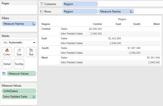
Why isn’t it padded out? This reveals another factor in domain completion, that we need to have different dimensions in play, right now there’s only Region. The next step is to duplicate the Region dimension, and we can use that copy instead:
With the default Compute Using of Table (Across), now we’re seeing Tableau complete the domain for each Region (copy) for each Region and therefore generating a mark for every combination of Region and Region (copy). We can also see this down below in the status bar, Tableau is showing 8 rows (4 Regions x 2 measures) by 4 columns, and 32 marks, indicating a fully completed domain: ![]()
The reason why we use the WINDOW_MAX(SUM([Sales])) is that within a given row there’s only a single value of sales and we want to return that value to every column. We could use WINDOW_AVG, _MIN, _MEDIAN, or _SUM, I’m just used to using WINDOW_MAX. Also, we can make the calculation more efficient by computing the result only once for each partition by wrapping it in PREVIOUS_VALUE(), to get:
PREVIOUS_VALUE(WINDOW_MAX(SUM([Sales])))
In this case PREVIOUS_VALUE() returns the value of the calculation from the prior column to the next column, and for the very first column uses the WINDOW_MAX(SUM([Sales])) as the argument. Now we can take that formula and use it in two identical calculated fields to fully pad out the data, one for the columns and one for the rows: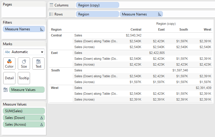
Here, I’m using Table (Across) as the Compute Using for across and Table (Down) for down. To compare each row vs. the other, I created a basic % difference calc:
([Sales (Down)]-[Sales (Across)])/ABS([Sales (Across)])
Brought into the view, it takes on the Compute Usings of the existing table calcs:
We can set up for a heatmap view by dragging SUM(Sales), Sales (Across), and Sales (Down) off of the view: 
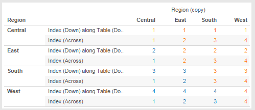
However this looks confusing, is that 59.0% in the first column indicating that South had 59% more Sales than Central or vice versa? The easier choice would be a form of triangular matrix, showing one against the other. In a regular crosstab, we could potentially filter out the dimension combinations that we don’t want, however here we’ve used domain completion and a filter on dimensions wouldn’t remove the data that’s been padded in by the table calculations. In this case, the table calcs call for a table calculation filter. To set that up, we can use the INDEX() table calculation twice to identify each cell going across or down, and then do a simple comparison to return True for only the upper/right triangular matrix:
//creates triangle in upper right. flip < sign to have triangle in lower left [Index (Down)]<=[Index (Across)]
And putting all the calcs together into one view: 
Finally, we can build the matrix as a highlight table. This is a little convoluted to work around what I believe is a a Tableau bug in version 8.0 and 8.1 (at least) where we have to use Show Me to get the highlight table with text that automatically becomes lighter on a dark background (if we manually build the highlight table Tableau will only have a single text color), here are the steps:
- Duplicate the workout crosstab worksheet.
- Moved the Upper/Right Triangle filter calc to the Filters Shelf, filtering for True.
- Drag the SUM(Sales), Index (Down), and Index (Across) measures off the Measure Values Shelf.
- Change the Sales (Down) measure into a discrete. (Tableau Tip – Once a measure is on the Measure Values card, you can change it into a discrete, even though you can’t drag a discrete measure onto the Measure Values card in the first place.)
- Change the Sales (Across) measure into a discrete.
- Drag Sales (Down) and Sales (Across) pills onto the Filters Shelf, filtering for All values. At this point, Tableau will replace Measure Values with the % Difference measure on the Text Shelf. (This is to park two measures, because using Show Me would otherwise remove the measure).

- On Show Me, click the Highlight Table. Tableau creates the highlight table, but moves the Region (copy) dimension to the Rows Shelf:

- Move Region (copy) back to the Columns Shelf. Now the table looks like an upper triangular matrix:
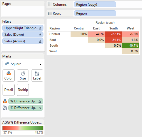
- Drag Sales (Down) off the Filters Shelf to the Columns Shelf to provide an extra label for comparison:
- Drag Sales (Across) off the Filters Shelf to the Rows Shelf to provide an extra label as well.

- For cleanup, change the Color Scheme to a red/black or something else that will work for color blind folks, get rid of the extra row and column dividers, and hide the labels to have a usable view:

- Finally, I added an additional calc that returns above/below/the same as to build a useful tooltip:

Here’s an alternate lower triangular matrix, and the whole workbook on Tableau Public:
I’m not sure how useful that kind of triangular matrix view is, so I’d been sitting on this post for awhile. It wasn’t until Monday that I got inspired to do something more…
Building a Correlation Matrix
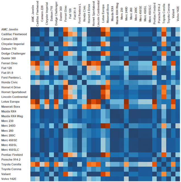
This week Bora Beran had a post on creating a correlation matrix in Tableau using the car data from R, with two versions: one demonstrating R integration and the other table calcs:
I think correlation coefficients are very cool, and underutilized because historically the’ve been more painful to build in Tableau due to the combination of pre-processing the data and needing to build out the table calcs. I was excited to see this and tried out this technique on the correlation matrix Bora had created and got it working for both table calcs and R. The R side got a bit more complicated because I had to pad out more of the measures, but it works, here’s a download link because Tableau Public doesn’t support R. (Soon, I hope?). This makes a great example of how using this technique can reduce load on Tableau, the original data set with the cross product has over 11000 rows in it, using domain completion and table calcs cuts it down to 1/352nd of its size while retaining full ability to filter the data.
Conclusion
In a sign of not seeing the forest for the trees, I hadn’t actually realized that this technique is a cross product without SQL until working on Bora’s post, and with his encouragement I finished up this post (and thanks for the shout-out, too!). Also, thanks to Jim Wahl, I’d forgotten about the dual-index filter trick until he used it in a Tableau forum post. If you’re looking for other ways to compare ones to others, there’s a list of different tricks in the Analyses wiki. If you use this or some other comparison technique in one of your analyses, please link to it below!

Jon: Very helpful post for me on two points: 1. a solution for putting together a cross tab in Tableau that w/o having to duplicate the data sources; and 2. your explanation of domain padding and domain completion.
I want to make sure I understand the difference and shall we say pad out the completion of your thought. 😉 When you say inside a blue call-out box:
“Domain padding and domain completion can look like one another, and even happen at the same time, however in this case they are not, one part of checking is looking at the Show Missing Values option on the Order Date pill: ” You illustrate the point with a screen shot in Tableau showing that “show missing values” is not selected.
Am I correct then in concluding that:
1. the table above that call-out box demonstrates domain completion b/c if Tableau would show there are 40 marks in a table of 4 rows and 10 columns, AND that we don’t need to check “show missing marks” to see them?
2. That if the domain was only padded then we’d see numbers in each “cell” and Tableau would show 32 marks in a table of 4 rows and 10 columns, AND we might have to check “show missing marks” to get Tableau to display numbers in each “cell.’ I put the word cell inside quotes to indicate it’s not a cell in the way we think of a cell in excel.
1. This is mostly true. There’s at least one case I can think of (using Show Empty Rows/Columns) where we could end up triggering domain padding without Show Missing Values being set that would look like domain completion.
2. I probably could have done the explanation a little differently… Domain completion and domain padding (Show Missing Values) are separate things, you don’t necessarily need to turn on Show Missing Values to pad out the domain to get marks.
For that view with Order Date and Region, as soon as the domain is completed, you’ll see 40 marks in the view. In this case, the triggers for domain completion are having dimensions on opposing shelves and a table calc that addresses on one of those dimensions (though there are cases with pill arrangements that won’t trigger domain completion, and some table calc settings won’t trigger domain completion).
For that same view, since Order Date is on Columns and is a range-aware pill (any date or datetime dimension except for an Exact Value datetime is range-aware, along with Tableau bins), turning on Show Missing Values would also pad the domain out to 40 marks. A key difference is that domain completion can happen for any dimension, domain padding is limited to range-aware pills.
So if you have a table calc addressing on one of the dimensions on opposing Shelves you can get domain completion and if one of those is a range-aware pill with Show Missing Values turned on, you can have both active at the same time.
Does that make sense?
Is this doable? – http://community.tableausoftware.com/message/246302#246302
Very nice article – A short question about the provided workbook: It seems to be that the calculated correlation between the “join”-solution and the “domain completion”-solution differs. For example sheet 2 give me 0,9994 between AMC Javelin and Chrysler Imperial but the DC-versions states 0,95901. Is this something expected?
Regards,
Roberto
Hi Roberto, I’ll check this out and get back to you.
Hi Roberto,
I got a chance to look at this and I can’t find the variance you describe. On all 4 worksheets (With R, using Table Calcs, DC TC View, DC with R View) the values for AMC Javelin and Chrysler Imperial match at 0.9994.
I’m not sure how you’d be seeing a variance, the first thing to check is whether you’d set any filters on the Variable dimension. Because different data sources are used it’s not a global filter. Also, if you’d altered any of the Compute Usings of the table calcs you’d end up with different results. If you want more help on this, feel free to email me, my address is in the About Jonathan section above.
Totally got stuck on this line and would really appreciate any help on this: “To set that up, we can use the INDEX() table calculation twice to identify each cell going across or down, and then do a simple comparison to return True for only the upper/right triangular matrix:”
Hi Sean,
Yeah, that sentence could have been clearer. There are two separate calculated measures–Index (Down) and Index (Across) that both have the same formula: INDEX(). Index (Down) has a Compute Using of Table (Down), Index (Across) has a Compute Using of Table (Across).
Then the nested table calculation Upper/Right Triangle Filter has the formula Index (Down) <= Index (Across) and uses results of each of the two Index calcs. Does that make more sense now? Jonathan
Pingback: Tableau Tips,Tricks,Best Practices - Calculation - Jenny (Xiao) Zhang
Pingback: Counting Pairwise Similar Votes in Tableau | Drawing with Numbers
This is a fabulous tutorial on creating the matrix, and it solves many of my problems. Thank you. I wonder if you can help with this idea – what if I have a Dimension with 5 behaviors, and I want to look at the % of people who do combinations of those behaviors. So i would want a cross consumption matrix of ABCDE across by ABCDE down, where I would want to create a calculation in each cell that is % of the total possible in that cell. Basically i am looking for the intersection of sets in a matrix format. Is this possible?
Hi Spencer,
While it’s possible to do this with table calculations, it’s easier to build by doing a self-join in the data source. See http://kb.tableau.com/articles/knowledgebase/market-basket-analysis for more details. One thing to note if your data source is Excel or text is that the new default connector doesn’t support the non-equi-join (the <> or !=) that is required, so you’d either need to use a data source filter or use the legacy connector. If you need help with this, let me know!
Jonathan
Hi.
I have a question i need to compare data from two diferent tables and make a total of the same columns.
How can i do this?
Hi Shayde,
There are multiple ways to interpret your question so I need a bit more detail to go on.
1) You write that you need to compare two different tables. Are these a) two separate tables of data or b) two separate Tableau worksheets (that use the same Tableau data source)?
2) You write that you need “…a total of the same columns.” Does that mean that you want to total up column A from Table 1 with column A from Table 2 or something else?
Jonathan