
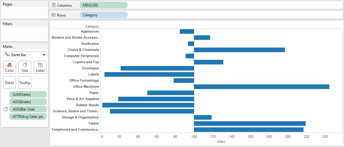
There are cases where we have bar charts whose centerline is not zero, for example when we’ve indexed a measure to have a base of 100. Here’s an example where the SUM(Sales) for each product Category is indexed to the average sales per Category:

What happens when we want the bars to start at 100 and then go up or down from there, like this?

Read on for how to build this in Tableau!
Building the Initial View
The Average Sales per Category is computed using a Level of Detail Expression:
{EXCLUDE [Category] : AVG({INCLUDE [Category] : SUM([Sales])})}
The inner INCLUDE tells Tableau to compute the sum of sales for each Category along with any other dimensions in the view. The outer EXCLUDE tells Tableau to get the average of the sum of Sales across all Categories while still including other dimensions in the view. That way if we add another dimension in the view that will automatically be added to the partitioning.
Then the Index calculation is the Sum of Sales for each Category divided by the average sales per category * 100:
SUM([Sales])/MIN([Avg Sales per Category]) * 100
Note that the Avg Sales per Category is aggregated, I used MIN here but it could just as easily have been MAX(), AVG(), or ATTR(), they’d all return the same results.
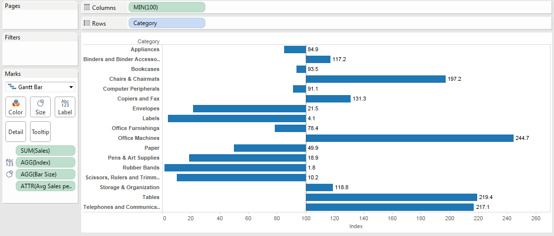
So that gets us the initial view, but the bar chart above doesn’t really show us the comparison against average because it’s baseline is 0, what we really want to display is the variation from the index of 100 where the length of each bar is that variation. If what we really want is to show the variation from the index of 100, let’s tell Tableau to draw that, so instead of drawing the bars on the value of [Index] let’s use a Bar Size of [Index] – 100:

There’s a problem, though, the axis is still drawn at 0. If we’re just labeling the marks then we might be able to get away without having the axis, so we can turn Show Header off and be done:

What if we want the axis to show at 100, though, like this desired view?
There’s no option in the Edit Axis dialog to change the centerline:

Changing your Mental Model
The “trick” I used here is based on a fundamental mental model for taking your Tableau skills to a new level:
Tableau is a data-driven drawing engine. As long as we feed Tableau the right data, it will draw anything we want.
Looking for right menu option or a dialog box only gets us so far with Tableau, to go further we have to build an understanding of Tableau’s heuristics and set up our data (whether in the data source or through computations in Tableau). The rest of this post is about doing just that and dealing with what crops up along the way using the process outlined in Eddie Van Halen and Dashed Lines.
Moving the Centerline with Gantt Bar Marks
Now we’ve got the bars actually showing the variation from the index of 100 but the axis at the bottom is based on a 0 centerline. Now, Tableau’s Bar marks are always based on 0. Why? I’m not sure exactly, I’ve got my guess (we evaluate bars by the length of the bar so always starting from 0 makes sense), and I’m sure that Tableau’s researchers have a well-thought-out position on the topic. Fortunately, Tableau also provides another set of bar marks that don’t have to be based on 0: Gantt Bar marks***.
Here’s the basic difference between Bar and Gantt Bar marks:
- Bar marks are encoded by one value – the length of the bar assigned by the continuous pill on Rows or Columns
- Gantt Bar marks are encoded using two values – the position of the start of the bar assigned by the continuous pill on Rows or Columns, and the length of the bar assigned by the pill on the Size Shelf
So using Gantt Bars we can set the start of the bar to 100 using a MIN(100) measure and then set the length of the Bar using the Bar Size measure we’ve already created:
In the above view I added a Reference Line with the value to set to MIN(100) and formatted it to look like Tableau’s default 0 line:

Aligning the Labels
When we turn on the mark labels for the Index measure, we see this:
The labels are by default left-aligned to the right-hand side of the bars. No matter what we do with the text alignment, there’s no way to have symmetric labeling of the bars because we’re using Gantt Bars. Regular Bar marks default to symmetric labeling:

…but not Gantt Bars. To get the symmetric labeling we can take one of two routes:
- Use a couple of calculated fields in conjunction with a reference line for one set of labels.
- Use a dual axis chart that would give us two Marks Cards where we can set the label alignment.
Single axis view with calculated fields
For this view I created two calculated fields:
//Left Label
IF [Bar Size] < 0 THEN [Index] END

//Right Label
IF [Bar Size] >= 0 THEN [Index] END
These only return non-Null values for the desired locations where I want labels. Again, I’m using the principle here of instead of trying to find the right button to push in Tableau, I’m setting up the data to have the values that I want before Tableau draws them. The Right Label is used for the right-hand axis:
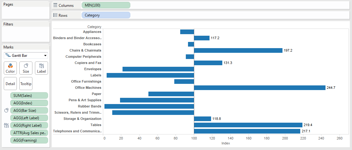
And then to build the left-hand axis I used an invisible reference line:

To get the view:

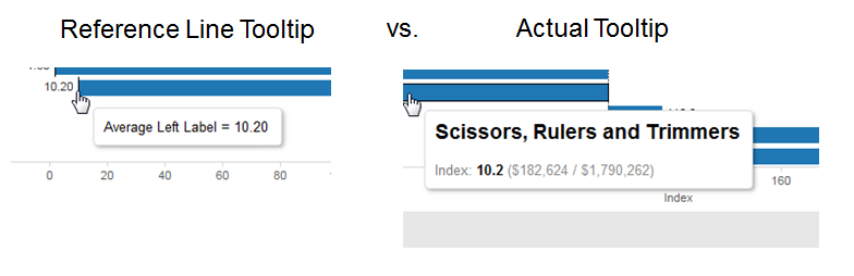
Now this view isn’t perfect, if a user hovers too close to the reference line they get the reference line tooltip and not the actual tooltip:
And this gets us bars that have the centerline at 100 with symmetrical labels, so I’d call it good enough. Time-wise start to finish this takes me about 6 minutes, so although it’s not certainly not straightforward it’s not too many steps to be able to quickly replicate it on your data.
Dual axis view with calculated fields
For this view I used two separate continuous pills on the Columns Shelf – MIN(100) and MAX(100) – to get two separate axes with two Marks Cards. Then using the same technique as the Right and Left Labels above I created two separate measures for the bar sizes:
//Left Bar Size
 IF [Index]-100 < 0 THEN [Index]-100 END

//Right Bar Size
IF [Index]-100 >= 0 THEN [Index]-100 END
Then the two Marks Cards get the appropriate Left/Right Bar Size on the Size Shelf and each Left/Right Label on the Label Shelf, with the Left Labels also getting an alignment nudge:

Conclusion
If you don’t care about showing axis legends then an indexed view is much simpler. If you do want to have the axis reflect the Index measure values and have a centerline on the Index then there’s more work to do that requires some understanding of how Tableau lays out data. Hopefully this post will have taught you just that!
Here’s the move axis centerline from 0 with a Gantt workbook on Tableau Public.
Good stuff. I’ve got a similar question. Say I have a report with 3 outcome measures (0 is better) and and 1 process measure (100% is better). Is there a way to invert the process measure on the same axis? In other words, say I have a bar chart with the x axis going from zero to 100%. Can I have the outcome measure bars start at zero and extend to the value, while the process measure bar starts at 100% and extends left to the value?
Hi Phil,
If the measures are defined as values of a single dimension then yes, it’s quite doable. If the measures are separate columns in your data source then you’d need transform the data into a “tall” source using Tableau’s Pivot function or an equivalent in order to have a dimension that you can partition the data with so the calculations will work. Also you’ll need a “HigherIsBetter” evaluation in the data to identify which measures have a higher target vs. a lower target, in this particular data set I already had a field defined, if you didn’t have too many measures you could do that in a calculated field. This data set is a (messy) demo one I put together with a batch of physician quality metrics, not all of them have targets defined, but it works for building the view like http://www.healthdataviz.com/2015/04/17/lower-is-better-flip-the-display/ where the HbA1c >9 “lower is better” measure has the bar going from right to left while the other measures are left to right.
The calcs are:
//Calc Rate
SUM([Numerator])/SUM([Denominator])

//Bar Start - the FLOAT is used so I can fix the axis range
FLOAT(IF [HigherRateIsBetter Flag] = 1 THEN
    0
ELSE
    1
END)

//Bar Size
IF MIN([HigherRateIsBetter Flag]) = 1 THEN
    [Calc Rate]
ELSE
    [Calc Rate] - 1
END
Here’s the Lower is Better – Flipping the Bars workbook on Tableau Public.
Jonathan
That is awesome. I have tall data, so I should be good. I actually need it for a report w that HbA1c > 9 measure too 🙂 Thank you!
I thought you might want that measure 🙂 let me know if you have any questions!
Something like this is what I have in mind:
http://www.healthdataviz.com/2015/04/17/lower-is-better-flip-the-display/
Great explanation Jonathan, thank you.
Pingback: #makeovermonday: Video games – ivisualize.co.uk
I would like to do something similar where I am using a negative number as my zero line, and where all bars negative and positive are to the right. Still having trouble trying to accomplish this. Any direction would be appreciated! Thank you.
Hi 18Bd79,
I’m not sure what you mean by “where all bars negative and positive are to the right”. Does that mean that you want all the bars to be extending to the right (i.e. in a positive direction) no matter their value? In that case you can do the following:
1. Use a Gantt chart
2. Put the negative start value on Columns
3. Create a calculated field that is ABS([your measure]). This forces all values to be positive.
4. Put the field from step 3 as the pill on the Size Shelf.
Jonathan
Hey Jonathan,
My problem probably has a simple solution. I would like to do the above in terms of the categories and visuals but I don’t want an average. I just want a customer count.
How do I change this part: {EXCLUDE [Category] : AVG({INCLUDE [Category] : COUNT([CUSTOMER_ID])})} to reflect what can easily be done in excel. E.g.
Cat 1 = 28%, Base = 39%, Index = (Base/Cat)*100 1 = 139
Thanks,
Josh
Hi Josh,
I’m sorry, I’m not clear on your goal. You’re starting with a count, then the Cat 1 & Base are expressed as percentages? My suggestion would be to use the workbook that I’d posted – here’s the link again https://public.tableau.com/views/moveaxiscenterlinefrom0withaGantt/singleaxisview?:embed=y&:display_count=yes&:showTabs=y make the edits that you can and add some comments on what you’re looking for, and post it to Tableau Public and add a comment here with the link.