
That quote from Aliens was running through my head after our code control system had crashed without a backup. We were in the final days of testing a major release for one of the world’s largest telecom companies when a subtle defect in a hard drive controller had finally corrupted the disks enough that the contents could not be recovered, and our sysadmin hadn’t been doing regular backups because of competing priorities. I was way in over my head as a fill-in release manager while the usual guy was on vacation. I was convinced we were going to have to tell the customer that we would delay delivery by 2+ months, and along the way blow a big hole in our revenue and future deliverables.
Game over.
Then someone changed my life. One of the project leads, a rugby player and bartender from MIT, sat down with me and said, “There is a way. There’s always a way.” I can still remember two things clearly from that moment: the color of the walls (a beige made darker by the shadows cast by the fluorescent light fixtures) and his eyes. I wouldn’t call what was in them confidence, more a quiet certitude. I thought about that last week when hearing Walter Isaacson describing Steve Jobs saying “Don’t be afraid.” to the Corning CEO.
There’s always a way.
User defined functions have been a feature request for Tableau for a long time now. As much as we can share workbooks, and post function formulas, none of that has really worked as easily as we’d like. Read on to get access to over 50 calculations for computing run and XbarMR (individuals and moving range) charts, and learn how you can build your own shareable & re-usable sets of user defined functions. There’s also a preview of how the upcoming Tableau version 8.1 will enhance this process!
After working on the dynamic parameter post, I got more curious about this idea of not using a secondary data source for data, but as a source of computation. And at the same time I had a data source that had way too many calculations in it. For our hospital unit dashboard that displays ~100 quality metrics, I’d built out a set of calculations to generate statistical process control charts. A couple of years ago. Ben Jones of Data Remixed had posted a method for building control charts in Tableau, I took that idea and ran with it to create the run, individuals, and moving range charts, including more special cause signals:

I think a lot about minimizing the number of times I have to rebuild something, so I really wanted to be able to re-use those calculations. I also like to share with the Tableau community, so if there was a way I could package up all the calcs so others could use them that would be great. One morning this summer, the path opened and I figured out the way. I could create a single row data source and put all the calculations into that – most of them are table calculations anyways, that don’t really care what data source they exist in. A couple of the calculations would point to fields in the primary data source, and a dummy blend field would enable the calculation source and actual data source to co-exist, and then the dimensions from the primary (like Date, or Hospital Unit) would be used for addressing and partitioning the calculations.
I built this into our production hospital unit dashboard, which I demoed at the Tableau Customer Conference a couple of weeks ago. The part of the demo that was showing this data source didn’t work so well because of inadequate testing on my part of some strange Tableau behavior, the recording of the session is (or will be) available at http://tcc13.tableauconference.com/sessions/, look for “Improving Hospital Quality of Care with Data Blending”. You’ll see a few other data blending tricks in that presentation, this one comes towards the end.
How to Set Up a User Defined Function Data Source
To start, we need a new, one row data source. Here’s the data source:
Single Value
1
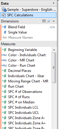
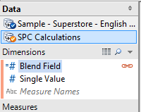
There is one calculated dimension in the data source:
- Blend Field – This is used when the UDF Data Source remains a secondary source, and will be copied into the primary data source to stop Tableau’s “In order to use fields…” warning message.

There are two calculated fields that drive all the other calculations in the UDF data source:
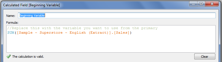
- Beginning Variable – this just points to the measure that you want to generate control charts for. In creating a UDF Data Source yourself, each measure or dimension should point to a dummy value.

- Decimal Places – For the process control charts, this is necessary to determine how many decimal places of accuracy you want in the comparisons used to determine control limits, shifts, and trends. In my original workbook, this actually points to a Decimal Places field stored with each metric.

If you’re building a UDF Data Source, then you’d add as many other calculations as you need. Note that you do need to keep in mind aggregation, since Tableau data blends will only work with aggregate calculations. However, in version 8.1 you’ll be able to take advantage of the copy/paste function and can have row-level calcs in a UDF Data Source, I’ll go over that at the end of the post.
For the statistical process control charts, Beginning Variable and Decimal Places are used to generate the measures used to plot each chart. Then there are a set of computations to generate the process median for the Run Chart, and separate process means for the Individuals and Moving Range Charts. With that information, calculations compute the control limits for the charts – all based on 3 sigma limits. Then further computations generate results that are used to generate the various special cause test results. Finally, those results are used to generate calculated fields for tooltips and color. Given the variation in rule sets for process control, the ones I used are based on Measuring Quality Improvement in Healthcare and presentations by Davis Balestracci of Harmony Consulting. Any mistakes are mine.
Here are links to the Process Control Tableau Saved Data Source (.tds) and the single row extract (.tde) so you can get started. Right-click and to save these two files into your …My Tableau Repository\Datasources folder.
Using the Process Control Charts Data Source
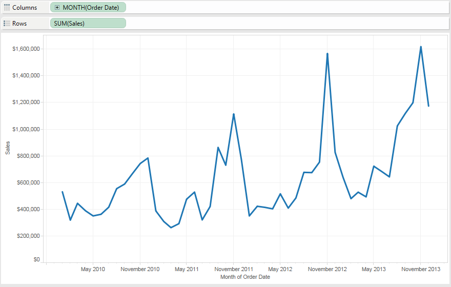
- Connect to the data source you want to measure. Here we’ll do Superstore Sales (Extract), and I’ll set up a view with Month of Order Date and Sales:
- Connect to the SPC Calculations saved data source, it will look like this:
- Copy the Blend Field Dimension from the SPC Calculations Data Source into the primary data source. This will make it available for blending.
- In the SPC Calculations Data Source, edit the Beginning Field to be the measure of interest from the original data source, in this case we’ll use Sales from Superstore:
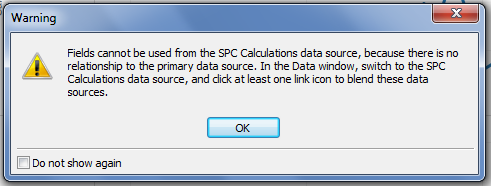
- Click on the Blend Field linking field icon in the SPC Calculations Data Source to make it active:
- Drag out the Run Chart measure onto Rows (or double-click on it to have the measure added to Rows). You’ll see that the Run Chart shows the same line and values (though not the same units) as the original measure:

If you get the “Fields cannot be used from the SPC Calculations data source…” error then you haven’t clicked on the Blend Field, go back to Step 5. (I do this all the time).
- Now you can remove the SUM(Sales) measure from the Rows Shelf.
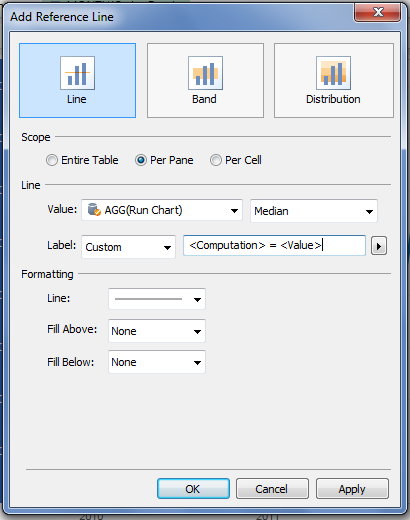
- There are two options to get the Median reference line necessary for the run chart. One is to simply generate a median reference line on the Run Chart measure, the other is to drag the SPC Median calculation onto the Level of Detail, then add that as a reference line for the Run Chart measure. Here I’ll just do the former:
- Next, drag the Color – Run Chart Measure onto Color. I also edited the Colors to set them to be black & red, and turned on the mark points to make them more visible. With this data, we can see three special cause signals have been detected:

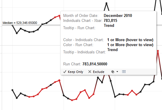
But what are the special causes? This is where the tooltips come in. - Scroll down through the list of Measures in the data source, drag out the Tooltip – Run Chart to the Level of Detail shelf. Now you can hover over any red mark and see what the detected special cause is, in the case of December 2010 a trend of 8 or more points was found:
 The spacing for the special cause tooltip is off because of the way Tableau deals with embedded newlines in the string, instead of formatting them as single-spaced they get double-spaced.So there’s a run chart with special cause signals on a brand new data source in 9 steps, total time for you could be under 90 seconds.
 - Now for the Individuals (Xbar) chart. This takes a little more work because there are more control limits to plot. Drag the Individuals Chart – Xbar Measure onto Rows. The values for this are the same as the Run Chart, however having different measure names automatically get us different Axis Titles:
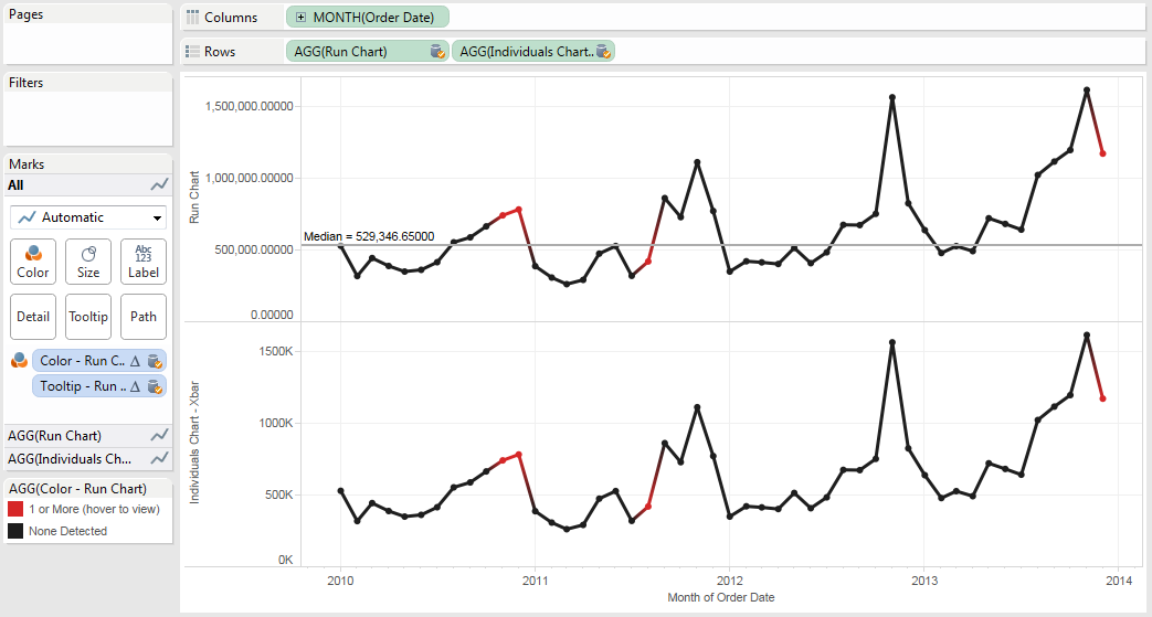 Tableau defaults to giving the Individuals Chart – Xbar measure the same fields on Shelves as the Run Chart measure, so we’ll have to change those.
 - Click on the green Individuals Chart – Xbar pill on Rows or the AGG(Individuals Chart – Xbar) Marks Card header to activate it:

- Drag the Color – Individuals Chart measure onto the Colors Shelf. You’ll probably want to edit the colors.
- Drag the Tooltip – Individuals Chart measure on top of the Tooltip – Run Chart measure to replace it. If you hover over December 2010, now you’ll see the special cause signals for both the Run Chart and Individuals Chart:
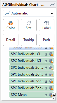
- Now for the control limits. Drag the SPC Individuals – LCL (Lower Control Limit), UCL (Upper Control Limit), Zone A-/+, Zone B -/+, and SPC Mean measures onto the Level of Detail Shelf. Conveniently, they are in one block so you can Shift+Click+Drag them in one group:

- You’ll add three Reference Bands to the Individuals Chart. One for the LCL & UCL, one for Zone A-/A+, and another for Zone B-/B+. Here’s the Reference Band for the LCL & UCL:

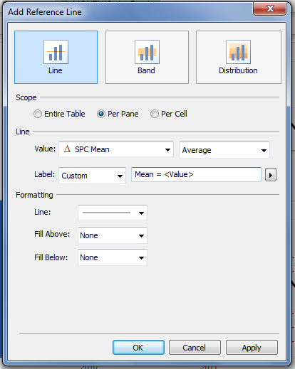
- Finally, you can add the process mean, using either an Average reference line on the Individuals Chart – Xbar measure or the SPC Mean measure, here’s the SPC Mean measure:
Adding on the individuals chart can only take another couple of minutes. Now onto the Moving Range (MR) Chart, the next several steps are just repeating what you’ve done above with some new measures. - Double-click the Moving Range Chart – MR measure in the Measures window or drag it to the far right of the Rows Shelf:

- Click on the green Moving Range Chart – MR pill on Rows or the AGG(Moving Range Chart – MR) Marks Card header to activate it.
- Since we’re adding a third measure, Tableau did not by default apply the Color and Tooltip to this new Measure, so there’s nothing on this Card. Drag the Color – MR Chart onto the Color Shelf, and set the colors and mark pointers as necessary.
- Drag the Tooltip – MR Chart onto the Level of Detail Shelf.
- Drag the SCP Mean Moving Range and SPC Moving Range UCL measures onto the Level of Detail Shelf:

- Add a reference line for the Moving Range Mean.
- Add a reference line for the Moving Range UCL:

Next Steps
That’s a Run Chart, Individuals Chart, and Moving Range Chart in under 5 minutes. Tack on a few more minutes for cleaning up the units, tooltip, title, etc. and you’ll have something you can quickly use. Not quite as fast as an Excel plugin, maybe, but can your Excel plugin do this in one more second?
I dragged Department onto Rows and Tableau automatically recomputed all the control limits for each Department in Superstore Sales – in other words, all of Tableau’s drag and drop functionality is now available for us to work with. Want to compare your top 20 customers by profit to everyone else? Here’s the In/Out of the Top Customers by Profit Set on Rows. Looks like November 2012 was an anomaly for everyone:
This turns control charts from something that can be quite time consuming to set up in Tableau into something we can use to build analytical views out of. You can swap out the measures being used via a parameter, get a little fancier with the Compute Usings and partition on some date range where the process underwent a change, etc.
Now, if you have some familiarity with table calcs, you might be asking, what about the Compute Using (aka addressing and partitioning)? In this layout, the default Compute Using for all table calculations is Table (Across), which works really well for a control chart. If you want more complex compute usings, then you can certainly set those up.
What about Tableau 8.1?
Tableau 8.1 (currently in beta) adds Copy/Paste for calculations, nested calculated fields, worksheets, and dashboards across data sources and workbooks. This avoids the dreaded Calculation_9387689317613 showing up in our workbooks. v8.1 also adds the ability to group dimensions and measures into folders.
Here’s the new 8.1 data window, with the measures already grouped in the data source:

And the 8.1 statistical process control data source, should you want to try it out:
I’ve used the 8.1 beta to copy and paste the whole set of calculations from one data source into another and it works fine. However, that has two complications:
- Measure and dimension folders are not copied from one data source to another in 8.1 (the folder has to be open and the measure(s) selected to be copied). I’ve already put in a feature request for this.
- In the case of a UDF data source like the Statistical Process Control source, that is a ton of calculated fields to use and that gets in the way of keeping fields organized in the primary data source.
So, I can see a couple of ways of using UDF data sources in 8.1:
- Set up the UDF data source in a ready-to-blend form, as I did for the process control data source. The addition of folders makes the UDF data source more self-documenting.
- Set up the UDF data source in a ready-to-copy form.
If you’re concerned about performance between the two options, I’m thinking that there would be very little performance hit because the 1 row UDF data source will certainly be cached by Tableau, so there’s only some overhead for processing the blend. I haven’t tested this out, though. I’m also curious about how a UDF data source might work in a Tableau Data Server setting, there’s some work to figure out how that might be configured.
Wrapping Up – The Game is NOT Over
The keys to building your own data source of user defined functions are:
- Set up a single row data source.
- Build a dummy blend field.
- Build your calculated fields so they are internally consistent in the data source, with “pointer” fields that will be replaced with the necessary measures and dimensions in the destination.
- Save the data source.
- Make it available to others, either by publishing to Tableau Server, email, etc.
It looks pretty simple when written like that, “all” it took was some stubbornness and creativity. I started out this post talking about how our code control system had failed with no backups. We ended up asking around, and between the checked-out code on various developers’ PCs we found enough of the code and cobbled together a working build of the software. We rammed it through all of the unit and acceptance tests, and got the release out the door on time, which back then meant putting someone on a plane with several copies of the software. There’s always a way.
For the sake of completeness, here’s the Tableau Public viz and the files mentioned in the post:
Here’s the Tableau Public viz:
Right-click to save each of these files:
Hi JD,
I used the content of this post today to generate the control charts for one of my examples and your instructions were easy to follow and totally complete. I’ll send you a pic of this through Twitter. I know how much time you put into this and I just wanted to say I really appreciate all the work that you share with us. I read all of your posts and learn from you, so for this I say “thanks” and keep pushing the Tableau envelope!
Ken
Pingback: I Wish #Tableau Had These Two Capabilities | 3danim8's Blog
How would you tackle using the Beginning Variable for something that is not a sum of the measure. Such as a measurement of a part. Still use SUM or would you change the field to look at it as an ATTR?
I figured it out – I needed to change the decimal on the measurement data so it wasn’t rounding it up! Works great as is!
Glad you figured it out!
Pingback: Not a funnel cake, nor funnel charts, it’s funnel plots! | Drawing with Numbers
Good afternoon. I am excited to find this post related to control charts. I’m new to Tableau and I’m not finding the dimension Blend Field once I am connected from the SPC Calculations Data Source. I only see the Single Value dimension. I’m sure I’m making a rookie mistake.
Sorry, the version that is online is slightly different from the one I’d written up. You can create a Blend Field with a value of 1 in each data source.
Great, sounds simple enough. Thank you.
Good afternoon. I am excited to find this post related to control charts. I’m new to Tableau and I am wondering and to ask you, is there a possible to do a growth line graph. Like i have the performance of Stock/Fund (historical data for very long). But I want to see what if I invest $1 or $100 in initial day or some period like 5 years or 10 years before. Initial value will be 1 or 100, and calculation derives the rest and show the result as graph in any manner.
Pingback: Control charts – learningtableaublog
Hi, Thanks for this. Really helpful primer on a topic I only understand intuitively and have been asked to implement at my company for the first time. I have a question that I hope you’ll have the time to answer:
Why have you named i-chart test 6 ‘8+ beyond zone C’? I understand that the calc pulls out any points where the preceding 7 have all either been under or all have been over the mean, but why is this a ‘zone’? Just a bit confused since you use zone A and zone B to refer to 1/3 and 2/3 of the Control Limit multiplier.
Hope that makes sense and thanks for all your work so far – a really great resource.
Hi Will,
Thanks for the appreciation!
The way I learned control charts Zone C is 0 to 1/3 of the distance between the mean and control limit, Zone B is 1/3 go 2/3, and Zone A is 2/3 to the control limit. The Zone B and Zone A measures are returning the values for the lower bounds of the zones.
It’s been a few years since I created this data source and I haven’t worked with it in quite awhile since I’ve looked closely at it. The 8+ beyond Zone C calculation is clearly identifying points where the previous 7+current are all under are over the mean as you described, there are two interpretations I can make:
1) The calculation is identifying points that are “at or beyond” Zone C, in this case the calc is confusingly named, but accurate.
2) Some resources specify a test for 7, 8, or 9+ successive points in Zone A or B, or stated in the referse “beyond Zone C”. In this case the calculation doesn’t do that at all. Additional calcs would need to be
Does that help you out?
Jonathan
Yup that’s perfect thanks!
This is great; I’m a newbie, though, and to complicate matters further, I don’t have Access, so I can’t see what’s in the data source.
A note on rules: Davis is great, and a good friend. Another excellent source is Don Wheeler. He and David Chambers came up with some research about 30 years ago that demonstrated that the four Western Electric Zone Tests that provide the best sensitivity with the fewest false signals were (I’m using Minitab/JMP rule numbers):
Rule one (point outside the UCL or LCL)
Rule two (9 in a row above or below the centerline)
Rule five (2 out of 3 more than one sigma from the centerline on the same side)
Rule six (4 out of 5 more than two sigma from the centerline on the same side)
The trend rule isn’t used by statisticians any more…the other rules will find significant trends. Minitab rule 9 (15 within one sigma) is useful for detecting bad subgrouping in averages charts, but is useless in individuals and moving range charts.
Jonathan,
This is a fantastic use of a dataset to perform standard calculations. I am relatively new to Tableau but this was easy to use. I would like to expand your work (of course I am willing to share it). I would like to use the same format to create c, p, n, and u charts. Eventually I will add g-charts as well. I have all the calculations but am trying to figure out how you created the basic dataset and extract. How do I extract what you have already done? Edit it? And then save it in a format that can be used? Perhaps I need to be pointed in the right direction? I can work in Access or excel (or a text editor)?
Happy to clarify, Thanks
Brian
Hi Brian, I’ll reach out to you through email.
Thanks, Look forward to it.
Hi Jonathan ,
Can we calculate process capability indices for data using Tableau and not integrating with any of the external statistical software like R and Python
Hi Smitha, sorry for the late response. I’m not familiar with process capability indices, from some quick web searches it looks like these are computable in Tableau. It’s a matter of translating the formulas into the necessary calculations, usually you’ll need table calculations or Level of Detail expressions to compute the process mean & standard deviation, and potentially the upper and lower limits.
You can calculate capability indices, but one aspect of capability that is often ignored is stability. The process has to be in statistical control (so you know the raw capability of the process) before you can assess its capability to meet customer specifications. The control limits for a stable process represent the “voice of the process,” or what you get. The spec limits represent the voice of the customer, or what you want. Capability studies compare the voice of the process to the voice of the customer.
So once you have, say, 30 or more (depending on whom you read and which type of chart you’re using) observations with no special cause signals, then you can calculate the capability indices using the sigma values from your chart. Cp is calculated by subtracting the lower specification limit from the upper specification limit, and dividing the result by six sigma units (basically, the distance represented by your control limits).
The “centered” capability index, or Cpk, is the smaller of two values, Cpu and Cpl.
Cpu is given by subtracting the process average from the upper specification limit, and dividing by 3 sigma.
Cpl is given by subtracting the lower specification limit from the process average, and dividing by 3 sigma.
You should NEVER assess capability in the absence of stability.
Hello Jonathan, I am currently trying to use these functions for control charts, but it seems that some of the rules are not being caught. For example, the calcs do catch when I have an outlier and highlight them, but they do not seem to be catching trends. There may be others that are not being caught as well, this is simply the only one that I have noticed thus far. I am thinking that it may have to do with the fact that my beginning variable is not the SUM([Value]), but rather the MAX([Value]). Any thoughts?
Pingback: Starter Kit: Executive KPI Dashboard
Pingback: Accelerating understanding with the Executive KPI Dashboard Starter Kit | Tableau Software
Hello, I am trying to apply these tests to a set of control charts I am creating. The 2 of 3 test is working but not the 8+ or the 3 of 4 for some reason. Also, I was trying to create a calculated field whereby I could, for example, highlight each of the 8 or so values in a run. Can you help me please? Thank you.
Hi Leeza, I’m sorry for the delay in responding, are you still looking for assistance with this?