
I had a situation where my users needed to select from a basket of hospital quality measures on a dashboard, and since some of the measures were new I wanted the filter to show all of the available options, and based on the dashboard layout there wasn’t really space on either side of the view for a vertically oriented filter.
What I really wanted was to show all the options at the top of the dashboard, I ended up getting a little creative and coming up with a new filter layout. Read on to find out how!
Tableau’s Quick Filters have a lot of options, and other than a slider, they are limited to a vertical layout:
Filter Actions can be used to make alternative layouts of a list of items, but when we’re using Rows or Columns and the list of options is long, there’s no way to compact the list. For example, here are the 17 Categories from Superstore Sales used horizontally and vertically. They end up flowing off the right or bottom of the viz (in Tableau Desktop I can see the scroll bars, I don’t see them at all in Tableau Public):
What I really wanted for my viz was for Tableau to “flow” the list of items from one row to the next. And then I remembered Andy Cotgreave’s fantastic post on to building a panel or trellis chart in Tableau. I won’t go into all of the details of how to build one – Andy does in the link. The trick here is that we’re not graphing anything per se, we’re just using the trellis chart to arrange the dimensional values so we can then have a Filter Action on them.
The big bonus to this technique is that since we’re using a worksheet to lay out the filter, we have all of Tableau’s formatting and layout controls at our disposal. For example, in the example below I’m coloring the categories by the Department.
Here’s how I put this together:
- Build the trellis chart, using the technique from Panel charts in Tableau. Rather than hard-coding for a particular number of columns, I left the parameter in so I could easily change the layout as desired. Here’s a tip: Depending on your dimensions in the view for informational or color purposes, the Compute Using for the table calcs could be more complicated. A way to simplify that can be to turn the dimensions into measures by aggregating them using MIN(), MAX(), ATTR(), etc.

- Build the worksheet(s) that will display the data and be used as a target for the Filter Action. In this case, I wanted to show a comparison of selected vs. group. Since we’re using a Filter Action that filters out at the data source, we can’t use a table calc filter, so we need to use a data blend where the Category field is not linked between the two sources.
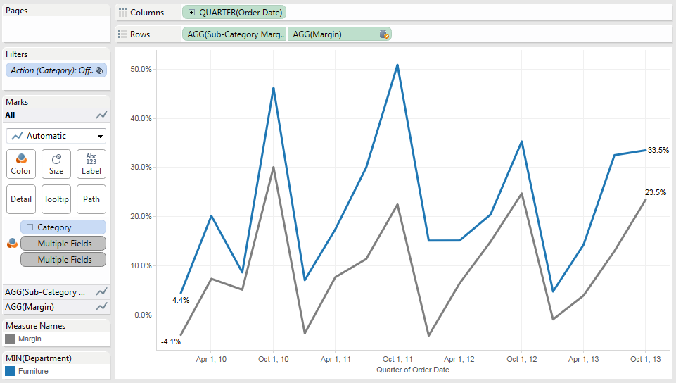
- Since both the trellis chart and lines are colored by MIN(Department), rather than showing a separate color legend I thought I’d try building the color legend into the worksheet title. That’s not something we can do with a regular title, so I built two additional worksheets using a Text Mark to become the title, one for the Category portion of the title that gets the colored by MIN(Department), the other for the worksheet title. In this case I’m living with the poor spacing between the two worksheets on the dashboard.

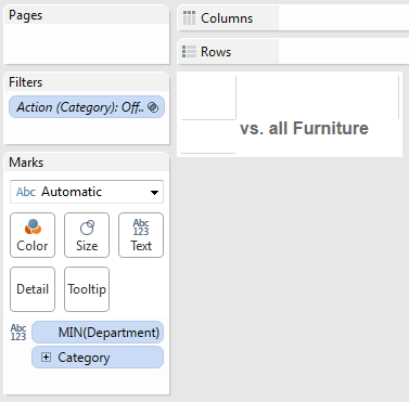
 The problem with the title is that when we put pill(s) on the Color Shelf, Tableau colors the entire Text Mark with the color, so we can’t have a single mark that is partially colored by the Color Shelf and the rest another Color. You can manually work around this with a bunch of calculated fields that are individually colored on the Text Shelf.
 - Build the dashboard.
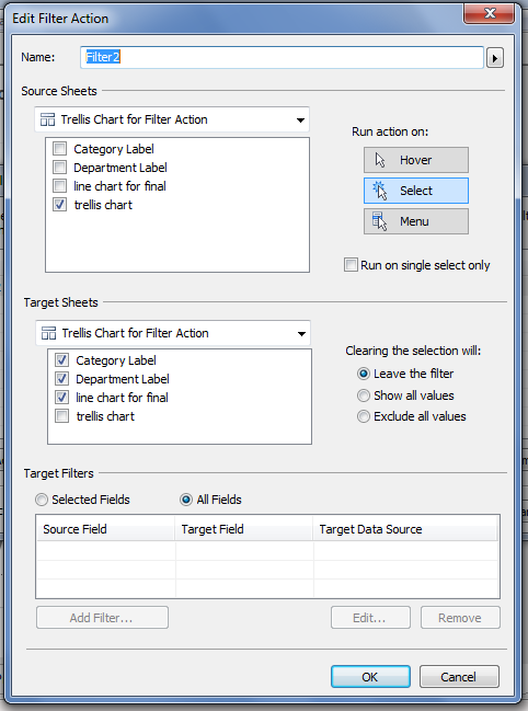
- The final step is to add the Filter Action that goes from the trellis chart to all the other worksheets. In this case, I was able to filter on All Fields because there’s only one dimension, you may need to be more selective.
That’s how you can use a panel chart or trellis chart to make a distinctive, compact filter layout that can show all the options. In my TCC talk, I’ll show an example of using this sort of filter to choosing from different data sources and worksheets on the dashboard. If you use this technique, please post a comment with a link to your viz or post, I’d like to see what others come up with!
Jonathan, this is great. I am curious if you have found a way or could think of a way to split those rows up by Category so that we would see Furniture on top, Office Supplies in the middle and Technology on the bottom. My mind races here but I could see a lot of beauty in those rows dynamically updating by contents of the Dimension sliced by another one instead of using the # of columns.
Hi Patrick, I’m not quite sure what you’re going after…if you put Department on Rows as a dimension, the table calcs will automatically be partitioned on Department, so the longer Office Supplies would end up taking two rows while the others only take up one row based on the # of Columns.
I think the key takeaway from this is that as long as you can make a worksheet that has the dimensions you want to filter on it, you can rearrange it to have the look you need.
Absolutely awesome! Thanks for sharing.