Tag Archives: wide

Show Me *All* The Numbers: Displaying Every Record for Too Tall Data

Here’s a sample data set with 4 records:

When we bring that data set into Tableau and build a text table, though, we only see 3 rows:

If we want to show all 4 underlying records as 4 rows in the Tableau text table we have to jump through a couple of hoops, the rest of this post describes why Tableau behaves that way and how to fix it.

The Data is Too Tall

There are all sorts of resources about working with data that is “too wide”, for example the old Preparing Excel Files for Analysis KB article, the new Pivot feature introduced in Tableau v9.0, or this post on Tiny Habits from Emily Kund with commentary from yours truly. Too wide data has too many columns for the kind of analysis that we want to use. There aren’t so many resources on “too tall” data, of which this is an excellent example.

To explain what “too tall” data is, let’s first look at the data:

What is the grain of this data? In other words, what combination of field(s) makes a unique record in the data?  We might be tempted to say Group, Color, and Size, but for Tableau there is no difference between the first two records:

Effectively the data has no unique grain. Yes, there’s a difference in position between these two records but that is not detectable by Tableau because record order (position) is not something stored in each record. This highlights something I talk about in my training classes: the difference in mental models between Tableau and WYSIWYG tools like Excel. Tableau approaches data as a database does, and the default behavior in databases is that record order doesn’t matter. The reason databases abstract record order away is to get higher performance.

So when we bring this data into Tableau and create a view Tableau’s default behavior is to aggregate the data to the level of the dimensions in the view (i.e. on all Shelves and the Marks Card except for Filters). Here’s what happens we bring all the fields in this data set into the view as dimensions:

There aren’t enough dimensions to separate out the two A/Red/Small records. This explains what I wrote earlier about the data lacking enough dimensionality. What we really need is another column (field) to identify the records. So we now have a simple definition:

  • “too tall” data has too few columns to effectively perform the analyses we want
  • “too wide” data has too many columns to do effectively perform the analysis we want

The rest of this post describes three ways to show all the records: Show Underlying data, editing the source, and constructing a specific Tableau view.

Do You Need to Show the Data in a View?

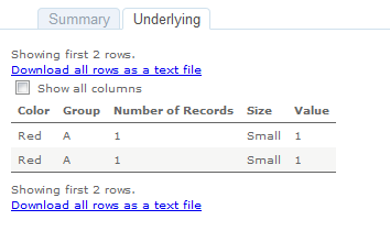
If you don’t need to show the data in a Tableau view users can still view the underlying data in both Tableau Desktop and from Tableau Server & Online. Here’s the underlying data in Tableau Desktop:

And on Tableau Server:
So some user education might be all you need to show all the records. If the data is too tall and you do have to show a view with all the records then you can alter the source data or set it up in Tableau.

Do You Control the SpiceSource?

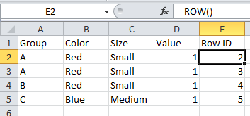
If you have control over the source data then many sources have features to add a unique record identifier that would add that necessary column to make the data not too tall, not too wide, but just right. For example Excel has the ROW() function:

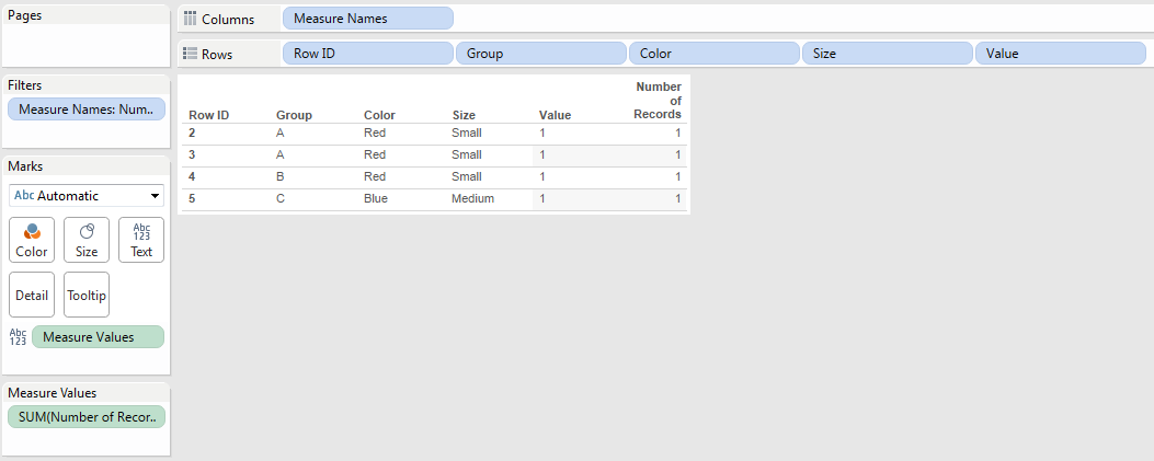
Creating a view with this that shows every record is trivial, we just need to add Row ID as a dimension:
If you’re not using Excel then you’ll need to look for a function that adds a row ID, record ID, etc. Part of why this is a rare problem is that most relational data tables are set up with unique keys (indexes) that give us those unique values to draw tables. Where I typically see too tall data coming from is from hand-entered data sources and ancient systems.

When you don’t have that option and you’re stuck with too tall data we can still get a view showing every record in Tableau.

Building a Tableau View Showing Every Record for Too Tall Data

There are three main steps to building a view to show every record:

  1. Turning off aggregation so Tableau will return every record from the data source.
  2. Creating a table calculation to increment over each record and provide a unique identifier.
  3. Using that table calculation as a discrete pill to sort the view.

Here’s how using the above data source:

  1. Turn off Analysis->Aggregate Measures:

    The view now looks like this:

    The reason why there’s a lot of white space is that Tableau is now returning multiple records (the two 1’s) for A/Red/Small and has turned on Mark Stacking by default. This is not a problem, we’ll be rearranging the view later on to get rid of Mark Stacking.
  2. Create a Rank calculated field with the following formula:
    RANK_UNIQUE(MIN([Number of Records]))

    I use RANK_UNIQUE() here instead of INDEX() because rank only counts non-Null values and should there be any unwanted densification those ranks will return Null, whereas INDEX() would return values that would throw off the desired ordering.

  3. Drag the Rank field to the Level of Detail Shelf and set the Compute Using to an Advanced… Compute Using where all the dimensions are used for addressing in the order that you want the records to appear:

    Something I’ll typically do at this point to validate is to add the table calc (Rank) to the text Shelf or Measure Values (here I have it on text):
    And we can see that the Rank is accurate.
  4. Turn Rank into a discrete (blue) pill:
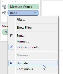
  5. Drag Rank to the Rows Shelf to the left of all the dimensions. With the unique identifier for each record (mark) the Mark Stacking goes away:
  6. As the last step turn off Show Headers for the Rank pill:

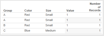
    The view now shows each individual record:
Conclusion

Tableau is designed to help us dive & swoop through thousands/millions/billions of rows of data to discover insights so Tableau’s default behavior is to aggregate the data. Tack on Tableau’s mental model of treating data as a database does and a task like showing every record can be more complicated when the data source isn’t aware of more modern database concepts and lacks the necessary dimensions to uniquely identify each record. A feature request for row numbering has been created to make this easier, vote it up if this is something that interests you!

Here’s a link to the too tall workbook on Tableau Public.

The Letdown and the Pivot

The Letdown

Tableau does amazing demos. Fire up the software, connect to a data source, select a couple pills, click Show Me, boom there’s a view. Do a little drag and drop, boom, another view. Duplicate that one, boom, another view to rearrange. Within three minutes or less you can have a usable dashboard, for 200 rows of data or 200 million.

Screen Shot 2014-04-16 at 6.29.57 AMIf you’ve seen those demos, the not-so-dirty little secret of Tableau is that they pretty much all start with clean, well-formatted, analytics-ready data sources. As time goes on, I’ve interacted with more and more new Tableau users who are all fired up by what they saw in the demos, and then let down when they can’t immediately do that with their own data. They’ve got to reshape the data, learn some table calcs right away, or figure out data blending to deal with differing levels of granularity, and/or put together their first ever SQL query to do a UNION or a cross product, etc. Shawn Wallwork put it this way in a forum thread back in January: “On the one hand Tableau is an incredibly easy tool to use, allowing the non-technical, non-programmers, non-analysis to explore their data and gain useful insights. Then these same people want to do something ‘simple’ like a sort, and bang they hit the Table Calculation brick wall…”

I work with nurses and doctors who are smart, highly competent people who daily make life or death decisions. Give them a page of data and they all know how to draw bar charts, line charts, and scatterplots with that data. They can compute means and medians, and with a little help get to standard deviations and more. But hand them a file of messy data and they are screwed, they end up doing a lot of copy & paste, or even printing out the file to manually type the data in a more usable format. The spreadsheet software they are used to (hello, Excel) lets them down…

…and so does Tableau.

A data analyst like myself can salivate over the prospect of getting access to our call center data and swooping and diving through hundreds of thousands of call records looking for patterns. However, the call center manager might just want to know if the outgoing reminder calls are leading to fewer missed appointments. In other words, the call center manager has a job to do, that leads to a question she wants to answer, and she doesn’t necessarily care about the tool, the process, or the need to tack on a few characters as a prefix to the medical record number to make it correspond to what comes out of the electronic medical record system; she just wants an answer to her question so she can do her job better. To the degree that the software doesn’t support her needs, there has to be something else to help her get her job done.

The Pivot

When Joe Mako and I first talked about writing a book together, our vision was to write “the book” on table calculations and advanced use cases for Tableau. We wanted (and still want) to teach people *how* to build the crazy-awesome visualizations that we’ve put together, and how they can come up with their own solutions to the seemingly-intractable and impossible problems that get posted on the Tableau forums and elsewhere. And we’ve come to realize that there is a core set of understandings about data and how Tableau approaches data that are not explicitly revealed in the software nor well-covered in existing educational materials. Here are a few examples:

  • Spreadsheets can have a table of data, so do databases (we’ll leave JSON and XML data sources out of the mix for the moment). But spreadsheet tables and database tables are very different: Spreadsheet tables are very often formatted for readability by humans with merged cells and extra layers of headers that don’t make sense to computers. A single column in a spreadsheet can have many different data types and cells with many meanings, whereas databases are more rigid in their approach. We tend to assume that new users know this, and then they get confused when their data has a bunch of Null values because the Microsoft Jet driver assumed the column starting with numbers was numeric, and wiped out the text values.
  • Screen Shot 2014-04-16 at 6.09.22 AMWe—Tableau users who train and help other users—talk about how a certain data sets are “wide” vs. “tall”, and that tall data is (usually) better for Tableau, but we don’t really talk about what are the specific characteristics of the data and principles involved that in a way that new Tableau users who are non-data analysts can understand and apply those principles themselves to arrange their data for best use in Tableau.
  • Working with Tableau, we don’t just need to know the grain of the data–what makes a unique row in the data–we also need to understand the grain of the view–the distinct combinations of values of the dimensions in the view. There can be additional grains involved when we start including features like data blending and top filters. Even “simple” aggregations get confusing when we don’t understand the data or Tableau well enough to  make sense of how adding a dimension to the view can change the granularity.

Carnation, Lily, Lily, Rose by John Singer Sargent, from WikiMedia CommonsJust as we can’t expect to be a brilliant painter without an understanding of the interplay between color and light, we can’t expect to be a master of Tableau without a data- and Tableau- specific set of understandings. Therefore, we’ve been pivoting our writing to have more focus on these foundational elements. When they are in place, then doing something like a self-blend to get an unfiltered data source for a Filter Action becomes conceivable and implementable.

Screen Shot 2014-04-16 at 6.10.37 AMThis kind of writing takes time to research, think about, synthesize, and explain. I’ve been reading a lot of books, trawling through painfully difficult data sets, filling up pages with throw-away notes & diagrams, and always trying to keep in mind the nurses and doctors I work with, the long-time Tableau users who tell me that they still “don’t get” calculated fields in Tableau (never mind table calcs), and the folks I’m helping out on the Tableau forums. So “the book” is going slower than I’d hoped, and hopefully will be the better for it.

If you’d like a taste of this approach, I’ll be leading a hands-on workshop on pill types and granularity at this month’s Boston Tableau User Group on April 29.

Postscript #1: I’m not the only person thinking about this. Kristi Morton, Magdalena Balazinska, Dan Grossman (of the University of Washington), and Jock Mackinlay (of Tableau) have published a new paper Support the Data Enthusiast: Challenges for Next-Generation Data-Analysis Systems. I’m looking forward to what might come out of their research.

Postscript #2: This post wouldn’t have been possible without the help (whether they knew it or note) of lots of other smart people, including: Dan Murray, Shawn Wallwork, Robin Kennedy, Chris Gerrard, Jon Boeckenstedt, Gregory Lewandoski, and Noah Salvaterra. As I was writing this post, I read this quote from a Tableau user at the Bergen Record via Jewel Loree & Dustin Smith on Twitter: “Data is humbling, the more I learn, the less I know.” That’s been true for me as well!