At the Boston Tableau User Group meeting this past month, Anthony Chamberas and I got to talking and he posed this brain teaser: he wanted a dashboard to show a bar chart showing volume for each region, and be able to pick a region and then on a separate line chart see the performance of that selected region over time compared to the remaining amounts. I kept on thinking about it on the ride back to Maine, and between the Kennebunk exit on I-95 and home I put together this proof of concept while Catherine Rush drove and kindly listened to me think out loud.
While we can set up views where we show one vs. the rest via parameters or sets, for this dashboard we want a user to be able to click on one or more bars and see something different in the lines. In Tableau, that calls for a Filter Action. The key bits to know are that Filter Actions:
- Work on dimensions only (not measures or table calcs)
- Require the dimension(s) being filtered to exist on both the origin and target worksheets
- Either include (or exclude) the data from the target worksheet(s) – the default is to include, once a Filter Action is created, we can edit the filter to exclude data
- Are processed at the same time in the pipeline as other dimension filters – in other words, prior to table calculation filters
Given that, we know that the Filter Action will be removing data needed to compute the total sales minus the selected sales. To bring an unfiltered total into the view, we can use a duplicated data source that doesn’t blend on that filtered dimension – Region in this case. That’s a mouthful, here’s an example worksheet showing how the filter will change results for the regular measure from the primary, but not the secondary:
A self-blend to get an unfiltered total is pretty useful, if you are using extracts you can even self-blend to the extract (or, better yet, a Tableau Saved Data Source) so as to not double your storage requirements.
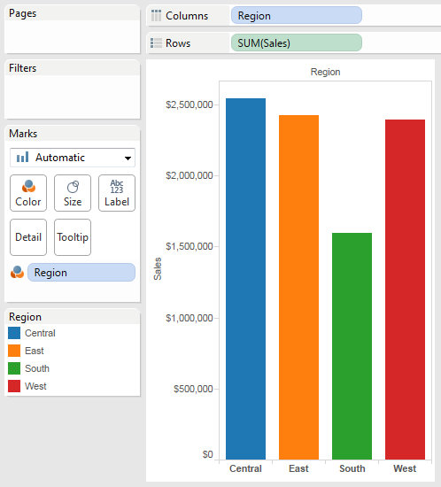
Here’s the bar chart, using Superstore Sales:
And here are the beginnings of the line chart. The blend is on Order Date and not Region:

The only other change is that I took Region off the Color Shelf for the Sales from Secondary measure, set the color to grey, and made it a little thicker:

Now we can put the two in a dashboard and click on the Bar worksheet’s “Use as Filter” context menu to use it to filter the other worksheet. Alternatively, you can build the Filter Action like so:

And here’s the starting dashboard, try clicking around:
There are a few things to note on this dashboard:
- When no bars are selected, the grey line is thicker and a little fuzzy, at least on Tableau Desktop, not so visible on Tableau Public. This is because of overprinting – Tableau is drawing a line for every Region.
- Also when no bars are selected, the view draws 4 colored lines, when we want just the single total line.
- Clicking on one or more bars filter for the particular Region, but doesn’t change the total of the sales from secondary. This is expected because we haven’t set up any calculation yet.
This leads to a couple of tasks that need to be done:
- Set up the selected sales measure for the colored line(s) from the primary to not show when no bars are selected.
- Set up the grey line to only draw one line for the total sales minus the total of all the selected sales
Selected Sales Measure: the colored line(s)
Here’s the formula for the Selected Sales measure, which will have a Compute Using of the Region (so it is partitioned on the Order Date):
IF SIZE() < COUNTD([Unlinked Region Sample - Superstore - English (Extract)].[Region]) THEN
    SUM([Sales])
END
This gets a little tricky because the Selected Sales measure is set up to evaluate what’s in the view given the Filter Action selection and return different results, I’ll walk through each part:
- The SUM([Sales]) measure returns the sum of Sales for each of the selected Regions. That gets us multiple lines.
- COUNTD(Region from the secondary) always returns the total number of Regions in the secondary for the current Order Date, no matter the Filter Action selection, because Region is not part of the self-blend.
- SIZE() is being used as a count distinct in this case, it returns the number of Regions in the view.
The evaluation says that if the # of Regions that are selected is less than the total number of Regions, then return the sum of Sales for each Region, otherwise return Null. The Null is what gets rid of the marks when no bars (Regions) are selected or all Regions are selected.
Sales – Total Selected Sales: the grey line
For this measure, we need to have our total unfiltered sales (the sales from secondary) and subtract from that the total of the selected sales, here’s the formula, which also has a Compute Using of the Region:
IF FIRST()==0 THEN
    SUM([Unlinked Region Sample - Superstore - English (Extract)].[Sales])
      -ZN(WINDOW_SUM([Selected Sales]))
END
Again, we’re setting up a measure to be responsive to the Filter Action, here’s what’s happening inside it:
- ZN(WINDOW_SUM([Selected Sales])) sums up all the Selected Sales across all Regions, and if there are none selected then returns 0.
- SUM(Sales from the secondary) is the unfiltered total sales.
- IF FIRST()==0 is used to only return a single non-Null value no matter how many Regions are selected, this gets rid of the overprinting.
With these two measures, we can set up the dashboard:
There are two other things that I did with the dashboard to make it work well:
- Turned off the Nulls warning on the line chart.
- Created a measure called Sales Spacer (Line) that is SUM(Sales from the secondary) * 1.1. This is an invisible reference line (set to the Max value) that ensures that the axis will have a fixed range and won’t change as the data is filtered. We could manually fix the axis range, but then if we added new data we’d have to remember to re-set the axis. The invisible reference line trick makes the axis range responsive to the range of the data.
This view is a fun example of how we can combine Filter Actions, data blending, and a little dose of table calculations to create a rich interaction. Anthony emailed me back to say he’s putting this into use right away to help his customers get a clearer view of their campaigns as they test one against others.
Adding an Area Chart
When writing up the above and doing a lot of clicking around, I wasn’t quite so happy with how much the lines jump around as we do the filtering, so I created an alternative with an area chart. Here’s how to build the chart – it’s about 20 steps that go pretty quickly:
- Duplicate the line chart.
- Drag the Action (Region) pill off the Filters Shelf. This confuses Tableau while we’re building the view.
- Drag the Sales – Total Selected Sales measure to the measure values drop area:
 The view will now have Measure Names/Measure Values and the pills will be red because Tableau decided to remove Region from the Level of Detail Shelf. Why Tableau does this, I don’t know.
- Drag Region from the Dimensions area to the Level of Detail Shelf. The view will now show two lines.
- Change the Mark Type to Area. You’ll see an Area chart at the top and nothing at the bottom (because we haven’t filtered out any Regions, the Selected Sales measure returns only Null values).
- Drag Measure Names from the Dimensions area to the Color Shelf. Now you’ll see only one Area chart.
- The next few steps are for getting the colors properly set. Drag Region on the Level of Detail so that its pill is below Measure Names.
- Click on the invisible Shelf Menu to the left of the Region pill to change it to be a Color pill as well, so both Measure Names and Region are on Color. Now you’ll see a Color Legend that looks like this:
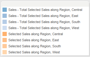
These colors don’t look anything like our Region colors, the reason why we see 8 values is because of the 2 measures and 4 Regions. The goal is to have the Selected Sales measures each match the particular Region’s color, then the Sales – Total Selected Sales measure will all be gray. - Change the order of pills on the Measure Values so the Selected Measures pill is above the Sales – Total Selected Sales pill.
- Edit the colors, here’s what comes up:

- Change to the Tableau 10 palette, then Assign Palette:
 This gets us to having the Selected Sales Regions working.
 - Next, change the four Sales – Total Selected Sales colors to all be gray:

- Click OK, now the colors are set. You won’t see any change in the view just yet.
- Tableau’s default is to set the Color Transparency on an Area chart to be 60%, if you want the colors to match then click on the Color Shelf button and crank the Transparency back up to 100%.
- On the Measure Values card, move the Selected Sales measure back down to the bottom. This controls where the Area Chart will draw the the Selected Sales, we want them to be on the bottom so the values are more visible.
- Because this is an area chart that stacks marks, we don’t specifically need the sales spacer. However, I wanted to show the Line chart and Area chart side-by-side, so we need to fix the axes for both at the same value. Since the marks will stack for each region, we need to divide them by the total number of regions in the view. Duplicate the Sales Spacer (Line) measure and edit it to add a /TOTAL(COUNTD([Region])), as in:
SUM([Unlinked Region Sample - Superstore - English (Extract)].[Sales])*1.1/TOTAL(COUNTD([Region]))
- Drag the new Sales Spacer (Area) measure over the Sales Spacer (Line) measure that’s still on the Level of Detail Shelf to replace it.
- Set the Compute Using for Sales Spacer (Area) to Region.
- Create an invisible reference line for Sales Spacer (Area):

- Now you can make a dashboard with the area chart, and set up a Filter Action from the Bar Chart to both the Line and Area charts:
Personally, I prefer the area chart view to the line chart because there are fewer changes as the line changes, however if multiple lines are being selected then the line chart works better. A third option would be to use a stacked bar chart, I’ll leave that one as an exercise for the reader. Thanks again to Anthony and Catherine for their ideas and feedback!
Yeah, someday I hope to be able to understand the problem your’re addressing, let alone the solution!
I had no idea there was such a thing as the “Use as Filter” context menu. So even in my confusion, your posts always teach me something. Thanks very much; I can imagine how much time this took to compose.
Jonathan,
Awesome article. I’ve used a similar method to create an unfiltered total, but was never able to leverage this through a filter action.
I think this is also particularly useful when showing a share of total for one vs. all other. This can be effectively shown with small multiples, or a lookup() filter, but showing this through a filter action works much better. I utilized the calculations you created to make a simple percent of total calculation:
[sales – selected]/sum([Sample – Superstore – English (Extract) (copy)].[Sales])
This allows the end user to see exactly how much that dimension member has contributed to the total over time. I think this view is particularly useful when there are many parts to a whole.
By default, this calculation will be equal to zero, so it’s only useful once triggered by a filter action. We can make a primary filter so that the view is only shown in the dashboard once the calculation is triggered:
iif([sales – selected share of total]>0,1,0)
Modified workbook is here:
http://public.tableausoftware.com/shared/Q8K95FB7S?:display_count=no
Thanks!
Thats nice. I have general question. When we give as add sub total rows and columns.. i do get grand total and followed by total. Can i change the label ” Grand Total ” to ” over all total ” or other names ?
Right-click on the Grand Total and choose Format… from the context menu, then you’ll be able to change the text for both the subtotal and grand total rows.
Hi,
Thank you for a great post, it’s just perfect for some of what I’m trying to do. But when I try to replicate the steps here with my own data I don’t get the desired results. More specifically I’m stuck at the first step where the “Sales from Secondary” will not add up to the same value for all rows (regions) for each year.
I think there could be a problem with “Null” values, as my data source have rows where the Region is missing, and if I include the “Null” row the “Sales from Secondary” will be correct for that row.
I.e. I will have something like (with “Null” included in the filter):
Year – Region – Sales,primary – Total(Sales, primary) – Sales,secondary
2012 – Null – – 100 – 100
2012 – A – 25 – 100 – 98
2012 – B – 45 – 100 – 99
2012 – C – 30 – 100 – 94
And excluding “Null” in the filter I get:
Year – Region – Sales,primary – Total(Sales, primary) – Sales,secondary
2012 – A – 25 – 100 – 98
2012 – B – 45 – 100 – 99
2012 – C – 30 – 100 – 94
While I expect to get:
Year – Region – Sales,primary – Total(Sales, primary) – Sales,secondary
2012 – A – 25 – 100 – 100
2012 – B – 45 – 100 – 100
2012 – C – 30 – 100 – 100
I’ve defined the Sales,primary and Sales,secondary to:
CASE [Region]
when “A” THEN [SALES]
when “B” THEN [SALES]
when “C” THEN [SALES]
END
so the contribution from “Null” values (or any other values for Region) should be null.
I’ve really tried to twist my head around this, but I don’t see what I’m doing different from your workbook here. I’m relatively new to Tableau so it could be a beginners error, but any tips or help would be very much appreciated.
I’ll sort of answer this myself. At least, I got it working, but I don’t understand why it wasn’t working in the first place. What I tried to do was to self-blend the two data sources (same saved data source), not on “Order date”, but rather on a calculated field with value [Order date] in both sources (I called them “Order date, primary” and “Order date, secondary”). I then placed the “Order date, primary” on the Rows shelf and got the (similar) results as above. This can easily be reproduced with the workbook shown in this post. I did notice in “Edit relationships” that it is not possible to choose the expandable version of the primary calculated date field (the one with DAY, MDY+++ fields) and the same field in the secondary.
And… The solution was to use the original “Order date” field as the blend in both sources and on the Rows shelf.
Pingback: The Letdown and the Pivot | Drawing with Numbers
Hi Jonathan,
Absolutely brilliant solution to a tricky problem, thanks so much for sharing your work!
Have you had any success doing this with COUNTD? I’m building a dashboard which very aggressively uses the techniques you used in this article, and I’m hitting a wall when it comes time to count things.
I’ve seen you link this article, but I haven’t managed to figure out how to employ any of these ideas in this example:
https://www.tableau.com/about/blog/2013/5/tips-tricks-alternatives-count-distinct-23253
Any guidance or suggestions would be wildly appreciated! Thanks again for this killer article!
– Andrew
Hey Jonathan,
Update: that was a silly question. Please ignore it. Maybe even delete it. No one should have to see that.
Here’s a better one (I hope). I’d like to accomplish this same thing, but instead of seeing the total of sales, I’d like to compare the selected region’s sales to the AVERAGE sales of the remaining regions. I haven’t quite managed to rework your formulas to give me that result.
And in truth, what I’d REALLY like to do is compare the selected region’s count of distinct customers to the AVERAGE count of distinct customers for the remaining regions. And I’m even further from accomplishing that.
Any guidance or suggestions would again be wildly appreciated! This article is phenomenal, thanks so much for making this available to us.
– Andrew
Hi Andrew,
Thanks for the compliments! What you describe is an example of using Level of Detail Expressions or table calculations (to get the average of the count distinct). However I’m not entirely sure how to get the desired results (excluding the selected value) given how Filter Actions work. It’s fairly straightforward using Tableau parameters but Filter Actions are different. I’ve got a couple seeds of ideas but nothing concrete, I’ll have a think on this over the next couple of days.
J
Thank you very much for thinking about it, Jonathan! I look forward to hearing what you come up with, if it’s possible at all. In the meantime, I’ll try for a parameter solution instead.
Thanks so much,
Andrew
Here you go: https://public.tableau.com/views/filteractiontoshowselectedvseverythingelsewithcountd/AvgofCountD?:embed=y&:display_count=yes&:showTabs=y
The insight here is that an average is really SUM(values)/COUNT(# of values), and in this case what we want is SUM(remaining values)/COUNT(# of remaining values). So if we can do a sum of the overall COUNTD(), we can subtract what Regions are filtered for and get the SUM(remaining values of COUNTD()), and then repeat that process for the counts. I used a FIXED LOD expression to get an unfiltered overall sum of the COUNTD(), and another FIXED LOD expression to get an unfiltered # of Regions. Then I could do (unfiltered total sum of COUNTD() – sum of COUNTD() that is filtered for) / (unfiltered total # of Regions – # of regions that are filtered for) and generate the grey population line. Then there are some surrounding IF/THEN statements to make sure we’re only display a line for each Region that is filtered for and only one line for the rest of the population. If you have any questions let me know!
Jonathan,
I’m so sorry, I didn’t see that you’d responded. Jonathan, this is absolutely killer. I’ve been messing around with it all morning, and it’s proven to be a very versatile solution. Thanks so much for putting in the time to come up with this. It’s already given me a lot of insights for homebrewing some custom aggregations, and I’m certain I’ll be using the lessons from your workbook for a very long time. Thank you very much!
Best,
Andrew
Glad it works for you!
Hi Jonathan,
I cannot thanks enough you or your likes at Tableau Forum for sharing the immense knowledge with all of us either through blog or community posts.
Now, can you guide me to a related issue – I’ve multiple worksheets in a dashboard. All except one act as source and the one act as target. Now the thing I am trying to achieve is that whatever I select on any of the source sheets should display the related data on the target sheet without removing the selections from any source sheets.
So, when I select some dimension value on sheet1, the target should show the data. But now if select something other values in sheet2, sheet3 sources, the target should show all the data from sheet1, sheet2 and sheet3. So, there should be additive behaviour.
Any pointer would be helpful!
Regards,
Ashish
Hi Ashish,
As you’ve found out Filter Actions on a given dimension effectively replace one another as we update the action, they aren’t additive. To get a Filter Action that works as an “OR” along the same dimension you’d need to 1) create N cross products of the dimension values where N is the number of origin sheets, 2) set up each origin sheet to use a different copy of the dimension as the origin/target of a Filter Action, and finally set up calculations (probably Level of Detail Expressions) on the target sheet to deal with the replicated values created by the cross product. It’s complicated and creates a lot of extraneous data and might not work for you, but it’s all we’ve got at this point.
Jonathan
Thank you Jonathan!
I realized that one way might be through cross joins but that does not seem feasible for many reasons and my issue is more complicated because I want to do “OR” between multiple dimensions (different dimension in each source sheet).
Regards,
Ashish
How to compare value of one dimension with other e.g. baseline with other dimensions in the same data source without blending. is there a way?
Hi Aalok,
Sorry for the late reply, to answer your question I’d need to see a sample of your data structure, the particular question is whether the baseline and others are represented as different columns or different rows. You can post a question on the Tableau community at http://community.tableau.com and link back to it here and I can take a look.