Tag Archives: kraken

Why is COUNTD(Customer Name) red?

Last week I’d promised to explain why the solution for identifying whether All items in a Tableau Quick Filter were selected wouldn’t work under certain circumstances in Tableau version 8, here it is, and along the way I’ll explain why COUNTD(Customer Name) could be red and the “Cannot blend the secondary data source because one or more fields use an unsupported aggregation.” warning message.

Continue reading

KPIs and Floating Dashboards

I haven’t seen this particular trick out there yet, it’s a fun one for the toolbox. When we’ve wanted to mix and match KPIs in a crosstab or text table, we’ve had to resort to multiple worksheets on a dashboard in a layout container, or a multiple axis crosstab. The former can result in various display issues because Tableau imposes certain border sizes, the latter has problems with performance due to the number of separate queries and computations that are necessary.

Tableau version 8 gives us floating dashboard elements with pixel-level precision for element location, and that gives us a third way to build text tables with KPIs.

Continue reading

Version 8 Blending: Version 7 Blending Under the Hood [UPDATED]

An update: Looks like this one is a bug… Tableau guru-to-the-gurus Joe Mako noted in the comments below that this behavior doesn’t occur for strings or numbers. I’d thought I’d seen this with other data types, but I was wrong. I’ve submitted this to Tableau tech support and updated the post, I’ll do another update when I hear back from Tableau.

I’ve got at least a couple more posts in the queue about various features of Tableau version 8 blending. Here’s how to run into one undocumented feature:

  • Date dimension(s) in the primary and secondary have the same name, or a defined relationship(s) in the Relationships window.
  • The date dimension(s) from the primary is/are in the view.
  • The data will blend using those date dimension(s), regardless of whether the link icon is on or off.

Click for a demonstration!

Tableau Data Blending, Sparse Data, Multiple Levels of Granularity, and Improvements in Version 8

Tableau’s data blending feature is great for mashing up data sets from a whole variety of data sources. Want do download local weather data from Weather Underground to see how precipitation affects your coffee sales in Seattle? Sure!

However, blending can be a little tricky to set up to get the appropriate level of detail in the view, especially when you need to blend at one level of granularity and aggregate at another. In this post, I’ll walk you through a technique for doing this in v7, and how version 8 makes this process easier, using an example drawn from my own work that adds a level of complexity because the data is sparse. This makes a great case study for how to integrate different features of Tableau to create the desired view.

Continue reading

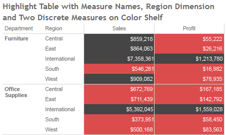
Measure Names on the Color Shelf: Tableau v8 Enhancements

Tableau version 8 “The Kraken” is in beta right now, and Tableau is also beta testing Tableau Public for the new release, and they’ve kindly given me access to it. Tableau v8 is a huge release, as I’m exploring it I’m finding some subtle and not-so-subtle differences. In the coming weeks I expect to do a series of posts on how those changes affect my workflow, and/or relate to prior posts of mine.

I’m going to focus on the new feature that enables multiple discrete (blue) pills on the Colors Shelf of the Marks Card, in particular how it interacts with the Measure Names pill and makes possible some things that were much more difficult to to in prior versions of Tableau.

Continue reading