Tableau version 8 “The Kraken” is in beta right now, and Tableau is also beta testing Tableau Public for the new release, and they’ve kindly given me access to it. Tableau v8 is a huge release, as I’m exploring it I’m finding some subtle and not-so-subtle differences. In the coming weeks I expect to do a series of posts on how those changes affect my workflow, and/or relate to prior posts of mine.
I’m going to focus on the new feature that enables multiple discrete (blue) pills on the Colors Shelf of the Marks Card, in particular how it interacts with the Measure Names pill and makes possible some things that were much more difficult to to in prior versions of Tableau.
When we start Tableau version 8, besides the muted color scheme the most obvious difference is the new Marks Card:

Instead of separate shelves as in Tableau v7 and earlier, there is a list of all the pills on the card, with each Shelf now a clickable, drop-able button. Each pill has an icon next to showing its associated Shelf, with no icon meaning that the pill is on the Level of Detail. You can left-click on the color icon to associate the pill with a different Shelf, I’m calling this the “pill’s Shelf menu” because it’s different from the context menu that shows up when you right-click on the pill or left-click on the pill’s down-triangle hover target:

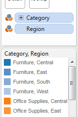
In the v8 beta there are two ways I’ve found to put multiple discrete pills on the Colors Shelf: One is to Shift+click and/or Ctrl+click multiple discrete pills and then drag them together onto the Colors Shelf, or if there are already one or more pills on the Colors Shelf, you can drag a pill onto the Marks Card (which puts it into the Level of Detail), then use the pill’s Shelf menu to set the pill to Color. When you have multiple discrete pills on the Colors Shelf, Tableau assigns a discrete set of colors:
The top-level pill in the list of Color pills determines the base colors, then the additional discrete values are given lighter variations of the first. If the domain of one of the secondary pills on the Colors Shelf is large, then Tableau ends up with a gradient effect:

Perhaps my favorite feature of the new Marks Card is that it makes the sort order totally visible. For example, rearranging the above view with Region and Category so Region is on top changes the color assignments: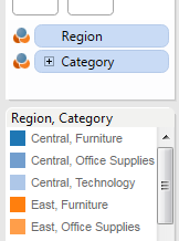
Where this gets interesting is that we can put Measure Names on the Marks Card, along with other discrete values. In this view, I’ve set up Department (the new v8 name for Category in Superstore Sales) and Measure Names on the Marks Card to color stacked bars. This is view that wasn’t really possible in earlier versions of Tableau without doing some data reshaping:
Where the new multiple pills on the Colors Shelf gets more fun is that we can not only put discrete dimensions there, but also discrete measures. For example, discrete measures that are based on different KPIs. In this case, I’ve set up two measures that are based on parameters, here are the formulas:
Sales Color:
IF SUM([Sales])>=[Sales Color Threshold] THEN "Sales Met" ELSE "Sales Fail" END

Profit Color:
IF SUM([Profit]) > [Profit Color Threshold] THEN "Profits Met" ELSE "Profits Fail" END
And here’s the basic text table, with Measure Names on the Columns Shelf so that each column is a separate measure:

Since we’ve created a discrete set of colors, just like we can with other discrete colors we can go to the Color Legend and edit the colors. In this case, I’m coloring anything that has failed to meet the target with red:

There’s a value for every combination of values that the discrete measures are generating in the view. Given the parameter settings, we’re only seeing Sales Fail and Profits Fail for values. This reveals a limitation: unlike discrete dimensions Tableau loads the entire domain of values of the dimension, Tableau does not do that for discrete measures. In order to set the colors to the desired values, you’ll need to adjust your view, with filters or parameters, to generate the whole range of values. Here I’ve adjusted the Profit and Sales Color Threshold values to generate the other 6 combinations of values:

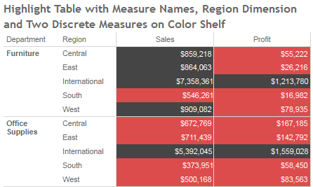
Then I set all the combinations involving Sales Fail and/or Profit Fail to Red. In the following dashboard, I’ve set up a bar chart, text table, and highlight table using this same range of colors, as you move the parameter controls different cells will turn red or black:
Now, you could do this in Tableau version 7 using a multiple axis crosstab – see Older But Still Useful – Conditional Formatting for details, but this way is much easier to set up (other than a bunch of clicking if you have a lot of measures), will have better performance, and retains the ability to quick sort the view, which is not possible with multiple axis crosstabs.
Nice post. Overall I think Tableau V8 offers improved handling of sets, groups, more flexible labeling, and continues to move the controls closer to the work.
I like “…move the controls closer to the work.” That’s a user-focused way of describing the changes, instead of “surfacing features” or “reducing friction,” which are other terms I’ve been using.
Nicely done, Zen!
Thanks!
Very nice work Jonathan.
In the Product Consulting group at Tableau we have a set of “New Hire Challenges.” One of them is the coloring separate columns on a highlight table based on different KPI’s. I solved it only after finding your conditional formatting workbook.
Fitting that you’re the first to find that the new multiple dimensions feature is an easier way to solve this.
I’m curious: Which dimensions did you use for the gradient effect example?
As a side note, there’s one more way to get multiple dimensions on the colors shelf: If you have a dimension already on the color shelf, you can shift-click-drag a dimension from the Dimensions list to the color shelf and it will be put onto the color shelf in addition instead of replacing what is already there.
Hi Michael,
Thanks for the tip! I’d been hoping there was another way to add discretes.
The gradient effect comes from Container and Customer on the Color Shelf (with a little tweaking), I’d found that by accident in an early beta.
Jonathan
Great work Jonathan! This will be great to include as an exercise in v8 training.
Hello,
in a text-table containing Sales and Profit Ratio by Sub-Category, I would like to highlight with a specific color the negative values for Profit Ratio;
I do not want to color the whole row displaying the Sales and the Profit Ratio when the later is negative, but only the value of Profit Ratio.
Is it possible?
Thank you, Alexandre
Hi,
Since that post Tableau has added the ability to make separate legends for each Measure in Measure Values, so the simpler way to do this is to put Measure Values on Color and then right-click on it and turn on Use Separate Legends, then format the legend for Sales to be a single color and then use the desired palette for Profit Ratio.