This is the second in a series on new features in Tableau 9.2, if you’re really into this I’ll be doing a training on Tableau 9.2 a few weeks after the software is released, more information below!
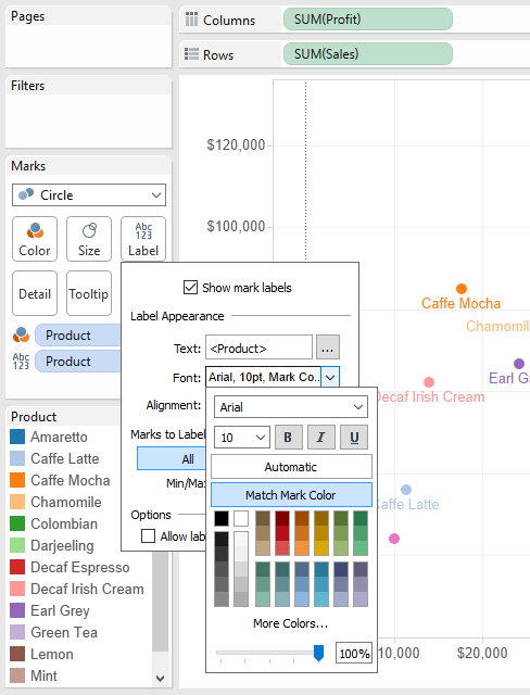
A new feature in Tableau 9.2 is to make label colors similar to mark colors. Here’s the old way:
And the new:
To turn this on, check “Match Mark Color” in the Label Shelf->Font options:
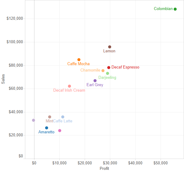
In the scatterplot view above the mark colors and labels pretty much look like they match, but they aren’t quite exact. For legibility Tableau is applying an algorithm to alter the label color based on where the label is in relation to the mark. Here are some additional charts, notice how the Darjeeling label is a lighter green on a white background and a darker green when it’s over the light green Darjeeling mark:
The algorithm isn’t perfect, Chamomile & Decaf Irish Cream in particular are too light on the Area chart, there’s a bug with transparency and Area marks in the beta, and this is essentially v1.0 of this new feature so we can look forward to some improvements over time.
What’s it good for?
I regularly have line charts where there are a few reporting units with the group performance, this will help users make the connection between the labels and the lines.
Here’s the coloring labels workbook on Tableau Public so you can see it out for yourself, and download if you have the 9.2 beta (if you want it check with your Tableau sales rep).
What’s New in Tableau 9.2?
Roughly two weeks after the public release of Tableau 9.2 I’ll be doing an online training on all the new features in Tableau 9.2 Desktop – this post is a sample of what you’ll be seeing in the course, a combination of how the feature works, where the edges are and how you might use it. Sign up below to get more info when the course is available!
Tableau version 9.2 is getting close to release and thanks to a couple of little birdies — moles? informants? people whose initials are [redacted] and [redacted])? — I’ve learned about some features that weren’t announced during the keynote at the 2015 Tableau Conference. I asked for permission to talk about them and over the next few weeks I’ll blog about a few of my favorites.
NOTICE: This is a discussion of beta software and as such the described features and functionality are subject to change or complete removal prior to actual release. (Francois told me I’d get pie charts for Christmas if I didn’t put this warning here.)
The Problem
Up through v9.1 Tableau will happily put any continuous (green) pill on the Filters Shelf, but when it comes to discrete (blue) pills Tableau’s behavior has been inconsistent.
Discrete pills based on dimensions and record-level calculations like [Sales] > 10000 are supported.
Discrete pills based on regular aggregates such as SUM([Sales]) > 10000 have not been supported.
Discrete pills based on table calculations such as LOOKUP(SUM([Sales]) >10000, 0) are supported.
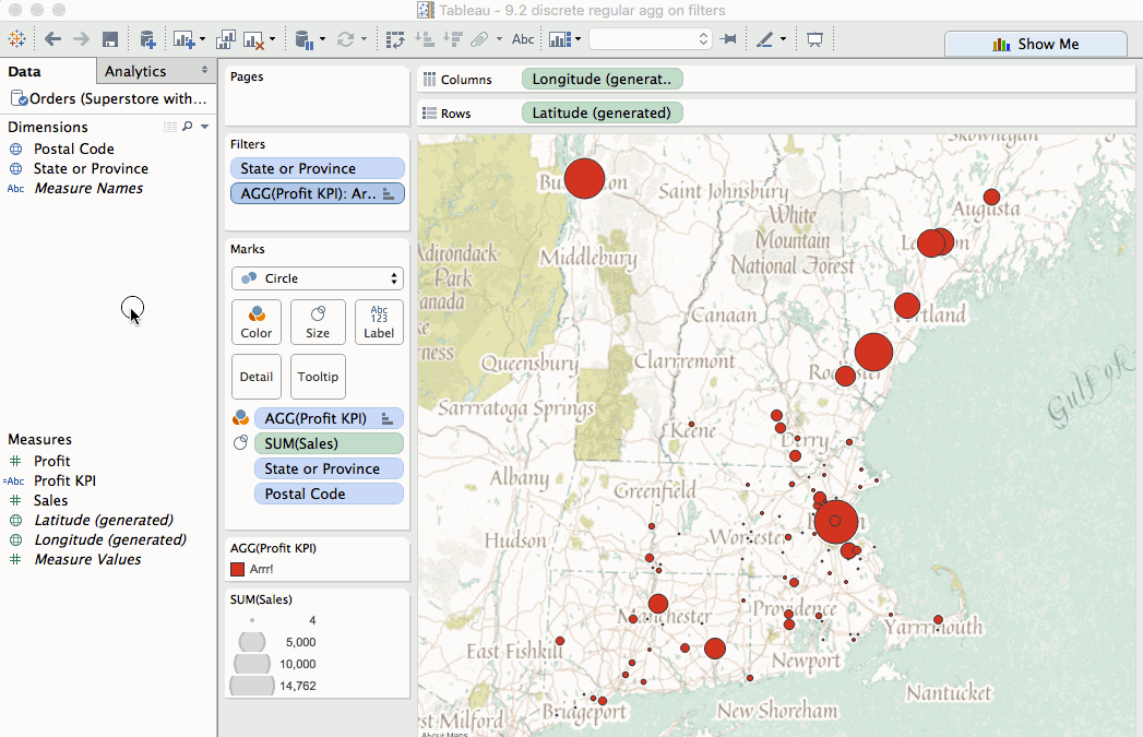
Here’s an example where I’m looking at Sales & Profit in my pirate-themed shops in New England. I’ve set up a KPI with the following formula:
IF SUM([Profit]) > 5000 THEN
    "Thar be profit!"
ELSEIF SUM([Profit]) > 0 THEN
    "Need more booty"
ELSE
    "Arrr!"
END
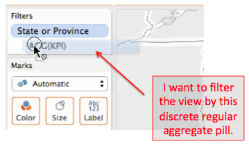
In version 9.1 and earlier if I try to filter to see only the Arrr! circles to find the money-losing stores, I can’t drop the KPI pill onto the Filters Shelf:
There have been a few workarounds for this by:
Brushing/highlighting via the Color Legend.
Using a LOOKUP() calculation as described in the table calc section above.
Converting the discrete KPI into numbers that can be used as a continuous filter like IF SUM([Sales]) > 10000 THEN 1 ELSE 0 END, then filtering for 1.
Using FIXED Level of Detail expressions to convert the aggregate measure into a dimension.
This seemingly arbitrary distinction between dimensions, regular aggregate measures, and table calculations confuses new users and the solutions can cause further complications. It’s a point of friction that to us as users doesn’t seem like it needs to be there at all, no matter the underlying complexity of the problem.
Engage Friction Reducers!
In version 9.2 (with a little Mapbox Pirates theme goodness) this issue is gone, *poof* like it never existed:
So we users don’t have to keep in mind the distinction between calculation levels and pill types, we can filter away.
And the discrete aggregate pill is also completely usable as a quick filter:
…and can even be used as a scoped filter like continuous regular aggregate measures:
There is still one limitation here, we can’t drop ATTR(Xerox Flag) from a primary data source onto the Filters Shelf:
I suspect the reason why has to do with ATTR() being a special aggregation computed in Tableau whereas MIN(), MAX(), COUNT(), and COUNTD() are all computed in the data source.
However, when using data blending we can put ATTR(secondary dimension) on the Filters Shelf because of how data blending works – many aggregate filters on secondary sources are generally computed in Tableau, not in the data source, so Tableau already has that ability to filter on ATTR(secondary dimension). Here’s an example using Xerox Flag from a duplicated secondary source:
For me as a calculation writer this is a nice new feature because it lets me express KPIs and other measures in their natural forms and work with them more easily. As a trainer my students are less confused and can focus more. Thank you, Tableau devs!
Tableau Public is running v9.2 already and you can see the filter by discrete regular aggregates workbook and download it to your v9.2 beta. (If you’re not running the beta, you can get it by contacting your Tableau sales rep).
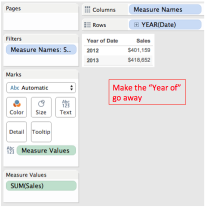
Here’s the problem, when using YEAR(Date) on Rows Tableau is automatically inserting the “Year of” for the header:
We could create a calculated field for YEAR([Date]) and then use an Exact Date for the pill, but there’s an even faster way.Using Tableau’s Custom Dates feature we can do that in a few clicks plus typing the name of our new date field:
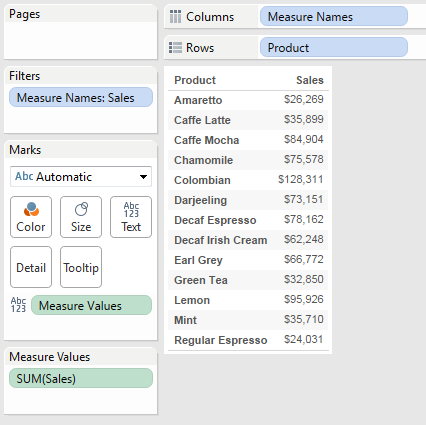
This is a little tip that started out with a “Tableau doesn’t do that” and then an “Ooh…it does…that’s so cool!” Here’s the problem: In a single measure table, I want the name of the measure column as a header. In this worksheet using the Coffee Chain data I want “Sales” to be on top of the Sales column:
Now there are a bunch of ways to work around this…if you really want to read a comprehensive list check out the gory details, but there’s a way that tops them all that I learned thanks to Alberto Bertollino. in the aforementioned thread. From the view above (that took two clicks to build), do one (ONE!) more click & drag operation to drop Measure Values over the column and voila!:
Alternatively, if you like double-clicking, that works too!
Over the last four years this tip would have saved me at least a couple of hours of doing things like creating tables with all discretes and then resizing columns and twiddling with formatting. Multiply that times thousands of Tableau users and we’re talking person-years.
Got another time-saving tip? Share it in the comments below!
I’ve been hearing lots of good things about Alteryx as an ETL tool and have been looking forward to using it more. Here’s what I did the day after Alteryx training: built an introductory solution in Alteryx for dynamically updating Tableau parameters, the post is up at DataBlick.