This is the second in a series on new features in Tableau 9.2, if you’re really into this I’ll be doing a training on Tableau 9.2 a few weeks after the software is released, more information below!
A new feature in Tableau 9.2 is to make label colors similar to mark colors. Here’s the old way:

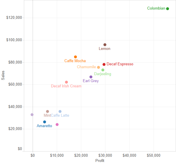
And the new:

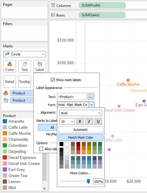
To turn this on, check “Match Mark Color” in the Label Shelf->Font options:

In the scatterplot view above the mark colors and labels pretty much look like they match, but they aren’t quite exact. For legibility Tableau is applying an algorithm to alter the label color based on where the label is in relation to the mark. Here are some additional charts, notice how the Darjeeling label is a lighter green on a white background and a darker green when it’s over the light green Darjeeling mark:

The algorithm isn’t perfect, Chamomile & Decaf Irish Cream in particular are too light on the Area chart, there’s a bug with transparency and Area marks in the beta, and this is essentially v1.0 of this new feature so we can look forward to some improvements over time.
What’s it good for?
I regularly have line charts where there are a few reporting units with the group performance, this will help users make the connection between the labels and the lines.
Here’s the coloring labels workbook on Tableau Public so you can see it out for yourself, and download if you have the 9.2 beta (if you want it check with your Tableau sales rep).
What’s New in Tableau 9.2?
Roughly two weeks after the public release of Tableau 9.2 I’ll be doing an online training on all the new features in Tableau 9.2 Desktop – this post is a sample of what you’ll be seeing in the course, a combination of how the feature works, where the edges are and how you might use it. Sign up below to get more info when the course is available!
Let me know about the Tableau 9.2 New Features training with Jonathan Drummey and DataBlick