Since Tableau v9.0 or so every new release has come with new features that simplify and reduce the amount of data prep I have to do outside of Tableau. Pivot in version 9.0, the first batch of union support in v9.3, support for ad hoc groups in calculations, cross data source joins and filters in v10.0, and more in-database unions and join calculations in v10.2. With the join calculations we can now do unions and cross/cartesian joins within or across almost any data source without needing Custom SQL or linked databases and without waiting for Tableau to implement more union support, read on to learn how!
Here are some use cases for unions across data sources:
Union data that is coming from different systems, for example when different subsidiaries of an organization are using different databases but you want a single view of the company.
Union actual sales data from transactional systems and budget data that might come from an Excel spreadsheet.
Union customer & store/facility data sets so you can draw both on the same map.
This post goes through examples of all three using a combination of text files and superstore, and Rody Zakovich will be doing a post sometime soon on unions and joins with Tableau data extracts. (Did you know you could do cross data source joins to extracts? That capability came with v10.0, and we can have all sorts of fun with that using join calculations!)
I grew up with the Maine story “Which Way to Millinocket” that famously ends in “You can’t get there from here.” Sometimes I feel like that when connecting to a brand new database in Tableau, here are a couple of recent errors:
“Unable to connect to ODBC Data Source. Check that the necessary drivers are installed and that the connection properties are valid. Unable to connect to the server […]. Check that the server is running and that you have access privileges to the requested database.”
The message doesn’t indicate what the exact problem is nor how to fix it, just some unhelpful suggestions. It’s the “You can’t get there from here” story.
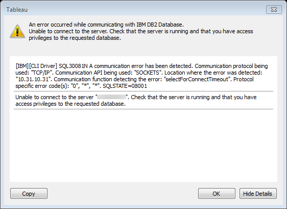
[IBM][CLI Driver] SQL30081N A communication error has been detected. Communication protocol being used: “TCP/IP”. Communication API being used: “SOCKETS”. Location where the error was detected: “10.31.10.31”. Communication function detecting the error: “selectForConnectTimeout”. Protocol specific error code(s): “0”, “*”, “*”. SQLSTATE=08001
Unable to connect to the server […]. Check that the server is running and that you have access privileges to the requested database.
This one is even worse…there’s a bunch of developer-ese that is most likely leftover code from back when IBM still shipped Token Ring and other protocols, it has no meaning to us. It’s like the other famous Maine farmer-giving-directions story where the farmer says “Go a few miles or thereabouts and take a left at the corner where the Hanson’s barn used to be that burned down awhile back.” The only marginally useful bit of the error message is the suggestion at the end (that is repeating what’s already at the top of the dialog).
The challenge with error messages like these is that the developers are doing the best they can and interconnecting pieces of software (like Tableau and your database of choice) is hard, sometimes there’s just not much information available to explain why things don’t work. Even more challenging is that all users like us care about is what we need to do next. This post is about what I do next when I run into errors like this. I use a checklist:
Checklist for Database Connection Errors
Double-check that whatever information you were given about the database connection is correct and try again. For example I once was trying (and trying) to connect to a database server named something like “mhlsql” only it was really “mh1sql”. Oops!
Triple-check that your information is correct. For example I was once given a database password that had a lot of gobbledygook and numbers and manually typed in the numbers again and again and had accidentally reversed two digits. If you can copy & paste information into the forms then do that instead of typing.
Check whether you have network connectivity in general. Browsing a random site on the web covers this. I’ve been frustrated thinking I couldn’t connect to a server when in fact the entire building had lost internet access.
Depending on your system and permissions you may need to skip this step: Check whether you can connect to the database server using a local (i.e. on your machine) database querying application like SQL Server Management Studio, MySQL Workbench, TOAD, etc.*** or an existing BI or reporting tool like Cognos, Crystal Reports, etc. This requires:
Having the right database driver. You can check your local driver against the versions at http://www.tableau.com/support/drivers and install a new one if necessary. Also databases are sensitive to 32-bit and 64-bit distinctions so you’ll need to know what is right for your computer *and* the database. This is a place where you may need to ask your IS/IT department for information and/or to install the driver.
Has that database server authorized your IP address? If you’re connecting to a database server for the first time it might be locked down and blocking your IP address. You can do some testing of this in step 5 below on using ping, telnet, etc. but ultimately this may need to go to IS/IT.
Do you have the right username/password or credentials to connect? Again, if you’re connecting to a database server for the first time you might not be set up to connect to that server.
Use the querying application or BI/reporting tool to check whether you can access the particular database as well as table(s)/view(s)/stored procedure(s) that you want to. For example you might be able to connect to the desired database but not have permissions on certain tables in the database.
Verify that your Tableau data source is using the same settings from steps #3. For example I’ve made a mistake where I accidentally connected to the production database in Tableau (where my credentials were limited) and the test database in the querying tool and then was wondering why I got errors in Tableau.
If you don’t have a querying application or you tried one and couldn’t get that to connect to my source then check whether you can ping or telnet or Remote Desktop/ssh into that database server machine (i.e. know that the machine is up). These aren’t always available depending on the configuration of the server and what kind of permissions you have.
You can run ping from the command line, the command is ping [hostname or IP address]. Getting the hostname or IP address for some databases can be difficult, for example on Windows if you just have a SQL Server database name. If you check your DSN (Windows) you can get the IP address or host name, you’ll need to open up the ODBC Administrator application which Microsoft has moved around in different releases, do a web search for your version. If this doesn’t work it could be that ping has been disabled on the database server machine or that the database server is refusing connections from my machine.
You can also run telnet from the command line, the command is telnet [hostname or IP address] [port]. Again you can sometimes find the port in the DSN, you can also do a web search to find the default port for my database. If this doesn’t work it’s not a sign that the database doesn’t exist because the port could have been mapped to something else or it could be that the database server is refusing connections from your machine.
If you have login credentials on the machine that the database server is running on then Remote Desktop or ssh can be useful to validate that your machine can at least “talk” to the remote machine.
If none of the above works then if you have a co-worker who does have a successful setup try connecting from their machine. On Windows if you’re using saved DSN’s then you’ll also need to check that the DSNs are exactly the same on both machines.
Do a web search and hopefully find something.
Wave the white flag and submit a trouble ticket to IS/IT.
*** In general having a local querying application is useful in debugging performance issues because your can grab a query from the Tableau Performance Recorder or Tableau logs and then run it to see what it does.
If you have any other tips, please submit them in the comments below!
Do you like this post? Would you like to get this kind of help available to you? Check out DataBlick, we offer Tableau and Alteryx consulting, training, and on-demand support.
Back in 2014 I was inspired by this New York Times post The Most Detailed Maps You’ll See from the Midterm Elections to try to figure out how to replicate those maps in Tableau. The maps essentially uses three color palettes on the same map, blue for Democratic leaning areas, red for Republican, and purple for tossups where the lightness (relative light/dark) of each color palette is based on the population of the precinct. So we might think of this in Tableau as coloring by a dimension (really a discrete value) of red/blue/purple and then shading that by a measure (the population), however that’s not something available in a couple of clicks.
This post covers a variety of techniques to build such a map, to simplify for this post we’ll build this map where there are two color palettes
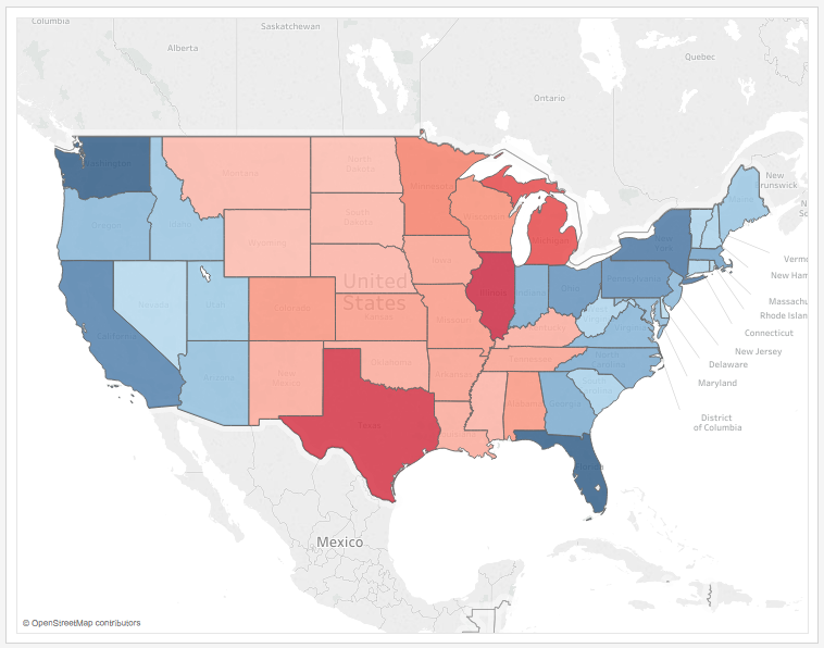
For this example the data set is Superstore Sales with some filters applied to create more variation. A set of states have been arbitrarily grouped as Red and another set as Blue, and the goal is to shade them within the Red and Blue hues by the % of Total Sales. I added some additional requirements:
The lightness of the colors in each palette must be equivalent (symmetrical) so the “darkest” color in each color ramp corresponds to the highest % of Total Sales regardless of which hue the color is (red or blue). This allows the user to compare the relative lightness across the hues, if we don’t then then the visualization will lead to inaccurate conclusions.
The color ramps for the palettes must automatically update as the data changes, for example if a user filters the view or new data arrives.
The color legends themselves have to be accurate and appear in the worksheet. This is an ease-of-construction requirement because if we’ve used a technique that hacks the color legends too much then we’d have to manually build a color legend and put that in a dashboard.
We need flexibility with the color palettes so they can look as good (as vibrant) as we want.
The method needs to support at least 1 additional palette, for example if this were used in a US election prediction map to be able to use a single third hue for a true tossup state, or as in the NYTimes post to add an additional purple sequential palette to identify precincts that voted close to 50-50.
I tried several different methods, the only method that satisfies all the requirements is the 6th one. The six methods are:
A calculated field that makes blue negative and red positive and then a diverging palette based on that field. Problem: The color ramps are not symmetrical and the color legend would have to be manually created.
Using a custom color palette (see my post An Exploration of Custom Color Palettes) with calculated fields to normalize the values and properly assign the colors in the palette. This enables the lightness to be equivalent and dynamically updates with the data so it’s really close to the requirements and could work in some situations. Problem: This requires more effort setting up the color palettes and calculations and the color legends would have to be manually created.
A dual axis map with background color and foreground as a sequential black palette with transparency. I first learned about this technique from Wil Jones of Interworks in Create a Dual Axis Color Map in Tableau. Problem: The colors are too muted.
Calculated field that returns discrete values and then manual assignment of colors. Problem: Colors are limited to the values that appear in the data, in this example the data is sparse so there’s no Red 6-8. so if the data changes the palette won’t automatically update (Tableau will assign the default palette) and and will need manual effort.
A dual axis map with calculations that are used to change the level of detail of each Marks Card by returning red states or blue states that have a geographic role assigned, then separate measures are available for each. This is getting close because it gets us completely separate palettes that can have the colors that we want. Problem: To keep the shading of each color palette the same the color ramps had to be fixed at 10%, so if the data changes the ramps will need to be edited to reflect the data or they could be misleading.
This starts out similar to method #5: A dual axis map with calculations that are used to change the level of detail of each Marks Card by returning red states or blue states that have a geographic role assigned, then separate measures are available for each. In addition a duplicate State dimension that is not a geography is used to increase the level of detail so the color calculations can have same ramp of values. Problem: Most complicated to set up, and can have bigger queries (which aren’t a big deal when we’re only looking at 50 states), but it’s totally dynamic and meets all the requirements.
Here’s how to build method #6:
Part 1: Dual axis maps at different levels of detail
Make sure you have in your data a field that will group the states. In my case I built a map of the 50 states and grouped the states by manually selecting some and creating an ad hoc group that I called State (group). If there’s a dimension value that can slice the states this will also work, or even a calculated field that creates a dimension.
Create two calculated dimensions for Red States and Blue States. Here’s the Red States formula: IF [State (group)] = 'Red' THEN [State] END. This only returns the state value and then Null for everything else. Also note the ability to use ad hoc groups in calculations is new in version 10.0, if you’re using an earlier version of Tableau you’d need to use a calculated field or field from the data source as a dimension in the calc.
Assign the Red/Blue States dimensions to the State geographic role.
Create a filled map with the Red States dimension on the level of detail.
Ctrl+drag (Cmd+drag on Mac) the Latitude (generated) pill on Rows to the right to create a second axis (and a third marks card, so there’s All and two Latitude (generated) cards).
Activate the bottom Marks card by clicking on the the right-hand Latitude (generated) pill on Rows.
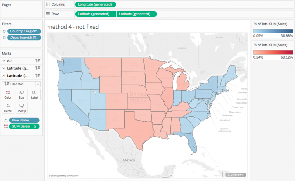
On the bottom marks card replace the Red States dimension with the Blue States dimension. You should now see a view like this:
What we’ve done here is to create a dual axis map with two different levels of detail where the two Marks Cards for this map have different dimensions. The upper map has the level of detail of Red States that includes all the states in the Red group plus one Null value for all the blue states, the lower map has the level of detail of Blue States that includes all the states in the Blue group plus one Null value for all the red states.
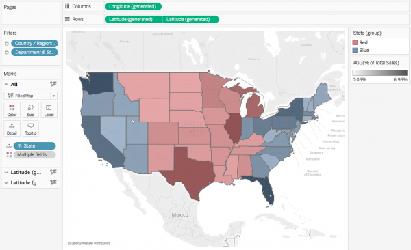
Now at this point we could put separate % of total measures on the two Marks Cards with a Compute Using on the Red/Blue state, respectively and put those on the Color Shelf. This is method #5 before we’ve fixed the colors:
However this has two issues:
Each Marks Card has a Null value (for blue states on the Red map and red states on the blue Map) that rolls up all those opposing states and ends up being the biggest % of Total and that affects the color ramp so the color range isn’t as big as it could be. Note how the largest blue value is 36.88%, but the map is entirely light blue. We can workaround this by using the filter option on the null/unknown marks indicator in the lower right, however…
The two color ramps are not symmetrical at the top end in terms of lightness/darkness and the only way here to make them symmetrical is to manually fix the color ramps, which then doesn’t meet the requirement to have the view automatically update.
While can manually fix the bottom end of the color ramps at 0 to make them symmetrical there, at the top end we really need to have the % of total measures return the same values so that way we don’t have to manually fix the color ramps. That leads to the next steps in Part 2.
Part 2: Increase the level of detail without increasing the # of visible marks
I played around with a bunch of ideas on how to fix the problem including doing a linear scaling, nesting table calculations, precomputing all the values so I wouldn’t need to use table calculations, and so on, until I came back to revisiting how Tableau’s color ramp is determined for sequential palettes. The default is that bottom end of the ramp is assigned to the lowest value of the field on the Color shelf and top end of the ramp is assigned to the highest value of the field on Color. The challenge with the approach so far is that in each of the Red & Blue color ramps there’s a % of total value (the Null value for the blue states & red states, respectively) that is being calculated but is not visible. And that led to my insight: “Why not enable Tableau to have an accurate set of values for the color ramp that aren’t visible?” and a few clicks later I had it.
This solution leans on a couple of bits of somewhat esoteric Tableau knowledge:
a) In maps the visible marks are the ones that have an assigned geography. In this case for only a subset of states have an assigned geography when the Red States dimension is used on one Marks card and a different subset has an assigned geography when the Blue States dimension is used on the other Marks card. So we’ve already seen that there can be additional marks in the view that aren’t visible, therefore we can have all the states available on each marks card by adding a State dimension that isn’t drawn as a geography.
b) Table calcs have some interesting (to me, at least) behavior when there are multiple marks cards at different grains of detail the table calculation results depend on what Marks card(s) the table calculation is on. If a table calculation is on a single Marks card then only the dimensions from that Marks card plus Rows, Columns, and Pages are available for addressing and partitioning. If a table calculation is on the All Marks card then it can use any of the dimensions anywhere for addressing and partitioning, however the table calculation is separately computed for each Marks card based on the dimensions available for each Marks card i.e. the dimensions on that Marks card + Rows, Columns, and Pages, and dimensions that are not on that particular Marks card are ignored. That’s a lot of words, someday it’ll have to be another post to go into more detail.
In this case to get the % of total table calculation to the return the same result across both the red state and blue state Marks cards we need to set up the addressing of the calculation so it is across all the State dimensions that we are using – the State dimension that will get an accurate % of total plus the Red and Blue States dimensions that are used to create visible marks.
Here’s how to build it starting from Part 1 above:
Duplicate the State dimension.
Remove the State geographic role from the State (copy) dimension that you created in step 1 by right-clicking on the State (copy) dimension in the Dimensions window and choosing Geographic Role->None: This is necessary so when we add the the new State (copy) dimension to the view that Tableau doesn’t draw all the states on both the red & blue Marks cards.
Click on the All Marks card header to activate it.
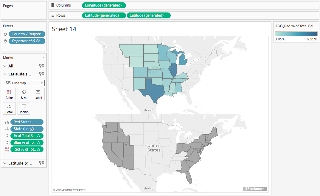
Add the State (copy) dimension to the Detail on the All Marks card. Pro tip – you can drag it onto the Detail button or any part of the open area in the bottom of the Marks card. You should see a view that looks like this:
Note the “27 unknown” in the lower right, that’s the sign that the level of detail has increased without making more states visible. If you see all the states in each map then you’ll need to re-do step 2.
We need to build three calculations to make the colors. The first is a bog-standard % of total calculation, we can do that entirely with drag & drop. Start by dragging Sales from Measures to the Detail on the All Marks card.
Right-click on the Sales pill on the Marks card and choose Quick Table Calculation->Percent of Total.
Right-click on the Sales pill again and choose Edit Table Calculation… to open the Table Calculation window.
Make sure Specific Dimensions is selected with all three State dimensions clicked on: Red States, Blue States, and State (copy). Validate that the table calculation is accurate by hovering over the marks, using View Data, etc.
Drag the Sales pill from the Detail back to the Measures window. Tableau creates a new calculated field and gives you a chance to name it, I called it % of Total Sales.
Now to build out the measures that will be used on Color. Right-click on the new % of Total Sales measure and chose Create->Calculated Field… to create a new calculated field.
Set the name of the new calculated field to be Red % of Total Sales, then click Apply.
Repeat step 10.
Set the name of this new calculated field to be Blue % of Total Sales, then click Apply.
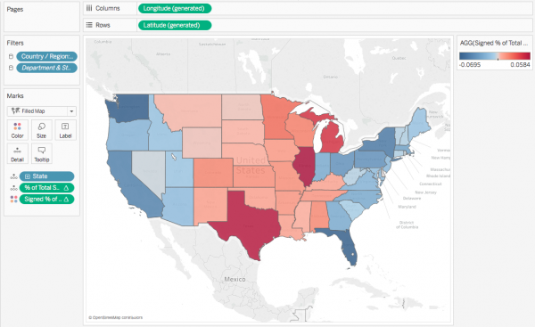
Drag both the Red & Blue % of Total Sales measures onto the All Marks card. The All Marks card should now look like this:
Activate the red state Marks card by either clicking on its header or clicking on the appropriate Latitude (generated) pill.
Click to the left of the Red % of Total pill to put it on Color. The view should now look like this:
Hover over the color legend and click on the drop-down menu->Edit Colors… to open the color palette.
Change the palette to Tableau’s default Red sequential palette.
Click on Advanced >> to open the advanced section.
Click on the Start checkbox and enter 0. This is to ensure that both color palettes start from the same value.
Click OK. The map should now look like this:
Activate the blue state Marks Card.
Click to the left of the Blue % of Total pill to put it on Color. Note that both color legends have the same ending value.
Hover over the color legend and click on the drop-down menu->Edit Colors… to open the color palette.
Click on Advanced >> to open the advanced section.
Click on the Start checkbox and enter 0. This is to ensure that both color palettes start from the same value.
Click OK. The map should now look like this:
The last step in building the map is to right-click on the right-hand Latitude (generated) pill on Rows and choose Dual Axis. Here’s the map:
From here we can clean up the map formatting, edit the tooltips, turn off the unknown indicator, etc.
Notes and Next Steps
A key part of what makes the colors more accurate is that Tableau’s default red & blue color palettes use the same lightness throughout the palettes. If you are going to use a different set of palettes then take some time to make sure the lightness values are equivalent for the palettes.
If what distinguishes between the states is a measure (as opposed to a dimension like the ad hoc group used here) then you’ll need to use a variation on this technique, if you have questions post below in the comments.
If you want to get an additional discrete color (such as to mark tossup states) then you can change the measure that draws colors for a given Marks card to return a single negative value and use a diverging palette with more configuration of the Advanced >> options, for example I’ve set up Minnesota to be yellow in this view:
If you’re careful with sequential or diverging palettes you can actually make multiple continuous ranges and/or discrete colors in the same palette, see An Exploration of Custom Color Palettes and Keith Helfrich’s post at http://redheadedstepdata.io/color-the-dupes/ for more details. So either method #6 or method #2 could build something like the NYTimes viz that I linked to at the beginning of this post, the question is how much mucking around with color palettes and color legends do you want to do?
If you think this is awesome and want more you then please check out DataBlick, we provide Tableau training and consulting and even short-term support to help you make better views and dashboards.
This summer while beta testing Tableau v10 I was very curious about the new mark sizing feature. Bora Beran did a new feature video during the beta showing a Marimekko chart aka mosaic plot. There have been a few posts on building Marimekko charts in the past by Joe Mako, Rob Austin, and a not-quite-a-Marimekko in an old Tableau KB article, but the two charts required extra data prep and the KB article wasn’t really a Marimekko, so I was really interested in what Tableau v10 could do.
I asked Bora for the workbook and he graciously sent it to me. (Thanks, Bora!) I found a problematic calculation, in particular a use of the undocumented At the Level feature that could return nonsensical results if the data was sparse. I rewrote the calculation, sent it back to Bora, and he came back asking if I’d like to write a blog post on the subject. (Thanks, Bora.) There are two lessons I learned from this: 1) the Tableau devs are happy to help users learn more about the new features, and 2) if a user helps them back they will ask for more. Caveat emptor!
Over the course of the next few weeks I did a lot of research, created a workbook with several dashboards & dozens of worksheets, arranged for Anya A’Hearn to sprinkle some of her brilliant design glitter and learned some new tricks, and wrote (and rewrote) 30+ pages (!) of documentation including screenshots. Martha Kang at Tableau made some edits and split it into 3 parts plus a bonus troubleshooting document and they’ve been posted this week, here are the links:
As part of the design process Anya and I had some conversations about how to color the marks. The data set I used for the Marimekko tutorial is the UC Berkeley 1973 graduate admissions data that was used to counter claims of gender bias in admissions so gender is a key dimension in the data and I didn’t want to use the common blue/pink scheme for male/female. It’s a recent historical development and as a father I want my daughter to have a full range of opportunities in life including access to more than just the pale red end of the color spectrum in her clothes, tools, and toys. Anya and I shared some ideas back and forth and eventually Anya landed on using a color scheme from a Marimekko print she found online.
Anya is going into more detail on the process in her Women in Data SF talk on Designing Effective Visualizations on Saturday 27 August from 10am-12:30pm Pacific, here’s the live presentation info and the virtual session info. It’s going to be a blast so check it out!
So that’s how I spent my summer vacation. Can’t wait for next year!
Tableau’s data densification is like…nothing else I’ve ever used. It’s a feature that is totally brilliant when it “just works” like automatically building out a running sum on sparse data and mind-taxingly complicated when a data blend’s results go haywire because densification was accidentally triggered.
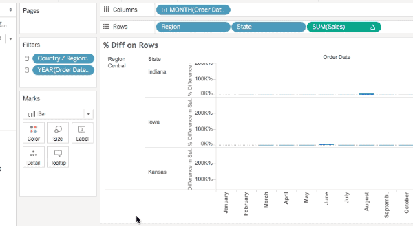
What I’ve historically taught users is to always ALWAYS look at the marks count in the status bar as a first way to detect when data densification occurs. Here’s Superstore Sales data with MONTH(Order Date) on Columns, Region and State on Rows, there are 499 marks and we can see that the data is sparse by the class that are missing Abcs:
If I add SUM(Sales) to the Level of Detail Shelf and set it to a Running Total Quick Table Calculation with the default Compute Using of Table (Across) so it’s addressing on Order Date then I see 576 marks and all the Abcs are filled in, this is Tableau’s data densification at work:
However, here are three additional views all still using the same pill layout and Quick Table Calculations showing three different marks counts (567, 528, and 456):
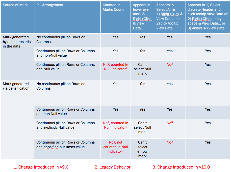
The marks count is changing based on a variety of factors, the different quick table calculations used (running total, difference, and percent difference) are a part of it but the underlying behavior depends on whether a mark is densified or not, the pill arrangement, and whether or not a densified mark has been assigned a value (including Null) or not. Prior to Tableau version 9.0 these all would have been counted in the marks count and the views would show 576 marks for each, Tableau v9.0 changed the behavior to only count the “visible” marks.
I’ll walk through the above there examples. In this one the Running Total has been moved from the Level of Detail to the Rows Shelf and there are 567 marks.
The reason why is that even though those combinations of Region, State, and Month have been densified for states like Iowa that don’t have any sales in the first month(s) of the year (more on how I know that below) those densified marks don’t have any assigned value (even Null) so they are not counted in the marks count nor are they counted in the Special Values indicator in the lower right.
In this view using the Difference calculation there are 528 marks and the Special Values indicator shows 48 nulls (528+48 = 576). In this case the Difference calculation is using the LOOKUP() function that is returning Null for the densified values.
Finally in this view using the % Difference calculation there are 456 marks and the Special Values indicator shows 120 nulls (456+120 = 576). In this case the % difference calculation is spitting out extra nulls due to divide by 0 results.
The difference is due to a change made in Tableau v9.0 where the marks count now only counts “visible” marks (Tableau’s term), where the definition of a “visible” mark is complicated, they are the “Yes” answers in the table below:
Now one of the ways I’ve been used to checking for densification is selecting all the marks (either by Right+Clicking and choosing Select All or pressing Ctrl/Cmd+A) and then hovering over a mark and Right+Clicking and choosing View Data… or waiting for the tooltip to come up and using View Data. For example here’s the select all View Data in v9.0 for the % Difference on Rows view, the yellow cells indicate where data was densified and there are 576 rows:
However, that doesn’t work anymore in Tableau v10.0, there was change made to the Select All functionality such that Select All only gets the “visible” marks, here’s that same view data in v10 and there are only 456 rows:
So Select All doesn’t work the way it used to, and the marks count can change in “interesting ways” (and we haven’t gone into what things like formatting Special Values can do), so what can we do to spot densification? There are three workarounds for this, all documented in the right-most column of the table above:
Select a discrete header or a range of headers, wait for the tooltip to come up, and click on the View Data icon.
Right-click in the view (but not on a mark) and choose View Data…
Use the Analyis->View Data… menu option.
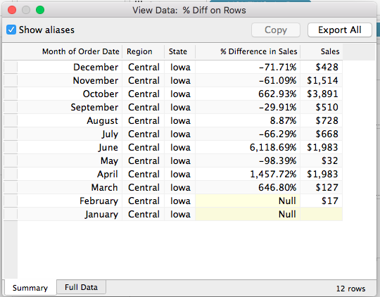
All of these will show the densified values, here’s an animated GIF of selecting Iowa selected in the Difference on Rows view where we can see the two Null values:
However only one of those is actually densified, to tell that exactly we need to add a field that actually has data. In this case I’ve added SUM(Sales) to the Level of Detail Shelf and the View Data for Iowa now shows that it’s really only January that is densified, since there’s nothing at all in the January SUM(Sales) cell:
Conclusion
The marks count is not a reliable indicator of the volume of densification and we need to resort to various selection mechanisms and the View Data dialog to more specifically identify how much has been densified. I’m not a fan of these changes: what I’d really like Tableau to do is to add a count of densified values to the status bar and details on what was densified to the default caption and the Worksheet->Describe Sheet… Until that time, though, hopefully this post will help you keep track of what Tableau is doing!
Here’s a link to the marks count workbook in v8.3 format (so you can open it up for yourself and see the differences in different versions).


 This is necessary so when we add the the new State (copy) dimension to the view that Tableau doesn’t draw all the states on both the red & blue Marks cards.