
Back in 2014 I was inspired by this New York Times post The Most Detailed Maps You’ll See from the Midterm Elections to try to figure out how to replicate those maps in Tableau. The maps essentially uses three color palettes on the same map, blue for Democratic leaning areas, red for Republican, and purple for tossups where the lightness (relative light/dark) of each color palette is based on the population of the precinct. So we might think of this in Tableau as coloring by a dimension (really a discrete value) of red/blue/purple and then shading that by a measure (the population), however that’s not something available in a couple of clicks.
This post covers a variety of techniques to build such a map, to simplify for this post we’ll build this map where there are two color palettes
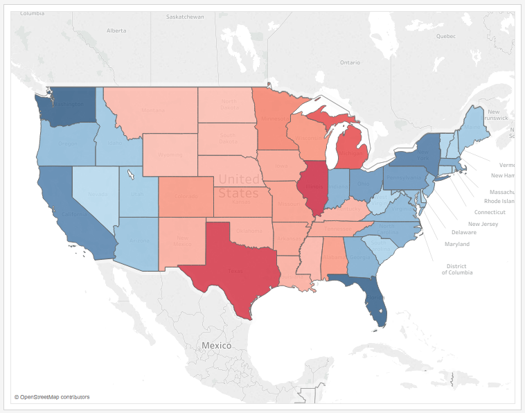
For this example the data set is Superstore Sales with some filters applied to create more variation. A set of states have been arbitrarily grouped as Red and another set as Blue, and the goal is to shade them within the Red and Blue hues by the % of Total Sales. I added some additional requirements:
- The lightness of the colors in each palette must be equivalent (symmetrical) so the “darkest” color in each color ramp corresponds to the highest % of Total Sales regardless of which hue the color is (red or blue). This allows the user to compare the relative lightness across the hues, if we don’t then then the visualization will lead to inaccurate conclusions.
- The color ramps for the palettes must automatically update as the data changes, for example if a user filters the view or new data arrives.
- The color legends themselves have to be accurate and appear in the worksheet. This is an ease-of-construction requirement because if we’ve used a technique that hacks the color legends too much then we’d have to manually build a color legend and put that in a dashboard.
- We need flexibility with the color palettes so they can look as good (as vibrant) as we want.
- The method needs to support at least 1 additional palette, for example if this were used in a US election prediction map to be able to use a single third hue for a true tossup state, or as in the NYTimes post to add an additional purple sequential palette to identify precincts that voted close to 50-50.
I tried several different methods, the only method that satisfies all the requirements is the 6th one. The six methods are:
- A calculated field that makes blue negative and red positive and then a diverging palette based on that field. Problem: The color ramps are not symmetrical and the color legend would have to be manually created.
- Using a custom color palette (see my post An Exploration of Custom Color Palettes) with calculated fields to normalize the values and properly assign the colors in the palette. This enables the lightness to be equivalent and dynamically updates with the data so it’s really close to the requirements and could work in some situations. Problem: This requires more effort setting up the color palettes and calculations and the color legends would have to be manually created.

- A dual axis map with background color and foreground as a sequential black palette with transparency. I first learned about this technique from Wil Jones of Interworks in Create a Dual Axis Color Map in Tableau. Problem: The colors are too muted.
- Calculated field that returns discrete values and then manual assignment of colors. Problem: Colors are limited to the values that appear in the data, in this example the data is sparse so there’s no Red 6-8. so if the data changes the palette won’t automatically update (Tableau will assign the default palette) and and will need manual effort.

- A dual axis map with calculations that are used to change the level of detail of each Marks Card by returning red states or blue states that have a geographic role assigned, then separate measures are available for each. This is getting close because it gets us completely separate palettes that can have the colors that we want. Problem: To keep the shading of each color palette the same the color ramps had to be fixed at 10%, so if the data changes the ramps will need to be edited to reflect the data or they could be misleading.

- This starts out similar to method #5: A dual axis map with calculations that are used to change the level of detail of each Marks Card by returning red states or blue states that have a geographic role assigned, then separate measures are available for each. In addition a duplicate State dimension that is not a geography is used to increase the level of detail so the color calculations can have same ramp of values. Problem: Most complicated to set up, and can have bigger queries (which aren’t a big deal when we’re only looking at 50 states), but it’s totally dynamic and meets all the requirements.
Here’s how to build method #6:
Part 1: Dual axis maps at different levels of detail
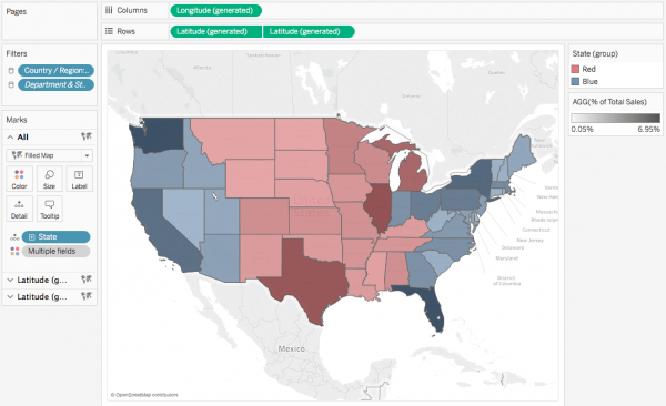
- Make sure you have in your data a field that will group the states. In my case I built a map of the 50 states and grouped the states by manually selecting some and creating an ad hoc group that I called State (group). If there’s a dimension value that can slice the states this will also work, or even a calculated field that creates a dimension.
- Create two calculated dimensions for Red States and Blue States. Here’s the Red States formula:
IF [State (group)] = 'Red' THEN [State] END. This only returns the state value and then Null for everything else. Also note the ability to use ad hoc groups in calculations is new in version 10.0, if you’re using an earlier version of Tableau you’d need to use a calculated field or field from the data source as a dimension in the calc. - Assign the Red/Blue States dimensions to the State geographic role.
- Create a filled map with the Red States dimension on the level of detail.
- Ctrl+drag (Cmd+drag on Mac) the Latitude (generated) pill on Rows to the right to create a second axis (and a third marks card, so there’s All and two Latitude (generated) cards).
- Activate the bottom Marks card by clicking on the the right-hand Latitude (generated) pill on Rows.
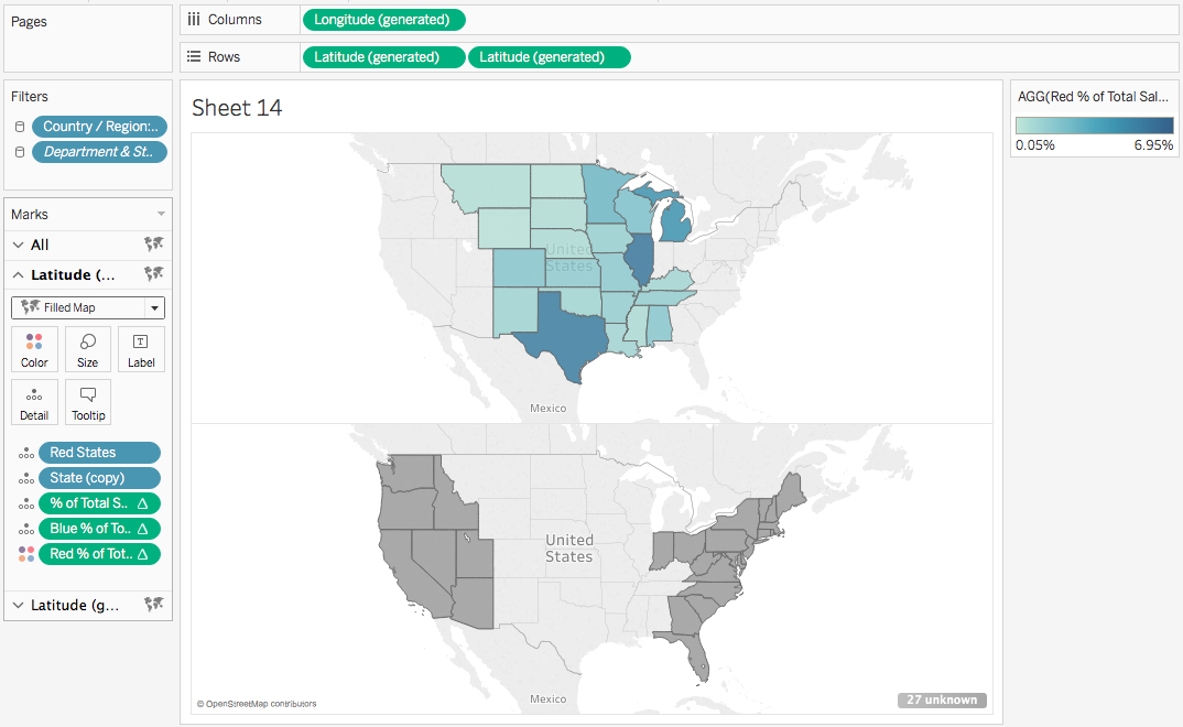
- On the bottom marks card replace the Red States dimension with the Blue States dimension. You should now see a view like this:

What we’ve done here is to create a dual axis map with two different levels of detail where the two Marks Cards for this map have different dimensions. The upper map has the level of detail of Red States that includes all the states in the Red group plus one Null value for all the blue states, the lower map has the level of detail of Blue States that includes all the states in the Blue group plus one Null value for all the red states.
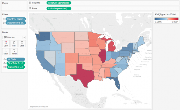
Now at this point we could put separate % of total measures on the two Marks Cards with a Compute Using on the Red/Blue state, respectively and put those on the Color Shelf. This is method #5 before we’ve fixed the colors:
However this has two issues:
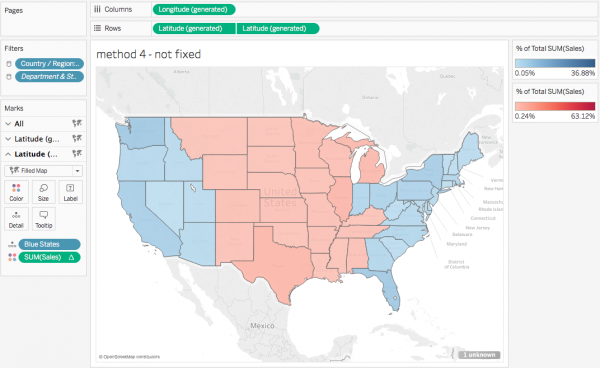
- Each Marks Card has a Null value (for blue states on the Red map and red states on the blue Map) that rolls up all those opposing states and ends up being the biggest % of Total and that affects the color ramp so the color range isn’t as big as it could be. Note how the largest blue value is 36.88%, but the map is entirely light blue. We can workaround this by using the filter option on the null/unknown marks indicator in the lower right, however…
- The two color ramps are not symmetrical at the top end in terms of lightness/darkness and the only way here to make them symmetrical is to manually fix the color ramps, which then doesn’t meet the requirement to have the view automatically update.
While can manually fix the bottom end of the color ramps at 0 to make them symmetrical there, at the top end we really need to have the % of total measures return the same values so that way we don’t have to manually fix the color ramps. That leads to the next steps in Part 2.
Part 2: Increase the level of detail without increasing the # of visible marks
I played around with a bunch of ideas on how to fix the problem including doing a linear scaling, nesting table calculations, precomputing all the values so I wouldn’t need to use table calculations, and so on, until I came back to revisiting how Tableau’s color ramp is determined for sequential palettes. The default is that bottom end of the ramp is assigned to the lowest value of the field on the Color shelf and top end of the ramp is assigned to the highest value of the field on Color. The challenge with the approach so far is that in each of the Red & Blue color ramps there’s a % of total value (the Null value for the blue states & red states, respectively) that is being calculated but is not visible. And that led to my insight: “Why not enable Tableau to have an accurate set of values for the color ramp that aren’t visible?” and a few clicks later I had it.
This solution leans on a couple of bits of somewhat esoteric Tableau knowledge:
a) In maps the visible marks are the ones that have an assigned geography. In this case for only a subset of states have an assigned geography when the Red States dimension is used on one Marks card and a different subset has an assigned geography when the Blue States dimension is used on the other Marks card. So we’ve already seen that there can be additional marks in the view that aren’t visible, therefore we can have all the states available on each marks card by adding a State dimension that isn’t drawn as a geography.
b) Table calcs have some interesting (to me, at least) behavior when there are multiple marks cards at different grains of detail the table calculation results depend on what Marks card(s) the table calculation is on. If a table calculation is on a single Marks card then only the dimensions from that Marks card plus Rows, Columns, and Pages are available for addressing and partitioning. If a table calculation is on the All Marks card then it can use any of the dimensions anywhere for addressing and partitioning, however the table calculation is separately computed for each Marks card based on the dimensions available for each Marks card i.e. the dimensions on that Marks card + Rows, Columns, and Pages, and dimensions that are not on that particular Marks card are ignored. That’s a lot of words, someday it’ll have to be another post to go into more detail.
In this case to get the % of total table calculation to the return the same result across both the red state and blue state Marks cards we need to set up the addressing of the calculation so it is across all the State dimensions that we are using – the State dimension that will get an accurate % of total plus the Red and Blue States dimensions that are used to create visible marks.
Here’s how to build it starting from Part 1 above:
- Duplicate the State dimension.
- Remove the State geographic role from the State (copy) dimension that you created in step 1 by right-clicking on the State (copy) dimension in the Dimensions window and choosing Geographic Role->None:
 This is necessary so when we add the the new State (copy) dimension to the view that Tableau doesn’t draw all the states on both the red & blue Marks cards.
 - Click on the All Marks card header to activate it.
- Add the State (copy) dimension to the Detail on the All Marks card. Pro tip – you can drag it onto the Detail button or any part of the open area in the bottom of the Marks card. You should see a view that looks like this:

Note the “27 unknown” in the lower right, that’s the sign that the level of detail has increased without making more states visible. If you see all the states in each map then you’ll need to re-do step 2. - We need to build three calculations to make the colors. The first is a bog-standard % of total calculation, we can do that entirely with drag & drop. Start by dragging Sales from Measures to the Detail on the All Marks card.
- Right-click on the Sales pill on the Marks card and choose Quick Table Calculation->Percent of Total.
- Right-click on the Sales pill again and choose Edit Table Calculation… to open the Table Calculation window.
- Make sure Specific Dimensions is selected with all three State dimensions clicked on: Red States, Blue States, and State (copy). Validate that the table calculation is accurate by hovering over the marks, using View Data, etc.
- Drag the Sales pill from the Detail back to the Measures window. Tableau creates a new calculated field and gives you a chance to name it, I called it % of Total Sales.
- Now to build out the measures that will be used on Color. Right-click on the new % of Total Sales measure and chose Create->Calculated Field… to create a new calculated field.
- Set the name of the new calculated field to be Red % of Total Sales, then click Apply.
- Repeat step 10.
- Set the name of this new calculated field to be Blue % of Total Sales, then click Apply.
- Drag both the Red & Blue % of Total Sales measures onto the All Marks card. The All Marks card should now look like this:

- Activate the red state Marks card by either clicking on its header or clicking on the appropriate Latitude (generated) pill.
- Click to the left of the Red % of Total pill to put it on Color. The view should now look like this:
- Hover over the color legend and click on the drop-down menu->Edit Colors… to open the color palette.
- Change the palette to Tableau’s default Red sequential palette.
- Click on Advanced >> to open the advanced section.
- Click on the Start checkbox and enter 0. This is to ensure that both color palettes start from the same value.
- Click OK. The map should now look like this:

- Activate the blue state Marks Card.
- Click to the left of the Blue % of Total pill to put it on Color. Note that both color legends have the same ending value.
- Hover over the color legend and click on the drop-down menu->Edit Colors… to open the color palette.
- Click on Advanced >> to open the advanced section.
- Click on the Start checkbox and enter 0. This is to ensure that both color palettes start from the same value.
- Click OK. The map should now look like this:

- The last step in building the map is to right-click on the right-hand Latitude (generated) pill on Rows and choose Dual Axis. Here’s the map:

From here we can clean up the map formatting, edit the tooltips, turn off the unknown indicator, etc.
Notes and Next Steps
A key part of what makes the colors more accurate is that Tableau’s default red & blue color palettes use the same lightness throughout the palettes. If you are going to use a different set of palettes then take some time to make sure the lightness values are equivalent for the palettes.
If what distinguishes between the states is a measure (as opposed to a dimension like the ad hoc group used here) then you’ll need to use a variation on this technique, if you have questions post below in the comments.
If you want to get an additional discrete color (such as to mark tossup states) then you can change the measure that draws colors for a given Marks card to return a single negative value and use a diverging palette with more configuration of the Advanced >> options, for example I’ve set up Minnesota to be yellow in this view:

If you’re careful with sequential or diverging palettes you can actually make multiple continuous ranges and/or discrete colors in the same palette, see An Exploration of Custom Color Palettes and Keith Helfrich’s post at http://redheadedstepdata.io/color-the-dupes/ for more details. So either method #6 or method #2 could build something like the NYTimes viz that I linked to at the beginning of this post, the question is how much mucking around with color palettes and color legends do you want to do?
Here’s a link to the Two Sequential Palettes on a Map workbook on Tableau Public.
If you think this is awesome and want more you then please check out DataBlick, we provide Tableau training and consulting and even short-term support to help you make better views and dashboards.
JD,
Last week I had someone admit to me that they won’t read my articles because they won’t read anything over 1 page long. I had to stop and think about that response. I wondered if I should change my approach to writing.
I also thought about meeting Andy Cotgreave at the Tableau conference last year when I snagged him for a quick conversation as he walked by me. What he said to me was: “Hey Ken, I’ve read your blog. Complicated stuff.” I had to admit at the time that i was shocked into silence because I never once thought of my blog in that way. In fact, I thought I was intentionally writing simple stuff.
Well, the point of me saying these things to you is to encourage you to continue to write articles like these that are for the students in the master class. There are a few people that can write these, a few people that have the passion to complete the work and document what they did, and possibly even fewer people that will take the time to read them. What will happen, however, is that from this work a new concept will arise that will change the way we look at data and the way we decide to visualize it. Your work has the possibility of creating change.
From my heart to yours, I’d like to say thanks for your continued excellence. You set the bar very high and I’m glad I get to be your student.
Ken
Thanks for this, Ken!
Hi Jonathan,
Thanks for your article. It’s very helpful. Unfortunately, I still have no idea how you can get an additional discrete color. I try to change the measure that draws Red, but it doesn’t work (aggregation and non aggregation).
Could you give some more detail explaination? Because the workbook link is invalid for me.
Thanks a lot.
Hi Sherry,
Sorry for the delay in response, I was at the Tableau Conference last week. I’ll be able to do a more detailed response next week, in the meantime which link wasn’t working for you?
Jonathan
Hi Jonathan,
Thanks for your response and waiting for your detailed answer.
The link issue probably because of the IE setting, right now is working for me.
Sherry
Hello Johnathan,
Thank you for the amazing write-up! I have been able to follow all of these steps to get the desired result but am struggling with just one facet. Could you provide some more explanation as to how you made Minnesota a different color entirely? I can’t seem to figure it out – any help is very appreciated!
Jesse
Hi Jesse, sorry for the late reply, comments on my site were borked for a while. In any case the Red/Tossup % of Total Sales is using a calculation to set the value for Minnesota to -1 or otherwise use the % of total sales, and then on Color that measure uses a diverging palette so we can yellow for MN and the gray to red palette for all the other red states.