Tag Archives: chart types

What I did on my summer vacation (hint: it’s about Tableau v10 and Marimekko charts)

This summer while beta testing Tableau v10 I was very curious about the new mark sizing feature. Bora Beran did a new feature video during the beta showing a Marimekko chart aka mosaic plot. There have been a few posts on building Marimekko charts in the past by Joe Mako, Rob Austin, and a not-quite-a-Marimekko in an old Tableau KB article, but the two charts required extra data prep and the KB article wasn’t really a Marimekko, so I was really interested in what Tableau v10 could do.

I asked Bora for the workbook and he graciously sent it to me. (Thanks, Bora!) I found a problematic calculation, in particular a use of the undocumented At the Level feature that could return nonsensical results if the data was sparse. I rewrote the calculation, sent it back to Bora, and he came back asking if I’d like to write a blog post on the subject. (Thanks, Bora.) There are two lessons I learned from this: 1) the Tableau devs are happy to help users learn more about the new features, and 2) if a user helps them back they will ask for more. Caveat emptor!

Over the course of the next few weeks I did a lot of research, created a workbook with several dashboards & dozens of worksheets, arranged for Anya A’Hearn to sprinkle some of her brilliant design glitter and learned some new tricks, and wrote (and rewrote) 30+ pages (!) of documentation including screenshots. Martha Kang at Tableau made some edits and split it into 3 parts plus a bonus troubleshooting document and they’ve been posted this week, here are the links:

On Gender and Color

As part of the design process Anya and I had some conversations about how to color the marks.  The data set I used for the Marimekko tutorial is the UC Berkeley 1973 graduate admissions data that was used to counter claims of gender bias in admissions so gender is a key dimension in the data and I didn’t want to use the common blue/pink scheme for male/female. It’s a recent historical development and as a father I want my daughter to have a full range of opportunities in life including access to more than just the pale red end of the color spectrum in her clothes, tools, and toys. Anya and I shared some ideas back and forth and eventually Anya landed on using a color scheme from a Marimekko print she found online.

Screen Shot 2016-08-24 at 10.58.30 PM

Anya is going into more detail on the process in her Women in Data SF talk on Designing Effective Visualizations on Saturday 27 August from 10am-12:30pm Pacific, here’s the live presentation info and the virtual session info. It’s going to be a blast so check it out!

So that’s how I spent my summer vacation. Can’t wait for next year!


Parallel Coordinates via Pivot and LOD Expressions

Parallel coordinates are a useful chart type for comparing a number of variables at once across a dimension. They aren’t a native chart type in Tableau, but have been built at different times, here’s one by Joe Mako that I use in this post for the data and basic chart. The data is a set of vehicle attributes from the 1970s, I first saw it used in this post from Robert Kosara. This post updates the method Joe used with two enhancements that make the parallel coordinates plot easier to create and more extensible, namely pivot and Level of Detail Expressions.

The major challenge in creating a parallel coordinates chart is getting all the ranges of data for each variable into a common scale. The easiest away to do this is to linearly scale each measure to a range from 0-1, the equation is of the form (x – min(x))/(max(x)-min(x)). Once that scale is made then laying out the viz only needs 4 pills to get the initial chart:

Screen Shot 2016-07-08 at 3.25.20 PM

The Category is a dimension holding the different variables, ID identifies the different cars in this case, the Value Scaled is the scaled measure that draws the axis. Value Scaled is hidden in the tooltips while Value is used in the tooltips.

Where this is easier to create is using Tableau’s pivot function, in Joe’s original version the data is in a “wide” format like this:

Screen Shot 2016-07-08 at 3.20.33 PMSo for each of the measures a calculation had to be built, and then the view was built using Measure Names and Measure Values:
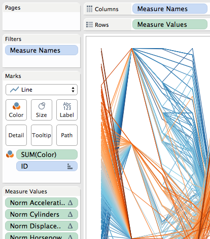
Screen Shot 2016-07-08 at 3.47.05 PM

The major limitation here is in the tooltips (in fact, Joe had rightly hidden them in the original, they were so useless):

Screen Shot 2016-07-08 at 3.33.36 PM

The tooltip is showing the scaled value, not the actual value of acceleration. This is a limitation of Tableau’s Measure Names/Measure Values pills…If I put the other measures on the tooltip then I see all of them for every measure and it’s harder to identify the one I’m looking at. Plus axis ranges are harder to describe.

Pivoting Makes A Dimension

I think of Tableau’s Measure Names as a form of pivoting the data, to create a faux dimension. I write faux because beyond the limits mentioned above we can’t group Measure Names, we can’d blend on Measure Names, we can’t do cascading filters on Measure Names, etc. The workaround is to pivot our data so we turn those columns of measures into rows and get an actual “Pivot field names” dimension (renamed to Category in my case) and a single “Pivot field values” measure (renamed to Value in my case):

Screen Shot 2016-07-08 at 3.45.22 PM

Then for the scaling we can use a single calculation (instead of one for every original column), here’s the Value Scaled measure’s formula:

([Value] - {EXCLUDE [ID] : MIN([Value])})/
({EXCLUDE [ID] : MAX([Value])} - {EXCLUDE [ID] : MIN([Value])})

I used an EXCLUDE Level of Detail Expression here rather than a TOTAL() table calculation as an example of how we can use LODs to replace table calculations and have a simpler view because we don’t have to set the compute using of the table calculation.

Now with a real Category dimension in the view the Value Scaled calc is computed for each Category & ID, and this also means that if we put the Value measure in the view then that is computed for each Category & ID as well, immediately leading to more usable tooltips:

Screen Shot 2016-07-08 at 3.55.53 PM

For a quick interactive analysis this view takes just a couple of minutes to set up and the insights can be well worth the effort. Prior to the existence of Pivot and LOD expressions this view would have taken several times as long to create, so for me this revised method takes this chart type from “do I want to?” to “why not??”

Cleaning Up

To put this on a dashboard some further cleanup and additions are necessary. Identifying the axis ranges is something that is easier as well with the pivoted data. In this case I used a table calculation to identify the bottom and top-most marks in each axis and used that as mark labels to identify the axis range:

Screen Shot 2016-07-08 at 3.58.04 PM

The Value for Label calculation has the formula:

IF FIRST()==0 OR LAST()==0 THEN
    SUM([Value])
END

The addressing is an advanced Compute Using so that it identifies the very first or last mark in each Category based on the value:

Screen Shot 2016-07-08 at 4.01.00 PM

In addition I created two different versions of the value pill that each had different number formatting and used those on the tooltips, used Joe’s original parameters for setting the color and sort order with revised calculations (which were also easier to use since Category is a dimension), and finally added a couple of other worksheets to be the target of a Filter Action to show details of the vehicle:
Screen Shot 2016-07-08 at 4.02.54 PM

Click on the image above to download the workbook from Tableau Public.

Chart Types

Chart Types

This section covers a whole bunch of chart types that are not part of Show Me, but can be built in Tableau, along with some notes on how to get existing charts to work more like I want them to. There’s also a whole section on the Path Shelf.

Be sure to check out the following sources of material on the Tableau Community:

Multiple mark types on same view:

put multiple measures on same row/column Then choose Dual Axes (synchronize if necessary) Then on the Marks card, click on the upper-right drop-down arrow to choose Multiple Mark Types

Showing Summary and Detail Together | Tableau Software
http://onlinehelp.tableausoftware.com/current/pro/online/en-us/help.htm#multiplemeasures_combocharts.html

Path Shelf

On blood transfusion data, getting a table calc to have connected points for a line chart:

Notes from Mar 2012 WebEx w/Joe Mako

I don’t want to misrepresent Joe’s awesome knowledge here, if there are any mistakes in these notes from our conversation they are almost certainly mine.
In Tableau v7.0, the Tableau DATETRUNC() from the pill menu doesn’t work. 1. Turn Quarter into Continuous field using DATE(DATETRUNC(‘quarter’,[date field])) 2. Set to Exact Date – Continuous 3. Put Month([date field]) on Path Shelf. Note – when on LoD it causes partitioning, when on Path shelf it helps connect marks 3. Then for each measure (axis) select the pill->Format->Hide…Connect Lines

Another comment on PATH shelf

Using  a set to get the path shelf to draw things properly: http://community.tableausoftware.com/message/136628#136628 From Think Data Thursday #4, 9/13/12 Path Shelf needs specific structure of data. In particular, origin/destination need to be in the same column, not separate columns. More on Path shelf From http://community.tableausoftware.com/message/188861#188861 If you’re trying to just get the data together, try these resources: http://kb.tableausoftware.com/articles/knowledgebase/using-path-shelf-pattern-analysis The key bit that is not talked about in that is that if you want to use Tableau’s built-in geocoding to get latitude and longitude, you need to change them to aggregate fields like MIN(State), this forum post has the details: http://community.tableausoftware.com/thread/109399 Finally, I’ve attached a workbook that demonstrates this. point to point mapping.twbx

Putting charts in tooltips:

http://www.tableausoftware.com/community/support/kb/barsintooltips http://www.thedatastudio.co.uk/blog/the-data-studio-blog/andy-cotgreave/charts-in-a-tooltip http://www.tableausoftware.com/about/blog/2010/09/using-bar-charts-tooltips Bullet charts: http://www.freakalytics.com/2011/01/29/enhanced-bullet-charts/ Tableau control charts: http://www.tableausoftware.com/support/knowledge-base/control-charts http://dataremixed.com/2011/10/how-to-make-control-charts-with-tableau/ http://sanpelegrino.tumblr.com/ funky pie charts: http://twitpic.com/72r2jp Treemaps http://www.cs.umd.edu/hcil/treemap/ Box plots: http://www.tableausoftware.com/support/knowledge-base/box-plot-analog

Likert scales:

http://www.datarevelations.com/likert-scales-the-final-word.htmlhttp://www.datarevelations.com/using-tableau-to-visualize-survey-data-part-1.htmlhttp://community.tableausoftware.com/thread/117982 – putting many questions all together to see the spread

More on surveys
http://peltiertech.com/WordPress/charting-survey-results/

Nice post about ordering & annotating data:
http://www.storytellingwithdata.com/2013/09/logic-in-order.html

panel or trellis charts:

http://www.thedatastudio.co.uk/blog/the-data-studio-blog/andy-cotgreave/panel-charts-in-tableau http://www.datarevelations.com/the-likert-question-question.html In Tableau, panel charts really need the X and Y axes to have the same values Joe’s version: http://community.tableausoftware.com/message/181493#181493

http://boraberan.wordpress.com/2013/03/15/trellis-charts-with-tableau-8/

Small Multiples for Tables

http://www.perceptualedge.com/articles/b-eye/tablelens.pdf

Ensuring dual axes are available

Make sure that both fields have the same datatype. One way to check to see what data type Tableau is recognizing a field as is to open the calculated field box, select the desired field and in the yellow box at the bottom right will tell what type of field it is. Note that datatype and number format are independent! See this thread on what can happen when you try mark labels on a dual axis chart without synchronized axes: http://community.tableausoftware.com/thread/114593

Parallel Coordinate Plots

http://public.tableausoftware.com/views/ParallelCoordinatesExample/ParallelCoordinatesExample http://www.tableausoftware.com/support/forum/topic/parallel-coordinates-plot http://www.perceptualedge.com/articles/b-eye/visual_multivariate_analysis.pdf http://www.perceptualedge.com/articles/b-eye/parallel_coordinates.pdf

Combination chart with overlapping bars and line:

Using measure values and unstacking marks to create the overlapping bars, dual axis to create the line. http://vizwiz.blogspot.com/2011/08/tableau-tip-7-easy-steps-to-create.html image[78] calendar view http://www.tableausoftware.com/blog/calendar-data-visualization waterfall charts http://community.tableausoftware.com/thread/107514?start=0&tstart=0 Using Custom Shapes http://community.tableausoftware.com/thread/116844 https://www.interworks.com/blogs/iwbiteam/2012/01/27/using-custom-shapes-tableau cumulative distributions (pareto chart) http://kb.tableausoftware.com/articles/knowledgebase/cumulative-distributions pareto Grouped Bar chart (like what Excel does)

See http://drawingwithnumbers.artisart.org/bars-and-lines/ for a more complete treatment of doing grouped bars and lines.
http://kb.tableausoftware.com/articles/knowledgebase/grouped-bar-chart side by side bars Joe Mako variation on this using Custom SQL that would allow for multiple lines, I think: http://community.tableausoftware.com/message/132454#132454 Also called side by side stacked bars Stem and Leaf plots http://www.datadrivenconsulting.com/2011/04/stem-and-leaf-plots-sorta-in-tableau/ stem and leaf plot Ternary charts http://community.tableausoftware.com/message/179240#179240 ternary plot making more interesting data-rich vizzes: 1.     duplicate a measure (usually as rows) 2. do multiple mark types 3. aggregate or disaggregate the measure as needed 4. turn on dual axis 5. synchronize axes examples – putting sales by customer circles on a bar chart of sales by state putting pie charts on a chloropleth map putting an overall average on a per unit average from TCC11 – JediTricks video Triangle charts http://community.tableausoftware.com/message/178976#178976 triangle plot

More than 2 mark types on same view

Joe Mako hack in Tableau 5 using reshaped data to draw lines as points, bars, and a line http://public.tableausoftware.com/views/BarLineandDot/Example Treemaps Treemaps in Tableau? can be done. Waterfall charts http://www.alansmitheepresents.org/2011/02/waterfall-and-funnel-charts.html

Kaplan-Meier Survival Curves

http://community.tableausoftware.com/message/216551#216551


Radial Chart

http://interworks.co.uk/tableau/radial-bar-chart/

[loop category=”wikicontent” tag=”charts,chart-types,bar-charts,Kaplan-Meier,Likert,Likert-scales,Marks-Card,panel-charts,trellis-charts,Path-Shelf,Show-Me,small-multiples,survival-curves,ternary-charts,tooltips,waterfall-charts”]
[field title] – Added [field date]
[content]
[/loop]

Related posts:

    [loop tag=”charts,chart-types,bar-charts,Kaplan-Meier,Likert,Likert-scales,Marks-Card,panel-charts,trellis-charts,Path-Shelf,Show-Me,small-multiples,survival-curves,ternary-charts,tooltips,waterfall-charts” exclude=”this” relation=”and” compare=”not” taxonomy=”category” value=”wikicontent”]

  • [field title-link][field thumbnail-link]

[/loop]