Tag Archives: domain completion

When 576 = 567 = 528 = 456: Counting Marks

Tableau’s data densification is like…nothing else I’ve ever used. It’s a feature that is totally brilliant when it “just works” like automatically building out a running sum on sparse data and mind-taxingly complicated when a data blend’s results go haywire because densification was accidentally triggered.

What I’ve historically taught users is to always ALWAYS look at the marks count in the status bar as a first way to detect when data densification occurs. Here’s Superstore Sales data with MONTH(Order Date) on Columns, Region and State on Rows, there are 499 marks and we can see that the data is sparse by the class that are missing Abcs:

Screen Shot 2016-08-16 at 11.52.15 PM

If I add SUM(Sales) to the Level of Detail Shelf and set it to a Running Total Quick Table Calculation with the default Compute Using of Table (Across) so it’s addressing on Order Date then I see 576 marks and all the Abcs are filled in, this is Tableau’s data densification at work:

Screen Shot 2016-08-16 at 11.55.19 PM

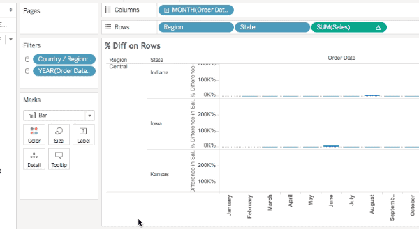
However, here are three additional views all still using the same pill layout and Quick Table Calculations  showing three different marks counts (567, 528, and 456):

Screen Shot 2016-08-16 at 11.59.11 PMScreen Shot 2016-08-17 at 12.00.55 AM

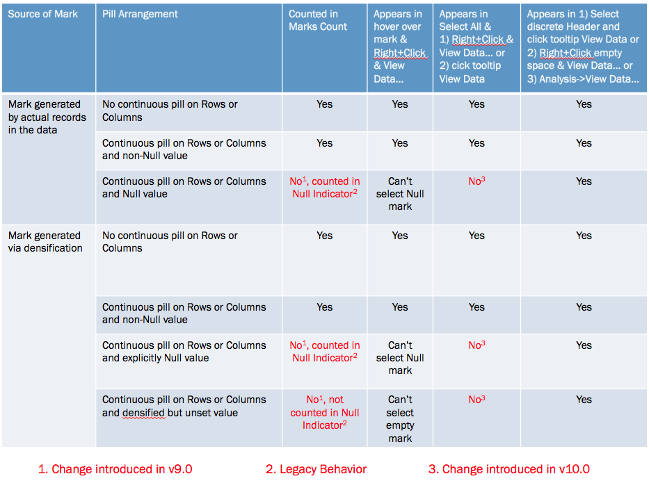
The marks count is changing based on a variety of factors, the different quick table calculations used (running total, difference, and percent difference) are a part of it but the underlying behavior depends on whether a mark is densified or not, the pill arrangement, and whether or not a densified mark has been assigned a value (including Null) or not. Prior to Tableau version 9.0 these all would have been counted in the marks count and the views would show 576 marks for each, Tableau v9.0 changed the behavior to only count the “visible” marks.

I’ll walk through the above there examples. In this one the Running Total has been moved from the Level of Detail to the Rows Shelf and there are 567 marks.

Screen Shot 2016-08-16 at 11.59.11 PM

The reason why is that even though those combinations of Region, State, and Month have been densified for states like Iowa that don’t have any sales in the first month(s) of the year (more on how I know that below) those densified marks don’t have any assigned value (even Null) so they are not counted in the marks count nor are they counted in the Special Values indicator in the lower right.

In this view using the Difference calculation there are 528 marks and the Special Values indicator shows 48 nulls (528+48 = 576). In this case the Difference calculation is using the LOOKUP() function that is returning Null for the densified values.

Screen Shot 2016-08-16 at 11.59.11 PM

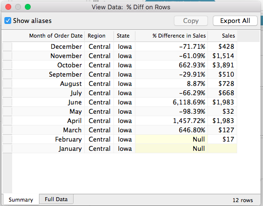
Finally in this view using the % Difference calculation there are 456 marks and the Special Values indicator shows 120 nulls (456+120 = 576). In this case the % difference calculation is spitting out extra nulls due to divide by 0 results.

Screen Shot 2016-08-16 at 11.59.11 PM

The difference is due to a change made in Tableau v9.0 where the marks count now only counts “visible” marks (Tableau’s term), where the definition of a “visible” mark is complicated, they are the “Yes” answers in the table below:

Screen Shot 2016-08-17 at 12.09.17 AM

Now one of the ways I’ve been used to checking for densification is selecting all the marks (either by Right+Clicking and choosing Select All or pressing Ctrl/Cmd+A) and then hovering over a mark and Right+Clicking and choosing View Data… or waiting for the tooltip to come up and using View Data. For example here’s the select all View Data in v9.0 for the % Difference on Rows view, the yellow cells indicate where data was densified and there are 576 rows:

Screen Shot 2016-08-17 at 12.12.24 AM

However, that doesn’t work anymore in Tableau v10.0, there was change made to the Select All functionality such that Select All only gets the “visible” marks, here’s that same view data in v10 and there are only 456 rows:

Screen Shot 2016-08-17 at 12.12.58 AM

So Select All doesn’t work the way it used to, and the marks count can change in “interesting ways” (and we haven’t gone into what things like formatting Special Values can do), so what can we do to spot densification? There are three workarounds for this, all documented in the right-most column of the table above:

  1. Select a discrete header or a range of headers, wait for the tooltip to come up, and click on the View Data icon.
  2. Right-click in the view (but not on a mark) and choose View Data…
  3. Use the Analyis->View Data… menu option.

All of these will show the densified values, here’s an animated GIF of selecting Iowa selected in the Difference on Rows view where we can see the  two Null values:

2016-08-17 00_21_03

However only one of those is actually densified, to tell that exactly we need to add a field that actually has data. In this case I’ve added SUM(Sales) to the Level of Detail Shelf and the View Data for Iowa now shows that it’s really only January that is densified, since there’s nothing at all in the January SUM(Sales) cell:

Screen Shot 2016-08-17 at 12.27.28 AM

Conclusion

The marks count is not a reliable indicator of the volume of densification and we need to resort to various selection mechanisms and the View Data dialog to more specifically identify how much has been densified. I’m not a fan of these changes: what I’d really like Tableau to do is to add a count of densified values to the status bar and details on what was densified to the default caption and the Worksheet->Describe Sheet… Until that time, though, hopefully this post will help you keep track of what Tableau is doing!

Here’s a link to the marks count workbook in v8.3 format (so you can open it up for yourself and see the differences in different versions).

At the Level – Unlocking the Mystery Part 2: Rank Functions

Many moons ago I did a first post exploring the non-obvious logic of the most secretive of Tableau table calculation configuration options: At the Level. A few weeks ago I was inspired by a question over email to dive back in, this post explores At the Level for the five rank functions: RANK(), RANK_DENSE(), RANK_MODIFIED(), RANK_UNIQUE(), and RANK_PERCENTILE(). The rank functions add a level of indirection to the already complicated behavior of At the Level and I don’t have any particular use cases, so…

If you are like me and won’t rest until you understand every detail of Tableau’s functionality, then this post is for you. Otherwise you may find this post unhelpful and/or confusing due to extreme table calculation geekery. You have been warned.

The particular challenge with ordinal functions like INDEX(), FIRST(), and the rank functions is that we absolutely have to understand how addressing and partitioning works in Tableau, and then we tack onto that an understanding of how the calculations work, and finally we can add on how At the Level works. For the first part, I suggest you read the Part 1 post on At the Level, it goes into some detail on addressing and partitioning. To understand the rank functions here’s the Tableau manual for table calculations (scroll down to the Rank functions section). Finally, read on for how At the Level works for rank functions.

Continue reading

Counting Pairwise Similar Votes in Tableau

This is another post inspired by a Tableau forums thread. Given a set of survey data that is in a “tall” format with a record for each voter & item (survey question) with their vote the goal is to end up with the sum of matching votes for each pair of voters. So if John & Karen both voted ‘yes’ on the same question that would count as 1 for that question, and then all other matching votes for the questions that John & Karen answered would be totaled up and that number put in a cell for the combination of John & Karen, like so:


The easiest way to do this would be using a join; however the data is from an OData source and those don’t support joins. Also data from OData sources has to be extracted and Tableau doesn’t currently support joining across extracts. The original poster indicated that doing any ETL wasn’t possible, the desire is to have everything just work in Tableau. So we turn to some alternatives, read on for how to build this with and without joins.

Approach

The way I approach this kind of problem is first to understand the goal and understand the data. The data seems pretty clear, and the goal is to end up with a matrix defined by the voter on Rows & Columns. So however many records there are in the data we want to see N^2 values where N is the number of voters. Given that the data source is OData (so no custom SQL) my first thought was to use the No-SQL Cross Product via Tableau’s data densification. That would requiring densifying both the voters (to make the matrix) and the items (to do the comparisons for each voter/item) and my initial attempts got way too complicated way too quickly so I bailed out on that. I came up with a slightly modified solution involving Tableau data blends, however I’m going to go through this first using a join-based solution because it’s easier to describe some of the subtleties involved (plus that will work for many data sources) and then the second time around with the blend-based solution

Join Solution

In this solution I set up the data so it has everything we need – all the combinations of votes and voters – then all we need to do is count records. Since we want to set up pairs of voters for each item, I set up a self-join on item:

This gets us the 47 combinations of voters & votes in the data. Now we can set up a view with the Voter dimensions from the original and the join:

Note that there are some empty cells here: the pairs Tom & Steave and Tom & Toney didn’t vote on any of the same items at all. We’ll come back to this later.

We only want to count voters that had the same vote, so the following Pairwise Vote Filter calc will return only those votes:

[Vote] = [vote (Sheet1$1)]

With that on the Filters shelf, we can set up a view using SUM(Number of Records):

There’s a bunch of empty cells here, what if we want 0’s to show? We can use Format->Pane Tab->Special Values->Text, but that will only work where there is data and we know there are some cells that don’t have data. To get those cells to be marks we can take advantage of Tableau’s domain completion by having a table calculation address on one of the voter dimensions.

We can use a simple table calculation like INDEX() (the field is called Domain Completion Trigger) and the default Compute Using of Table (Across) will address on the voter (Sheet1$1) dimension, padding out the marks:

With that in place we can now build the final view for the join. I set Format->Pane tab->Special Values->Text to be 0, changed the Mark Type to Square, edited the color to use a custom diverging palette (starting at 0), and turned off “Allow labels to overlap other marks” to have Tableau auto-swap the text color so the darker cells have white text:

So the data didn’t have quite all the granularity that we needed for display and we had to turn on data densification with a table calculation to pad it out. In the next section we’ll use Tableau’s ability to do even more padding.

Blend Solution

This uses a different approach. In this case, we set up the view so it has all the marks that we need (but not quite all the marks we’d want), blend in the data for the each half of a pair of voters and then use calculated fields to compute across the data and  “paint” the right values into the marks. It uses the original data as a primary source and then the domain completion technique outlined in the No-SQL Cross Product post to effectively get the necessary marks, then uses two self-data blends to get the comparison data that take advantage of the fact that Tableau data blends are computed after densification. For more information on that, see the Extreme Data Blending session from the 2014 Tableau Conference. https://tc14.tableau.com/schedule/content/1045.

Starting out I duplicated the Voter twice, naming one Voter (Rows) and Voter (Cols), then put those on Rows and Columns, respectively. We only see the 5 marks for the 5 voters:

Then we can use the same INDEX() calc to trigger domain completion:

We need to do the comparison at the level of voter *and* item, and for Tableau to compare across data sources the comparisons have to be done as aggregates, so that means that item has to be in the view. When we add Item to the view what we’re seeing in each cell is a mark for each time the the voter on Rows and Voter on Columns both had votes for the same Item. There are 47 marks here, just like the 47 rows we got from the self-join solution.

A problem here is that we lose some of the domain completion, we’ll work around that. (Where I’d tried to start was to do the second set of densification necessary domain complete on Item as well, but that got too complicated.)

The view just got a lot bigger here, that’s because of Tableau’s mark stacking behavior. We’ll fix that later with a table calculation filter.

Now we can set up a couple of self-blends by first duplicating the data source twice. It’s also possible to duplicate the data connection only (for example by directly connecting to the extract), however that requires more effort to set up. I named the duplicated sources Rows and Cols, and in each created calcs for Voter (Rows) and Voter (Cols), respectively. Then I could add in the Vote fields from each source and Tableau automatically blends the Rows source on Item, Voter (Rows) and blends the Cols source on Item, Voter (Cols). If I hadn’t named the fields the same then I could have used Data->Edit Relationships… Here’s a view showing for each voter pair the vote (Item), the votes from Rows, and votes from the Cols source:

This view lets us see what votes line up with what. So in row karen/column john, we can see that they both voted for items 21, 25, and 32, and had the same votes for each.

The next step is to build a test calculation for the view. Here’s the formula for Pairwise Similar Vote Test:

IF ATTR([blend Sheet1 (test_voting) (rows)].[Vote])
 == ATTR([blend Sheet1 (test_voting) (cols)].[Vote]) THEN 1 ELSE 0 END

We’re using ATTR() as an aggregation because a) that’s the default and b) we are comparing fields from two different sources and Tableau requires them to have some sort of aggregation applied.

In the view, we can see that the calculation is working accurately:

The Vote dimensions from the secondary are useful for checking the calcs, but they aren’t needed at this point so we can get rid of them:

Now to count up the votes in each cell. Here’s the Pairwise Similar Votes w/0 table calculation:

IF FIRST()==0 THEN
    WINDOW_SUM(IF ATTR([blend Sheet1 (test_voting) (rows)].[Vote])
      == ATTR([blend Sheet1 (test_voting) (cols)].[Vote]) THEN 1 ELSE 0 END)
END

This has a Compute Using on the Item so it partitions on Voter (Cols) and Voter (Rows). The inner IF statement is our same calc, those results get summed across all Items in each partition, and then the IF FIRST()==0 returns only a single non-Null value in each cell. Here it is:

We can then duplicate that view, make the marks Square, duplicate the Pairwise Similar Votes pill to the Color Shelf, set up a custom diverging color, duplicate the pill again to the Filters shelf to set it to filter for non-Null values, and we end up with this:

There are those empty holes where there are no Items for Tom & Steave and Tom & Toney. There’s no way that I know of using this particular blend to fill them in, because Item has to be a dimension in the view the domain completion is limited. This might be useful in some cases, I also came up with an alternative.

In this alternative instead of returning 0 when there are no pairwise similar votes the calc returns Null, here’s the revised Pairwise Similar Votes formula:

IF FIRST()==0 THEN
    WINDOW_SUM(IF ATTR([blend Sheet1 (test_voting) (rows)].[Vote])
      == ATTR([blend Sheet1 (test_voting) (cols)].[Vote]) THEN 1 END)
END

This has the same settings as the first, only now it won’t show any numbers. Then using the same process as before along with tweaking the color palette to start at 0 we can have a view that only shows where there are non-zero results, with white for everything else:

Conclusion

So there’s a couple of ways to go at this, the relatively easy way with a join and the more complicated way with the data blend. Personally, I’m in favor of voting up the Join Data from Different Sources feature request to allow joins across data sources, then even something like an OData source could be extracted twice and joined to create the desired view.

And the Tableau Public link: Pairwise Similar Votes.

Comparing Each Against Each Other: The No-SQL Cross Product

Here’s a problem that has been bouncing around in my brain since I first used Tableau. How do I compare the results of every permutation of one item vs. another? Here’s an example using Superstore Sales – I put Region on Rows and Columns, and SUM(Sales) on the Text Shelf, and only see four values: Screen Shot 2013-12-11 at 9.27.56 PM

What if I want to compare Sales in Central to those in East, South, and West, and Sales in East to South and West, and Sales in West to Sales in South simultaneously? We can compare two at a time using parameters or a self-blend, or one vs. the rest in different ways via sets or table calcs or calculated fields, but how about each against each other? What if we want a correlation matrix? Read on to find out how to do this without any SQL, and learn a little bit about domain completion.

Continue reading

Padding and Working with Null or Missing Values

Padding, Null/Missing Values

When We Need to Pad Data Outside Tableau

Some cases when we need to pad data “outside” Tableau, either in the data connection or underlying queries.

  • When doing future projections, in order to get future dates.
  • When combining two data sources that are both incomplete. An example is the basic falls view, where we want to look at fall rates and # of falls by unit over time. Some units may have no falls in the time period being reviewed, so we need to pad for the unit so that is always displayed. In addition, if there are no falls for the given time period for the unit, then Tableau won’t display headers for discrete dates for the unit, so we need to pad for the date. In addition, there might not be falls in a given unit when we don’t yet have the patient days (denominator for the fall rate), so we need to be sure to pad the date to get to the current date.
  • In order to get lines to draw properly in time-series data. (see a discussion link somewhere here)

More on padding data from Joe Mako – using Custom SQL to pad data:
http://community.tableausoftware.com/thread/104070?start=30&tstart=0

Most everything else in this section is about padding data in Tableau…

Padding Data

One way:
ZN(LOOKUP(SUM(IF [fieldname] = [value] THEN 1 ELSE 0 END),0))

Padding event information to get lines to draw
http://community.tableausoftware.com/message/174518#174518

Using ZN(LOOKUP()) to pad to get an area chart to draw:
http://community.tableausoftware.com/thread/119225

Use ZN() function to fill in zeroes (for example, to get the ref lines to show up) http://www.tableausoftware.com/support/forum/topic/filling-zero-blank-values

Working with Null/Missing Values

Post on how to create an average that includes setting missing days as 0:
http://community.tableausoftware.com/thread/116248

Getting from an “empty” cell to data:
http://community.tableausoftware.com/message/173105
ZN(), IFNULL(), etc. work when there is a Null value. When there is no data, LOOKUP(agg([field]),0) returns Null when there is no data and that can be wrapped in the ZN, etc. Alternatively the Format special values text can be used.

From http://community.tableausoftware.com/message/176503#176503
When working with blends where the secondary datasource has no corresponding rows, can use IFNULL(ATTR([secondary field])) as a calc in the primary to determine if there’s data returned, for example the following to return 0 for no value else return a value:
IF ISNULL(ATTR([secondary datasource field])) THEN 0 ELSE SUM([secondary datasourcefield]) END

more on padding data (getting Null values so Tableau will draw lines correctly):
http://community.tableausoftware.com/thread/104070?start=0&tstart=0

More on padding (at least for Tableau 6), from http://www.tableausoftware.com/support/forum/topic/trellis-plots comments by Joe Mako:

When dimensions are on Rows & Columns shelf, Tableau pads the domain. When one dimension is on the columns shelf, and one on rows shelf, tableau doesn’t pad the domain.

Having both dimensions used for addressing (right-side list box in Advanced…->Compute using) effectively causes Tableau to pad the domain.

Notes from Mar 2012 WebEx w/Joe Mako

I don’t want to misrepresent Joe’s awesome knowledge here, if there are any mistakes in these notes from our conversation they are almost certainly mine.

Joe notes there’s some strangeness when there’s there are distinct groups, i.e. a one-to-many hierarchy like category/sub-category in superstore sales. Joe walked me through an example: Put Sub-category on columns, SUM(Profit) on rows, Category on LoD. Have 17 marks in a Bar chart. Change mark type to line, suddenly there are 51 marks.

Also, show missing values can do weird stuff in Tableau 7.0.

For dates, use DATEPART/DATETRUNC instead of Tableau’s options because Tableau’s options are harder to use for table calcs.

If a combination of dimensions doesn’t exist, Tableau can get weird fast with padding.
Example w/SuperStore Sales:
Put Customer on Columns, Container & Category on Rows. See blank cells, and Abcs, with 4514 marks. Create Index() calculated field, and put that on the Text shelf. Suddenly there are 15900 marks.

also, see table calc padding.twbx workbook

From Joe Mako post http://community.tableausoftware.com/message/186882#186882
– Arrangement of dimension pills on shelves, Rows, Columns, and shelf on the Marks card, eg making a crosstab
– Using a date pill for the compute using
– Show Missing Values for discrete date pills
– Your Mark type, Line and Polygon mark types will pad more with a dimension on the Level of Detail shelf, depending on your data contents.

Each combination here has different results and affects padding differently. Another factor is how is padded marks can be detected and handled either in filtering or in formulas, because the concept of “Missing” is not equal to Null. The order of operations needs to be considered.

Controlling padding/densification

Use discrete measures on Rows & Columns to prevent unwanted densification, post from Joe Mako: http://community.tableausoftware.com/message/223044

There’s a lot of undocumented functionality in terms of padding within Tableau, so be careful about using these last bits.

[loop category=”wikicontent” tag=”padding”]
[field title] – Added [field date]
[content]
[/loop]

Related posts:

[loop tag=”padding,densification,domain-completion,domain-padding,missing-values,show-empty-columns,show-empty-rows,show-missing-values,null,empty” exclude=”this” relation=”and” compare=”not” taxonomy=”category” value=”wikicontent”]

  • [field title-link][field thumbnail-link]

[/loop]