Tableau Sets can turn incredibly complicated interactions into a few mouse clicks that can reveal patterns in your data. However, if you’ve ever created a Set in a secondary data source and tried to use it across a blend in a primary, this is what you see:
Lots of grayed out items that can’t be touched. It’s like you’re at a party and have just met the hot-babe-of-appropriate-gender-of-your-dreams and they are totally into you, but only at the party, and not back at your place.
However, like many things in Tableau, with a little creativity you can get what you need, and there is a way where you can have your Sets anywhere you want.
If you’re not familiar with sets, then I suggest you start with Hot. Dirty. Sets. That was the title of a great session on sets by Russell Christopher and Michael Kravec at the Tableau Customer Conference in DC last month, the session video is up at http://tcc13.tableauconference.com/sessions. In their presentation Russell and Michael plumbed the depths of bad puns and went through a number of use cases. If you’re not familiar with Tableau version 8 sets, definitely watch the video. If you didn’t got to TCC, I suggest you watch this (vanilla) Tableau On-Demand training video on sets.
For this post I’ll attempt to avoid any more jokes about sets and show you how you can get jiggy with use sets from blended secondary data sources, and probably learn a bit more about data blending on the way.
![]()
In this tutorial I’ll be using the Superstore Sales and Coffee Chain data that ship with Tableau, with the Superstore Sales as the primary, Coffee Chain as the secondary. The Coffee Chain data is an Access database, and Tableau uses Microsoft JET for the driver for Access, Excel, and text files (this will change somewhat in 8.2). Microsoft JET has more limited functionality than other database connectors, so the first step is to extract that data into Tableau’s data engine. That will enable us to use the IN/OUT of sets.
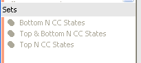
Then in the Coffee Chain database we create a set for the Top N States by Sum of Sales:
And here’s a view of that Coffee Chain data, where there are only 20 states:
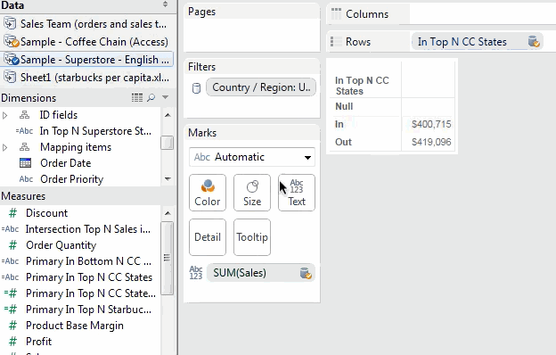
But when we set up a view based on Superstore Sales and switch over to the Coffee Chain data, any and all sets are taboo greyed out:
However, we can use sets in calculated fields. The In/Out of a Set returns a boolean value, and here’s a simple formula used for the In Top N CC States calculated field:
IIF([Top N CC States],"In","Out")
This is treated as a dimension in the CoffeeChain data, which can lead to all sorts of applications, including using as a filter, color, or in additional calculated fields.
Set from Secondary as Filter
Here’s a starting view from Superstore Sales as our primary data source:

Before putting the In Top N CC States on the Filter Shelf, though, in the Coffee Chain data click on State as a linking field:

Now you can drag the In Top N CC States calculated dimension from the Coffee Chain data onto the Filters Shelf, and here’s the filter setting:

And the view: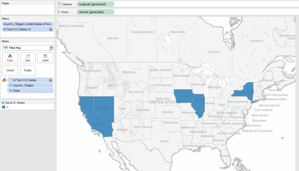
The worksheet is now only returning the 5 states from the primary and secondary data sources that meet the filter criteria from the set from the secondary data source. You’ve now used a Set from a secondary source!
Set from Secondary on Color
How about using the set calculation in the view? If we change the In Top CC States to All values, and put a copy of the pill on the Color Shelf then we see three different values: In, Out, and Null.
![]()
Why are there Nulls? This is one aspect of data blending that can be confusing. In the Superstore Sales data, there are 49 US states (48 contiguous states plus the District of Columbia). In the Coffee Chain data, there are 20 states. 5 of those are In the Top N CC States set (blue above), 15 of those are Out (light orange). That leaves 29 states in the Superstore Sales data have no corresponding rows in Coffee Chain. For the In Top Top N CC States set calculation, rather than assigning those 29 states to In or Out, Tableau assigns a value of Null to those states because they don’t have corresponding values, and in this case they get a dark orange color. This is the same behavior Tableau has for any linked dimension value from the secondary that doesn’t have corresponding values in the primary.
How can we help those Nulls come Out of the closet become part of the Out of the set?
This assignment of Null values is done in the primary data source, as there’s so way we can change it in the secondary (without doing some sort of padding in the secondary for all of those states). However, there is a way we can do that in the primary data source. Tableau does all the computation it can within each data source, then blends the data sources together, at which point things like calculations that refer to another data source are computed. We can create a calculation in the primary that refers to the set in the secondary, and test whether the set calculation is returning Null. Here’s the formula from Superstore Sales for the Primary In Top N CC States calculated field:
IFNULL(MIN(IIF([Sample - Coffee Chain (Access)].[Top N CC States],"In","Out")),"Out")
The inner IIF() is a row-level calculation that evaluates the In/Out of the Set, then that gets wrapped in MIN() because we’re working across the blend – Tableau requires us to aggregate all measures and dimensions used in calculated fields from other data sources. The IFNULL() then tests the result of the MIN(), and if there’s a Null from one of those 29 states that is in the primary but not the secondary, the IFNULL() Outs that one as well. Here’s a view with the calculation, where now everything is In or Out: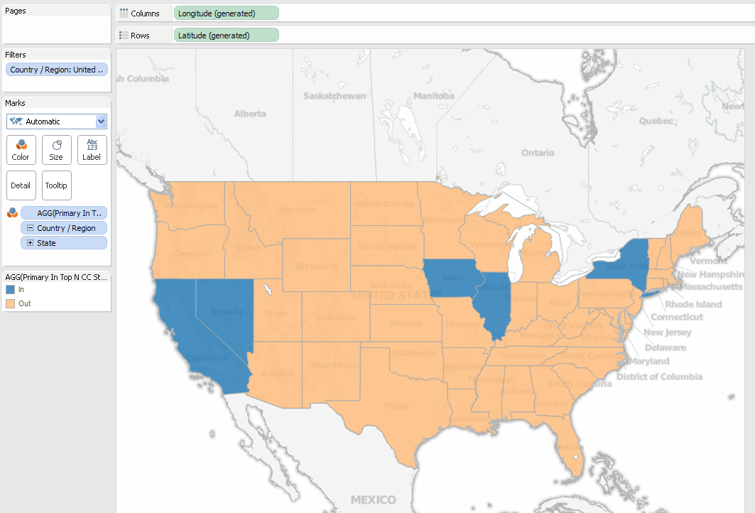
But you don’t have to be monogamous limit yourself to just one set. You can use combined sets from the secondary, for example in this view with CoffeeChain as the Primary I’m showing the top and bottom 5 states from the CoffeeChain data: 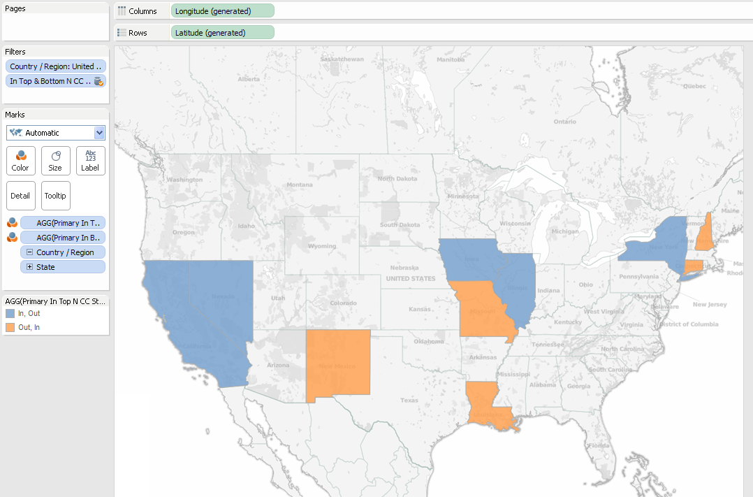
Now to talk about complications and workarounds before getting into some advanced cases:
Discrete vs. Continuous Measures
It’s important to note that the Primary In Top N CC States set calculation is a measure, because it’s using an aggregate from the secondary data source. 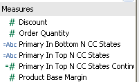
One effect is that Tableau won’t let us filter on discrete (blue) measures like the Primary In Top N CC States:
My understanding is that this has to do with Tableau needing to know the domain (range of values) of measures to build the filter. (Here’s a Tableau Idea to support this, vote it up!) However, we can filter on continuous measures, so if you want to use that primary filter you can change the calc to return numbers instead of strings, like this calc called Primary In Top N CC States Continuous:
IFNULL(MIN(IIF([Sample - Coffee Chain (Access)].[Top N CC States],1,0)),0)
And this will work fine as a filter:

Alternatively, you could use a table calc filter such as LOOKUP([Primary In Top N CC States],0) since discrete measures based on table calculations can be used as filters. I prefer the regular aggregate for performance reasons: Table calculation filters are applied after the data has been returned to Tableau, so that can lead to a lot of unnecessary traffic across the wire.
Using In/Out of Secondary Set in Primary Crosstab
In a simple view in Coffee Chain and our Top N set, we can quickly see the Sum of Sales for the In/Out of the set: 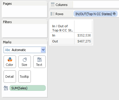
We can even set that up from the Superstore as Primary, using the In Top N CC States set calculation from the Coffee Chain secondary, all we need to do is make sure that State is turned on as a blending field and do a little extra filtering to get rid of those pesky Null values: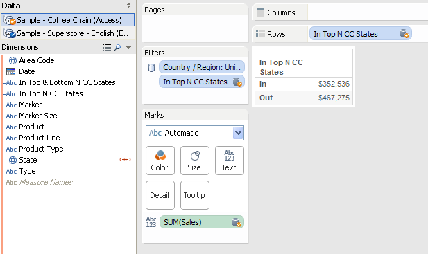
Advanced Uses for Secondary Sets
You can mix and match Sets from Primary and Secondary sources, here are three examples:
Cohort Analysis
In this view, we’re looking at trends for profits broken down by the performance reviews of our sales people, looking to see if there are any trends. The sales data comes from Superstore Sales, the performance reviews are coming from a secondary data source. The panes are created by the In/Out of the Top 40 Customers by Profit. The top pane shows the sales for the Top 40 customers, the bottom pane everyone else. The lines are colored by the In/Out of the Top 5 Salespeople:

Combining Sets Across Data Sources
To create a combined set, we can use a calculated field that evaluates the sets from the different data sources, like this one that gets the intersection of the Top N States for Sales from both Superstore Sales and Coffee Chain, assuming the Superstore Sales is primary:

And here it is used in a view, with the Top 5 States from each, only 3 states overlap:
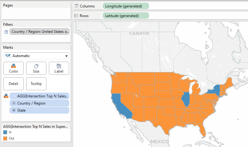
The Three Way
Why stop at only two sets from different data sources? In this view using Coffee Chain as primary, we’re coloring the states based on the In/Out of the Top N States by Coffee Chain Sales, the Top N States with highest # of Starbucks per capita (data from Statemaster.com), and Top N States by Superstore Sales. Three data sources, three sets:

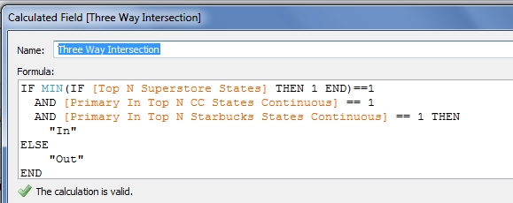
And, of course, you can build calculated fields as well, here’s one in Superstore:

Conclusion
Here’s a link for the Tableau Public workbook for Sets with your Secondary.
With a little creativity and a whole lot of jokes at the maturity level of the average American teenage boy, we can get more out of data blending and sets. If you’d like Tableau to have more support for secondary sets out of the box (and generally treat secondary data sources more like primary data sources), please vote for http://community.tableausoftware.com/ideas/2773.
Now, go forth and use sets in strange places any position you want in new ways!