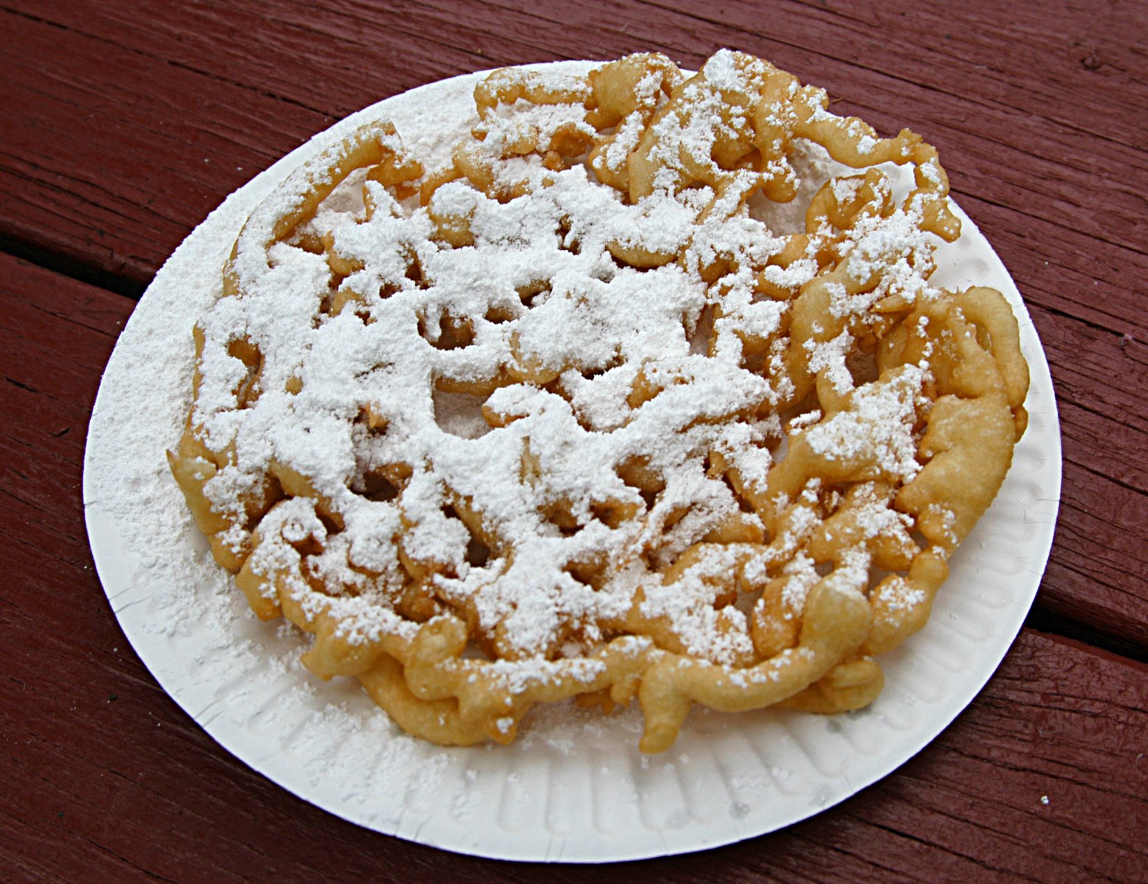
Growing up in New England, we had fried dough as the county fair’s mix of white flour, hot oil, and sugar. I wasn’t introduced to its crispier cousin until a trip through Pennsylvania and they became my favorite. But I’m not writing today about funnel cakes – delicious as they are – nor the funnel chart, I’m writing about how to build a funnel plot in Tableau.
What’s a funnel plot? A simple explanation is that a funnel plot is a form of control chart that alters the control limits based on the size of the sample. This is useful when there can be a wide variation in sample sizes between entities, for example when evaluating mortality rates for hospitals where one hospital may have 1,000 cases per year and another 100,000, or performance on a particular physician quality metric such as readmission rates per physician where the panel size may vary from 50 patients to over 1,000.
Some resources to learn more about funnel plots are:
- Funnel plots for comparing institutional performance by David J. Spiegelhalter
- Variation and its Discontents by Stephen Few and Katherine Rowell
- Public Health England (formerly Association of Public Health Observatories)
So far, I haven’t seen anyone else build a funnel plot in Tableau, and hopefully after reading this post you’ll have an understanding of why solving this was as sticky as a funnel cake covered in melted butter & sugar, have a better sense of how Tableau takes in data to draw marks, and be able to build a funnel plot yourself.

