Embarrassment is the feeling of getting caught doing exactly what you wanted to be doing.
– Author unknown
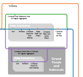
Today I get to celebrate a new Tableau 8.1 feature and reveal some obsessive compulsive behavior. My firstbigset of posts on this blog were about answering a really common forums question, how to customize grand totals. With Tableau 8.1’s new Two Pass Totals feature, you just might not need those posts anymore!
Finding and highlighting not well-known and/or novel solutions with Tableau and writing them up in such a way as to have something I could reference in answering user questions. Some big posts are the Customizing Grand Totals series (parts 1, 2, and 3,), User Defined Functions and Control Charts, and Conditional Formatting.
I think I’ve mostly met those goals…my first post was 16 months ago today, with 41 since, and I’ll continue posting but at a slower pace for a while. I’ve quietly announced this already, my bigger news is that I’m collaborating with Joe Mako on a series*** of ebooks on Tableau. We’ve been doing a lot of deep thinking and research to figure out how we approach and work with Tableau to build the amazing solutions we come up with so that we can share those fundamental techniques with others. In one sense, we’re writing the books that we wish would have existed when we started with Tableau, in another we’re trying to make more Tableau Jedi and Zen Masters. Our goal is to help users who want to have a better sense of how Tableau thinks and works “under the hood” so they can come to their own solutions. It’s a bit different in structure and scope than the other Tableau books out there, with more theory mixed in with the practice.
*** Between a day job, parenting, husband-ing, householding, and feeding my Tableau forums addicition, writing the book is taking longer than I’d initially thought, so instead of trying to write a magnum opus (and have to keep revising for the moving target of new functionality in new Tableau releases), we’re cutting things down to be able to ship something sooner. I’m really excited about this, here’s a little snippet (of a draft of) something you’ll see in the first book, due out this winter:
We’ll also have a full-size poster available for the real Tableau fanboys & fangirls out there. 🙂
Thanks to everyone who has given me encouragement and support, and I look forward to the next 100K!
At the Boston Tableau User Group meeting this past month, Anthony Chamberas and I got to talking and he posed this brain teaser: he wanted a dashboard to show a bar chart showing volume for each region, and be able to pick a region and then on a separate line chart see the performance of that selected region over time compared to the remaining amounts. I kept on thinking about it on the ride back to Maine, and between the Kennebunk exit on I-95 and home I put together this proof of concept while Catherine Rush drove and kindly listened to me think out loud.
The Superstore Sales data that ships with Tableau makes life seem so easy: Numbers like Profit and Sales that go up, up, and up. But we don’t only measure things by how high they go, but also how low. Working with hospital quality data, we have small numbers like infection rates that we want to get even smaller. We have rates like the percentage of patients who receive aspirin on arrival that we want to get larger. And then there are measures like how many medication error events are reported that we of course want to get smaller, but we wouldn’t trust if that number got too small too soon because it might indicate under-reporting. Tack on situations like hospital units that may go for months or years without having any events (but are still mandated to report), data arriving at different times, and a variety of units with differing numbers of decimal places, and putting everything on one dashboard gets a wee bit complicated.
This is a process post about how I solved this problem for a hospital quality dashboard with some brilliant help, a dose of calculated fields, and a number of iterations. I presented this dashboard at the Tableau Customer Conference last month, and offer up this post as a a contribution to Tableau Design Month.
That quote from Aliens was running through my head after our code control system had crashed without a backup. We were in the final days of testing a major release for one of the world’s largest telecom companies when a subtle defect in a hard drive controller had finally corrupted the disks enough that the contents could not be recovered, and our sysadmin hadn’t been doing regular backups because of competing priorities. I was way in over my head as a fill-in release manager while the usual guy was on vacation. I was convinced we were going to have to tell the customer that we would delay delivery by 2+ months, and along the way blow a big hole in our revenue and future deliverables.
Game over.
Then someone changed my life. One of the project leads, a rugby player and bartender from MIT, sat down with me and said, “There is a way. There’s always a way.” I can still remember two things clearly from that moment: the color of the walls (a beige made darker by the shadows cast by the fluorescent light fixtures) and his eyes. I wouldn’t call what was in them confidence, more a quiet certitude. I thought about that last week when hearing Walter Isaacson describing Steve Jobs saying “Don’t be afraid.” to the Corning CEO.
There’s always a way.
User defined functions have been a feature request for Tableau for a long time now. As much as we can share workbooks, and post function formulas, none of that has really worked as easily as we’d like. Read on to get access to over 50 calculations for computing run and XbarMR (individuals and moving range) charts, and learn how you can build your own shareable & re-usable sets of user defined functions. There’s also a preview of how the upcoming Tableau version 8.1 will enhance this process!