

A funnel cake with powdered sugar, nom nom nom!
Growing up in New England, we had fried dough as the county fair’s mix of white flour, hot oil, and sugar. I wasn’t introduced to its crispier cousin until a trip through Pennsylvania and they became my favorite. But I’m not writing today about funnel cakes – delicious as they are – nor the funnel chart, I’m writing about how to build a funnel plot in Tableau.
What’s a funnel plot? A simple explanation is that a funnel plot is a form of control chart that alters the control limits based on the size of the sample. This is useful when there can be a wide variation in sample sizes between entities, for example when evaluating mortality rates for hospitals where one hospital may have 1,000 cases per year and another 100,000, or performance on a particular physician quality metric such as readmission rates per physician where the panel size may vary from 50 patients to over 1,000.
Some resources to learn more about funnel plots are:
- Funnel plots for comparing institutional performance by David J. Spiegelhalter
- Variation and its Discontents by Stephen Few and Katherine Rowell
- Public Health England (formerly Association of Public Health Observatories)
So far, I haven’t seen anyone else build a funnel plot in Tableau, and hopefully after reading this post you’ll have an understanding of why solving this was as sticky as a funnel cake covered in melted butter & sugar, have a better sense of how Tableau takes in data to draw marks, and be able to build a funnel plot yourself.
Here’s a very high level overview of how funnel plots are produced:
- Get the raw data.
- Bin the data.
- Compute the control limits for each bin. The calculation used depends on the data you’re analyzing: For proportions, use a standard error; for counts, rates, and indirectly standardized ratios, use a Poisson distribution. For this post, I’m only covering the funnel plot for proportions.
- Plot the original data as points and the control limits as lines.
How Excel Draws Data
In funnel plots spreadsheets for Excel such as the ones provided by Public Health England, or Stephen Few & Katherine Rowell, the raw data exists as one table, while there is a separate table with 50 or 100 bins for computing the control limits whose values all depend on the raw data (screenshots from the Few/Rowell spreadsheet):
Then the final view is plotted from the two tables. The points come from the raw data, the mean and control limits lines are 5 different data series from the control limits table: 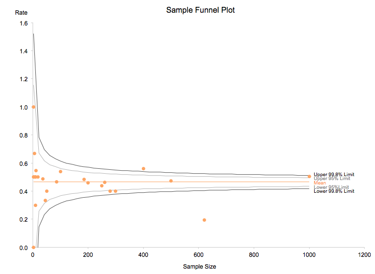
This highlights one of the strengths of Excel: We can take data in an arbitrary set of cells, run come computations on it to generate results into another arbitrary set of cells with whatever range we want, and then arbitrarily plot some arbitrary set of those cells in a meaningful way. So even though there are 25 rows with 25 data points in the raw data table and 50 rows with 250 data points in the control limits table, Excel will happily plot everything on the same chart because we’ve told it what X and Y axis values go together inside all those SERIES() formulae:
How Tableau Draws Data
Tableau has a different model of organizing and displaying data:
- The number of marks displayed for a measure is the number of distinct combinations of values of the primary data source dimensions in the view (after all filters have been applied).
- Each view has a single primary data source with 0 or more secondary data source that are blended in via a form of a left-join. One key difference from a regular left-join is that dimensions from secondary data sources do not increase the # of marks in the view.
What does this mean? If I plot those 25 data points in Tableau, I get 25 marks: 
So how to add the lines for the control limits? We can’t arbitrarily add another 250 data points inside Tableau to draw the lines for the control limits without doing some pre-processing to union some extra rows in, or doing some data reshaping inside or outside Tableau, for example to use domain padding. Tableau’s data blending is a form of a left-join that does not increase the level of detail so that won’t work either. And in any case, since those 250 data points depend on the original data, the table calculations that would be necessary to cross the original data points to the 250 additional data points could quickly get very complicated.
Beyond the data, there are some other complications with regards to display: To get a smooth curve, we can’t use reference lines – in one of my early experiments I tried to have a bazillion reference lines to fake a curve and that was ugly. Another option I explored was a double dual axis, and those in Tableau can end up looking pretty messy with lots of unwanted marks.
This is one place where Excel is certainly more flexible.
To kick the difficulty level up a notch, I wanted a solution that I could easily apply to a variety of data sets (like my work with Statistical Process Control Charts), so anything that required a bunch of pre-processing or overly complicated table calculations was not an option. This was a low priority side project for me, so for the last two years every few months I’d open up my proof of concept workbook, stare at it for a while, try out an idea or two that wouldn’t work, and then close the workbook. It wasn’t until reading Stephen Few & Katherine Rowell’s paper that the idea light bulb came on: Instead of trying to tack on a bunch of rows, I’d work with the data in place. In other words, those 5 series (or measures) for the mean and control limits lines would be plotted with as many points as there were in the data. So if the data source had low cardinality, the lines would be more jagged, but if the data source had high cardinality, the lines would look as good as the Excel worksheets.
And a couple of hours later, I had a working demo in Tableau: 
To keep performance up, I decided to keep the same model as the other worksheets and bin the data, so the process for building funnel plots in Tableau looks a little different:
- Get the raw data.
- Sort the data for performance & validation.
- Compute the bin sizes, trying for 50 bins but being ok with only as many bins in use as there are data points.
- Figure out what bin each data point falls into.
- Compute the control limits for the bins that are in use.
- Plot the data using the denominator for the X-axis values of both the data points and the lines, while the Y axis is specific to the proportion or the control limit.
In the next section I’ll walk through the calculations to build the funnel plot for proportions. The funnel plots for rates, counts, and indirectly standardized ratios require a Poisson distribution calculation that is not available in Tableau, however it is possible in R and will be the subject of a future post.
Building the Funnel Plot for Proportions in Tableau
To create the funnel plot, I’m using the technique outlined in my User Defined Functions post. In Tableau 8.0, this lets me (or you) use all the table calculations in just a few steps, without having to copy & paste a bunch of fields and make sure all the names are correct. This technique will also work (with some modifications) in Tableau 7.0 as well.
The Raw Data
There are only three fields that are necessary in your raw data source:
- Data Point ID – Some sort of unique identifier of each data point. This might be a hospital or provider name, etc.
- Numerator – the # of incidents or events
- Denominator – the sample size for each event.
If you have a proportion in your data, that will be ignored, the user-defined functions data source re-computes it from the numerator and denominator.
Loading in the Funnel Plot Functions
- Download the Funnel Plot for Proportions.tds and put it in your …/My Tableau Repository/Data Sources folder.
- Download the Funnel Plot for Proportions.tde and put it in your …/My Tableau Repository/Data Sources folder.
- In Tableau, connect to your raw data.
- Connect to to Funnel Plot for Proportions data source you saved in step 2.
- Copy the Blend Field dimension from the Funnel Plot data source to your raw data source. Alternatively, in Tableau version 8.1 and above you can just select all the measures from the Funnel Plot data source and copy them into you raw data source.
- In the Funnel Plot data source (or the raw data if you copied the measures), edit the Numerator measure to change the formula to point the appropriate numerator field from your raw data.
- In the Funnel Plot data source (or the raw data if you copied the measures), edit the Denominator measure to change the formula to point the appropriate numerator field from your raw data.
Building the Validation & Aliasing Crosstab
To make sure the calculations are accurate and to work around an issue with formatting measure names, we’ll first set up a crosstab, then duplicate that to build the funnel plot.
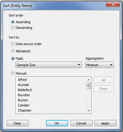
- Start a new worksheet and from the raw data source, drag the data point ID dimension – Entity Name in this case – onto the Rows Shelf.
- To help with validating the table calculations and improve their performance, sort the Data Point ID dimension on the denominator dimension – Sample Size in this case – using Ascending/Min:
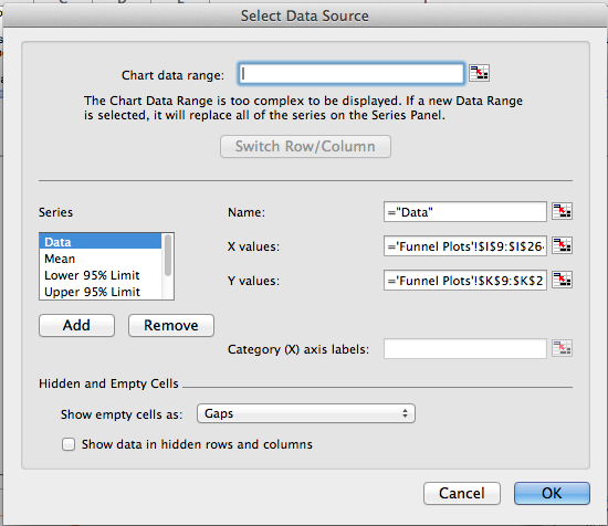
- In the Funnel Plot data source, in the Dimensions window click on the blending icon next to the Blend Field.
- From the Funnel Plot data source, add the Numerator, Denominator, and Rate. You might also add the original numerator, denominator, and rate (if it exists) from the raw data to validate that everything is working as expected:

- Now from the Funnel Plot data source, add the following six measures to the Measure Values card: Denominator Axis Padding, Mean of Proportion, Lower 95% Limit, Lower 99.8% Limit, Upper 95% Limit, Upper 99.8% Limit. Tableau will give them all a default Compute Using of Table (Down).
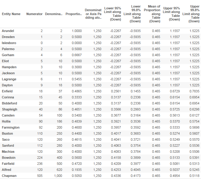
- Set the Compute Using for each of those Measures to the data point ID dimension – Entity Name in this case.
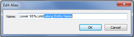
- The measure names for the table calculations all have the Compute Using text – “along Entity Name” in them. To use the Measure Names as labels in the view, we need to set their alias. Right-click on each column header and choose Edit Alias…, then delete the extra text.
 We could edit the aliases from the Color Shelf later on, I like to do it at this point to have a clear validation view.
 - Once you’re done that, you’ll have a crosstab like this that is ready to duplicate to build the view (for this view, I’ve also added the Significance/Outlier field that also has a Compute Using on the unique data point ID):

Building the Funnel Plot for Proportions
I liked the design of the Few/Rowell spreadsheet, so the instructions here demonstrate how to build that particular viz.
- Duplicate the crosstab worksheet you just built.
- In the copied worksheet, drag the Measure Values pill from the Text Shelf onto the Rows Shelf. Tableau will draw a set of bar charts.
- Drag the Measure Names pill from the Columns Shelf onto the Color Shelf. Tableau will now have colored stacked bars.
- Drag the raw data point id (Entity Name in the example) dimension pill and the Significance/Outlier pill from the Rows Shelf onto the Level of Detail. Now there will be a single stacked bar.
- From the Measure Values card, drag the Denominator pill onto the Columns Shelf (or the denominator from the primary). Now Tableau will show a view with shape marks:

- Drag the Numerator pill off the Measure Values card onto the Level of Detail Shelf, so it can be displayed in the tooltip later on.
- Drag the Denominator Axis Padding pill to the Level of Detail Shelf. Now you’ll see something that looks a lot closer to a funnel plot:

- Right-click on the Denominator axis and choose Add Reference Line… The Add Reference Line dialog appears.
- Add a reference line for the Denominator Axis Padding Measure, with a Label of None and Line of None.

Now the view has some breathing room for the labels we’ll add later. - Drag the Proportion/Percentage pill (or the equivalent measure from the the primary) onto the Rows Shelf to the left of the Measure Values pill.
- Right-click on the Measure Values pill and choose Dual Axis.
- Right-click on the right-hand Value axis and choose Synchronize Axis.
- Right-click once more on the Value axis and uncheck Show Header to hide the axis.
- On the Measure Values section of the Marks Card, change the Mark Type to Line. Now we see the funnel plot:
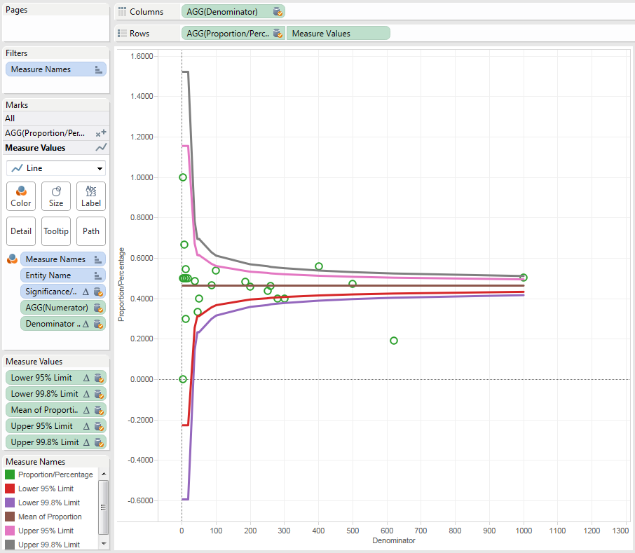
- Clean up the formatting of the line marks – use the size slider to shrink the lines, edit the colors, change the Rate axis range to be 0 to 1 if you want, etc.
- On the Measure Values section of the Marks Card, Ctrl+drag a copy of the Measure Names pill onto the Label Shelf. Click on the Label Shelf Button to set the Marks to Label to Line Ends, and label the end of lines
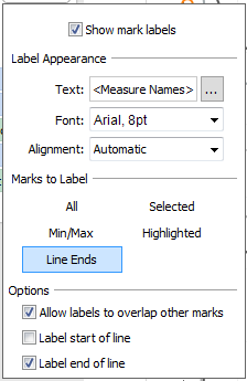 Depending on the space available, you may need to manually shift the labels so they don’t overlap.
 - Here’s the funnel plot:

- Do any extra cleanup that you need to do. For example, you could put the Significance/Outlier field on the Shape or Color Shelves to further call out the outliers, format the tooltips, etc.
Now you can build your own funnel plots in Tableau, here’s a link to the funnel plots workbook on Tableau Public. The rest of the post has some extra details on what’s happening under the hood.
Smoothing the Lines
For this made up data with 25 data points, the lines aren’t particularly smooth – for example, between 45 and 50 on the X-axis we can see a “hitch” in the lines:![]()
This is due to having so few data points. For data sets with 50 or more data points, the lines should be mostly smooth. A future post will cover how to pad out the data to get a very smooth line for display purposes, it’ll be using the techniques demonstrated by Noah Salvaterra and Joe Mako in the comments on the Tableau Public blog post on Fitting a Normal Curve to a Histogram.
The Calculations
For completeness’ sake, here are the calculations and what they do. I’ve ordered the calcs so the ones with the most nesting are below, the calcs that are least dependent on other calcs are at the top.
Numerator
 // replace this field with the numerator - # of incidents, # of events from your data
 // this must be an aggregate calculation
 MIN(1)
Denominator
 //replace this field with the denominator (sample size) from your data
 //this must be an aggregate calculation
 MIN(1)
Proportion/Rate
 [Numerator]/[Denominator]
Minimum Denominator
 PREVIOUS_VALUE(WINDOW_MIN(SUM([Denominator])))

Optimized calc to return the smallest denominator in the data to every row. Used for computing the bins.
Maximum Denominator
 PREVIOUS_VALUE(WINDOW_MAX(SUM([Denominator])))

Optimized calc to return the largest denominator in the data to to every row. Used for computing the bins.
Denominator Axis Padding
 //used as a hidden reference line to pad out the axis so the labels have space
 PREVIOUS_VALUE([Maximum Denominator] * 1.25)

This will end up on the Level of Detail Shelf to generate a hidden reference line. Returns the same value for every row.
Denominator Bin Increment
 // determines what the increment for each standard error will be, trying for 50 bins to get
 // 50 points for the upper and lower control limit lines
 PREVIOUS_VALUE(ROUND(([Maximum Denominator] - [Minimum Denominator])/50))

Optimized calc that dynamically figures out the bin size based on the range of the data.
Denominator Calculated Bin
 //what bin a given point will fall into
 (INT([Denominator]/[Denominator Bin Increment])*[Denominator Bin Increment])+[Minimum Denominator]

This is computed for each bin.
Mean of Proportion
 //this is the average of the rates
 PREVIOUS_VALUE(WINDOW_AVG([Proportion/Percentage]))

Optimized calc that returns a single value to every row.
Standard Error
 //standard error computation
 IF [Denominator Calculated Bin] == LOOKUP([Denominator Calculated Bin],-1) THEN
     PREVIOUS_VALUE(0.0)
 ELSE
     SQRT([Mean of Proportion]*(1-[Mean of Proportion])/[Denominator Calculated Bin])
 END

This is the key that makes the funnel plot for proportions. Rather than computing the standard deviation or standard error from the entire range of data for the prior, a separate standard error is computed for each bin. The optimization for this calc lets it only compute a new standard error when there's a new bin, otherwise it returns the prior value. If the unique data point ID is not sorted in advance, then there won't be any optimization but the calc will still work.
Upper 95% Limit
 IF [Standard Error] == LOOKUP([Standard Error],-1) THEN
     PREVIOUS_VALUE(0.0)
 ELSE
     [Mean of Calculated Rate]+1.96*[Standard Error]
 END

This is an optimized calc that only computes a new limit when there is a new value of the Standard Error. The other upper and lower limit calcs use similar computations.
Significance/Outlier
 IF [Rate] < [Lower 99.8% Limit] THEN
     "Low (0.001)"
 ELSEIF [Rate] < [Lower 95% Limit] THEN
     "Low (0.025)"
 ELSEIF [Rate] > [Upper 99.8% Limit] THEN
     "High (0.001)"
 ELSEIF [Rate] > [Upper 95% Limit] THEN
     "High (0.025)"
 ELSE
     "Normal"
 END

Uses the other calcs to return a discrete field for each calc. This could be used in a text table, as a tooltip, on the Color or Shape Shelf for the Rate marks, etc.
Conclusion
Funnel plots are a helpful way to evaluate variation when there are large differences betweens samples, and now we can make use of them in Tableau! Thanks to Ramon Martinez for his timely research, David Napoli for help with R, and Stephen Few and Katherine Rowell for their inspiration. Here are the files referenced in this post:
- Funnel Plot for Proportions.tds
- Funnel Plot for Proportions.tde
- funnel plot for proportions on Tableau Public
In the coming weeks I plan to add a couple of additional posts on the subject, one on using the R integration in Tableau 8.1 to generate funnel plots for counts, rates, and indirectly standardized ratios, and an additional post on making smoother curves.
Jonathan: Sweet work. Will try it w/ one of my data sets and let you know how it goes.
You have got to be kidding !!!
This is out of the box in Spotfire
Yet another example of the hype and disfunction of Tableau for graphical analysis !!
Hi Michael, I definitely agree that there has been a ton of hype about Tableau. Where you wrote “Yet another example of the hype and dysfunction…” I’m imagining you have in mind other examples of where Tableau doesn’t do graphical analysis as well as Spotfire does, could you share some with me? When I was evaluating visual analytics tools a few years ago Spotfire was one of my final candidates (it ended up getting ruled out due to cost at the time, we had a very *very* small budget). I know that just seeing some demos and poking at a product isn’t enough to really see what it can do, so when someone like you comes along who has some clear ideas about what it can do I’m curious.
Jonathan
Hi Jonathan
I created the PHE Excel funnel plot templates with some colleagues and with the help of David Spiegelhalter a few years back. I am just getting to grips with Tableau and have been wondering how to replicate. I have seen plots in Instant Atlas (we helped them) and Qlikview (again we helped) but not tableau so this article is very helpful. I can’t quite get my head around what you are doing – be good to swap notes?
Sure! I’ll email you.
Jonathan
Jonathan- thanks for your work and generous sharing. As an analyst at a large hospital system- I really appreciate being able to follow in your path. I had never heard of funnel plots, but they seem well suited for many of our analyses (comparing hospital performance). I’m also using your control charts template- again very generous of you to put so much effort in and share it. Hopefully your work will contribute to improved patient outcomes in our system.
Btw the first link is broken. Here’s a working one:
http://medicine.cf.ac.uk/media/filer_public/2010/10/11/journal_club_-_spiegelhalter_stats_in_med_funnel_plots.pdf
Hi Phil, thanks for your kind words and the updated link! And if you’re at all interested, please do blog about your work–I know it’s difficult given PHI and confidentiality, and I think there are many, many ways we can improve our workflows (and hopefully patient outcomes as well) by sharing tips & techniques.
Thank you for your posts on Tableau they have been really helpful and easy to follow. I created Process Control Charts by following your guide and I’m now trying to create funnel plots. However we are looking at rates and not proportions – were you able to make any progress with creating funnel plots for rates?
Hi Sarah,
Working on the funnel plots has been a side project and it’s been way to the side for awhile. I could pick it up again in the next few weeks, a requirement is going to be using R, is that ok in your environment?
Hi Jonathan,
Yes, thank you, if you could that would be really helpful. I came across your post on ‘Tableau and R’ so I’ll have a further look into that and try and get my head around how it works.
Got my hot headed friend spouting Funnel chart and Funnel plot are the same thing, luckily stumbled upon your website.
Hi Jonathan (and nice to “see” Julian in the comments),
Wonderful blog post. I’ve had this one stored in my favourites and have been meaning to come back to it for some time.
You mention in your blog above that “a future post will cover how to pad out the data to get a very smooth line for display purposes”. Did you get any further with this?
Although I understand how the underlying table calculations work and replicate the old PHE/APHO workbook, I’m afraid I couldn’t understand how to apply the principles of Salvaterra and Mako’s respective workbooks to achieve this smoothing effect.
Any pointers?
Hi Warren,
I have not come back to this to pad out the data to smooth the line. The challenge is that we need to:
a) create calculated field(s) that will allow us to trigger densification, then trigger the densification
b) modify the existing calculations to deal with the densified values
c) validate the results
d) create nested table calculations to then properly create the lines
e) validate the results
It’s do-able, but my experience has been that views created in this way are “fragile” that changing a filter, moving a pill and/or adding a pill can totally break the view. So for me the juice has not been worth the squeeze given other priorities. Using the above steps as a guide, at what point are you running into problems?
Jonathan
Hi Jonathan!
I really love this blog post, thank you for providing this walk through.
I have one question –
I have a numerator and denominator that is causing the Standard Error calculation to return null.
The mean of calculated rate is calculating just fine, as the denominator calculated bin.
Any idea what could be breaking the standard error calculation?
Thanks in advance for your help.
Hi Daniel, debugging table calculations without details of what dimensions are in the view, what your calculations are, what the compute using(s) of the table calculations are, etc. is incredibly difficult, there are just so many variables in play. Feel free to send me an email at jonathan (dot) drummey (at) gmail (dot) com and I’ll take a look when I can.
Pingback: Funnel plots for count data in Tableau – brute force approach – Part C