This summer while beta testing Tableau v10 I was very curious about the new mark sizing feature. Bora Beran did a new feature video during the beta showing a Marimekko chart aka mosaic plot. There have been a few posts on building Marimekko charts in the past by Joe Mako, Rob Austin, and a not-quite-a-Marimekko in an old Tableau KB article, but the two charts required extra data prep and the KB article wasn’t really a Marimekko, so I was really interested in what Tableau v10 could do.
I asked Bora for the workbook and he graciously sent it to me. (Thanks, Bora!) I found a problematic calculation, in particular a use of the undocumented At the Level feature that could return nonsensical results if the data was sparse. I rewrote the calculation, sent it back to Bora, and he came back asking if I’d like to write a blog post on the subject. (Thanks, Bora.) There are two lessons I learned from this: 1) the Tableau devs are happy to help users learn more about the new features, and 2) if a user helps them back they will ask for more. Caveat emptor!
Over the course of the next few weeks I did a lot of research, created a workbook with several dashboards & dozens of worksheets, arranged for Anya A’Hearn to sprinkle some of her brilliant design glitter and learned some new tricks, and wrote (and rewrote) 30+ pages (!) of documentation including screenshots. Martha Kang at Tableau made some edits and split it into 3 parts plus a bonus troubleshooting document and they’ve been posted this week, here are the links:
As part of the design process Anya and I had some conversations about how to color the marks. The data set I used for the Marimekko tutorial is the UC Berkeley 1973 graduate admissions data that was used to counter claims of gender bias in admissions so gender is a key dimension in the data and I didn’t want to use the common blue/pink scheme for male/female. It’s a recent historical development and as a father I want my daughter to have a full range of opportunities in life including access to more than just the pale red end of the color spectrum in her clothes, tools, and toys. Anya and I shared some ideas back and forth and eventually Anya landed on using a color scheme from a Marimekko print she found online.
Anya is going into more detail on the process in her Women in Data SF talk on Designing Effective Visualizations on Saturday 27 August from 10am-12:30pm Pacific, here’s the live presentation info and the virtual session info. It’s going to be a blast so check it out!
So that’s how I spent my summer vacation. Can’t wait for next year!
Tableau’s data densification is like…nothing else I’ve ever used. It’s a feature that is totally brilliant when it “just works” like automatically building out a running sum on sparse data and mind-taxingly complicated when a data blend’s results go haywire because densification was accidentally triggered.
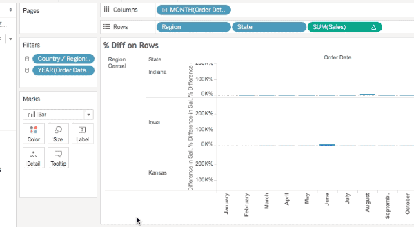
What I’ve historically taught users is to always ALWAYS look at the marks count in the status bar as a first way to detect when data densification occurs. Here’s Superstore Sales data with MONTH(Order Date) on Columns, Region and State on Rows, there are 499 marks and we can see that the data is sparse by the class that are missing Abcs:
If I add SUM(Sales) to the Level of Detail Shelf and set it to a Running Total Quick Table Calculation with the default Compute Using of Table (Across) so it’s addressing on Order Date then I see 576 marks and all the Abcs are filled in, this is Tableau’s data densification at work:
However, here are three additional views all still using the same pill layout and Quick Table Calculations showing three different marks counts (567, 528, and 456):
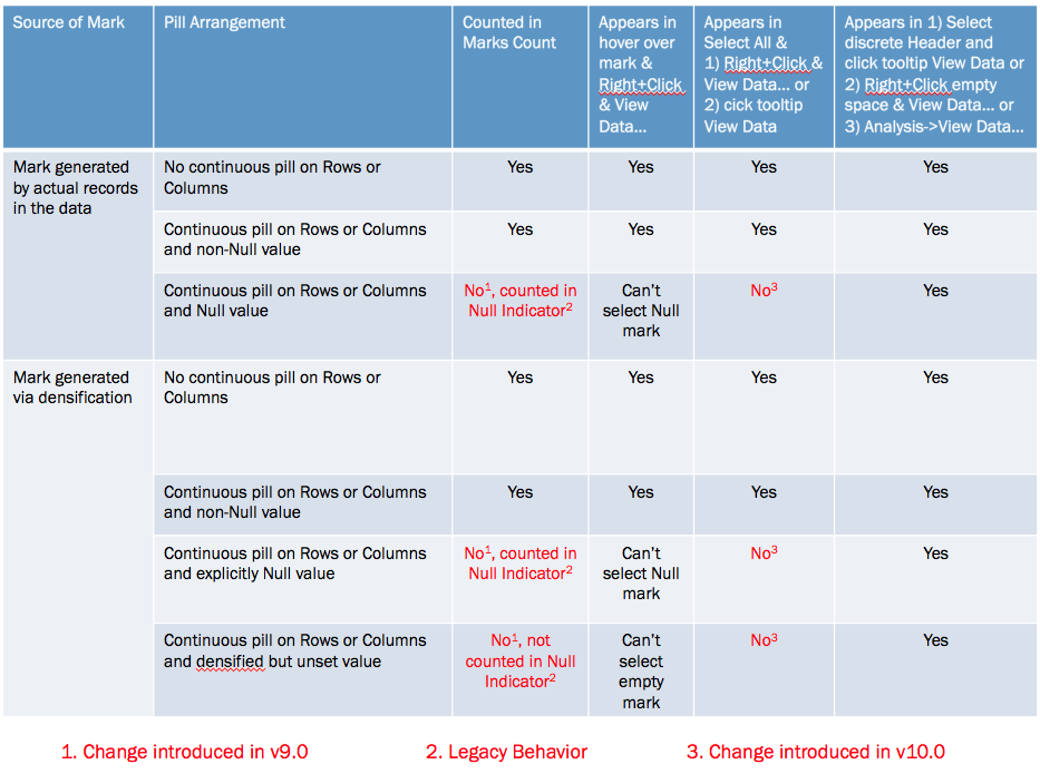
The marks count is changing based on a variety of factors, the different quick table calculations used (running total, difference, and percent difference) are a part of it but the underlying behavior depends on whether a mark is densified or not, the pill arrangement, and whether or not a densified mark has been assigned a value (including Null) or not. Prior to Tableau version 9.0 these all would have been counted in the marks count and the views would show 576 marks for each, Tableau v9.0 changed the behavior to only count the “visible” marks.
I’ll walk through the above there examples. In this one the Running Total has been moved from the Level of Detail to the Rows Shelf and there are 567 marks.
The reason why is that even though those combinations of Region, State, and Month have been densified for states like Iowa that don’t have any sales in the first month(s) of the year (more on how I know that below) those densified marks don’t have any assigned value (even Null) so they are not counted in the marks count nor are they counted in the Special Values indicator in the lower right.
In this view using the Difference calculation there are 528 marks and the Special Values indicator shows 48 nulls (528+48 = 576). In this case the Difference calculation is using the LOOKUP() function that is returning Null for the densified values.
Finally in this view using the % Difference calculation there are 456 marks and the Special Values indicator shows 120 nulls (456+120 = 576). In this case the % difference calculation is spitting out extra nulls due to divide by 0 results.
The difference is due to a change made in Tableau v9.0 where the marks count now only counts “visible” marks (Tableau’s term), where the definition of a “visible” mark is complicated, they are the “Yes” answers in the table below:
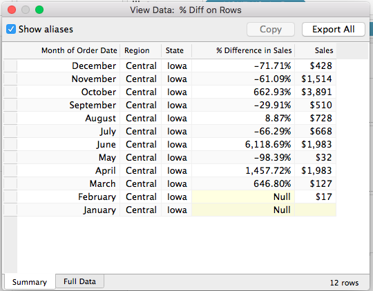
Now one of the ways I’ve been used to checking for densification is selecting all the marks (either by Right+Clicking and choosing Select All or pressing Ctrl/Cmd+A) and then hovering over a mark and Right+Clicking and choosing View Data… or waiting for the tooltip to come up and using View Data. For example here’s the select all View Data in v9.0 for the % Difference on Rows view, the yellow cells indicate where data was densified and there are 576 rows:
However, that doesn’t work anymore in Tableau v10.0, there was change made to the Select All functionality such that Select All only gets the “visible” marks, here’s that same view data in v10 and there are only 456 rows:
So Select All doesn’t work the way it used to, and the marks count can change in “interesting ways” (and we haven’t gone into what things like formatting Special Values can do), so what can we do to spot densification? There are three workarounds for this, all documented in the right-most column of the table above:
Select a discrete header or a range of headers, wait for the tooltip to come up, and click on the View Data icon.
Right-click in the view (but not on a mark) and choose View Data…
Use the Analyis->View Data… menu option.
All of these will show the densified values, here’s an animated GIF of selecting Iowa selected in the Difference on Rows view where we can see the two Null values:
However only one of those is actually densified, to tell that exactly we need to add a field that actually has data. In this case I’ve added SUM(Sales) to the Level of Detail Shelf and the View Data for Iowa now shows that it’s really only January that is densified, since there’s nothing at all in the January SUM(Sales) cell:
Conclusion
The marks count is not a reliable indicator of the volume of densification and we need to resort to various selection mechanisms and the View Data dialog to more specifically identify how much has been densified. I’m not a fan of these changes: what I’d really like Tableau to do is to add a count of densified values to the status bar and details on what was densified to the default caption and the Worksheet->Describe Sheet… Until that time, though, hopefully this post will help you keep track of what Tableau is doing!
Here’s a link to the marks count workbook in v8.3 format (so you can open it up for yourself and see the differences in different versions).
In helping other Tableau users as part of DataBlick or my pro-bono contributions to the community I get a lot of Tableau workbooks in a lot of versions, in the last two weeks I’ve received v8.3, v9.0, v9.2, v9.3, and v10beta workbooks and when I edit them I need to make sure I’m using the same version of Tableau. And I’m often frustrated because I’ll open the workbook in the wrong version of Tableau and get this message:
or this one:
And then I have to open it up in other versions which can take awhile. I shared this problem in a Tableau Zen Master email thread and Shawn Wallwork replied with his trick for Windows that only takes a few seconds, and I was able to take that and come up with one for the Mac as well.
The basis for this technique is that the version of the Tableau workbook is stored in the XML of the .twb (Tableau Workbook) file, in particular the version attribute of the <workbook> tag, and we can open up the XML in any old text editor, I’ve highlighted the <workbook> tag that shows this workbook was created in version 9.1:
However a .twbx (Tableau Packaged Workbook) is stored as a zip file so I’ve always just opened workbooks up in different versions of Tableau until I found the right one or once in awhile took the time to fire up a zip application, extract the TWBX to a folder and then looked at the .twb file. Both of these methods are slow. Shawn pointed out a shortcut on Windows using the free 7-Zip application that only takes a few seconds, here’s a demo:
The steps on Windows are:
Right-click on the TWBX and choose 7-Zip->Open Archive.
Right-click on the .twb and choose View.
Find the <workbook> tag and version attribute.
Close the window.
That inspired me to figure out an equivalent on the Mac. I use BBEdit for my text editor (BareBones also offers a free text editor called TextWrangler that can do the same thing) and BBEdit natively supports zip files. It turns out I can just drag the TWBX onto the BBEdit icon on the dock and BBEdit will open up the zip file:
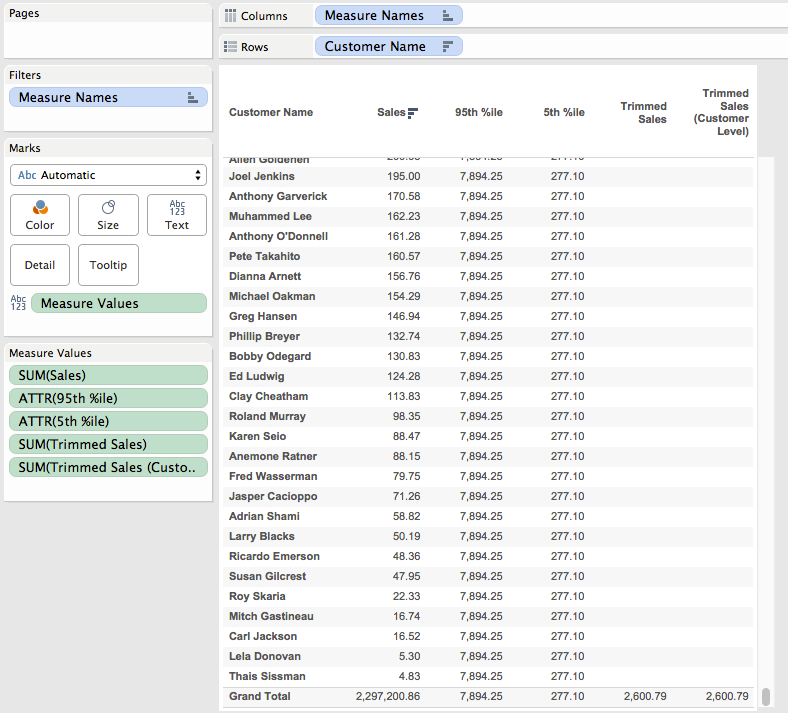
Excel’s TRIMMEAN() function can be quite useful at removing outliers, essentially it removes the top and bottom Nth percent of values and then computes the mean of the rest. Here’s the equivalent formula in Tableau that in Superstore Sales computes the TRIMMEAN() of sales at the customer level removing the top and bottom 5th percentile of customers when used with the AVG() aggregation:
Read on for how to build and validate your own TRIMMEAN() equivalent in Tableau.
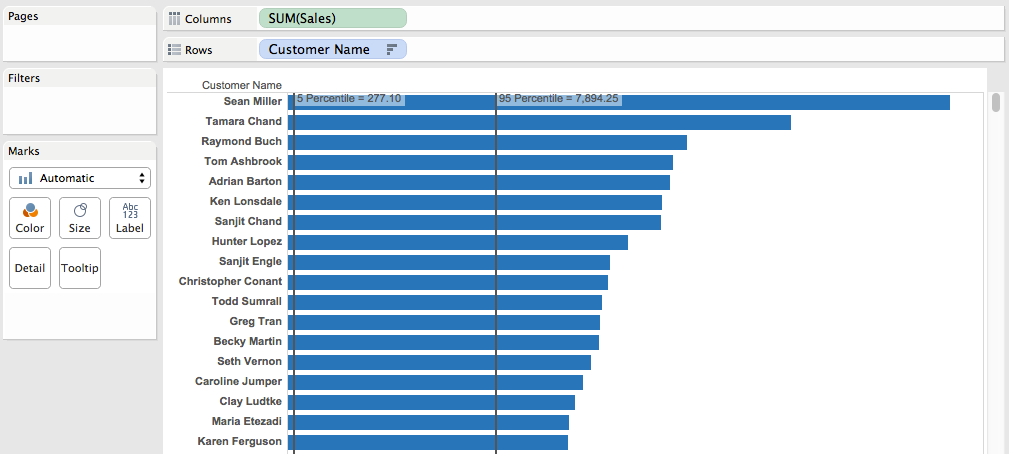
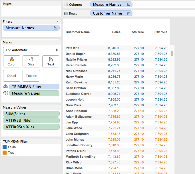
When building out calculations in Tableau I try to let Tableau do as much of the computation as possible for both the calculations and the validation, so I’m typing as little as I can. Starting with Superstore, let’s identify the top and bottom 5th percentiles, here’s a view using a reference distribution:
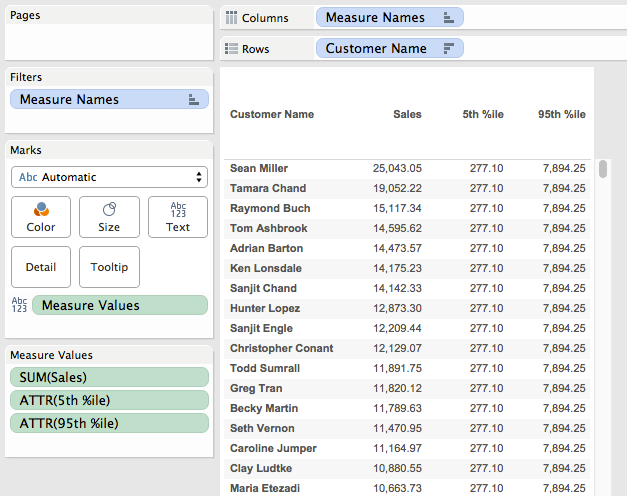
Now we know what we’re going to have to remove. The next step is to duplicate this worksheet as a crosstab, then build out calcs that can return the 5th and 95th percentiles of Sales at the Customer Name level. While this can be done with table calculations (here’s an example from the Tableau forums) I’m going to use FIXED Level of Detail Expressions so I’ve got a dimension I can use, so for example I could compare the trimmed group to the non-trimmed group. Here’s the 95th percentile Level of Detail Expression:
The inner LOD is calculating the sales at the Customer level, then the outer LOD is returning the 95th percentile as a record level value. Here’s the two calcs which have values that compare to the reference lines above:
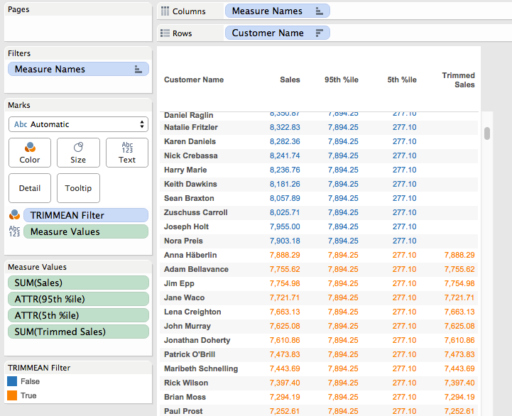
The next step is to filter out the values outside of the desired range, here’s the TRIMMEAN Filter formula:
This uses the 5th and 95th percentile formulas and only returns True when the Customer level sales is less than the 95th percentile or greater than the 5th percentile, we can visually validate it by dropping it on the Color Shelf:
Now that we have this the next step is to calculate what the trimmed mean would be. Again, we can use a view with a reference line, this time it’s been filtered using the TRIMMEAN Filter calc and the reference line is an average:
Now we can embed the TRIMMEAN Filter formula inside an IF/THEN statement to only return the sales for the filtered values, this is the Trimmed Sales calc:
IF {FIXED [Customer Name] : SUM([Sales])} <
   {FIXED : PERCENTILE({FIXED [Customer Name] : SUM([Sales])}, .95)}
AND {FIXED [Customer Name] : SUM([Sales])} >
   {FIXED : PERCENTILE({FIXED [Customer Name] : SUM([Sales])}, .05)} THEN
   [Sales]
END
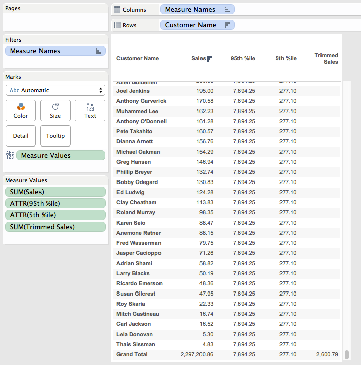
And here it is in the workout view, only returning the sales for the trimmed customers:
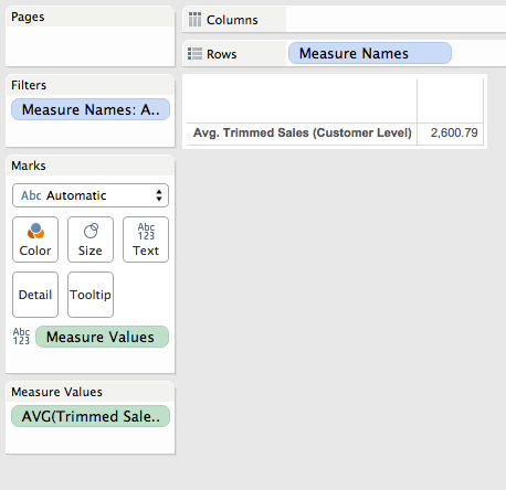
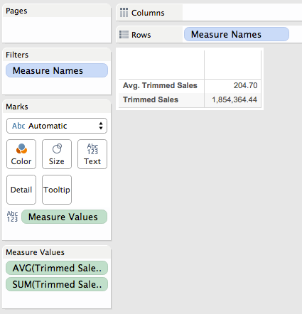
Now that we have the trimmed sales there are two ways we can go. If we want the trimmed mean without the Customer Name in the Level of Detail then we can validate that in our workout view by using Tableau’s two-pass Grand Totals to get the average of the customer-level trimmed sales. This was created by:
Removing the TRIMMEAN Filter pill from Colors (this increases the vizLOD and is no longer necessary).
Clicking on the Analytics tab.
Dragging out a Column Grand Total.
Right-clicking the SUM(Trimmed Sales) pill on Measure Values and setting Total Using->Average.
Scrolling down to the bottom we can see that the overall trimmed mean matches of 2,600.79 matches the one from the reference line.
Note that we could have used the Summary Card instead, however using the Grand Total lets us see exact values.
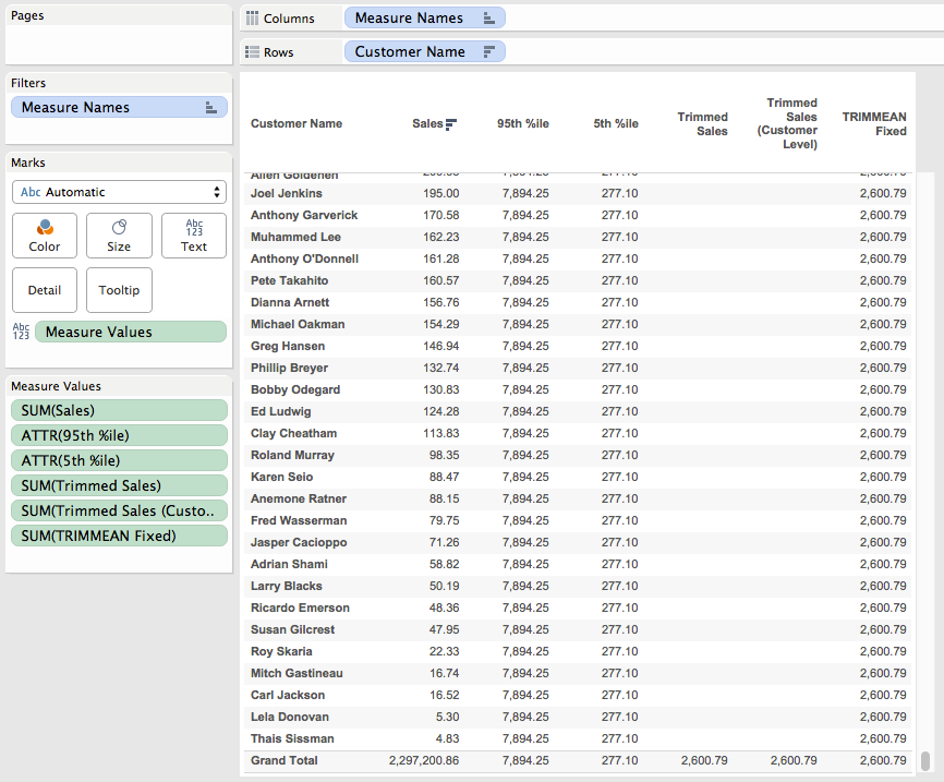
There’s a problem, though, if we use the Trimmed Sales all on its own in a view it breaks, whether using SUM() or AVG():
The reason why is that the Trimmed Sales is a record level value and Superstore is at the level of detail of individual order items, but we’re trying to compute the trimmed mean across Customer Names. For the true trimmed mean in this case we need to aggregate this trimmed sales to the Customer Name like we did in the workout view, here’s the Trimmed Sales (Customer Level) formula that uses the Trimmed Sales and wraps that in an LOD to get the Customer Level sales:
This returns the same results in the workout view:
And works all on its own in a view:
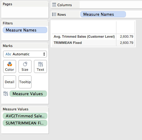
Now this is a case where the FIXED level of detail expression is returning different results depending on the level of detail of the view, if we want it to return the same result then we can wrap all that in one more LOD expression, this is the TRIMMEAN Fixed calculation:
And here it is in the workout view and a view without any dimensions:
Final Comments
This is a good (and bad) example of how Tableau is different from Excel. In one bad sense note that I didn’t parameterize the percentage for the trimmed mean, this is because in Tableau it would require two parameters because we can’t put calculations as the arguments to the PERCENTILE() function. In another bad sense the calculation requires understanding Level of Detail expressions and is not wrapped into a simple formula. On the other hand we’ve got very precise control over what the calculation is computing over with those Level of Detail expressions and aren’t just limited to doing trimmed means, we could do trimmed medians, get the Nth percentile of the trimmed values, etc.
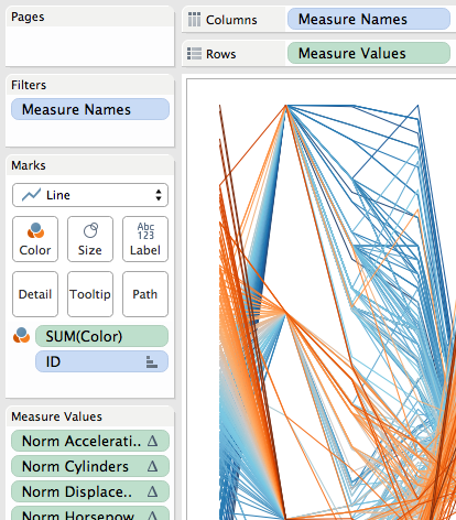
Parallel coordinates are a useful chart type for comparing a number of variables at once across a dimension. They aren’t a native chart type in Tableau, but have been built at different times, here’s one by Joe Mako that I use in this post for the data and basic chart. The data is a set of vehicle attributes from the 1970s, I first saw it used in this post from Robert Kosara. This post updates the method Joe used with two enhancements that make the parallel coordinates plot easier to create and more extensible, namely pivot and Level of Detail Expressions.
The major challenge in creating a parallel coordinates chart is getting all the ranges of data for each variable into a common scale. The easiest away to do this is to linearly scale each measure to a range from 0-1, the equation is of the form (x – min(x))/(max(x)-min(x)). Once that scale is made then laying out the viz only needs 4 pills to get the initial chart:
The Category is a dimension holding the different variables, ID identifies the different cars in this case, the Value Scaled is the scaled measure that draws the axis. Value Scaled is hidden in the tooltips while Value is used in the tooltips.
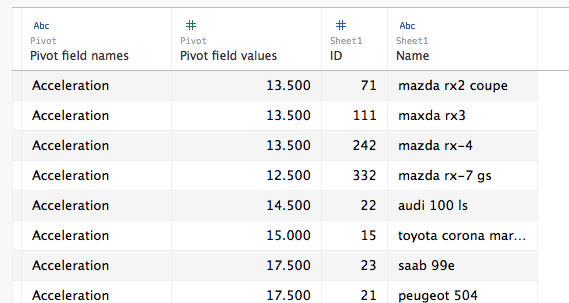
Where this is easier to create is using Tableau’s pivot function, in Joe’s original version the data is in a “wide” format like this:
So for each of the measures a calculation had to be built, and then the view was built using Measure Names and Measure Values:
The major limitation here is in the tooltips (in fact, Joe had rightly hidden them in the original, they were so useless):
The tooltip is showing the scaled value, not the actual value of acceleration. This is a limitation of Tableau’s Measure Names/Measure Values pills…If I put the other measures on the tooltip then I see all of them for every measure and it’s harder to identify the one I’m looking at. Plus axis ranges are harder to describe.
Pivoting Makes A Dimension
I think of Tableau’s Measure Names as a form of pivoting the data, to create a faux dimension. I write faux because beyond the limits mentioned above we can’t group Measure Names, we can’d blend on Measure Names, we can’t do cascading filters on Measure Names, etc. The workaround is to pivot our data so we turn those columns of measures into rows and get an actual “Pivot field names” dimension (renamed to Category in my case) and a single “Pivot field values” measure (renamed to Value in my case):
Then for the scaling we can use a single calculation (instead of one for every original column), here’s the Value Scaled measure’s formula:
I used an EXCLUDE Level of Detail Expression here rather than a TOTAL() table calculation as an example of how we can use LODs to replace table calculations and have a simpler view because we don’t have to set the compute using of the table calculation.
Now with a real Category dimension in the view the Value Scaled calc is computed for each Category & ID, and this also means that if we put the Value measure in the view then that is computed for each Category & ID as well, immediately leading to more usable tooltips:
For a quick interactive analysis this view takes just a couple of minutes to set up and the insights can be well worth the effort. Prior to the existence of Pivot and LOD expressions this view would have taken several times as long to create, so for me this revised method takes this chart type from “do I want to?” to “why not??”
Cleaning Up
To put this on a dashboard some further cleanup and additions are necessary. Identifying the axis ranges is something that is easier as well with the pivoted data. In this case I used a table calculation to identify the bottom and top-most marks in each axis and used that as mark labels to identify the axis range:
The Value for Label calculation has the formula:
IF FIRST()==0 OR LAST()==0 THEN SUM([Value]) END
The addressing is an advanced Compute Using so that it identifies the very first or last mark in each Category based on the value:
In addition I created two different versions of the value pill that each had different number formatting and used those on the tooltips, used Joe’s original parameters for setting the color and sort order with revised calculations (which were also easier to use since Category is a dimension), and finally added a couple of other worksheets to be the target of a Filter Action to show details of the vehicle:


 So for each of the measures a calculation had to be built, and then the view was built using Measure Names and Measure Values: