Note: this post uses a lot of animations and might be slow to load. Also the post was updated about 2 hours after publishing thanks to a tip from Pauli Isaacs @ Tableau about thinking about viz Level of Detail and what makes a markID.
I use a heart rate variability monitor and yesterday I was watching the graph on the app (sample below):
At first I was thinking of this as a “pulse rate” visualization but that style of monitoring has the trace of the pulse rate going from left to right, and then I realized it’s more like a seismometer or lie detector where the trace is drawn on the right while the paper is pulled to the left.
It takes a little bit of data preparation but we can get that effect in Tableau with the new #VizAnimations animated transitions feature coming in v2020.1. Here’s a view using climate data from the Met Office Hadley Centre showing 170 years of variance from the 1960-1990 global mean temperature:
I really like how having the marks “come in from the right” makes it seems like something is happening “right now”, and as the marks get to the late 20th century to the first couple of decades of the 21st the rising temperature change has a bigger impact. This kind of effect wasn’t really possible in earlier versions
Read on to find out how to apply this to your own data!
Overview
There are several steps to this method:
Identify the dimension that you are using on Pages and the sort order. In this case that’s the Year and we’re going in ascending order. Then pad out the data so that each of those values of that dimension has all the data from the preceding values. So for each Year we’ll do a self-join to get the prior years.
Create calculated fields to identify the latest/last value of the dimension on Pages and create a common x axis.
Adjust the animation speed so that it doesn’t overly animate.
Create calculated fields to act as a display x axis.
Note that technically this method will work for versions of Tableau prior to v2020.1, however with the animation controls it’s smoother.
1. At the core: a self-join to pad out the data
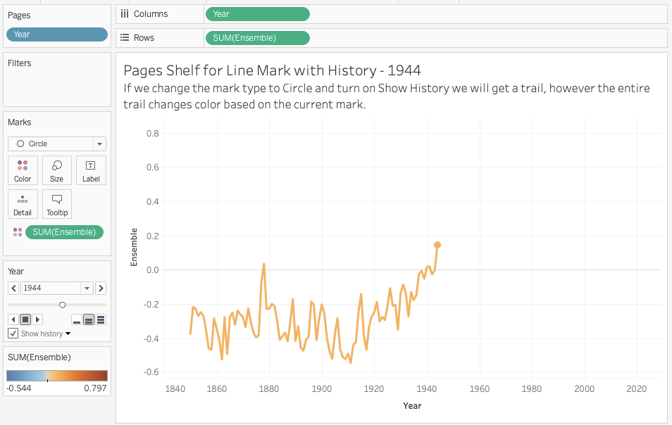
If you’ve ever tried to use the Pages Shelf in Tableau to draw a line mark over time you’ve ended up with something like this:
There’s a workaround where instead of using a line mark type we can use circles or something else and turn on Show history for Pages with mark trails and get a “line”, but the color of the trail depends on the color of the current mark, so the Color Shelf isn’t very useful:
Also if we hover over the mark trail there is no tooltip since there’s only one mark displayed.
Now a way I like to think of the Pages Shelf in Tableau is that it’s like a flip book:
https://images.app.goo.gl/FzTeRSi8ddcfq1aU6
The Pages Shelf is slicing the view into a set of “pages” based on the values of the field(s) on Pages. Since Year is on Pages that means we see one year for each Page, and in this case since Year is the only dimension in the view (setting the viz level of detail aka vizLOD) there’s only one mark for each year.* Mark trails are a convenience that Tableau adds.
* I’m skipping the other factor in the number of marks that is the number and layout of continuous fields on Rows/Columns and measures on Measure Values. #tableaunerdybits
Therefore if we think of going left to right with the years and adding a mark for each additional year of data what we really want to do is display all the years preceding each year as we add each new year. For example in this data set in 1850 we just have 1850, in 1851 we want to display the data for 1850 & 1851, in 1852 we want the data for 1850, 1851, and 1852, and so on. So we need to pad out 1851 with two years, 1852 with three years, and so on.
I term the field that we’re paging by the “Page” field, so “Page Year” in this case, and then the version that is getting displayed the “Display” field, so “Display Year” in this case.
The way we can set up this data source in Tableau is with a non-equi-join on the Year, which is supported in Tableau Desktop and Tableau Prep for most all data sources:
Note that the non-equi-join is doing a form of cross product on the data, so if you have a lot of original data you may need to aggregate first using a custom query or view, or Tableau Prep or some other tool. Here’s a screenshot of the resulting data, not the replication of the Display Years across the Page Years:
Once we’ve got that then in a few clicks we can get a left to right animation that preserves the color, has tooltips, etc. (This animation is running slower because it’s using default settings).
2. Setting up the right to left seismograph animation
In order to build the desired view we can’t just reverse the axes because we need to preserve the time order of the data. What we really want to do is draw the first mark (1850) at the right-most edge of the x axis. Then for the next Page Year 1851 we want to draw 1850 just to the left and then 1851 at the right-most edge, and so on.
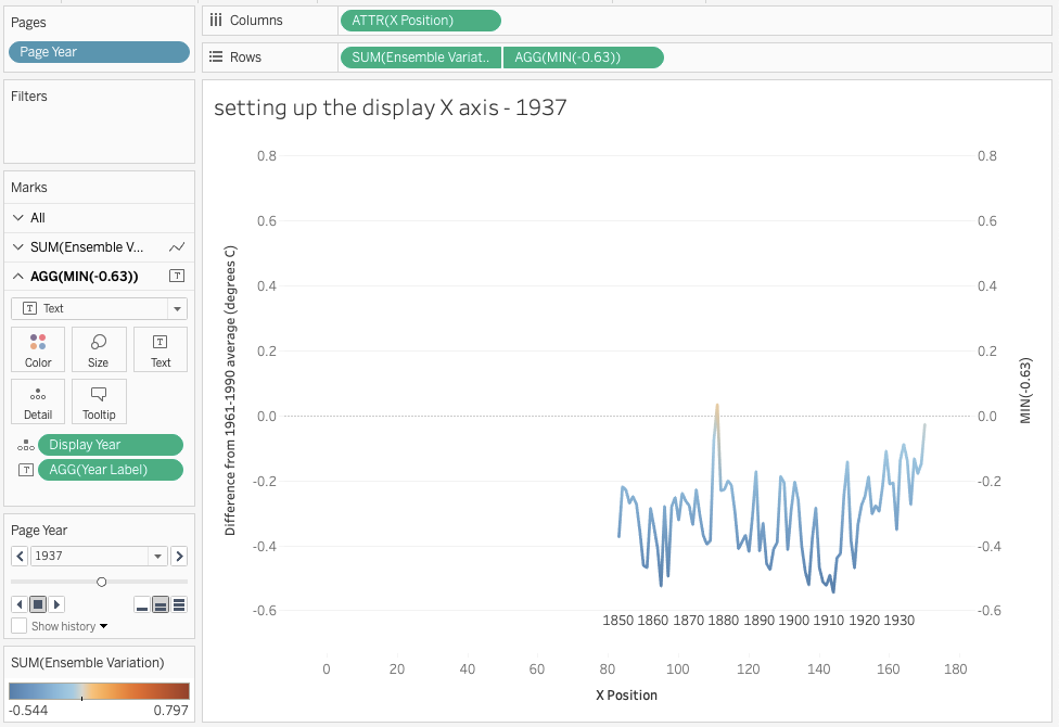
Another piece to know about the Pages Shelf is that it draws all of the discrete headers & continuous axis ranges in advance to the full set of values/widest extent. Therefore we need to make a common axis for all of the marks. This leads to a level of abstraction where instead of plotting the marks based on the year we’ll indirectly do that using some math where the first Page Year & Display Year 1850 is at position X, then in Page Year 1851 the Display Year 1850 will move to position X-1 (i.e. to the left) and Display Year 1851 will be at position X, and so on.
To do this I created a Max X Position calculation with using a FIXED level of detail expression and the formula {FIXED : COUNTD([Page Year])} to identify the number of years.
Then the X Position calculation has the formula [Max X Position] – ([Page Year] – [Display Year]). This appropriately offsets each year, as in this workout view:
I also added a Year Label calculation with the formula IF MIN([Display Year]) % 10 = 0 THEN MIN([Display Year]) END, this will be used later to simulate an X axis.
A couple of notes on this:
This formula is assuming that the dimension used on Pages is sequential and has no gaps, if there were then you’d need a different calculation for the Max X Position.
It could also be possible to get the desired formula using a series of table calculations (and potentially have higher performance in some situations), in this case I skipped that due to the complexity of the calculations; directly using the Year values in the calculations feels more “direct” to me.
With that in place we can use the Page Year on Pages, the Display Year on Dtail and ATTR(X Position) on Columns and see the view going from right to left:
We’ll fix the X axis further below, the next step is to get the desired animation behavior.
3. Moving from “worm-like” to fully “sliding”
With the default animation settings (note this is the v2020.1 beta, the final display might change) as the new marks are added to the right the animation slides left, but the right-most mark is “extruded to the right, then up or down” and looks to me like a worm searching for food. This is due to the Sequential animation that is animating all the marks in sequence.
The solution is to change the animation Style to Simultaneous, and personally I like the look of changing the Duration to a Custom setting of 0.1.
Here’s a GIF with the revised setting:
Now we’re getting somewhere!
4. Setting up an X axis for display
The last piece is to set up a working X axis. Since the X Position calculation is “fixing” the X axis for the Pages Shelf we can’t just use that X axis, instead we need something else. In this case I’m turning to a labeling technique that I learned from Ramon Martinez’s Overweight & Obesity viz Workbook: Overweight and Obesity across Countries where we use a dual axis. In this case the synchronized second axis is using a type in calculation to set the Y location and then the Year Label calculation is on Text. Since the Year Label calculation only returns every 10th year then it appears to be a label:
After building & verifying that it works then we can turn off Show Headers and do other formatting to get the final view:
Conclusion
As I’d written earlier in this post I really like the effect of the marks coming in from the right instead of the left as a way to help telling the story of the data; besides making for a common “entrance” for each new year’s data the sliding effect of moving the earlier years’ marks to the left helps remind me of the “what happened before” and keep that trend in mind, which in the case of climate data is getting quite extreme. I’ll definitely be using this method as time goes on.
I’ve also got a couple of ideas for future exploration…the first is to build a truly “moving window” like we see in an ongoing seismometer or polygraph readout. The second idea is to extend the “axis for display” concept to enable custom zoom effects on the Y axis to help draw attention to changes in the data.
One of my favorite recent projects at PATH has been creating a decision-making dashboard to support indoor residual spraying vs. malaria in Zambia for the Malaria Control & Elimination Project in Africa (MACEPA). The goal is to use up the remaining bottles of insecticide spray left over from the first round of spraying by appropriately targeting areas presently experiencing higher rates of malaria.
The dashboard was designed so that users can click on the circles (community health worker catchments) and/or the grey blobs (the pre-defined spray areas containing dozens to hundreds of structures) to ultimately generate a list of spray areas that can be exported. I first built this using Tableau v2018.3’s Set Actions, but there was a challenge controlling the interactivity: It’s all too easy to accidentally click on the wrong mark, click in an empty area, not be holding Shift down at the right instant, etc. and end up triggering the action and resetting the selected list of spray areas.
I was having a conversation with my one of my colleagues about a related use case and she encouraged me to look this more, and I thought that what I really wanted was to be able to treat the destination list as a separate “data source” that we could easily & directly add or remove values from…and then I thought about parameters as a separate data source*** and Tableau v2019.2’s Parameter Actions now give us a way to easily control the contents of that parameter source. In a few minutes I had a proof of concept, then I expanded that to create a suite of primitives for adding & removing (via parameter actions) & querying the list of values.
*** I can’t say that idea is unique to me. A long time ago I’d noticed that in the Tableau workbook XML that Tableau’s parameters were actually stored in the section, and awhile back Mark Jackson built his amazing Monopoly viz by storing the game state in parameters.
So now users can click on either a community health worker catchment or spray area to add it to the list, and then from either the inset map view or using a menu action remove the selected item from the list:
Here’s another use case for this technique: fantasy league drafts. For this the user starts out with a list of players and then can “draft” players into their team and also mark which players are on other peoples’ teams. There are 6 basic actions: add to my team, add to their team, remove from my team, remove from their team, and then clear my team and clear their team. This is all done with calculations and parameter actions:
The rest of this post describes the key differences between set actions and parameter actions, how to use parameter actions as a data source, and links to a workbook with a number of useful calculations built out.
What are the differences between a Set Action and a Parameter Action?
Beyond the obvious difference in that set actions (introduced in v2018.3) update sets and parameter actions (v2019.2) update parameters there are a variety of differences that define what we can do with each.
Fundamentally a parameter action takes the value from the selected mark (or an aggregation result from the selected marks) and then assigns that value to the parameter, then triggers a viz refresh. The viz refresh is exactly the same as when we manually change a parameter value: Tableau uses the new value in any evaluations of that parameter – in calculations, for display in views, in reference lines & bins & top N filters, etc.
Source of values: Set actions get their values from a single field in one data source. Whereas one or more fields (even from different sources) can be used to assign values to a parameter action, where different fields can be configured as the source of different actions that all target the same parameter. For example we could have multiple menu parameter actions that have different effects on the same parameter.
Level of calculation origin: The origin field used for a set action must be a record-level field. Whereas for parameter actions the origin field can be record-level, aggregate, or a table calculation.
Required viz Level of Detail (vizLOD): Set actions require that the record level value that the set is based on is present in the viz. Since it’s a record level value that means it’s a dimension in the view that can change the viz Level of Detail (vizLOD). Sometimes that can create a situation where the vizLOD is more fine-grained than we’d like and then we have to change the view and/or other fields in the view in ways that create more complexity. While parameter actions require that the origin field of the parameter action is in the view the fact that the origin field can be at any level of calculation (see prior point) means that we can use an aggregation or even a table calculation and not change the vizLOD.
Data source (in)dependence: Sets presently (as of v2019.2) only exist in a single data source…occasionally we can use them as part of a data blend but that only works for some particular use cases. Whereas parameters live “outside” any particular data source.
Available controls: As of v2019.2 the only way to control the membership of sets through set actions is to create a viz to use as the origin of the values. Whereas parameters already have a rich set of controls (dropdown, single select radio button, etc.) for parameter lists & ranges and we can use those in conjunction with parameter actions.
Single select vs. multi-select. Set actions support single- and multi-select, in fact there’s no easy way to enforce single select for a set action (or filter action). As of this writing parameters (and therefore parameter actions) in Tableau can only have a single value, so Tableau’s provided parameter controls support only single select. With the new parameter actions in v2019.2 we can choose whether we want to enforce a single select (if a user does a multi-select then the parameter is not updated) or do an aggregation of the selected multiple values to a single value for the parameter. For example for numeric parameters we have the usual aggregations (sum, avg, min, max) plus some summary statistics:
As of v2019.2 for date & text data types the parameter action aggregations are limited to min & max.
Single value vs. multiple value aka multi-valued. Sets inherently support multiple values. Parameters support a single value…though this post is about a way to get around just that!
That’s a laundry list of differences between set actions and parameter actions. Now let’s talk about filter actions.
Why not use a filter action?
Filter actions can only include or exclude values from the target, and in addition each filter action overwrites the prior selections. So if I’ve just selected set of marks A and I want to add another set of marks B then with filter actions (or Set Actions) I have to carefully select all of A and B and then trigger the action. This is really challenging when all we often want to do is just append (or remove) a few marks.
In addition the filter action value(s) have to exist in the target data source, otherwise there’s no way to validate them. Since parameters are in a sense a completely separate data source then we can use whatever values we want.
What about the Javascript API?
The JS API could of course do all this, I personally find it useful to have multiple ways to accomplish the same task. 🙂
What this looks like
Here’s a flow chart of the the configuration:
So the list parameter is a string list of values that we’re adding to, removing from, etc.
How to build views and dashboards using parameter lists
The parameter as a data source workbook (presently a Dropbox download and you’ll need the v2019.2 beta to open it) has a wide variety of calculations for adding & removing values from the parameter list source as well as querying the parameter. Here’s how to use it:
1. Copy field(s) to your workbook
You can copy & paste these calculations & parameters from the workbook into your own workbook. There are four folders of calculations:
Param as DS Action Strings – these are calculated fields that you will use as the source values of parameter actions. Copy the fields for the action string(s) you want to use.
Param as DS Core Fields – these fields are used in configuring the other fields, testing whether the delimiter is ok to use, and in other calculations. Copy all of these fields.
Param as DS Core Queries – these are queries used in other action strings & queries. Copy all of these fields.
Param as DS Queries – these are calculated fields that provide information about the current state of the parameter, for example testing whether a given value is in the list, counting how many times a value is in the list, etc.
After copying the field(s) over you’ll then do the following:
2. Determine the unique value for identifying marks
We need to have a unique value for item item we want to store so we can track it. It might be something like a Customer ID, or a login name, or something else. You’ll need to pick a field or combination of field(s) that uniquely identifies the value(s) you want to add and then put that into the Unique Value field as a string.
Note that if your desired unique value is intended to be an aggregate or table calculation then the you’ll need to make sure that the aggregation is done before the Unique Value. Also note that this will turn a number of the action & query fields into measures, so do set up the aggregate before you build any views using those fields.
3. Determine the delimiter
This needs to be a character or combination of characters that don’t existing the data so that way we can separate values in the list. The Delimiter Param parameter holds the delimiter value and then that gets used to create the Delimited Unique Value field:
For the calculations can’t work the delimiter value can’t exist in anywhere in the Unique Value field. You can test the delimiter on your data using the Delimiter Test dimension measure in a view: ~screenshot of delimiter test.
Note that the delimiter can be more than one character, so for example if you want to use : as your delimiter but there are some fields that have a : you can use :: or even :::.
Also note that the Nth fields like “Insert (at Nth position)” and “Find Nth position of value” use FINDNTH() and/or REGEX functions that are not presently available for table calculations. So if you’re trying to base the parameter on table calculations and want to use the Nth logic you’ll have to build that with more primitive functions. If you’d like this functionality in Tableau then please vote for this feature request:REGEX…, SPLIT(), and FINDNTH() support for ta… |Tableau Community Forums.
4. Add action string(s) to your view(s)
For each action that you want to set up you’ll need to add the associated action string to the view, typically on the Detail Shelf with either Include in Tooltip turned off or a custom tooltip configured.
Then these action strings can be combined, for example:
Append (and remove other instances):
[Remove (value from list)] + [Delimited Unique Value]
A complete list of supplied operations for action strings is below.
5. Configure each parameter action
The parameter action configuration is done much like filter or set actions: You choose the source sheets or dashboards, how the action will be triggered (hover/select/menu), the target parameter and the field used for the value. In addition you have to choose what to do if the user selects multiple marks, for v2019.2 and this particular use case I’ll typically choose “None”.
6. Use the Param as DS Queries to build out display, calculations, etc.
The Param as DS Queries and Param as DS Core Queries folders have a variety of useful calculations, for example testing whether a value exists in the list, finding out where that value is in the list, and so on. A list of those is below. These can be used in any way you can imagine!
Basic queries
Value Exists in List – test whether a given value is in the list:
CONTAINS([List Param], [Delimited Unique Value])
Get Size of List – count how many items are in the list:
Find Nth Position of Value – if an given value is in the list N+M times find the string position (from 1 to the length of the parameter) of the Nth value, otherwise return Null.
Get Nth Item – Uses a parameter for N where N = 1 to some number to return the value at the Nth position.
REGEXP_EXTRACT([List Param],
    //start a non-capture group, then use a
    //non-capture group inside that (not sure why, but it
    //works to keep the delimiters out)
    '(?>(?>' + [Delimiter Param]
    //get the non-delimiter characters in a capture group
    + '([^' + [Delimiter Param] + ']+)'
    //back in the non-capture group
    + [Delimiter Param] + ')'
    //get the Nth pattern of the capture group
    + '{' + STR([Nth Position]) + '}' + ')')
A complete list of operations for queries is below.
List of operations
These are the operations (configuration, action strings, and queries) that have been configured in the parameter as a data source workbook (presently a Dropbox download and you’ll need the v2019.2 beta to open it).
Param as DS Action Strings
Append (to List) – Append value to the list. If the same value is used for the parameter action multiple times then it will be repeated in the parameter’s value.
Append (and remove other instances) – This version of append clears out all prior instances of the selected value from the parameter before appending it to the parameter.
Insert (at beginning) – Inserts the value at the beginning of the parameter.
Insert (and remove other instances) – Inserts at the beginning and like the Append (and remove other instances) ensures that the inserted value is unique.
Insert (at Nth position) – Inserts the value at the 1st, 2nd, 3rd, Nth position in the parameter list depending on the value of the Nth Position parameter. The old Nth value and successive values are “pushed” to the right.
Insert (at Nth position and remove other instances) – acts like the other remove other instances while inserting at Nth position.
Remove (value from list) – Removes all instances of the given value from the parameter.
Remove First Item – removes the first item from the list.
Remove Last Item – removes the last item from the list.
Remove Nth Item – removes the Nth item from the list based on the Nth Position parameter.
Rest list – resets the list to an empty string.
Param as DS Configuration
Delimited Unique Value – The Unique Value surrounded by the delimiters. This is used in almost all other calculations.
Delimiter Test – A dimension that identifies whether the selected delimiter appears anywhere in the values for the Unique Value field.
Unique Value – The field or combination of fields used to generate the value(s) to add & remove from the list. This must be a string data type.
Param as DS Core Queries
Find Nth Item Position – finds the string position (from 1 to the end of the string) of the Nth item on in the parameter list.
Get Size of List – counts the number of items in the list.
Param as DS Queries
Count (# of times value is in list) – counts the number of appearances of the given value in the list.
Find 1st Position of Value – finds the starting string position of the first appearance of the given value in the list.
Find Last Position of Value – finds the starting string position of the last appearance of the given value in the list.
Find Last Position of Value – finds the starting string position of the Nth appearance of the given value in the list, where the Nth is the Nth Position parameter.
Get First Item – returns the value of the first item in the list.
Get Last Item – returns the value of the last item in the list.
Get Nth Item – returns the value of the Nth item in the list, where the Nth is the Nth position parameter.
Get Length of Item at Nth Position – returns the string length of the item a the Nth position.
Return Distinct Values – This uses a regex to return the distinct or unique values in the parameter list, however due to my lack of regex skills and/or Tableau’s lack of full support for all regex features this calculation re-orders the list.
Value Exists in List – Test whether the given value exists in the list.
Using the parameter as data source calculations to build a fantasy league draft visualization
Here’s a quick overview of how I used the parameter as a data source workbook to build the fantasy league draft viz shown here:
First of all I determined that I was going to need two lists, one for “my” team and one for “their” team.
I also determined the set of operations I was going to need:
Append (to list)
Remove (from list)
Reset List
Value Exists in List
Then I copied the calculations from the parameter as a data source workbook.
The calculations were renamed to have “My” in their name, for example the List Param became My List.
Then I duplicated the My List parameter and renamed that to Their List, then duplicated and calculations to have them point at the Their List parameter. Now I had a full set of calculated fields to use to set up parameter actions and views.
I then created an Available Players view where I used a multiple axis crosstab to give me separate marks cards (so I could have separate pills on each controlling separate parameter actions). The first axis (for my team) had the Add to My Team and Remove from Their Team fields, with parameter actions configured to affect the respective lists.
I put the On My Team and On Their Team fields both onto Color to initially check that the values were accurate.
Then on the second axis (for their team) I added the Add to Their Team and Remove from My Team fields to detail and configured the parameter actions.
After testing that everything worked I moved the On My Team and On Their Team pills to Filters and set both to False, so the Available Players list only shows unselected players.
Then I created a worksheet for My Team that used the On My Team filter set to True and added the Remove My Team field to detail to use to generate a parameter action to remove with a click.
That worksheet was there duplicated and fields replaced for Their Team.
For the Reset My Team button I created a worksheet with the Reset My Team field and a parameter action.
And then that was duplicated to reset their team.
And then the dashboard with a bit of drag & drop.
Conclusion
Beyond the spray area selection and fantasy league drafts there are many other use cases for this technique -building games, creating surveys or quizzes inside a viz, dynamically re-sorting marks (for example moving a top level mark to the back), and all the different possibilities for creating cohorts on the fly.
I also don’t think this post is gong to be the last way to do this;Tableau has been adding a lot of features for interactivity in the last couple of years (highlighters, selection by category, set actions, extensions, etc.) and my expectation is that we’ll see new ways for configuring interactivity!
Here’s a link to the the parameter as a data source workbook (presently a Dropbox download and you’ll need the v2019.2 beta to open it).
Tableau’s native parameters have a couple of key limitations as of this writing in February 2018: The list of values is static and we can only select one value at a time, not a range of values. So when we want to do something like set up a viz with user-selectable top and bottom thresholds we have to set two parameters, not one, when what we really want is a nice range control like the view below:
What it looks like here is that I’m using a ranged “parameter” to change the mark color & shape whose set of possible values is based on other filters…which is what we’ve wanted in Tableau for awhile now. Now you might be asking “Why go to all this trouble, why not use Tableau’s JavaScript API or the (forthcoming) Extensions API?”. And my response to that is that not everyone has the expertise available to use Tableau’s APIs or D3 so we’ve got to make the best use of the tool that we have at hand. Curious about how can you build this for yourself? Read on to find out!
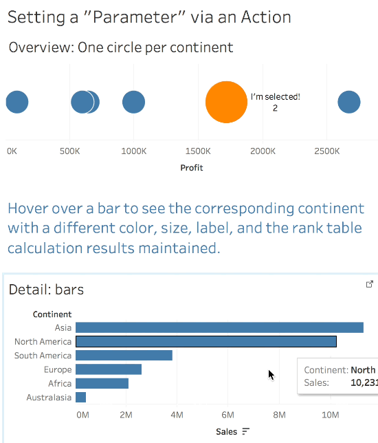
I got a question recently about wanting to use an action in Tableau to set a parameter. For example in this view below the goal is to hover over a one of the bars below to send the action to the circles on top and use that value to color the marks, change the shape, etc. In this case what we want to do is some sort of evaluation like [Circles Continent] = [Selected bars Continent] to be able to flag the selected continent and treat it differently, just like we would if we had something like [Circles Continent] = [Continent Parameter].
But for actions that cross worksheets all we have are highlight & filter actions. Here’s what happens with a highlight action:
Tableau’s highlight is limited to greying out the non-highlighted marks and being able to optionally display text.
And if we try a filter action we are even more stuck:
The filter action removes all marks but the selected mark which then breaks the rank table calculation, positions the mark in the wrong place, and doesn’t really let us do things like change the selected mark’s color vs. the other marks.
So Tableau doesn’t have an action to set a parameter value so we’re kind of out of luck…or are we? Try out this viz, you can hover and see the color and size change while the rank value is still preserved:
Now you can get this kind of effect using Tableau’s JavaScript API, this was done without using any JS at all. Read on for an explanation of how you can do this for yourself! Also thanks to Rody Zakovich, he gave some feedback to this and came up with some great extensions that he’ll be posting about!
A caution for Tableau newbies: this uses some relatively advanced data preparation, Level of Detail expressions, data blending, filter actions, understanding of the difference between the grain of the data and the viz level of detail, and knowledge of Tableau’s order of operations. If those terms don’t mean anything to you then you might want to start out by learning about those first.
Tableau is a Data-Driven Drawing Engine
The key to all of this is that fundamentally Tableau is a data-driven drawing engine. By that I mean that what we see in the viz and available interactivity are dependent on the data. So if we feed the right data to Tableau we can get it to do (al)most anything we want. For example in a post from last year I set up waffle or unit charts inside a map.
In this case what we’re wanting to do is change Tableau’s interaction behavior across worksheets. Looking at our options for interacting across worksheets in a workbook:
Highlight actions can identify specific values have a very specific set of behaviors around appearance so we can’t change that.
Filter actions can identify specific values in the target viz but remove other values.
So there’s a loophole in filter actions…filter actions remove other values, but since the origin & targets of the filter action are coming from the data if we feed Tableau the right data we can have it keep what we want and no more. So in this case we just need to feed Tableau more data (as in copies of the data) so that after the filter action takes effect we have enough data to identify the selected & non-selected marks. Here’s a description of what I mean:
How I think of this is that we’re starting out with i continent values and what we’ll do is expand that out to some number j continent values (actually 2i or i*i), then the filter action will cut that number down to a manageable number k continent values that we can then use calculations to identify the selected and non-selected marks.
Introducing the Scaffold
A scaffold is used in building construction, and in Tableau a scaffold data source is one that helps us get the data “just so”. In Multiple Ways to Multi-Select and Highlight I did a version of this where a union was used to give enough data so that way a mark could be highlighted. That required a full union of the data which can get prohibitively large, so for this method we’ll use a scaffold source that has just the values we need, and then when we want measures from the underlying data we can use a Tableau data blend.
The scaffold uses multiple copies of the list of the values that we want to filter for (Continent in this case). Now if you just have a “flat” table of data and don’t have a separate unique list of values then there are multiple ways to get one, please see Creating a List of Values in Tableau from Text and Excel Sources. I’ll be using
Once you have the list there are two different scaffolds you can use: One uses a cross product (i.e. for every continent there is every other continent), the second uses a union (thanks to Rody for that suggestion and demo). I’ll go through the cross product scaffold first because that’s a bit easier to set up than the union.
Using a Cross Product Scaffold to use a Filter Action as a Parameter
This section goes through the cross product scaffold. A cross product is also called a cross join or cartesian join or Cartesian product and a simple description is “for each value of A return each and every value of B”. So if we start out with the two values [A1, A2] and three values [B1, B2, B3] then we get the six combinations [A1B1, A1B2, A1B3, A2B1, A2B2, A2B3].
In this case we’re building a cross product of the dimension we want to build an action on and for this example we’re using Continent so the cross product will be 6 continents * 6 continents and end up with 36 rows in the scaffold. It’s important that the scaffold only has one record for each combination, if it has more than one record then the calculations below will break and alternative formulae would be required.
I’ll explain a little further about how this ends up working down below.
Creating the scaffold and setting up initial interactivity
In Tableau connect to your original data source, in this case Superstore.
Followed the instructions for creating an aggregated extract source from Creating Lists of Values for Tableau from Text & Excel Sources. For this next step I used the Continent dimension. Note where you saved the extract.
Connect to the extract (.tde or .hyper file) in Tableau.
Drag a second copy of the extract onto the canvas.
In the join window set up an inner join with two join calculations so the join is 1 = 1.
Rename the copy of the dimension to something useful, I used xprod continent. (xprod is short for cross product).
Rename the data source to something useful, I named it xprod Continents.
Create a worksheet for the target using the scaffold (xprod) source as the primary with any necessary fields from the secondary source. This view requires the dimension & xprod dimension to be somewhere on the viz. To help see what’s going on I used a crosstab to start. Note that the xprod dimension is not in the compute using of the rank table calculation since there are multiple copies of the data.
Connect to your original data source.
Create the origin worksheet, in this case it’s a simple set of bars:
Build a dashboard with the origin and target sheets.
Add a filter action as a Select filter and and add a filter that for the source field uses the original dimension from the raw source and for the target field uses the xprod dimension from the scaffold source from step 6.
Here’s a demo:
How does this work?
The scaffold source has 6 copies of the data, one for each xprod Continent. The filter action targets the xprod continent so when the filter action is triggered only one xprod Continent remains, and because we’ve multiplied the data there are the 6 Continent values remaining.
This leaves us with two useful attributes for each mark – the Continent, and the xprod Continent that identifies the selected value. The xprod continent is effectively the [Selected bars Continent] or [Continent Parameter] that we originally wanted to be able to do evaluations like [Circles Continent] = [Selected bars Continent] or [Circles Continent] = [Continent Parameter], only we had to do some extra data preparation to get there!
Identifying Selected Marks for Setting Color, Size, etc.
Now to we can do the evaluations to identify the selection status. There are three states to track:
No selection made at all (which is something we can’t do with a regular parameter)
The selected mark
The non-selected marks (when there is a selected mark)
When there is no selection at all then there are 6 xprod continents for each Continent so we can count those and be able to flag the selected/non-selected state. Then if a selection is made the Filter Action reduces the data to only one value of xprod continent so we can test for that to identify the selected mark vs. non selected marks.
Here’s the Selection Status (xprod) formula used in the scaffold source:
//given the scaffold source COUNT(continent) across the data will return more than
//1 when the scaffold isn't filtered
//this uses the ability of EXCLUDE LOD expressions to be evaluated as
//record level calcs before they are aggregated in the view
IF {EXCLUDE [xprod continent]: COUNT([Continent])} > 1 THEN
    -1 //no continent selected
ELSE
    // identify selected continent
    IF [Continent] = [xprod continent] THEN
        1 //selected
    ELSE
        0 //not selected
   END
END
With this flag now in place we can create additional calculations that can be placed on Color, Size, Shape, Label, Tooltip, etc. or even elsewhere in the viz.
For example here’s the Highlight Text calculation:
IF [Selection Status Flag (xprod)] = 1 THEN "I'm selected!" END
This only returns “I’m Selected” for the selected mark and Null for everything else. By putting this on Label it only appears when the mark is selected and can be used on Color as well. Note that it uses the ATTR() aggregation because the Selection Status Flag (xprod) is using an EXCLUDE LOD expression.
I created another calculated field for Size and some customization of the Size so that the nothing selected state has a mid-size neutral state, the selected mark is large, the non-selected marks are small. Here’s the completed viz:
Setting up with Select and Iterating
A couple of notes on setting these calculations up in the view – since we are using fields that have different results depending on the filter action status we will need to do an iterative process. For example when using Highlight Text on Color I needed to put the field in, trigger the filter action as a select action (so it would stay in place when I moved off the mark), then set the color for the selected mark, then verify everything was working by turning the action on and off, and then finally making the action a hover action.
Removing the Extraneous Scaffolded Marks
If we select all the marks in an unfiltered/non-selected scaffold view there are 36 marks – behind each Continent mark we can see there are the scaffolded continent marks from the xprod continent dimension. Personally I don’t like views that have extra marks kicking around for the following reasons:
The more marks Tableau has to draw the slower the viz.
Even though the marks are hidden they can cause confusion on the parts of users as they interact with the viz.
The extra marks will be part of any viewing of summary data or data downloads and that can be especially confusing.
So how can we filter out the extraneous marks? This is where knowledge of Tableau’s order of operations, the viz level of detail (vizLOD), and filter actions comes into play. ~~link to documentation. The vizLOD is Continent and xprod continent and when there’s no filter action there are 6 xprod continents for each Continent, whereas when the filter action is activated there is 1 xprod continent for each Continent. Now the filter action is applied as a record-level aka dimension filter in Tableau’s order of operations ~~link so we need to use a filter that comes after that which could be an aggregate filter, a table calculation filter, or (as in this case) and INCLUDE or EXCLUDE LOD expression-based filter. Here’s the formula for the Remove Extra Marks (xprod) calculation:
This uses a variation of the technique from my earlier post on identifying a dimension at a lower level where we’re using a Level of Detail expression to compute a result as an aggregate and then comparing it a record level. In the filtered view we know there’s only one xprod continent for each continent so that works out just fine.
~pic of selected
In the unfiltered view the EXCLUDE LOD will return the first xprod continent (probably Antarctica) and then only that one is kept while showing the 6 continents.
~pic of not selected
With this filter in place we end up with only 6 marks either way and have removed the extra marks added by the scaffolding to get a nice clean viz.
Final Notes on using a Cross Product Scaffold to use a Filter Action as a Parameter
This is not a technique for the faint of heart, it’s using a wide range of Tableau’s functionality to get a specific set of user interactivity. So it might not be for you. In building views like this for me where I’ve worked out the details of how the calcs need to work the most challenging part is often building the scaffold source. For example if you have hundreds or thousands of values of the dimension(s) you need to scaffold then the cross product can get prohibitively large, and for that we’ve got the alternative of using a union, we’ll cover that in the next section.
Using a Union Scaffold to use a Filter Action as a Parameter
Rody pointed this out to me as an option, this method uses a union’ed scaffold source instead of a cross product and a filter action whose filter pill is set to Exclude. So the scaffold source can be a lot smaller, but the set up is a little more complicated.
Overview
For this method instead of having N sets of values in the scaffold there are only 2 sets of values. We set up special calculated fields in the scaffold and the original data that will enable the filter action to exclude (remove) from a selected value from the scaffold so we can use that difference to detect what has been selected.
How to Build the Union Scaffold
Here’s how to build this, this is a slight variation on the instructions for an aggregated extract from Creating Lists of Values for Tableau from Text & Excel Sources:
In Tableau connect to the raw data source.
Union the raw data to itself.
Create a worksheet that only has the necessary dimensions plus the Table Name and Sheet dimensions.
Create an aggregated extract per the instructions in the link. ~pic
This ends up with a scaffold source where there are two copies of the list of values, like this: ~pic
Setting Up Interactivity
In the original data source create an ExcludeOrigin field in the original data with the formula '~~' + [Continent].
Create an origin worksheet with the Continent & ExcludeOrigin fields.
In the scaffold source create an ExcludeTarget field with the formula:
//there's an implied ELSE Null, the Null values are the ones we will ultimately keep
IF [Table Name] = 'Data1' THEN '~~' + [Continent] END
Build the target Scaffold sheet with Continent and ExcludeTarget as dimensions. Note that there are 2N marks where N is the number of Continents with 2 values of ExcludeTarget for each. ~pic
Add any measure(s) you want from the original data via a data blend.
Create a dashboard with the two worksheets.
Add a filter action on Select from the origin worksheet to the target worksheet that goes from the ExcludeOrigin field to the ExcludeTarget field. ~pic
Trigger the filter action by selecting a mark on the origin worksheet.
Go to the target worksheet.
Right-click on the Action (ExcludeTarget) pill on Filters and choose Edit Filter… The Edit Filter window appears. (If you don’t see the pill on Filters then you haven’t triggered the Filter Action).
Click on Exclude, then click OK. ~pic
Go back to the dashboard and click on different marks on the origin worksheet, you’ll see the target update.
To explain how this works we have to keep in mind that there are effectively two states:
When there are no marks selected in the origin worksheet then nothing is excluded from the target sheet and we see all N (12) marks from the scaffold.
When a mark is selected in the origin worksheet then the corresponding mark with the non-Null value of ExlcudeTarget is removed from the viz, leaving us with N-1 (11) marks remaining.
Identfying Selected Marks for Color, Size, etc.
Because this scaffold is built using a union the detection of mark selection status works a little differently, here’s the formula for the Mark Selection Status (union) field:
//In the union scaffold there are two states: all rows exist or one has been filtered out by the selection
//if all rows exist then there are 2x the number of continents and we can test for that
IF {EXCLUDE [Continent], [ExcludeTarget] : COUNT([Continent])} % 2 = 0 THEN
    -1 //no selection made
ELSE
    IF {EXCLUDE [ExcludeTarget] : COUNT([Continent])}  = 1 THEN
        1 //the selected value
    ELSE
        0 //the non-selected values
    END
END
Essentially since we’ve doubled the data then we can use the modulo (%) operator to detect that doubling and identify the no selection status, then by counting continents we can find out whether are 1 or 2 records and identify the selected/non-selected marks.
From here the other calculations are all the same as for the cross product scaffold except for the Remove Extra Marks calculation. In that case the Remove Extra Marks (union) formula is:
ISNULL(ATTR([ExcludeTarget]))
Note that we could just use ATTR([Exclude Target]) and filter for Null as an alternative…this is one of those cases where I like having a separate calculated field because then by the name of the field I can give the viz maintainers a chance to understand what is going on.
Here’s a completed dashboard using the union, you’ll find the interactivity to be the same as the cross product version:
Conclusion…or…When Should I Use This?
When I’m building a dashboard and my users are wanting interactivity that is more than what Tableau immediately offers I go through a mental checklist:
Is the goal something that we can pull off using highlighting, sheet swapping, filter actions, parameters, sets, etc.?
Is this the only “ask” for additional interactivity or are there other cases for this dashboard where the desired user experience is pushing the boundaries of what is provided in Tableau? If so are there resources to use some JavaScript and Tableaus JS API?
Only then do I start considering more complicated methods that require more data prep and configuration like the one presented here.
Here’s a link to the Filter Action as Parameter dashboard on Tableau Public. Hopefully you learned a bit about how to take advantage of Tableau’s capabilities, if you have any alternatives or questions please ask in the comments below!
There are various use cases where we start out with a “flat” table like the Superstore sample data that has a number of columns with various dimensions and we want to make a simple list of unique values of one or more dimensions. such as a list that has just the six continents in Superstore:
The use cases for this include:
Using a filter action value as a parameter in the target source (look for posts from myself and Rody Zakovich on this in the next week).
Cross data source filters with higher performance when the list of filter values can be small compared to the volume of data.
Creating scaffold data sources to pad out data and ensure there are no sparse combinations of values.
Situations where we’d want to do a union or cross product of the data to do something like a market basket analysis but the union or cross product would be prohibitively large, so instead we only union or cross product desired dimension(s) and then join in the original data as necessary.
If you are starting out with a well-structured data warehouse with dimension tables, can write SQL, Python, or R, build custom views on the data source, use data preparation tools like Alteryx or Easymorph or Trifacta, etc. then obtaining or generating these kinds of lists is pretty straightforward. But not everyone has those skills or resources, and in the case of users who just have Excel and/or text files we need to get creative. This post goes through a three different methods to get these lists in Tableau:
Ask!
Aggregated Extract
Excel Pivot Table as a Data Source
Custom SQL
In this post I’ll go through each of these options. [Note: this post was updated on 10 Jan 2018 to make the aggregated extract method a little simpler.]
1. Ask!
This might seem obvious, but sometimes we’re stressed out and under deadlines and don’t realize we might be able to get help. If the data you are working with is coming from someone else then go ahead and ask them if they have a list of unique values. I’ve found that most people want the data they produce to be used and used well and if I’m coming back to them asking for something so I can do more with “their” data they are happy to accommodate me. I might phrase the request like “I want to make sure I’m using the latest list of departments, can you give me that list?”
The one caveat to getting data back from your ask is that you’ll need to go through some validation to make sure the list matches up with the “real” data, sometimes the amount of validation and cleansing isn’t worth the effort and one of these other approaches is better. However if you’re in a data-starved environment the kind of relationships you can make by asking for data can lead to more trust and ultimately more access to the data you want (and need).
2. Aggregated Extracts
For this method we’re going to connect to the data source and build an extract only we’ll be telling Tableau to aggregate the data to the desired level of detail (the field(s) we want to use) before Tableau builds the extract. The resulting extract then just has a record for each combination of field(s) that we want to use.
Connect to the data source.
Create a single worksheet with the field(s) you want to use as dimension pills, I usually just put them on Rows as discrete (blue) pills:
Right-click on the source and choose Extract Data… The Extract Data window opens.
Click on the Aggregate data for visible dimensions checkbox.
Click the Hide All Unused Fields button.
Click Extract. Tableau will ask where to save the extract. Choose a location and click OK.
Voila, you now have an aggregated extract source that you can use in Tableau data blends and/or join to!
Notes on Aggregated Extracts
There are a few things to keep in mind when using aggregated extracts: First of all there’s the need to refresh them to keep up with the data so if you have Tableau Server you’ll need to set up an appropriate schedule, if not then you’ll need to set up your own manual or automated workflow that gets the results you need. One possibility is using Tableau’s extract API.
Secondly if new columns are later added to the data they are automatically added to the extract. This may be ok for some use cases, there are others where this will break views that depend on that extracted data.
Finally, if you want to join on this aggregated extract you’ll need to join directly to the .tde or .hyper file. Where this gets complicated is handling data updates. You’ll need one workbook or workflow to update the extract and then use the extract in a second workbook. Unfortunately we can’t publish the extract to Tableau Server or Online and join to that published data source (yet), otherwise that would be an easy workaround. There are a number of cases where a Tableau data blend is sufficient, we’ll be demonstrating one in the next week.
3. Excel Pivot Table as a Data Source
For Excel sources besides connecting to worksheets with raw data we can connect to worksheets that are built as a pivot table.
Here’s how using Excel 2016 for Mac:
Open the source in Excel.
Create a pivot table in a new worksheet.
Drag the field(s) you are interested in to Rows.
Rename the Row Labels header to have appropriate values if necessary.
Remove the grand total.
Rename the worksheet to something more meaningful than Sheet2.
Save the workbook in Excel.
Open up Tableau and connect to the Excel workbook.
Drag the pivot table you just added onto the canvas:
Now you can use this to join to other tables and/or use in data blends.
Notes on using Excel Pivot Tables as a Data Source
Before Tableau introduced Level of Detail expressions in version 9 I used pivot tables in production views to pre-aggregate the data for some values and also to create tables I could join on to pad out the data so I could be sure to see records for every (person, office, metric) for every month. This method has one potentially major challenge around data updates, though, and that is that if we have data in worksheet A and a pivot table in worksheet B and we update the data in A (such as adding a new value that should appear in the pivot table B) that change won’t be reflected in the pivot table B until there is an explicit command in Excel to update the pivot table B and then save the workbook.
Even though we can tell Excel to do things like “Refresh data when opening file” this flag is only detected by Excel, not Tableau. Therefore to get updates to the data to be reflected in the pivot table the workflow has to include the steps to do a Data->Refresh All or open the pivot table worksheet before saving the workbook.
4. Custom SQL for Excel & Text Files
When I’m delivering Tableau training classes and we get to the point of talking about SQL & Tableau there are two common reactions: 1) yeay! and 2) [eyes glaze over]. This part is for the people in the latter category. Tableau hasn’t turned everything we might want to do into point & click, so sometimes we need to work with raw data. We do this in our everyday lives…there’s no good vegetarian restaurant in my town so when my wife & I want African ground nut stew we’ve got to make it ourselves. So I think of using Custom SQL as using the raw ingredients of the data to get a result I don’t have another way to get. However, in this case we’re going to be lazy (in a good way) and make Tableau write the SQL for us! Here’s how (these instructions don’t work for Tableau for Mac, see the Notes section below for more info):
Start adding a new data source that is the Excel or text file you want to connect to.
In the Open dialog select the file, then on the Open button click the drop down carat and choose “Open with Legacy Connection”. You’ll return to the data source window.
Drag the worksheet or file if necessary onto the canvas.
Use the Data->Convert to Custom SQL menu option. The Convert to Custom SQL window will appear.
Edit the Custom SQL to remove all the fields that you don’t need.
Make sure to delete the trailing comma from the last field in the SELECT before the FROM.
Add the DISTINCT keyword after the SELECT before the first field. The SQL query will now look something like this:
Click Preview Results… to test. If it comes back with an error then check your syntax (see notes below for some tips) and try again. If it works by showing a View Data window with your results close the View Data window and then click OK to close the Custom SQL window You’ve now created a unique list of values using custom SQL!
The advantage of using Custom SQL compared to using an aggregated extract or pivot table is that it updates with the data and doesn’t require the more complicated workflows of the other methods.
Simple SQL SELECT Query Syntax
Here’s a really simple example for getting one field from one table:
SELECT DISTINCT [table].[field1] AS [field1]
FROM [table]
If you want multiple fields from one table the SQL query looks like this:
SELECT DISTINCT  [table].[field1] AS [field1],
   [table].[field2] AS [field2],
   [table].[field3] AS [field3]
FROM [table]
In some ways SQL is written a little backwards, and in more complicated queries backwards and forwards. To me the real “starting place” of a SQL query is the FROM part because that is telling the SQL engine where (what table, worksheet, or text file, generically called “table”) to get the data from. Then the SELECT is going to grab the set of fields that we specify. The DISTINCT keyword tells the SQL engine to only get the unique (distinct) combinations of values of those fields instead of grabbing every single record.
The field names themselves use the [table name].[field name] convention so that if there are multiple tables in a query each field referenced can be uniquely identified. The table and field names are surrounded by square brackets by default to handle situations where the table or field name might have spaces. Finally Tableau uses the AS [field name] aliasing option to ensure that the name used by Tableau is a usable name in Tableau.
SQL doesn’t care about spaces & line feeds, we could write SELECT DISTINCT [table].[field1] AS [field1] FROM [table] all one one line and it would work just fine.
SQL cares very much about the placement of square brackets & commas, if one is out of place or missing then the whole query will fail. Make sure that you have all brackets in place and make sure that the last field in the SELECT doesn’t have a comma after it.
Notes on Custom SQL for Excel & Text Files
The Legacy Connector is not available on Tableau for Mac, so we can’t use this particular method for connecting to Excel or text files on the Mac.
The Legacy Connector is actually the Microsoft JET driver that was phased out in Tableau version 8.3 for a variety of reasons, here’s a link of differences to be aware of from the Tableau legacy connector documentation. Also here’s the Tableau documentation on Connect to a Custom SQL Query. Finally I did a post awhile back on details of using the Custom SQL in the context of Microsoft Access connections which also use the MS JET driver, some of the points there are useful to keep in mind.
Hacky…or not?
If it all seems a bit hacky and contrived then I agree with you. At this time if all we have are Excel or text files and what features Tableau provides we’re in a low-resource environment and workarounds are necessary.
I regularly see projects I’m working with needing to invest more in data preparation in order to keep Tableau humming along. That investment could be in scripting languages like Python or PowerShell or R, using PowerQuery, starting the process of moving data into a database (there are free versions of many databases), and/or use more dedicated data preparation tools like Alteryx, Easymorph, or Trifacta. I like to set expectations around this early on in new projects because once they start using Tableau invariably projects run into imitations of their existing data pipeline to provide the volume and variety of data that they can now analyze in Tableau.
Conclusion
The goal for this post was to set you up with the skills you need to get a custom list of distinct values to support several different use cases and I hope this did that for you. As mentioned early on, Rody Zakovich and I have some posts in the works that use this to do some new things in Tableau!