
My daughter loves gymnastics, watching animal dissection videos, kale chips, and space. I’ve always been fascinated by orrerys, and not having the mechanical skill to build one, I decided to make a virtual one for her, and of course thought of using my favorite visualization tool:
Since the Pages Shelf doesn’t have a play button on the Tableau Public web interface, the workbook is best downloaded into Tableau Public (free download), Tableau Desktop, or Tableau Reader (free download). When the playback of the Pages Shelf is cranked up to full speed, the marks can be drawn several times per second and be a reasonable facsimile of an animation. The view takes about 25 seconds to load on my computer due to all the calculations, so you might need your patience pants on.
Building the Orrery
Read on for a description of how the orrery was built, with a special bonus section on a much maligned Mark Type. I had several goals for this project:
- Animate several planets – but not Pluto, Lilyana was very specific about Pluto not being a planet.
- Have the planets go round and round for awhile, with reasonable performance.
- Use minimal starting data, doing as much of the calculation as possible in Tableau.
- Add the Moon if possible.
- Show the sun-facing side in a different color.
- Add a star field.
- Add Saturn’s rings if possible.
You can see all of these but the rings, and with the rings I came close. Along the way, I made a few design choices:
- The orbits are circles. I’m not trying to do ellipses, or handle perihelion precession, or deal with the “wobble” in a planet’s orbit caused the influence of its moons, etc.
- The arrangements of the planets are not fixed at any particular point in time, I just picked interesting starting positions.
Implementation
Since Tableau needs a row for each planet for each point in time – a “tick” in the data, I used a couple of Excel tables (Planets and Ticks) and Custom SQL to do a cross product. Then some relearned trigonometry gets the X and Y locations for each tick, with animation by the Pages Shelf and Mark Trails used to give a sense of the orbital paths. That was a great start, and my daughter thought that was pretty neat.
The easy way to add a moon is to do the X & Y calculations for moon’s planet, and calculate the moon’s position as an offset of that. I started this out using a set of table calculations, but it turned out to slow down the view too much. So, I altered the Planets table to add a Parent planet ID, and then changed the Custom SQL to do a left join back to the Planets table, so each moon row now has the parent’s data if it exists. Watching the patterns of the moons is fun, especially if you turn on Deimos and Phobos in the workbook, or the Galilean moons of Jupiter:

There’s also a “Days per Tick” parameter, turn that way down to make the animation move slowly, higher makes it move more quickly. This pic was done with Days per Tick at 1.
I wanted to show the sun-facing side in a lighter color, and came up with a couple of ways to do this. The simplest would have been to use 8 Shape Marks, one for each of the 8 sun-facing positions. However, the Shapes are bit-mapped images that can get a bit fuzzy at different resolutions. So I decided to go with Pie Marks.
My Favorite Use of Pie Charts (Ever)
In Tableau, Pie, Circle, and Square Marks are all drawn as vectors, so they resize easily. And pie marks can be segmented as we wish. So I added a new table with 8 wedges and added that to the cross product for each combination of orbital body and tick. Getting this to work took some trial and error. It turns out that Tableau always draws the first mark in a pie chart at 12:00, the next mark clockwise from there, and so on, so I couldn’t just have 8 arrangements based on the body’s X/Y position. In order to have the wedges drawn at the right position I’d need to sort the wedges, and we can’t have 8 different sort orders in the same view, so I needed 8 wedges * 8 arrangements for 64 different color assignments (plus 1 for the Sun):

Pie charts have some good uses after all!
Why Saturn Has No Rings (Or More About Pies)
At first I thought I’d just draw the rings like the Sun, only I’d use two pies, one for a spacer and the other for a single ring. However, for the Pie Mark Type, if there are two or more marks drawn at the same X/Y coordinates, instead of creating overlapping marks, Tableau simply creates more wedges in the pie. I was stuck on this until one of the Think Data Thursdays~~~link, where Mark Jackson showed that if the coordinates were ever so slightly offset, Tableau won’t merge the pies. However, when I tried that out I ran into two problems: One was that the amount of offset required was so much that the ring looked lopsided, and Saturn ended up with multiple Mark Trails that made it look more like a comet.

I also tried out a dual axis approach with circle marks for the rings, this might be able to work but would’ve required additional effort to make sure that only the ring marks were plotted and this had taken me long enough already.
Why Bother with Hubble?
The view needed a background star field, and at first I looked at Hubble images and they were all too busy, so I built my own using Excel and Tableau. RANDBETWEEN() and Fill-Down led to plotting a couple of hundred stars on a black background, and I added a color range from light blue to light orange before taking the screenshot to use it as a background image.
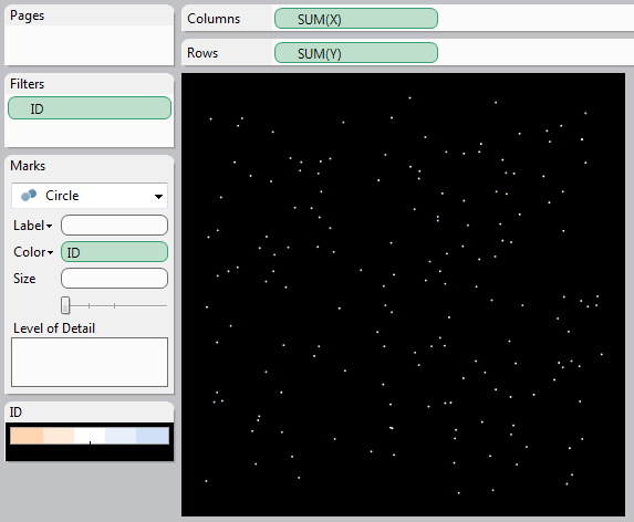
One fun feature – there are actually two instances of the star field image as a background image, if you open up the workbook and bring in Jupiter or one of the outlying planets, you’ll see the same star field, which is pretty much what you’d see if you were zooming out in space as well – even as more planets came into view, the relative positions and sizes of the background stars would stay the same.
I’d built most of the orrery back before the Tableau Customer Conference this past November, and with that whole Zen Master thing, the holidays, and other projects it’s been on the back burner for too long. For those of you who have been waiting, I hope it’s worth it!
I wouldn’t have the patience to build something so intricate. But since you’ve done it…I tip my hat. Very nice work.
Thanks! It was a labor of love!
Awesome work Jonathan!
The next step would be:
The vortex view of planetary motion around the Sun
http://kottke.org/13/03/the-vortex-view-of-planetary-motion-around-the-sun
This is one of the most interesting Tableau applications I have seen over the past 6 or 7 years. You’ve inspired me to think outside the box with Tableau, even more than I’ve been trying to do! Very good work! Maybe I missed the link, but is there a packaged workbook somewhere for this?
I just found the link to download the workbook!
I’m glad you did, and thanks for your compliment! I didn’t have a full Tableau Public viz because the animation doesn’t work there, so the link got a little buried.
Totally gobsmacked!! Now to think of ways to incorporate an orrery at work.
Excellent! I look forward to see what you come up with!
Pingback: 100,000 Hits and an Announcement | Drawing with Numbers
Pingback: Orrery Remix – by Noah Salvaterra | Drawing with Numbers
Pingback: Multiple Ways to Multi-Select and Highlight in Tableau | Drawing with Numbers
Pingback: Text Wrapping within Tableau Panes | Drawing with Numbers