Parallel coordinates are a useful chart type for comparing a number of variables at once across a dimension. They aren’t a native chart type in Tableau, but have been built at different times, here’s one by Joe Mako that I use in this post for the data and basic chart. The data is a set of vehicle attributes from the 1970s, I first saw it used in this post from Robert Kosara. This post updates the method Joe used with two enhancements that make the parallel coordinates plot easier to create and more extensible, namely pivot and Level of Detail Expressions.
The major challenge in creating a parallel coordinates chart is getting all the ranges of data for each variable into a common scale. The easiest away to do this is to linearly scale each measure to a range from 0-1, the equation is of the form (x – min(x))/(max(x)-min(x)). Once that scale is made then laying out the viz only needs 4 pills to get the initial chart:

The Category is a dimension holding the different variables, ID identifies the different cars in this case, the Value Scaled is the scaled measure that draws the axis. Value Scaled is hidden in the tooltips while Value is used in the tooltips.
Where this is easier to create is using Tableau’s pivot function, in Joe’s original version the data is in a “wide” format like this:
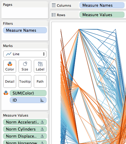
 So for each of the measures a calculation had to be built, and then the view was built using Measure Names and Measure Values:

The major limitation here is in the tooltips (in fact, Joe had rightly hidden them in the original, they were so useless):

The tooltip is showing the scaled value, not the actual value of acceleration. This is a limitation of Tableau’s Measure Names/Measure Values pills…If I put the other measures on the tooltip then I see all of them for every measure and it’s harder to identify the one I’m looking at. Plus axis ranges are harder to describe.
Pivoting Makes A Dimension
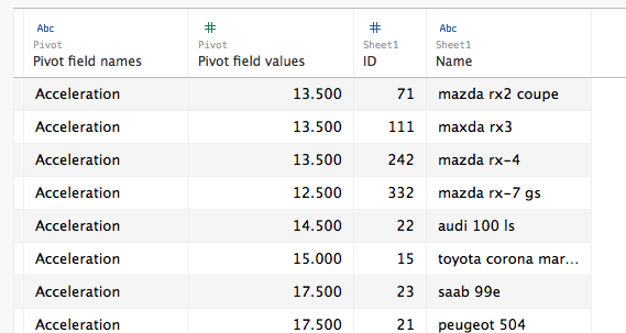
I think of Tableau’s Measure Names as a form of pivoting the data, to create a faux dimension. I write faux because beyond the limits mentioned above we can’t group Measure Names, we can’d blend on Measure Names, we can’t do cascading filters on Measure Names, etc. The workaround is to pivot our data so we turn those columns of measures into rows and get an actual “Pivot field names” dimension (renamed to Category in my case) and a single “Pivot field values” measure (renamed to Value in my case):

Then for the scaling we can use a single calculation (instead of one for every original column), here’s the Value Scaled measure’s formula:
([Value] - {EXCLUDE [ID] : MIN([Value])})/
({EXCLUDE [ID] : MAX([Value])} - {EXCLUDE [ID] : MIN([Value])})
I used an EXCLUDE Level of Detail Expression here rather than a TOTAL() table calculation as an example of how we can use LODs to replace table calculations and have a simpler view because we don’t have to set the compute using of the table calculation.
Now with a real Category dimension in the view the Value Scaled calc is computed for each Category & ID, and this also means that if we put the Value measure in the view then that is computed for each Category & ID as well, immediately leading to more usable tooltips:

For a quick interactive analysis this view takes just a couple of minutes to set up and the insights can be well worth the effort. Prior to the existence of Pivot and LOD expressions this view would have taken several times as long to create, so for me this revised method takes this chart type from “do I want to?” to “why not??”
Cleaning Up
To put this on a dashboard some further cleanup and additions are necessary. Identifying the axis ranges is something that is easier as well with the pivoted data. In this case I used a table calculation to identify the bottom and top-most marks in each axis and used that as mark labels to identify the axis range:

The Value for Label calculation has the formula:
IF FIRST()==0 OR LAST()==0 THEN
SUM([Value])
END
The addressing is an advanced Compute Using so that it identifies the very first or last mark in each Category based on the value:

In addition I created two different versions of the value pill that each had different number formatting and used those on the tooltips, used Joe’s original parameters for setting the color and sort order with revised calculations (which were also easier to use since Category is a dimension), and finally added a couple of other worksheets to be the target of a Filter Action to show details of the vehicle:

Click on the image above to download the workbook from Tableau Public.
