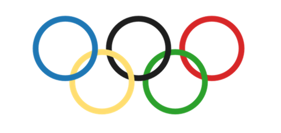
This very brief visualization is inspired by Aaron Copland (who’s music always sounds more Olympian than other pieces to me), and a tweet earlier from Marcel P. Bosboom who wrote, “If it can’t be visualized in #Tableau there is no reason to know about it.”
Creating the visualization
The rings were drawn using a custom shape since the built-in circle shape is too thin. The positioning took a fair bit of tweaking since Tableau does not explicitly put marks at a fixed point, instead Tableau shifts things around based on the headers in the view and the start/end points of the axes. I had to have the axis headers in the view in order to adjust the start and end points and iteratively adjust for how things would look on the dashboard, without the header. Here’s the data if you want to play with it yourself!

Very creative!
Nicely done! Cheers Jonathan.
Least informative and inaccurate.
You are close, but it is not the logo. See http://www.logostage.com/logos/Olympic.png the rings should interlock with white space.
I would think a better route would be to use the polygon mark type, effectively drawing a vector image (too bad Tableau cannot draw bezier curves), and then use a blank 1px background image to allow you to set a fixed aspect ratio. Then you can have both an accurate logo and ensure it looks good no matter the dimensions of the worksheet.
Hi Joe,
You win the “most observant” sticker! I was wondering when someone would bring up the lack of interlocking rings. I didn’t put white borders (actually halos because they are Shape marks) around the rings because that would have drawn too much attention to the fact that the rings are overlapping but not interlocking.
I didn’t know about using a 1px image to fix the aspect ratio, that would have been much easier. And the idea of using polygons honestly never occurred to me, I’ve only used them a few times. Thanks for the tips!
> “I didn’t put white borders (actually halos because they are Shape marks)”
I believe that because they are shapes, you cannot add halo/boarders, as a result of the mark type. The shape mark type is actually a square image, and I don’t think Tableau would have a way of detecting the drawn boarder, only the square edge of the image. So no boarders for shape mark types, only the the vector style marks, like Area, Bar, Circle, Square, Polygon, etc. In my experience, Line, Text, and Shape do not have the ability to set a boarder. I have no idea why there is a disabled Halo combo box in the Color context menu. Have you found a situation where you can turn on a halo?
> Have you found a situation where you can turn on a halo?
Yes, but only when the view is a symbol map. On the symbol map, the halo is activated and is essentially a border around the border for all the mark types you mention, becomes a border around Lines, becomes a rectangular background for Text marks, and for Shape marks does the awesomely cool thing that you (and I) didn’t think Tableau would be able to do: Tableau detects the all the boundaries of the transparency in the shape images and draws the halos around those, so circles become rings, the white-on-black arrows get highlighted inside and out, etc. The one caveat is that if you try a dual axis chart with a filled map underneath, Tableau will still let you pick a halo color but doesn’t draw any halo.
I just figured this out a couple days ago while answering this forum post: http://community.tableausoftware.com/thread/119190, seeing the rings was the initial seed for the Olympic Rings viz. I also created an Idea http://community.tableausoftware.com/ideas/1414 to have halos enabled for other view types as well.
And, Joe, this is really very cool for me, I’ve learned so much from you that it’s nice to be able to return the favor and share a bit of learning with you!
Thank you! I just up-voted your idea.
There is quite a bit about Tableau that I too am still learning, I really appreciate the great community of helpful users.
(unrelated, how many levels deep does your comment formatting allow for? does it get to a point where the available width one word?)
It turns out that 5 levels are as deep as it gets…I couldn’t reply to your last comment. This was a much easier way to find out than to dive into the code!