Though I got to be one of the beta testers for Tableau version 8, I missed an effect of Tableau’s new rendering engine that affects how we customize Grand Totals.
If you’re in a hurry, here’s the key bit: In version 8, if you are customizing grand totals using the table calculation technique from Customizing Grand Totals – Part 2, set the menu item Analysis->Stack Marks->Off. Alternatively, you can use a table calc on the Pages Shelf, read on for that one.
Using the example from Customizing Grand Totals – Part 2, if we try to make the grand total have the sum of the average sales per Department (the version 8 name for Category), Tableau defaults to this view:
There are two problems: first, the text is left-aligned (and can’t be changed), second the view takes up the entire window. What’s going on? This next view – where I took out the IF FIRST()==0 … END optimization – explains:
Tableau is stacking the marks in the Grand Total row.
Version 8’s New Layout Engine
One of the useful new features in version 8 is that Tableau changed the default behavior of views so there are aren’t overlapping marks when there is a greater level of detail than could appear in a given pane. The new version 8 layout engine is key to packed bubbles, treemaps, and word clouds, where instead of marks being placed along Cartesian coordinates defined by axes, they are being laid out by an algorithm internal to Tableau.
For example, here’s a view of what you would see in version 7 and earlier with Department (the version 8 name for Category) is on the Level of Detail and Avg(Sales) on the Text Shelf:
Here’s that same view, only with version 8’s default setting:
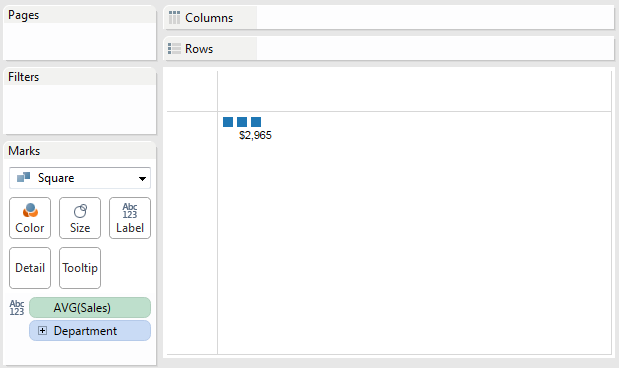
What Tableau is doing here is called mark stacking. Instead of drawing all the marks in one place, it’s stacking them. If we change the Mark Type to square, Tableau v8 will draw three squares:
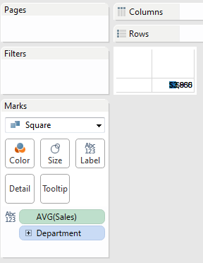
And if we turn off Mark Stacking by using the Analysis->Stack Marks->Off menu item, we get all the squares on top of one another:
Solution 1: Turn of Mark Stacking
Analysis->Stack Marks->Off forces Tableau to use the old-style (version 7? Classic?) rendering, and that works to get us back to a right-aligned view that only takes up the necessary space:
Solution 2: Pages Shelf
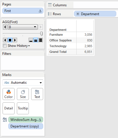
Joe Mako shared with me another technique for this: Create a table calc such as FIRST() or INDEX(), then put that on the Pages Shelf with the same Compute Using as is used for the Grand Total calc. Then you can hide the Pages Shelf and control from the final view.
The reason why this works is that Tableau computes the Pages Shelf after almost all other computations are complete, and here we’re only showing the value of FIRST() – 0 – or INDEX() – 1 – that has an associated Grand Total. Otherwise (based on the optimized grand total calculation we’re using) we’d end up with nothing in the view, which you can see in the Tableau Public workbook, just move the Index to a value of 2 or 3 and watch the data disappear:
These two techniques are both workarounds on top of another workaround – the custom calculation for a grand total. Neither would be necessary if Tableau added support for one of my pet feature requests, having the grand totals and subtotals display a visual total of the displayed marks.
It’s great to have the workarounds, though personally, I’m not sure which technique I’ll be using more often – I can see places for both. Turning off mark stacking seems to be the easier technique. Let me know what works for you, and if you’ve come up with any other options!


Pingback: Counting Pairwise Similar Votes in Tableau | Drawing with Numbers