
What if you want to show the total in the view, but a reference line makes your axes too big and your marks too small? This post goes through a variety of solutions that exist in Tableau today.
For example, if we just add a reference line to the following simple bar chart, the bars get too short:
Adding a Grand Total column has the same issue:

Here’s a list of techniques to deal with this:
- Set up calculated fields to label the first, last, or largest bar mark.
- Use a Mark Annotation that uses the Total Sales
- Add a secondary axis that uses a measure that is say, 10% larger than the largest mark value and put a single text mark there. Alternatively, use a secondary axis with a measure that has the desired value and use that as a reference line, taking advantage of Tableau’s layout.
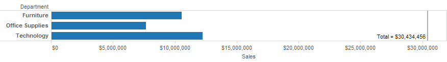
- Combine two worksheets on a dashboard using the chart as one worksheet and the total as a floating object. Or arrange the worksheets in another way you want.
- Put the total value in the worksheet title or caption.
- Add a discrete calculated field that returns a single value for all rows and use that as a header.
- In Tableau Desktop, you can also see totals in the Summary Card and/or status bar.
And a Tableau Public viz that demonstrates all of them:
The inspiration for this post was a Tableau feature request to support making the label of a reference line some other value than a value calculated from the measure, and a little procrastination over some messy SQL and unclear business logic. If you know of other techniques, add them below!