
One of the people I really wanted to meet at #data17 was Sarah Battersby, if you haven’t seen her blogs on mapping you’re missing out. It turns out she wanted to meet me, too!
Awesome to meet a data idol! #MeAndMyZen pic.twitter.com/nKHr8yGJxt
— Sarah Battersby (@mapsOverlord) October 10, 2017
So Sarah does really awesome stuff (can you tell I’m a fanboy yet??) and yesterday she posted about doing spiral jittering on maps:

That inspired me to dig out an old post where I’d done a waffle chart or unit chart jittering technique on a time series:

And adapt that to a map, like this one that makes me think of bunches of grapes:

Why would we need to do this?
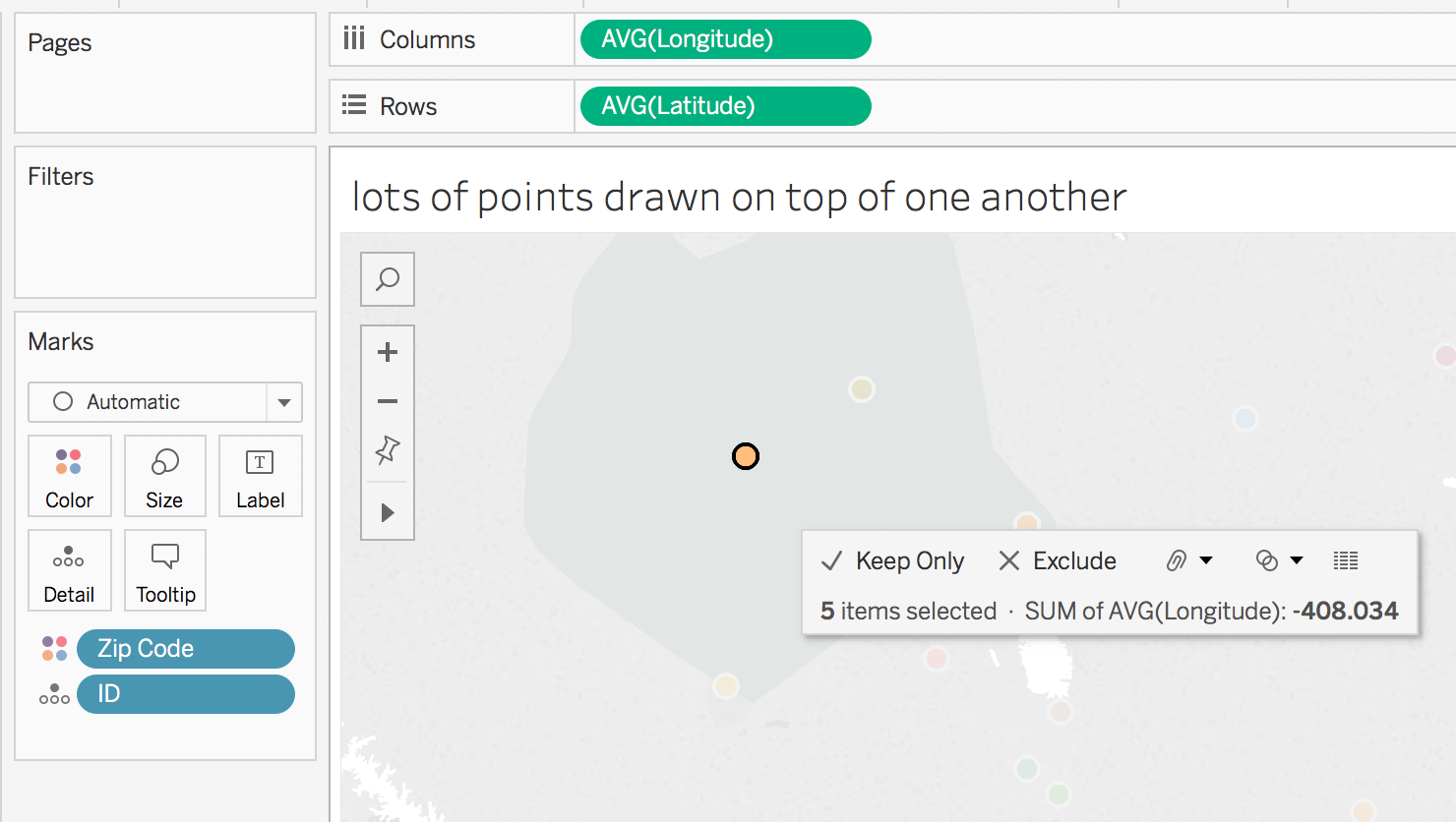
I’m not going to go into all the details, you can go read Sarah’s fantastic Jittering post instead for an overview. Basically there are times when we have more than one “thing” for one or more point(s) on a map and we want to show them that way. For example in the map below there are 5 IDs for the selected zip code that are all plotted on top of one another. Through using jittering we can show a mark for each ID like in the jittered map above where that one visible circle is replaced by five circles.
There is nothing new under the sun
Back in 2013 Stephen Few proposed the idea of bricks on maps as a way of encoding a value, the technique I’m using here could be used to get the same result. The key difference is that instead of using the unit or waffle chart to encode the single value we’re using the unit chart to encode multiple values. Andy Cotgreave also had a nice post on some of the issues with this kind of chart.
How do we put a waffle chart on a map?
First of all we need a data source that has latitudes & longitudes that we can do calculations on. If you don’t there are a variety of ways to get one. After that we need to get mathy. Here’s my workout view:
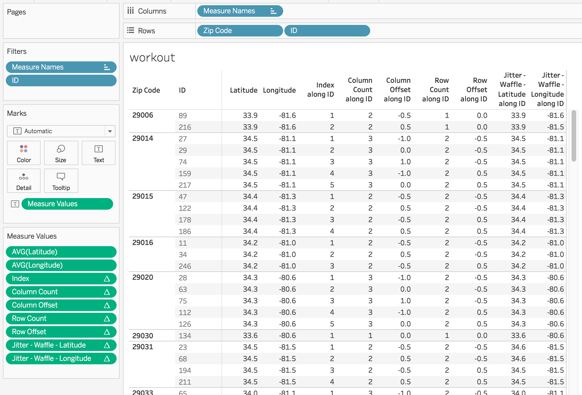
All of the table calculations have a compute using on ID, the idea is that the compute using is set to the dimension(s) that are making the extra marks and then the dimension(s) left for partitioning (Zip Code in this case) are the ones that are creating the initial map positions.
I’ll briefly walk through each calculation.
Index uses Tableau’s INDEX() formula and uniquely identifies each mark.
Column Count gets us a count of columns that is based on forming the smallest possible square that will contain all the marks, here’s the formula:
//this formula will try to draw a square, if you want something else then just put in a fixed aggregate number like MIN(3)
IF INT(SQRT(SIZE())) == SQRT(SIZE()) THEN
 SQRT(SIZE())
ELSE
 INT(SQRT(SIZE()))+1
END
Column Offset then computes the number of positions of lateral (latitude) offset for each mark from the center of the unit chart. I’ve done some different experiments on where to position the unit chart and for me the most natural is to have the center of the unit chart be the centroid of the point.
//this gets the column position in the row
IF [Index] % [Column Count] = 0 THEN
 [Column Count]
ELSE
 [Index] % [Column Count]
END
//subtract the position of the midline to get the offset
 - ([Column Count] + 1)/2
Row Count then gets the number of rows in the unit chart, and would again benefit from a CEILING() function for table calcs (hint hint).
IF INT(SIZE()/[Column Count]) = SIZE()/[Column Count] THEN
 SIZE()/[Column Count]
ELSE
 INT(SIZE()/[Column Count]) + 1
END
Row Offset computes the number of positions of vertical (longitude) offset for each mark from the center of the unit chart:
//row position in column
IF INT([Index]/[Column Count]) = [Index]/[Column Count] THEN
 [Index]/[Column Count]
ELSE
 INT([Index]/[Column Count]) + 1
END
//subtract the midline of the row to get the offset
- ([Row Count] + 1)/2
Jitter – Waffle – Latitude then gets the latitude for the point and subtracts the row offset multiplied by a waffle jitter parameter that lets us deal with the zoom level to offset by just the right amount of latitude. This field has the Latitude geographic role assigned.
TOTAL(AVG([Latitude])) - [Row Offset] * [waffle jitter]
Jitter – Waffle – Longitude does the same for the longitude.
TOTAL(AVG([Longitude])) + [Column Offset] * [waffle jitter]
Note that I’ve only tested this so far with US latitude & longitudes, these calcs might need to be slightly different if you are east of 0 longitude or south of the equator.
Building the View
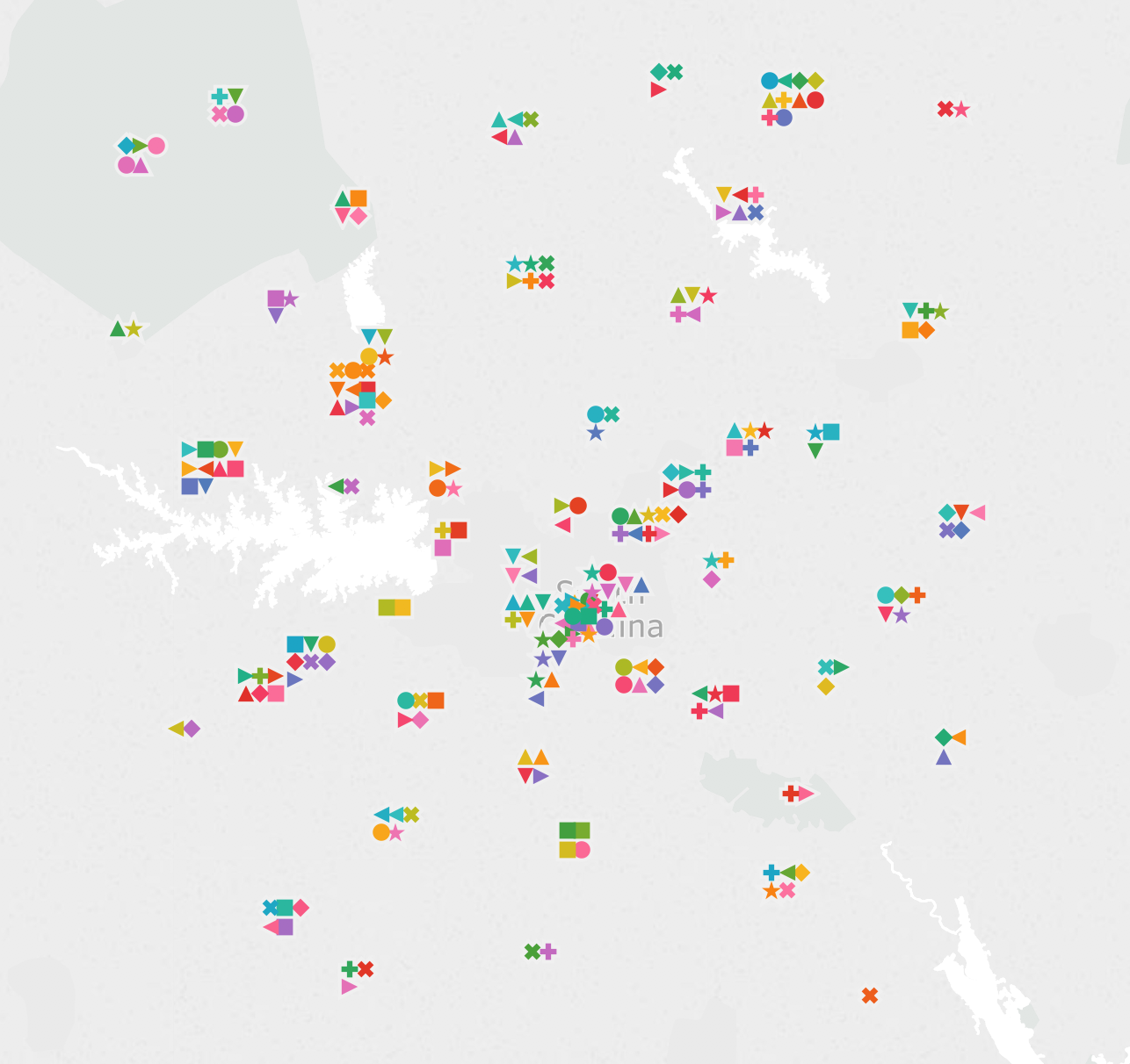
With all the calcs created in the workout sheet and verified, then we can duplicate that sheet and start dragging & dropping pills to build a view. In this case I’ve created a dual axis on to show that the centers of the unit chart are on the centroids of the zip codes (the black crosses) and at this zoom level a waffle jitter value of 0.02 works well:

For this view I’ve made the waffle jitter slightly smaller to 0.015 degrees and added white borders to the marks:
Why Stop Here?
We don’t have to use just circle marks, in this view I’ve used shape marks and different colors for each shape just to show how much information we could place on a single view.
And in Tableau v10.5 we could even do something like only show the unit chart on a map if there weren’t too many marks nearby (by using a binning or hex bin function in an LOD expression) and use the new Viz in Tooltip feature to get the detail.
Conclusion
Thanks to Alan Eldridge for the original jittering post and Sarah for adding more jittering options and inspiring this post! Here’s the unit or waffle chart jitter on maps workbook on Tableau Public.