
I recently got a request for help with a wrapping challenge. Not holiday presents, instead text wrapping in Tableau. Here’s a demo view illustrating the problem:
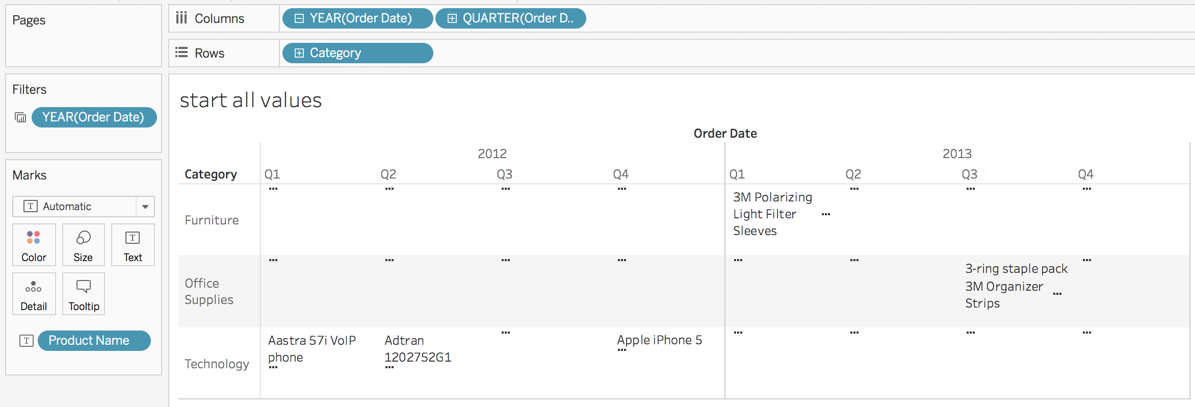
There’s a whole bunch of ellipses (…) where there’s too much data to display. The only options Tableau gives us in this case are to:
- Change the order of the text by sorting the Product Name dimension.
- Manually change the size of each pane by resizing the headers.
- Use the Fit options to dynamically Fit Width, Fit Height, or Entire View.
The manual sizing is problematic because it won’t dynamically adjust to the number of marks, and in the case of views with lots of marks like this one it takes a lot of effort to figure out what size will get all the marks, never mind that the list of values is really hard to read:

And while the Fit options are great at ensuring a view with only a few marks takes up the available space when there are many marks it ends up either not displaying values or creating overlapping values depending on the settings.
Controlling X + Y
In this view the mark layout–either no pills or only discrete (blue) pills on Rows and Columns– is generating a pane for each distinct combination of header values and then Tableau’s mark stacking algorithm is laying out the text. So at this point we’re stuck and can’t do anything about what Tableau is up to. This is where we need to keep in mind one of the master Tableau concepts: everything is a scatterplot. If Tableau won’t place the marks where we want them then we can generate our own X + Y coordinates whether by adding data or creating our own calculations. This is the approach taken by the tile maps introduced to Tableau by Brittany Fong or or as a model of the solar system that I made awhile back: . More recently Ken Flerlage did a great introduction on his Beyond Show Me series of blog posts.
Therefore “all” we need to do is figure out where to place the marks. More on that in a moment, there are two more details I want to go into:
Green Panes vs. Blue Panes: Pane Sizing
Tableau’s logic around what generates a pane vs. marks in a pane is a little complicated so I’m going to keep this focused on three key elements, here are the first two:
- All panes created by a given combination of pills are the same size.
- (corollary to #1) If we resize one header or axis then all the other panes for that header or axis will resize as well. Tableau does this because it’s easier to visually parse (read) a view that has consistent sizing of elements.
Here’s a view with COUNTD(Product Names) on Text & Color with just discrete (blue) pills on Rows and Columns:

Somehow we need to fit 509 Product Names into the pane for Q4 2015/Office Supplies. If I resize Office Supplies to be taller then both Furniture & Technology change as well:

The same goes if I’ve got a continuous axis to place X/Y coordinates on. In this view I’ve simply put MIN(0) and MIN(1) on Columns & MIN(0) Rows and we can see a set of axes:

If I resize MIN(1) on Columns then to make it wider then all of the panes for MIN(0) and MIN(1) on Columns are resized.

So we can’t really dynamically resize panes to fit the data, all we can do is fit more or less into a pane. Therefore the desired solution can’t involve resizing panes, instead we will need to be generating more or fewer panes, and that leads to the next point around panes.
Green Panes vs. Blue Panes: Number of Panes
The third key element around green panes and blue panes is this:
- a) Continuous pills generate an axis for every discrete pill header. b) Discrete pills generate a header for every value of the pill.
We can see a) in action in the continuous views above, with MIN(0) and MIN(1) on Columns we get two axes for each quarter/year combination. So to add more axes we’d need to add more continuous pills but we can’t dynamically add them, and the number of axes ultimately depends on the discrete pills anyway so discrete is the way to go.
We can see b) in the discrete views above, there’s a header for each quarter in each year. Where this gets a little more interesting (and more useful in our case) is when the data is sparse, as in this case where the Avery products are not sold in every customer Segment:

Avery 5 is only sold in one segment so there is only a single header for Consumer, whereas Avery 494 is sold in all three segments so there’s a header for each.
So how this comes together is that in reating X/Y coordinates for positioning the text in our desired view we’re going to use discrete headers that can give us just enough headers (and no more) for the task, here’s a pic of the desired view with those headers:

Packing the Marks: the Algorithm
I experimented with some different layouts and looked at the following factors:
- In each pane there’s a list of 0 or more values (marks).
- At least in English when we’re reading lists we tend to make them top to bottom and when more is needed we add another column to the right.
- There’s a balance in readability between too many columns vs. too tall columns. When there are many columns already then adding more columns for the list makes the view harder to read; in other words, a “tall” view with fewer columns is easier to read than a “wide” view.
- When the panes in a row or panes in a column have different numbers of marks it’s important to efficiently stack the marks: too much white space can make the view harder to read.
- A stacking layout that is closer to a differently-sized squares is easier to read than one that ends up with differently-sized rectangles.
The algorithm I came up with is a variation on the panel chart layout I used in Waffle Charts and Unit Charts on Maps that uses table calculations. The algorithm does the following:
- Calculates the index for each mark in a pane using INDEX() and the number of marks in a pane using SIZE(). These calculations are used in the following calculations.
- Counts the number of mark columns needed for each pane where there’s a Max # of Mark Columns. parameter to set a “no more than” value to prevent views from getting too wide. Then a nested calculation counts the maximum number of mark columns in each column.
- Once we have the number of mark columns then the algorithm computes the number of mark rows for each pane, and then gets the maximum number of mark rows for each row.
- Finally the mark row position and mark column position can be computed based on the index for each mark in the pane and the available number of rows and columns.
I numbered the calculations so they can be each brought into a workout view in order with their compute using set and validated before moving to the next calc. Calcs 1 & 2 require a compute using on the dimension to be used on Text and Calcs 4 & 6 have nested compute usings, see the comments on the calcs for details.
Here’s the workout view:

One complication is that the date dimensions are on Detail with custom dates with the ATTR() aggregation on Rows. This is a method to prevent unwanted data densification.
Once the workout view is built and validated then it’s possible to duplicate the view and rearrange pills, here’s that view:

There’s still a bit of manual resizing required, in this case it’s just to have enough size in each of the panes created by the column and row position table calculations to display the text. Once that is done those headers can be hidden for the final view:

We’re not limited to a text display, for example here’s a highlight table that only took a couple more clicks:

Conclusion
Here’s a view to play with where you can adjust the Max # of Columns parameter and the number of states (which is a proxy for how many products are displayed). Click the image to open the text wrapping in pane view on Tableau Public:
 The key concept to keep in mind is that when Tableau won’t plot marks where we want we can add to the data source to get the necessary X&Y coordinates via joins, blends, and/or writing calculations. Since Tableau was designed as a tool to support interactive visual analytics tasks like making giant text tables with the desired text wrapping can take more effort than we might like, however given Tableau’s flexibility we can get the job done.