
The 3D Caveat
Showing Jonathan Drummey an early version of the 3D Tableau workbook, his response included some words I’ve reflected on since: “Just because I can, doesn’t mean I should.” The comment wasn’t disparaging, it was directed at examples of 3D pie and bar charts I’d built which I’ve since removed. I’m not a fan of 3D charts. Tableau is perfectly capable of doing 3D charts; they just weren’t built in because they tend to distort more than engage.
What follows is not meant as a point of view on best practices, rather it is an exploration of some techniques I’ve been playing with and thought others might find interesting (or at least pretty). These examples exists because they can; the jury is out on whether or not they should. I’ve done my best to keep this presentation light, however, deep concepts both in Tableau and math are discussed. Feel free to skip ahead and look at the pictures or ask me to clarify in the comments if you need more detail; it will not be on the test.
Now the 3D workbook is probably the most visually remarkable part of this post, so I’m saving it for last. To be clear though, when I say 3D, I mean 3D, not 3D-ish. We live in a 3D world, and while you can see artifacts of that fact in a photograph, photographs are generally 2d, as are “3D” charts in excel; they suggest 3D, having come from a 3D world by using shading and perspective. I’m talking about something that will step right out of your monitor like a good 3D movie (and hit you in the face if you lean in too close). Like with 3D movies, appropriate glasses are needed to get the full experience. I’ll give some instructions on where to find these and suggest a brief intermission when we reach that point.
Creating Data
For some time after I started using Tableau, I believed the marks and the underlying data to be more or less the same thing. In fact there are several situations where marks are generated without having them in the underlying data! If this is news to you, don’t panic, everything will be fine. Consider a dataset with the values: 1,1,1,2,2,7,9,9. Frequencies for this data could be displayed in a few different ways; here are the two that seem the most natural:
 |
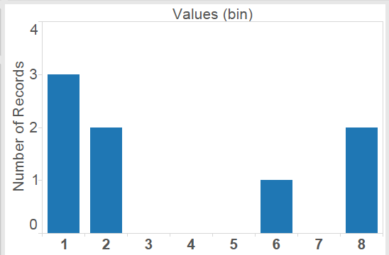 |
The second of these shows blanks for some values that didn’t occur in the original dataset. Like dates and date-times, Tableau Bins are range aware; that is, there is some built in awareness of there being bins that were skipped over. In this case the bin size is 1, and when “Show Missing Values” is selected, I get blanks for the empty bins that occur between my data points. This type of densification is called domain padding. There are several others, but those would take several more blog posts. The number of empty bins that could be created in this way is unlimited. These bins are empty, but they are accessible to table calculations, so if I create an Index computing across the table I get this:
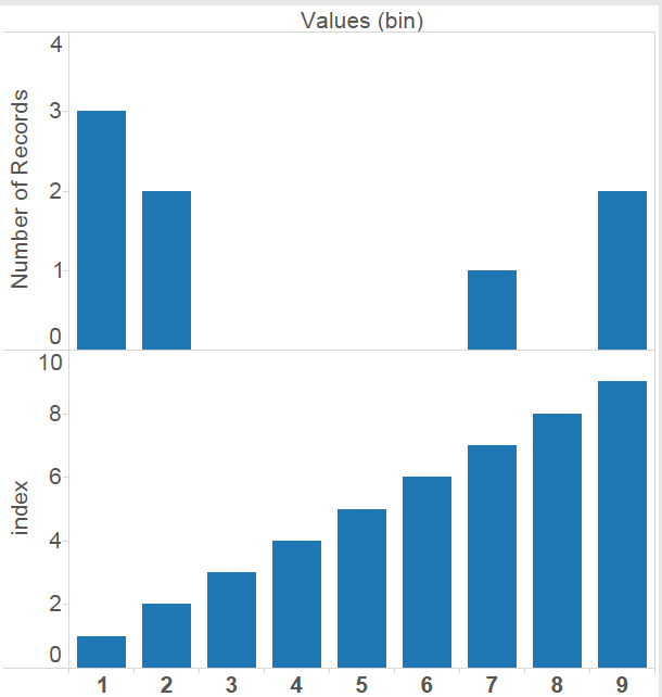 The Index shows 9 points, though the dataset has only 8 rows and has data in only 4 bins. In fact, the largest dataset used for this post has 32 rows, well under the million rows of data allowed in Tableau Public, and with domain padding could become as many rows as Tableau Public would let us before it ran out of memory. In theory, any of the demonstrations should be possible to do with 2 rows of input data, but I’ll leave that as an exercise.
Multi-step Recurrence Relations
The LOOKUP(expression, [offset]) function in Tableau will return the value of another field or calculation at a different row. It shows up in the difference and percent difference calculations. With the offset argument it is possible to specify arbitrary number of rows back. A similar, and often confused function, is PREVIOUS_VALUE(expression) which looks back exactly one row in the current field or calculation. Along with domain padding, this started me thinking about recursion. While it would be possible to do simple 1-step recursion in this way, there is no second argument in the PREVIOUS_VALUE function, so more than one step back is off limits to this function.
The Fibonacci Sequence
0, 1, 1, 2, 3, 5, 8, 13, 21, 34,… each number is the sum of the last 2. While PREVIOUS_VALUE() gets us the prior one, there doesn’t seem to be a way to get back further. Note the Fibonacci sequence actually has a closed formula for these terms that would avoid the recursion, but I’m just using it as an example.
I like solving problems, but sometimes even a problem solved leaves a bad taste in my mouth. This is such a solution. I like it because it works, but only for that reason. Anyone who comes up with a better solution will get a drink (more like another drink) on me at the Tableau Customer Conference.
So here is how I do it: A function (or calculation in Tableau), can output at most one value for any given input. I’d like to break this rule and output 2 numbers so that I have not only the previous value, but also the one before. The trick is, I didn’t specify what type this output should be. Since I can convert between types, there is no reason why I can’t output a vector as a string, concatenating numbers together separated by a delimiter, and then grab the appropriate value from the vector to display as a measure Feeling sick to your stomach yet?
Here is the Fibonacci sequence being dynamically computed in Tableau Public (the source data has 10 rows).
Fractals
I’ll refer to Wikipedia for a general description of fractals, so I can stay more or less on Tableau. Basically, many fractals can be thought of as a visual version of an iteration process.
The first example is a Serpinski Carpet. Starting with a square, remove the center 9th (in the tic-tac-toe sense). This leaves 8 smaller squares. Remove the center 9th from each of these leaving 8×8=64 smaller squares. Now keep on removing squares forever. The source data has 32 rows:(2 for each the x and y axis) * (2 for the axis along which the iteration takes place) * (4 because I’m using polygons to avoid needing to tinker with the size slider each time I change the maximum number of iterations).
Here are a few iterations of the Serpinski Carpet as an animated GIF:

And you can see it for yourself on Tableau Public: Serpinski Carpet Workbook
Next up is the Mandelbrot Set. The Mandelbrot set is produced via recursion on the complex plane. Alternatively, this can be thought of as a 2 dimensional real iterative process, with a bit more complexity in the formula: Starting from a point (u,v) we perform a 2 dimensional iteration:
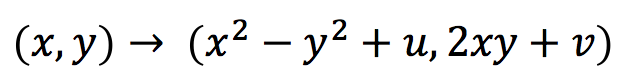
A point is out if the sequence of points diverges (i.e. gets further and further from zero). The remaining points form the Mandelbrot set. If the distance from zero ever becomes greater than 2, then the sequence is certain to diverge. This fact is often used to color the complement recording the first iteration where this distance was greater than 2. In practice only finitely many iterations can be performed (and with finite accuracy) so this is really a sketch. The viz is parameter driven, so the center, zoom, number of iterations and resolution can be adjusted. There are only 8 rows in the source data, which is not too shabby for an infinitely complex mathematical structure. Note: Tableau 8.1 added a pass-through to R, so in theory these computations could be handled outside Tableau or the data could be pre-processed as Bora Beran recently blogged. I’ve yet to realize a performance improvement from using the R pass-through for this iteration, though at this point I might not be doing it right, it definitely seems like a more scalable approach than my converting to text trick.

Mandelbrot Set Workbook on Tableau Public
Intermission
For the next workbook I’d suggest wearing ChromaDepth 3D glasses. Where does one get ChromaDepth glasses? All over! Crayola sells 3D coloring books in most drug stores I’ve looked in (Wallgreens, CVS, Duane Reade), toy stores, craft stores, Amazon, Ebay, and even a lot of grocery stores have them lately. The only problem with the Crayola ones is that they are made for children, so they may not fit on your head (until you break the arms off). I ordered a few pairs recently online that are made for grownups and am pretty happy with the quality (I got the ChromaPro 3D), you can even get custom printed ones. So go ahead and get some glasses. Off you go…
3D
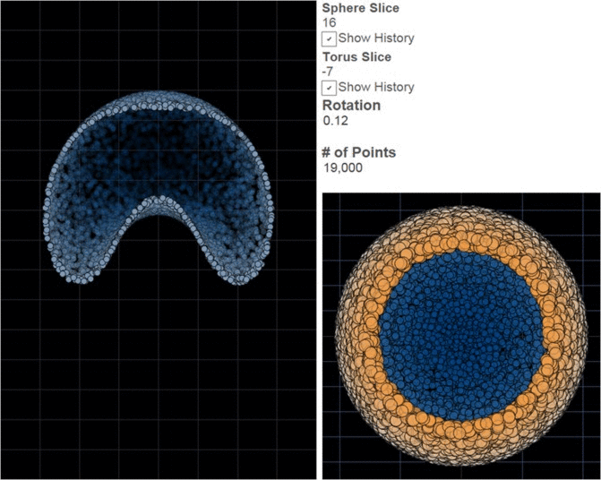
There are many options for doing genuine 3D on your computer, but most require either a significant investment in technology or image processing in order to create separate images for the left and right eyes and make each of these images available to only one eye. ChromaDepth is different in that each lens is essentially a weak prism oriented in opposite directions. You’ve probably seen a prism separate light into a rainbow; the glasses similarly scatter light slightly by wavelengths. Moving red slightly to the center makes it appear closer to the viewer, then orange, yellow, green, blue, purple (I find the response to be a bit flat at the ends of the spectrum, so I go from orange to blue). The illusion becomes more impressive with a dark background and if 2d cues for distance are also incorporated, i.e. farther things are relatively smaller and close things obscure farther things when they get in the way. One beautiful property of ChromaDepth is that because color is being used to encode distance, the images can be viewed without special glasses. They won’t be 3D without the glasses, but they won’t be fuzzy either. So if you skipped intermission and you don’t have 3D glasses, have a look anyway, you won’t break anything. There are only 2 rows in the source data.
3D Workbook on Tableau Public
Conclusion
Who needs a million rows? I do, and then some, but using Tableau to create rich visualizations based on a dataset with only a handful of rows is probably not something anyone intended. I think it hints at a deeper truth that in the age of big data is often overlooked. A picture can be worth a thousand words; it isn’t always, and even when it is there is a big difference between a thoughtful essay and a bag with a thousand words in it. The excitement for me is in finding something unexpected; looking sideways at a dataset and learning something I wouldn’t have guessed and sharing that story with others. Surprises can come in very small packages and the richness of a story isn’t a function of the number of rows any more than it is the number of semicolons; but I do love me some semicolons.
Here are links to all the workbooks referenced in this post: