Last year in version 10.0 Tableau introduced the highlighter that lets us quickly highlight marks. It’s got two potential limitations, though:
- We can only highlight a single value or all marks meeting a search criteria, not multi-select values.
- Tableau’s Highlighter (and Highlight Actions) are hard-coded so we don’t have control over the formatting of the highlighted marks.
We can work around those limits in a few different ways:
- Using a separate worksheet with Highlight Action(s) enabled with Hover or Select.
- Using a separate worksheet with Highlight Action(s) enabled, a dual axis, and a duplicated dimension to display different marks. This technique was developed by Rody Zakovich in his post Only Color Marks on Dashboard Highlight .
- Using a self-union’ed data source and a dual axis to get total control over how the highlighted marks are displayed and have more control over the user interface for choosing the highlighted marks. I think I might have invented this technique, I haven’t seen anything quite like it before. This method lets us build views like this:
Read on for how to build these out and choose the right method for you!
Tableau’s v10.0 Highlighter
In the following view (and all the other views) there are 50 customers from a Superstore sample data set in a Pareto-ish chart showing their contribution to the % of total sales. In this kind of view we can’t label every mark with the customer name because they’d overlap and we want to enable some sort of highlighting based on a customer list to call out the customers.
In this particular view using Tableau’s highlighter if I enter “b” in highlighter criteria and keep the mouse pointer over the criteria then all customers w/ “b” are highlighted, and I can quickly move the mouse over the list and highlight them individually.

This is great! We can turn on the highlighter by right-clicking on any discrete (blue) pill in the view and choose Show Highlighter, it’s that easy.

Try it out yourself here:
Only what if I want to only select a couple of arbitrary customers? There’s no multi-select available in the highlighter (at least as of Tableau v10.2). Or what if I want to control how the highlighted marks are formatted? We can’t control those either.
Basic Highlight Actions
We can work around the Highlighter’s limitation of no multi-select using a basic Select Highlight Action, this section covers how to do that. Building out a Highlight Action in Tableau requires:
- One or more source worksheet(s), these are what gets clicked on to active the action
- One more more target worksheet(s), which could be the same as the origin sheet(s)
- The Highlight Action itself
We add Highlight Actions by using the Worksheet->Actions… or Dashboard->Actions… menu items to bring up the Actions window, and then we can click the Add Action > ->Highlight… button/menu to create the highlight action.
In this dashboard I’ve created a the % of total of running sum of sales view and a second Basic Action worksheet that alphabetically lists the customers, then here’s the configuration of the Highlight Action to go from the Basic Action Sheet to the Basic view:

The Source and Target worksheet sections are fairly straightforward, they let us get very specific about which worksheet(s) on which dashboard(s) can serve as sources and targets, and the Target Highlighting lets us choose the grain of what gets highlighted. The Run action on section is where it gets interesting, there are three options:
- Hover. This is the fastest for interactivity, but is limited to hovering over single values so we can’t get multi-select.
- Select. This enables multi-select since we can use click+drag, Shift+click and/or Ctrl+click (Cmd+click on Mac) to select multiple marks.
- Menu. This is the slowest option since we have to hover over the value, get the tooltip, and then click on the menu item.
So we want to use Select in order to get multi-select for the highlight action, here’s a view:
This use of highlight actions is pretty easy to set up and lets us highlight multiple marks at once, however it has the following limitations:
- The only way to display the selection values is via a worksheet, at present we don’t have any way to use a drop-down, collapsing list, etc. When there’s a long list to work with that gets challenging.
- The formatting of the highlighted marks is defined by Tableau, we can’t change it.
Highlight Actions w/Duplicated Highlight Pills and Dual Axis
When I saw Rody Zakovich’s Only Color Marks on Dashboard Highlight last year I had an “Ooooohh… that’s so cool!” reaction. Rody created a method where we could have more control over how highlighted marks are displayed by using a dual axis where one axis has the formatting we want and that’s what gets highlighted while the original axis is greyed out. His post goes into more details, here are the steps in a nutshell:
- Create the original view.
- Create a duplicate field of the field we want to highlight. We’ll actually use the duplicate for the highlighting, not the original.
- In the target view create a dual axis chart w/synchronized axes, one axis is the original axis and the second is the highlight axis. Make sure the highlight axis marks are in the back.
- Add the duplicate field as a pill to the level of detail of the highlight axis Marks card.
- Add a Highlight Action from the source view to the target view that only uses the duplicated field.
In this view I’ve set up a set of line marks for the original axis and circle marks for the highlighted axis where the line has been made thick enough to conceal the circle marks. The Customer Name (copy) dimension is the duplicate field so only the circle marks are highlighted when clicked on:
A key bit is step #3, the marks on the highlight axis need to be hidden behind the original displayed axis. This can be a little tricky when placing views on a dashboard. Here’s a pic of the original worksheet, note how the circle marks are visible here, but when placed in the actual dashboard they are hidden behind the line marks.

You can interact with the dashboard here:
This is pretty great, we can get the multi-select for highlighting and have some control over the marks. However it’s got two limitations:
- Like the Basic Highlight Actions the only way to display the selection values is via a worksheet, at present we don’t have any way to use a drop-down, collapsing list, etc. When there’s a long list to work with that gets challenging.
- Needing to conceal the highlighted marks means that those highlighted marks can’t be too big and that could make it harder to find the marks in a view with more going on.
So let’s go a little further and get a view that doesn’t have either of these drawbacks.
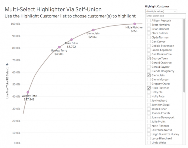
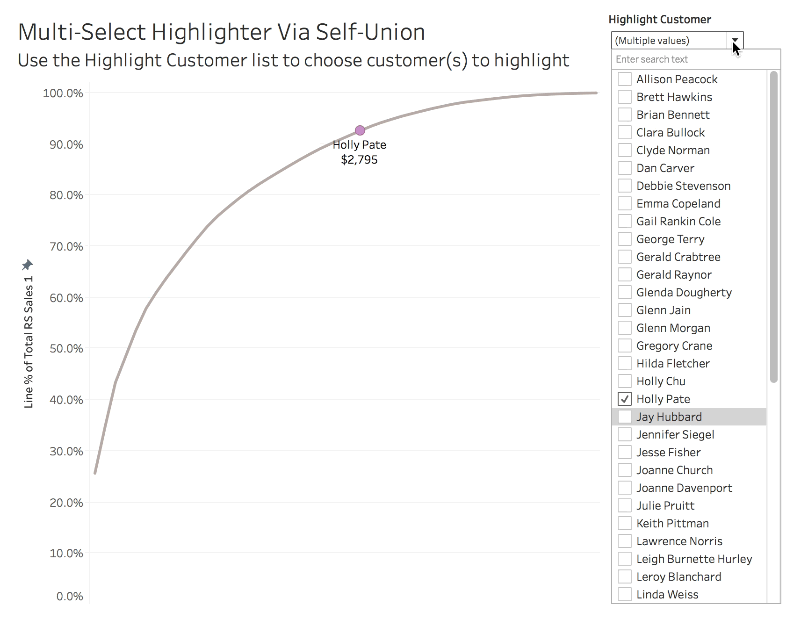
Multi-Select Highlighting via Self-Union
Here’s the worksheet that has it all, we’ve got multi-select using a familiar multi-select control and we can format the highlighted marks any way we want:
Note that this is in a dashboard in order to display properly in the blog, no dashboard is actually necessary.
The key insight that leads to this is one I’ve covered in other posts on this blog: Tableau is a drawing engine for data. If we take the time to understand how Tableau turns data into views then we can do (almost) anything we want.
Conceptually this method is somewhat similar to the prior technique where we used a dual axis where one axis gets highlighted. In this case instead of highlighting one axis we filter for one copy of the data set that draws on one axis while leaving the other data set always displayed in the background. Since we are using a filter we can use Tableau’s native multi-select filter control and avoid the problems of using a source worksheet, and since we are filtering for specific values to “highlight” they aren’t displayed at all so we don’t have to conceal the highlighted values, the marks can be any shape & size (and location) we desire.
Here’s how to set this up:
- Union your data source. In this case I’m using an Excel connection so I could use Tableau’s native union , if your data source doesn’t support union then you can potentially use a cross data source join to set up a union . One copy of the data will be used for creating the original view, the second copy will be used as the source for the filter and to draw the marks. In this case we identify the copies by the Table Name dimension that Tableau automatically adds: Orders identifies the original copy and Orders1 identifies the second copy for the filter.

- Create measure(s) that use values from the original copy. Here the Sales 1 measure has the formula
IF [Table Name] = 'Orders' THEN [Sales] END. Since the self-union will replicate values of the measures, this ensures that we have accurate values. For this view I also built out a Running Sum of Sales 1 measure and a Line % of Total RS Sales 1 measure that create the Pareto line:

- Now for the fun part: Create the “highlight” field. In this case I called it Highlight Customer and it has the following formula:
IF [Table Name] = 'Orders1' THEN[Customer Name]
ELSE
'ZZ - Keep in List'The formula returns a list of values that includes all the customers (from the highlight copy) plus a single ‘ZZ – Keep in List’ value that represents all the customers from the original copy.
END - Add the Highlight field to the Filters Shelf and configure the Quick Filter. In this case I turned off all the customizations and turned on Only Relevant Values, and (most importantly) clicked on the ZZ- Keep in List value to show the line chart.

With the ZZ – Keep in List value selected (and tucked away at the bottom of the filter list) we can always see the original “real” copy and then dynamically filter for as many values as we want from the highlight copy. - We’re ready to create a measure to draw the highlighted marks, here’s the formula for Circles % of Total RS Sales 1:
IF COUNTD([Table Name]) = 2 THEN
[Line % of Total RS Sales 1]
ELSE
Null
ENDWhen the user has selected a customer in the Highlight Customer filter then both the original and highlight copies are filtered for, and in that case there are two values of Table Name (Orders and Orders1 in this case) and COUNTD([Table Name]) returns 2. In that situation we return the desired value where we want to plot the highlighted mark. When a customer isn’t selected then only the original copy is filtered for (based on the ZZ – Keep in List fiedl) and COUNTD([Table Name]) returns so we return Null and Tableau doesn’t draw anything (i.e. no highlight). - Drag the highlight measure into the view, format the marks as desired, create a dual axis, synchronize the axis, turn off Show Header, etc. Here’s a pic of the final Tableau workspace:

This method gets around the limitations of Tableau’s native highlighter by supporting multi-select and giving us complete control over the highlighted marks. However, it’s got a few drawbacks itself:
- We have to union the data, which can be a) complicated to set up and b) make some data sets overly large. The size of the union could be reduced by making the highlighted copy just include the values of the highlighted dimension plus all associated values of other dimensions that you’d want to filter for.
- Since this is using a filter it can be slower to render than the Highlighter or a Highlight Action.
- Needing to leave the ZZ – Keep in List value in the highlight list is clunky. Ideally we’d be able to keep the ZZ- Keep in List value while hiding it from the filter, vote this feature request up if you’d like that.
- This is the most complicated view to set up and requires being able to think about Tableau working at multiple levels of detail. Tableau could make this a lot easier in a variety of ways, here are three: One would be to just support multi-select in the native highlighter, a second is to give us more control over the highlighting formats, and another would be to extend the forthcoming map layers functionality that was announced at the 2016 Tableau Conference to support other marks besides maps and allow independent filtering of the layers.
Conclusion
This post reviewed four techniques for highlighting marks that can give you varying amounts of control over what gets highlighted and how the highlighted marks look:
- Tableau’s native highlighter.
- Highlight Actions
- Highlight Actions with a dual axis to draw highlighted marks differently.
- Multi-select highlighting via a self-union and a dual axis to use filter controls instead of the Highlighter or Highlight Actions.
Choose the one that works for you and create beautiful interactions! Here’s a link to the multi-select highlighter via self-union workbook on Tableau Public.
If you find this useful and want to learn more about Tableau we’ve got trainings and a variety of support options at DataBlick, check us out!
JD,
You keep on truckin down the road while creating virtuoso Tableau blog posts. I cannot even believe the timing on this one because I was formulating an approach last night at 3 am for being able to highlight +/- 3sigma outliers in a data set I recently developed. I believe you have just given me the path forward, and for that I’d like to say thanks.
In fact, I believe I’m going to see if I can go a step further and take one of these techniques and merge it with one of my oldies but goodies: https://3danim8.wordpress.com/2013/09/12/how-to-use-tableau-to-clean-your-data-using-an-iterative-z-score-approach/.
Thanks pal,
Ken
Sounds cool! I’d looked at that post of yours awhile back and tried to come up with a faster/cleaner approach and couldn’t with the tools at the time, may you have better luck than I did!
Jonathan
Jonathan,
Love the technique but have problems with the actual visualization because one might think that Hilda Fletcher had a larger sales than Wesley Tate because her dot is so much higher than Wesley’s. I suspect many people not familiar with how a Pareto works would be confused that Hilda barely contributed to overall sales.
But the technique? Stellar.
Steve Wexler
Good point! If used this viz style would definitely need more annotation. When I was coming up with a viz type to use to demonstrate the viz in the back of my mind was a whale curve chart, and rather than do that I picked a Pareto thinking it would be more familiar but that was likely the wrong choice.
Jonathan
Hi Jonathan,
Can we have multiple options in Filter action that runs on Menu. I want to show two options when I click a field. Accordingly it should take me that dashboard.
Regards,
Tushar
Instead of one Filter Action with multiple options what you’ll need is multiple Filter Actions, one for each option. Cheers, Jonathan
Pingback: Creating Lists of Values for Tableau from Text & Excel Sources | Drawing with Numbers