My daughter loves gymnastics, watching animal dissection videos, kale chips, and space. I’ve always been fascinated by orrerys, and not having the mechanical skill to build one, I decided to make a virtual one for her, and of course thought of using my favorite visualization tool:
I’ve been reading Alberto Cairo‘s The Functional Art – which is a fabulous book, btw – and thinking about annotations as part of storytelling. Then Tableau Zen Master Joe Mako posted this yesterday:
#Tableau Challenge: Multiple Different Subtotals with just a Table Calc. Using Coffee Chain data, can you make this?
Mastery can be magic. I can remember a time as a young person when I just started to have a clue about how music was made hearing an Eddie Van Halen solo on the radio and wondering, “How does one person make that many notes???” Or the scene in The Empire Strikes Back where Yoda lifts the X-Wing out of the bog and Luke is hornswoggled. Amazement, disbelief, and “I want to do that too!” all rolled into one feeling, when the heretofore impossible becomes, for an instant, possible.
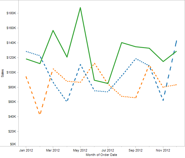
One of the things Tableau doesn’t do is let you draw line charts with dashed lines, to create a view like this that could be from Excel or another application:
Except that Tableau can do this, and you’re about to learn how – actually, three entirely different techniques. Along the way you’ll learn some more about how Tableau draws Line Marks and table calculation domain padding.